5 Support Vector Machines
This chapter presents another type of classifiers known as support vector machines (SVM). It corresponds to the 9th chapter of James et al. (2021).
We will cover:
- The maximal margin classifier, which requires the classes of the response variable to be separable by a linear boundary.
- The support vector classifier which is a generalization of the maximal margin classifier and allows an boundary that does not perfectly separate the classes.
- The support vector machines which further allow for non-linear boundaries.
5.1 Maximal Margin Classifier
5.1.1 Hyperplane
We will use the notion of a separating hyperplane in what follows. Hence, a little detour on recalling what a hyperplane is seems fairly reasonable.
In a \(p\)-dimensional space, a hyperplane is a flat affine subspace of dimension \(p-1\) (a subspace whose dimension is one less than that of its ambiant space).
Let us consider an example, in two dimensions, where a hyperplane is simply a line.
library(tidyverse)
x <- seq(0,1, by = .1)
y <- 2*x+1
df <- tibble(x = x, y = y)
ggplot(data = df, aes(x = x, y = y)) +
  geom_line()+
  theme(text = element_text(size=6), legend.position = "right") +
  xlab(expression(x[1])) + ylab(expression(x[2]))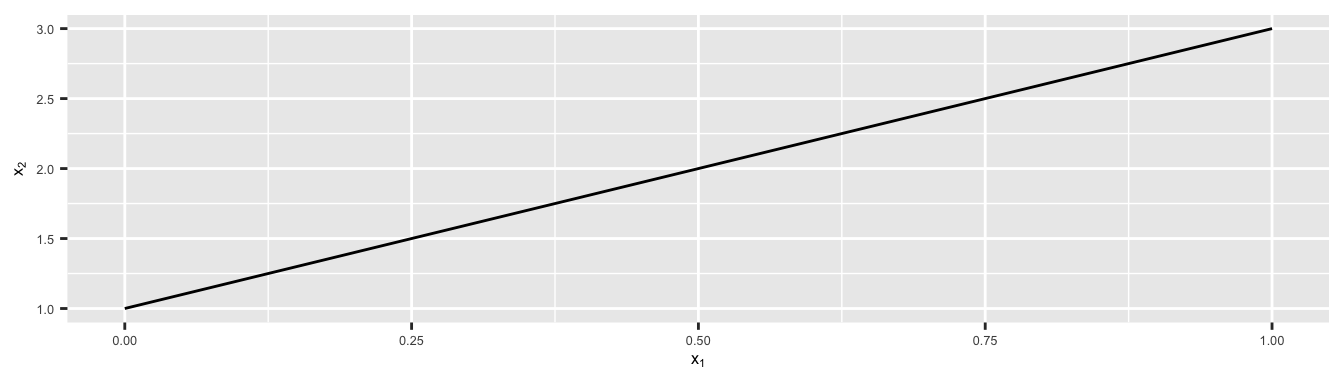
Figure 5.1: In two dimensions (\(p=2\)), a hyperplane is a one-dimensional subspace, a line.
In three dimension, a hyperplane is a flat two-dimensional subspace, i.e., a plane.
x <- seq(-10, 10, length= 30)
y <- x
f <- function(x, y){
  2*x+4*y
}
z <- outer(x, y, f)
z[is.na(z)] <- 1
persp(x, y, z, theta = 30, phi = 30, expand = 0.5, col = "lightblue",
      ltheta = 120, shade = 0.15, ticktype = "detailed",
      xlab = "x_1", ylab = "x_2", zlab = "x_3=2x+4y"
)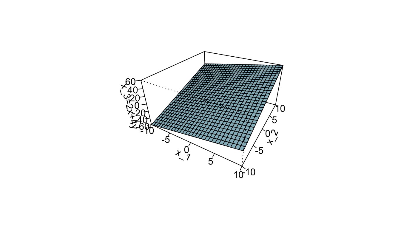
Figure 5.2: In three dimensions (\(p=3\)), a hyperplane is a flat two-dimensional subspace (\(p=2\)), a plane.
In two dimensions, for parameters \(\beta_0\), \(\beta_1\) and \(\beta_2\), the following equation defines the hyperplane: \[\begin{align} \beta_0+ \beta_1 \mathbf{x}_1 + \beta_2 \mathbf{x}_2 = 0 \tag{5.1} \end{align}\]
Any point whose coordinates for which Eq. (5.1) holds is a point on the hyperplane.
In a \(p\)-dimension ambiant space, an hyperplace is defined for parameters \(\beta_0\), \(\beta_1\), , \(\beta_p\) by the following equation: \[\begin{align} \beta_0+ \beta_1 \mathbf{x}_1 + \ldots + \beta_p \mathbf{x}_p = 0 \tag{5.2} \end{align}\]
Any point whose coordinates are given in a vector of length \(p\), i.e., \(\mathbf{X} = \begin{bmatrix}\mathbf{x_1} & \ldots & \mathbf{x}_p\end{bmatrix}^\top\) for which Eq. (5.2) holds is a point on the hyperplane.
If a point does not satisfy Eq. (5.2), then it lies either in one side or another side of the hyperplane, i.e., \[\begin{align} \beta_0+ \beta_1 \mathbf{x}_1 + \ldots + \beta_p \mathbf{x}_p > 0 \text{ or}\notag\\ \beta_0+ \beta_1 \mathbf{x}_1 + \ldots + \beta_p \mathbf{x}_p < 0 \end{align}\]
Hence, the hyperplane can be viewed as a subspace that divides a \(p\)-dimensional space in two halves.
x_1 <- seq(-2,2, by = .1)
f <- function(x) (1*x+.1)*0.5
x_2 <- f(x_1)
grid <- expand.grid(x_1=seq(-1.05,1.05, by = .1),
                    x_2=seq(-1.05,1.05, by = .1)) %>%
  tbl_df() %>%
  mutate(colour = ifelse(x_1 + 0.1 - 2*x_2 > 0, "magenta", "blue"))
df <- tibble(x = x_1, y = x_2)

ggplot(data = df, aes(x = x_1, y = x_2)) +
  geom_polygon(data = tibble(x = c(-2, 2, 2), y = c(f(-2), f(2), f(-2))),
               aes(x=x, y = y), fill = "magenta", alpha = .2) +
  geom_polygon(data = tibble(x = c(-2, -2, 2), y = c(f(-2), f(2), f(2))),
               aes(x=x, y = y), fill = "blue", alpha = .2) +
  geom_point(data = grid, aes(x = x_1, y = x_2, colour = colour)) +
  geom_line() +
  theme(legend.position = "none") +
  coord_equal(xlim = c(0, 1), ylim = c(0,1)) +
  xlab(expression(x[1])) + ylab(expression(x[2])) +
  scale_colour_manual(
    NULL, values = c("magenta" = "#D41159", "blue"="#1A85FF"))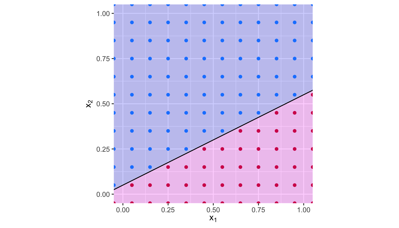
Figure 5.3: Hyperplane \(x_1 -2 x_2 + 0.1\). The blue region corresponds to the set of points for which \(x_1 -2 x_2 + 0.1>0\), the red region corresponds to the set of points for which \(x_1 -2 x_2 + 0.1<0\).
Let us consider a simplified situation to begin with the classification problem.
Suppose that we have a set of \(n\) observations \(\{(\mathbf{x}_1, y_1), \ldots, (\mathbf{x}_n, y_n)\}\), where the response variable can take two values \(\{\text{class } 1, \text{class } 2\}\), depending on the relationship with the \(p\) predictors.
In a first simplified example, let us assume that it is possible to construct a separating hyperplane that separates perfectly all observations.
In such a case, the hyperplane is such that:
\[\begin{align} \begin{cases} \beta_0 + \beta_1 x_1 + \ldots + \beta_p x_p > 0 & \text{if } y_i = \text{class 1}\\ \beta_0 + \beta_1 x_1 + \ldots + \beta_p x_p < 0 & \text{if } y_i = \text{class 2} \end{cases} \end{align}\]
For convenience, as it is often the case in classification problem with a binary outcome, the response variable \(y\) can be coded as \(1\) and \(-1\) (for class 1 and class 2, respectively). In that case, the hyperplane has the property that, for all observations \(i=1,\ldots,n\): \[\begin{align} y_i(\beta_0 + \beta_1 x_{i1} + \ldots + \beta_p x_{ip}) > 0 \end{align}\]
Let us illustrate this with simulated data in two dimensions, that are perfectly separable by a line.
df <-
  tibble(x_1 = c(5,7,9,12, 13,1,2,4,6,8),
         x_2 = c(1,1,4,7,6,3,1,5,9,7),
         y = c(rep(-1, 5), rep(1, 5))) %>%
  mutate(colour = ifelse(y == -1, yes ="blue", no = "magenta"))
The data can be visualised as follows:
ggplot() +
  geom_point(data = df,
             mapping = aes(x = x_1,
                           y = x_2, colour = colour)) +
  scale_colour_manual(
    NULL,
    values = c("blue" = "#1A85FF", "magenta" = "#D41159"))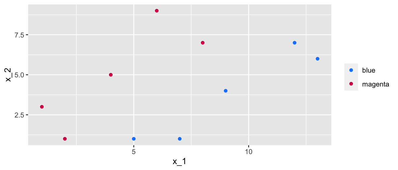
Figure 5.4: Data in two dimensions with two classes, where a separating line can perfectly separate the data.
There exists an infinite number of values for the slope and the intercept so that a line separates the data into two distinct parts, one in which all the blue points will be grouped, and another one in which all the magenta points will be grouped. Some values can be picked, for example:
slope <- 1.4 ; intercept <- -5This results in the following separating line:
ggplot() +
  geom_point(data = df,
             mapping = aes(x = x_1,
                           y = x_2, colour = colour)) +
  scale_colour_manual(
    NULL,
    values = c("blue" = "#1A85FF", "magenta" = "#D41159")) +
  geom_abline(slope = slope, intercept = intercept) +
  coord_equal(xlim = c(0, 15), ylim = c(0,10)) +
  theme(legend.position = "none")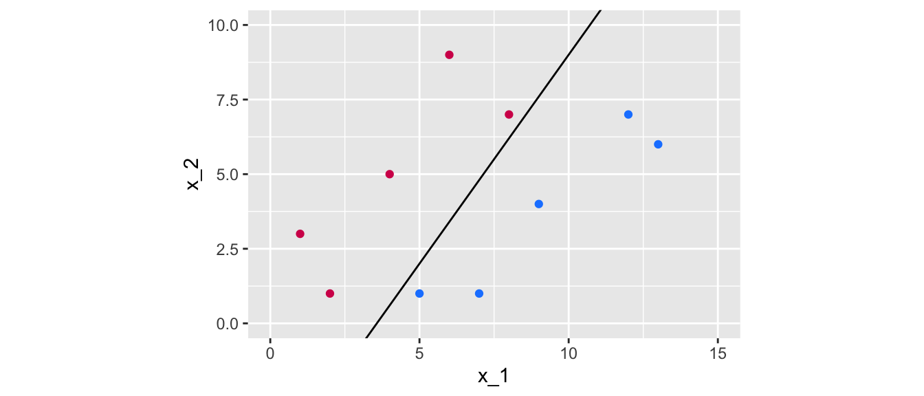
Figure 5.5: A first line of equation \(x_2 = 1.4 x_1 - 5\) that perfectly separates the data.
But other values might work just fine:
slope_2 <- 1 ; intercept_2 <- -2.5ggplot() +
geom_point(data = df,
mapping = aes(x = x_1,
y = x_2, colour = colour)) +
scale_colour_manual(
NULL, values = c("blue" = "#1A85FF", "magenta" = "#D41159")) +
geom_abline(slope = slope, intercept = intercept) +
geom_abline(slope = slope_2, intercept = intercept_2, colour="#FE6100") +
geom_label(
data = tibble(x_1 =8, x_2=9, lab = "x_2 = 1.4x_1 - 5"),
mapping = aes(x = x_1, y = x_2, label = lab), fill = "black",
colour = "white") +
geom_label(
data = tibble(x_1 = 10, x_2=6, lab = "x_2 = x_1 - 2.5"),
mapping = aes(x = x_1, y = x_2, label = lab), fill = "#FE6100",
colour = "black") +
coord_equal(xlim = c(0, 15), ylim = c(0,10))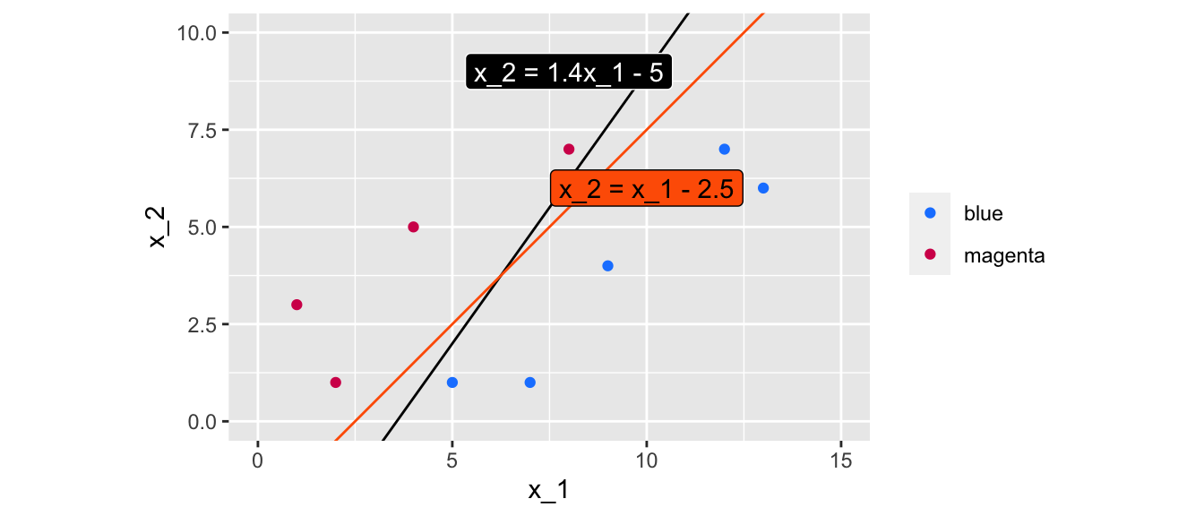
Figure 5.6: Two lines of equations \(x_2 = 1.4 x_1 - 5\) and \(x_2 = x_1 - 2.5\) that perfectly separate the data.
The question is: how can values for the slope and intercept be found using an algorithm, in an optimal way?
5.1.2 Margin
As usual, we would like to decide among the possible values, what is the optimal choice, regarding some criterion.
A solution consists in computing the distance from each observation to a given separating hyperplane. The distance which is the smallest is called the margin. The objective is to select the separating hyperplane for which the margin is the farthest from the observations, i.e., to select the maximal margin hyperplane.
This is known as the maximal margin hyperplane.
Let us visualise a margin, for the two different values of intercept and slope that were used earlier. To do so, the Euclidean distance of each point to the separating line needs to be computed.
df_tmp <-
  df %>%
  mutate(distance_margin =
           abs(slope*x_1 - x_2 + intercept) /
           sqrt(slope^2+(-1)^2))
df_tmp
## # A tibble: 10 × 5
## x_1 x_2 y colour distance_margin
## <dbl> <dbl> <dbl> <chr> <dbl>
## 1 5 1 -1 blue 0.581
## 2 7 1 -1 blue 2.21
## 3 9 4 -1 blue 2.09
## 4 12 7 -1 blue 2.79
## 5 13 6 -1 blue 4.18
## 6 1 3 1 magenta 3.84
## 7 2 1 1 magenta 1.86
## 8 4 5 1 magenta 2.56
## 9 6 9 1 magenta 3.25
## 10 8 7 1 magenta 0.465Once these distances are calculated, the minimum needs to be kept: this define the margin, conditional on the separating line that was used.
min_margin <-
  df_tmp %>%
  arrange(distance_margin) %>%
  slice(1) %>%
  magrittr::extract2("distance_margin")
min_margin
## [1] 0.4649906If we want to plot the margin, we need to further compute the intercept of the lines that define it.
dist_intercept <- min_margin/sin(pi/2-atan(slope))The margin obtained with a slope of 1.4 and an intercept of -5 can be visualised this way:
ggplot() +
  geom_point(data = df,
             mapping = aes(x = x_1, y = x_2, colour=colour)) +
  scale_colour_manual(
    NULL, values = c("blue" = "#1A85FF", "magenta" = "#D41159")) +
  geom_abline(slope = slope, intercept = intercept, colour = "#FE6100") +
  coord_equal(xlim = c(0, 15), ylim = c(0,10)) +
  geom_abline(slope = slope, intercept = intercept-dist_intercept,
              colour = "black", linetype = "dashed") +
  geom_abline(slope = slope, intercept = intercept+dist_intercept,
              colour = "black", linetype = "dashed") +
  theme(legend.position = "none")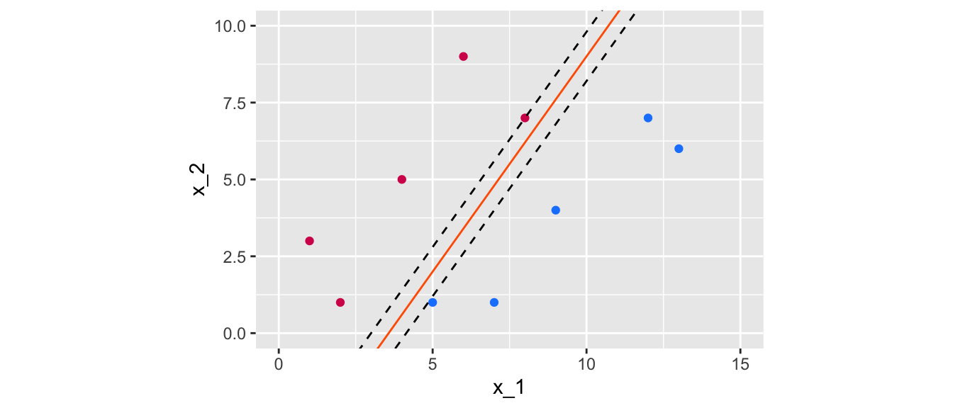
Figure 5.7: Margin obtained using the following separating hyperplane: \(x_2 = 1.4x_1 -5\).
Now, let us get the margin with a slope of 1 and an intercept of -2.5:
df_tmp <-
  df %>%
  mutate(distance_margin =
           abs(slope_2*x_1 - x_2 + intercept_2) /
           sqrt(slope_2^2+(-1)^2))
min_margin <-
  df_tmp %>%
  arrange(distance_margin) %>%
  slice(1) %>%
  magrittr::extract2("distance_margin")
min_margin
## [1] 1.06066Let us look at the margin graphically:
dist_intercept <- min_margin/sin(pi/2-atan(slope_2))
ggplot() +
  geom_point(data = df,
             mapping = aes(x = x_1, y = x_2, colour=colour)) +
  scale_colour_manual(
    NULL, values = c("blue" = "#1A85FF", "magenta" = "#D41159")) +
  geom_abline(slope = slope_2, intercept = intercept_2, colour = "black") +
  coord_equal(xlim = c(0, 15), ylim = c(0,10)) +
  geom_abline(slope = slope_2, intercept = intercept_2-dist_intercept,
              colour = "black", linetype = "dashed") +
  geom_abline(slope = slope_2, intercept = intercept_2+dist_intercept,
              colour = "black", linetype = "dashed") +
  theme(legend.position = "none")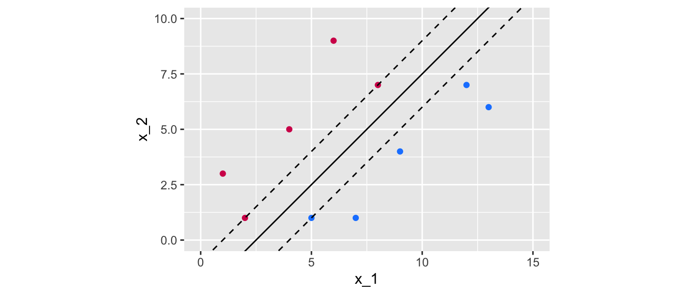
Figure 5.8: Margin obtained using the following separating hyperplane: \(x_2 = x_1 -2.5\).
The obtained margin is relatively higher in the second case. The idea is to try to find the maximal. This boils down to an optimization program.
The optimization problem is the following: \[\begin{align} &\max_{\beta_0, \beta_1, \ldots, \beta_p, M} M\tag{5.3}\\ &\text{s.t. } \sum_{j=1}^{p} \beta_j^2 = 1\tag{5.4}\\ &\quad y_i(\beta_0 + \beta_1 x_{i1} + \ldots +\beta_p x_{ip}) \geq M, \forall i = 1, \ldots, n \tag{5.5} \end{align}\]
Constraint (5.5) ensures that each obs. is on the correct side of the hyperplane.
Constraint (5.4) ensures that the perpendicular distance from the \(i\)th observation to the hyperplane is given by: \[y_i(\beta_0 + \beta_1 x_{i1} + \ldots +\beta_p x_{ip})\] Together, constraints (5.4) and (5.5) impose that each observation is on the correct side of the hyperplane and at least a distance \(M\) from the hyperplane.
We will see how this optimization problem can be implemented in R in a moment. For now, let us admit that the maximum margin is the one obtained with the values 1 for the slope and -2.5 for the intercept.
ggplot() +
  geom_point(data = df,
             mapping = aes(x = x_1, y = x_2, colour=colour)) +
  geom_point(data =
               tibble(
                 x_1 = c(5,2,8),
                 x_2 = c(1,1,7),
                 colour = c("blue", "magenta", "magenta")),
             mapping = aes(x = x_1, y = x_2, fill = colour),
             colour="black", size = 4, shape = 21) +
  scale_colour_manual(
    NULL, values = c("blue" = "#1A85FF", "magenta" = "#D41159")) +
  scale_fill_manual(
    NULL,values = c("blue" = "#1A85FF", "magenta" = "#D41159")) +
  geom_abline(slope = slope_2, intercept = intercept_2, colour = "black") +
  geom_abline(slope = slope_2, intercept = intercept_2-dist_intercept,
              colour = "black", linetype = "dashed") +
  geom_abline(slope = slope_2, intercept = intercept_2+dist_intercept,
              colour = "black", linetype = "dashed") +
  coord_equal(xlim = c(0, 15), ylim = c(0,10)) +
  theme(legend.position = "none")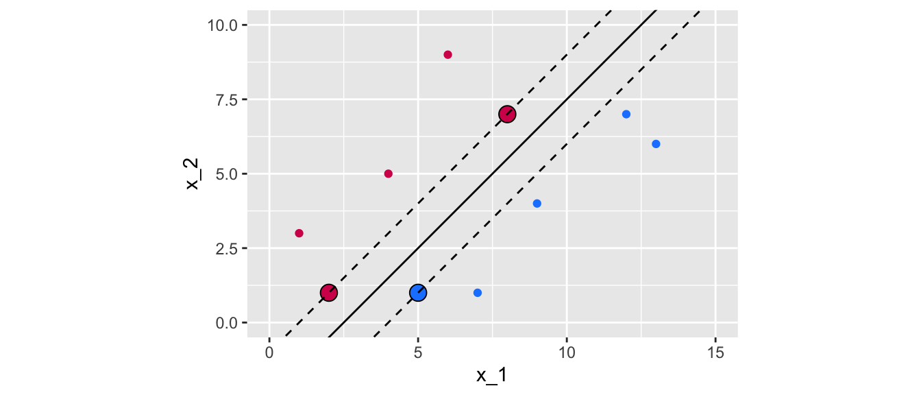
Figure 5.9: Maximum margin classifier for a perfectly separable binary outcome variable.
In the graph above, 3 observations from the training set that are equidistant from the maximal margin hyperplane were highlighted. These points are known as the support vectors:
- they are vectors in \(p\)-dimensional space
- they “support” the maximal margin hyperplane (if they move, the maximal margin hyperplane also moves).
For any other points, if they move but stay outside the boundary set by the margin, this does not affect the separating hyperplane. So the observations that fall in top of the fences are called support vector because they directly determine where the fences will be located.
In our example, the maximal margin hyperplane only depends on three points, but this is not a general result. The number of support vectors can vary according to the data.
Once the maximum margin is known, classification follows directly:
- cases that fall on one side of the maximal margin hyperplane are labelled as one class
- cases that fall on the other side of the maximal margin hyperplane are labelled as the other class.
The classification rule that follows from the decision boundary is known as hard thresholding.
So far, we were in a simplified situation in which it is possible to find a perfectly separable hyperplane. In reality, data are not always that cooperative, in that:
- there is no maximal margin classifier (the set of values are no longer linearly separable)
- the optimization problem gives no solution with \(M>0\).
In such cases, we can allow some number of observations to violate the rules so that they can lie on the wrong side of the margin boundaries. We can develop a hyperplane that almost separates the classes. The generalization of the maximal margin classifier to the non-separable case is known as the support vector classifier.
5.2 Support Vector Classifiers
Let us consider the case in which finding a maximal margin classifier is either not possible or not desirable.
A maximal margin classifier may not be desired as:
- its margins can be too narrow and therefore lead to relatively higher generalization errors
- the maximal margin hyperplane may be too sensitive to a change in a single observation.
As it is usually the case in statistical methods, a trade-off thus arises: here it consists in trading some accuracy in the classification for more robustness in the results.
Let us add some data (four observations) to the synthetic dataset at hand:
new_data <-
  tibble(x_1 = c(7, 10, 5, 8.5),
         x_2 = c(3.5, 9.5, 2.3, 3.5),
         y = c(1, -1, -1, 1),
         colour = c("magenta", "blue", "blue", "magenta"))

df_2 <-
  df %>%
  bind_rows(new_data) %>%
  mutate(class = factor(colour, levels = c("blue", "magenta")))
Let us plot the data on the previous graph.
ggplot() +
  geom_point(data = df_2,
             mapping = aes(x = x_1, y = x_2, colour=colour)) +
  geom_point(data = new_data,
             mapping = aes(x = x_1, y = x_2, fill = colour),
             colour="black", size = 4, shape = 21) +
  scale_colour_manual(
    NULL, values = c("blue" = "#1A85FF", "magenta" = "#D41159")) +
  scale_fill_manual(
    NULL, values = c("blue" = "#1A85FF", "magenta" = "#D41159")) +
  geom_abline(slope = slope_2, intercept = intercept_2, colour = "black") +
  geom_abline(slope = slope_2, intercept = intercept_2-dist_intercept,
              colour = "black", linetype = "dashed") +
  geom_abline(slope = slope_2, intercept = intercept_2+dist_intercept,
              colour = "black", linetype = "dashed") +
  coord_equal(xlim = c(0, 15), ylim = c(0,10)) +
  theme(legend.position = "none")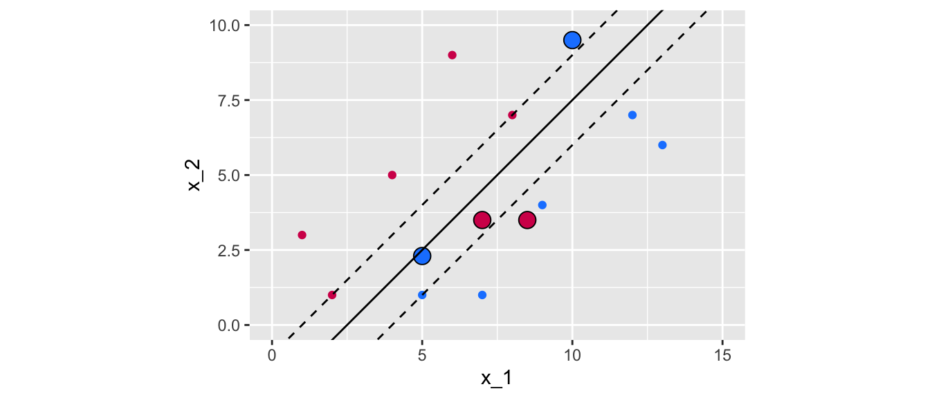
Figure 5.10: The new observations violate the previous margin.
As can be noted, the now observations that were added lie between the fences of the previous margin. In addition, the two magenta points lie in the wrong side of the hyperplane. One of the blue point (the one on top) is also on the wrong side of the hyperplane, while the second blue point (at the bottom) is on the correct side of the hyperplane but on the wrong side of the margin.
The support vector classifier will allow some points to violate the buffer zone. The optimization problem becomes: \[\begin{align} &\max_{\beta_0, \beta_1, \ldots, \beta_p, \varepsilon_1, \ldots, \varepsilon_n, M} M\tag{5.6}\\ &\text{s.t. } \sum_{j=1}^{p} \beta_j^2 = 1\tag{5.7},\\ &y_i(\beta_0 + \beta_1 x_{i1} + \ldots +\beta_p x_{ip}) \geq M (1-\varepsilon_t), \forall i = 1, \ldots,\\ n)\tag{5.8}\\ & \varepsilon_i \geq 0, \sum_{i=1}^{n} \varepsilon_i\leq C, \tag{5.9} \end{align}\]
where \(C\) is a nonnegative tuning parameter, \(M\) is the width of the margin.
\(\varepsilon_1, \ldots, \varepsilon_n\) allow individual observations to lie on the wrong side of the margin or the hyperplane, they are called slack variables (more details on those are provided below).
Once the optimization problem is solved, the classification follows instantly by looking at which side of the hyperplane the observation lies. For a new observation \(x_0\), the classification is based on the sign of \(\beta_0 + \beta_1 x_0 + \ldots + \beta_px_0\).
The slack variable \(\varepsilon_i\) indicates where the \(i\)th observation is located relative to both the hyperplane and the margin:
- \(\varepsilon_i = 0\): the ith observation is on the correct side of the margin
- \(\varepsilon_i > 0\): the ith observation is on the wrong side of the margin
- \(\varepsilon_i > 1\): the ith observation is on the wrong side of the hyperplane
The tuning parameter \(C\) from Eq. (5.9) reflects a measure of how permissive we were when the margin was maximized, as it bounds the sum of \(\varepsilon_i\). Setting a value of \(C\) to 0 implies that we do not allow any observations from the training sample to lie in the wrong side of the hyperplane. The optimization problem then boils down to that of the maximum margin (if the two classes are perfectly separable). If the value of \(C\) is greater than 0, then no more than \(C\) observations can be on the wrong side of the hyperplane:
- \(\varepsilon_i>0\) for each observation that lies on the wrong side of the hyperplane
- \(\sum_{i=1}^{n} \varepsilon_i \leq C\)
So, the idea of the support vector classifier can be viewed as maximizing the width of the buffer zone conditional on the slack variables. But the distance of some slack variables to the boundary can vary from one observation to another. The sum of these distances can then be viewed as a measure of how permissive we were when the margin was maximized.
- the more permissive, the larger the sum, the higher the number of support vectors, and the easier to locate a separating hyperplane within the margin
- but on the other hand, being more permissive can lead to a higher bias as we introduce more misclassifications.
Let us illustrate how the method works in R. We will use the function svm() from the package {e1071}.
It should be noted that the optimization problem that svm() addresses is written differently (see Karatzoglou, Meyer, and Hornik (2006)). The cost parameter of the function svm() allows us to control the penalty paid by the SVM for missclassifying a training point:
- a high cost value will be used to missclassify as few observations as possible
- a low cost (strictly greater than 0) will allow for more observations to be missclassified (the prediction function will be simpler).
With our initial data (perfectly separable date), let us set a high cost in the function, corresponding to penalise a lot missclassifications made with the training observations. We will therefore obtain a hard-margin. We will set cost = 1000. Here, we also set kernel = "linear" to use a linear kernel. More details on kernels will be provided in the next section, to consider non linear decision boundaries.
Before using the svm() function, let us create a factor variable in our initial dataset:
df <- df %>% mutate(class=factor(colour))library(e1071)
svm_fit <- svm(
class~x_1+x_2,
data = df,
cost = 1000,
# Using a linear kernel
kernel = "linear",
# Not scaling the variables
# Scaling: transforming y and X to get 0 mean and unit variance
scale = FALSE)
svm_fit##
## Call:
## svm(formula = class ~ x_1 + x_2, data = df, cost = 1000, kernel = "linear",
## scale = FALSE)
##
##
## Parameters:
## SVM-Type: C-classification
## SVM-Kernel: linear
## cost: 1000
##
## Number of Support Vectors: 3Only tree observations define the support vector. Their index can be accessed as follows:
svm_fit$index## [1] 1 7 10Which corresponds to those points:
df_support_vector <-
  tibble(df %>% slice(svm_fit$index))
df_support_vector
## # A tibble: 3 × 5
## x_1 x_2 y colour class
## <dbl> <dbl> <dbl> <chr> <fct>
## 1 5 1 -1 blue blue
## 2 2 1 1 magenta magenta
## 3 8 7 1 magenta magentaThe negative intercept is in the element rho from the returned object. Hence, the coefficient \(\beta_0\) can be computed this way:
beta_0 <- -svm_fit$rho
beta_0
## [1] -1.666317The coefficient \(\beta_1\),can be obtained as follows:
beta_1 <- sum(svm_fit$coefs * df$x_1[svm_fit$index])
beta_1
## [1] 0.6664919And \(\beta_2\):
beta_2 <- sum(svm_fit$coefs * df$x_2[svm_fit$index])
beta_2
## [1] -0.6664919We can thus deduct the values for the intercept in our two dimensional case:
intercept <- -beta_0/beta_2
intercept
## [1] -2.500131And the slode:
slope <- -beta_1/beta_2
slope
## [1] 1ggplot() +
geom_point(data = df,
mapping = aes(x = x_1, y = x_2, colour=colour)) +
geom_point(data = df_support_vector,
mapping = aes(x = x_1, y = x_2, fill = colour),
colour="black", size = 4, shape = 21) +
scale_colour_manual(
NULL, values = c("blue" = "#1A85FF", "magenta" = "#D41159")) +
geom_abline(slope = slope, intercept = intercept, colour = "black") +
coord_equal(xlim = c(0, 15), ylim = c(0,10)) +
geom_abline(intercept = -beta_0/beta_2, slope = -beta_1/beta_2,
colour = "black") +
geom_abline(slope = slope, intercept = (-beta_0-1)/beta_2,
colour = "black", linetype = "dashed") +
geom_abline(slope = slope, intercept = (-beta_0+1)/beta_2,
colour = "black", linetype = "dashed") +
theme(legend.position = "none")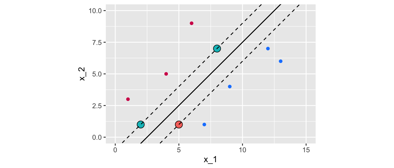
Figure 5.11: Maximal margin classifier for the initial dataset with linearly separable observation.
Now, let us simulate some new data that are not perfectly linearly separable. First, we begin with perfectly separable data:
set.seed(1234)
x_1 <- rbeta(n=5000, shape1 = 1, shape2 = 1)
x_2 <- rbeta(n=5000, shape1 = 1, shape2 = 1)
df <- tibble(x_1 = x_1, x_2 = x_2)

df <-
  df %>%
  mutate(
    flag = (0.5* x_1 + x_2 - 0.6 > 0 & 3*x_1 + x_2 - 1.5 < 0) |
      (3*x_1 + x_2 - 1.5 > 0 & 0.5* x_1 + x_2 - 0.6 < 0) |
      (3*x_1 + x_2 - 1.5 > 0 & 1.5* x_1 + x_2 - 1 < 0)) %>%
  filter(!flag) %>%
  mutate(
    class = ifelse(3*x_1 + x_2 - 1.5 > 0 & 1.5*x_1 + x_2 - 1 > 0 &
                     0.5*x_1 + x_2 - 0.6 > 0,
                   yes = "blue", no = "magenta")) %>%
  group_by(class) %>%
  sample_n(200) %>%
  ungroup()
And then, let us create some data that will be on the wrong side of the separating line.
df_new <-
  df %>%
  mutate(
    flag = (0.5* x_1 + x_2 - 0.6 > 0 & 3*x_1 + x_2 - 1.5 < 0) |
      (3*x_1 + x_2 - 1.5 > 0 & 0.5* x_1 + x_2 - 0.6 < 0) |
      (3*x_1 + x_2 - 1.5 > 0 & 1.5* x_1 + x_2 - 1 < 0)) %>%
  filter(!flag) %>%
  mutate(
    class = ifelse(3*x_1 + x_2 - 1.5 > 0 & 1.5*x_1 + x_2 - 1 > 0 &
                     0.5*x_1 + x_2 - 0.6 > 0,
                   yes = "magenta", no = "blue")) %>%
  group_by(class) %>%
  sample_n(20) %>%
  ungroup()
These two datasets can be merged:
df_2 <-
  df %>%
  bind_rows(df_new) %>%
  mutate(class = factor(class)) %>%
  sample_frac(1)
Let us have a look:
ggplot() +
  geom_point(data = df_2,
             mapping = aes(x = x_1, y = x_2, colour = class)) +
  scale_colour_manual(
    NULL,
    values = c("blue" = "#1A85FF", "magenta" = "#D41159"))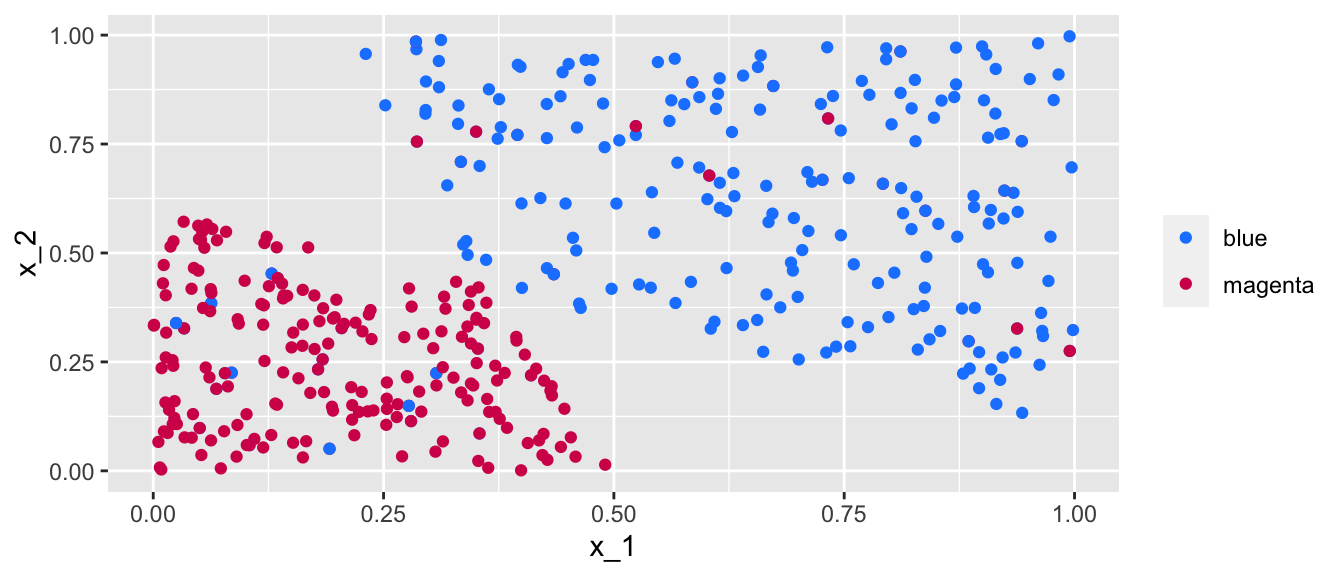
Figure 5.12: Simulated almost linearly-separable data.
Data are no longer linearly separable (but they are almost linearly separable), hence it will not be possible to obtain a hard-margin. The cost parameter can however be used to allow more or less missclassified training observations. Let us begin with a value of 100 :
svm_fit_2 <- svm(
  formula = class~x_1+x_2,
  data = df_2,
  cost = 100,
  # Using a linear kernel
  kernel = "linear",
  # Not scaling the variables
  # Scaling: transforming y and X to get 0 mean and unit variance
  scale = FALSE)
svm_fit_2
##
## Call:
## svm(formula = class ~ x_1 + x_2, data = df_2, cost = 100, kernel = "linear",
## scale = FALSE)
##
##
## Parameters:
## SVM-Type: C-classification
## SVM-Kernel: linear
## cost: 100
##
## Number of Support Vectors: 142There are 142 points that define the support vector. Let us visualise the soft-margin. First we need to compute some elements for the plot to be made. Let us make a function to make things more compact.
plot_results <- function(svm_result){
  df_support_vector <-
    tibble(df_2 %>% slice(svm_result$index))
  beta_0 <- -svm_result$rho
  beta_1 <- sum(svm_result$coefs * df_2$x_1[svm_result$index])
  beta_2 <- sum(svm_result$coefs * df_2$x_2[svm_result$index])
  intercept <- -beta_0/beta_2
  slope <- -beta_1/beta_2
  f <- function(x) x*slope+intercept
  ggplot() +
    geom_polygon(
      data = tibble(x = c(-2, 2, 2), y = c(f(-2), f(2), f(-2))),
      aes(x=x, y = y), fill = "blue", alpha = .2) +
    geom_polygon(
      data = tibble(x = c(-2, -2, 2), y = c(f(-2), f(2), f(2))),
      aes(x=x, y = y), fill = "magenta", alpha = .2) +
    geom_point(data = df_2, aes(x = x_1, y = x_2, colour=class)) +
    scale_colour_manual(
      NULL, values = c("blue" = "#1A85FF", "magenta" = "#D41159")) +
    scale_fill_manual(
      NULL, values = c("blue" = "#1A85FF", "magenta" = "#D41159")) +
    geom_abline(intercept = -beta_0/beta_2, slope = -beta_1/beta_2,
                colour = "black") +
    geom_abline(slope = slope, intercept = (-beta_0-1)/beta_2,
                colour = "black", linetype = "dashed") +
    geom_abline(slope = slope, intercept = (-beta_0+1)/beta_2,
                colour = "black", linetype = "dashed") +
    coord_equal(xlim = c(0, 1), ylim = c(0,1)) +
    theme(legend.position = "none")
}
The results can be plotted:
plot_results(svm_fit_2)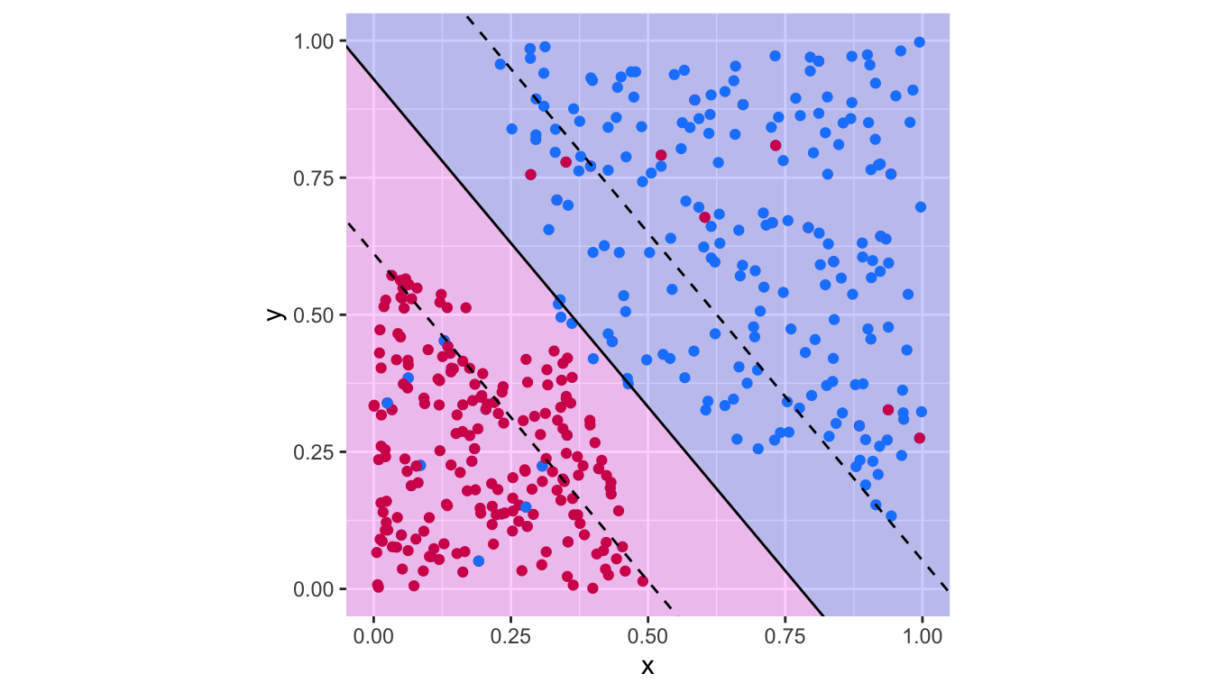
Figure 5.13: Support vector classifier with \(c=100\).
The confusion table:
confusion_t <-
  table(observed = df_2$class,
        predicted = predict(svm_fit_2, df_2))
confusion_t
## predicted
## observed blue magenta
## blue 195 25
## magenta 20 200There are thus 45 missclassified observations.
1 - sum(diag(confusion_t)) / sum(confusion_t)## [1] 0.1022727Let us consider a smaller value for the cost parameter of the svm() function. Recall that reducing the value of this argument should allow more observations to be missclassified.
svm_fit_3 <- svm(
  formula = class~x_1+x_2,
  data = df_2,
  cost = .1,
  # Using a linear kernel
  kernel = "linear",
  # Not scaling the variables
  # Scaling: transforming y and X to get 0 mean and unit variance
  scale = FALSE)
svm_fit_3
##
## Call:
## svm(formula = class ~ x_1 + x_2, data = df_2, cost = 0.1, kernel = "linear",
## scale = FALSE)
##
##
## Parameters:
## SVM-Type: C-classification
## SVM-Kernel: linear
## cost: 0.1
##
## Number of Support Vectors: 267The results can be plotted:
plot_results(svm_fit_3)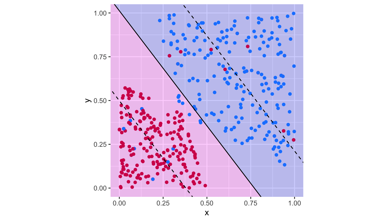
Figure 5.14: Support vector classifier with \(c=.1\).
The confusion table:
confusion_t <-
  table(observed = df_2$class,
        predicted = predict(svm_fit_3, df_2))
confusion_t
## predicted
## observed blue magenta
## blue 193 27
## magenta 20 200There are thus 47 missclassified observations.
1 - sum(diag(confusion_t)) / sum(confusion_t)## [1] 0.1068182It can be noted that the decision boundary has changed when the cost parameter was modified.
The choice of the cost parameter can be obtained using cross validation, thanks to the tune() function from {e1071}. A grid of values need to be provided.
values_cost <- 10^seq(3, -2, length = 50)Then the tune() can be used:
tune_out <- tune(svm,
                 train.x = class~x_1+x_2,
                 data=df_2,
                 kernel="linear",
                 ranges=list(cost=values_cost))
By default, 10-fold cross validation is used. The function tune.control() passed on to the argument tunecontrol of the tune() function allows to change this.
The results:
tune_out##
## Parameter tuning of 'svm':
##
## - sampling method: 10-fold cross validation
##
## - best parameters:
## cost
## 1000
##
## - best performance: 0.1022727The cost parameter that provided the best results (with respect to the the classification error):
tune_out$best.parameters## cost
## 1 1000The best model is returned (hence, there is no need to evaluate it a second time).
tune_out$best.model##
## Call:
## best.tune(method = svm, train.x = class ~ x_1 + x_2, data = df_2,
## ranges = list(cost = values_cost), kernel = "linear")
##
##
## Parameters:
## SVM-Type: C-classification
## SVM-Kernel: linear
## cost: 1000
##
## Number of Support Vectors: 142The confusion table:
confusion_t <-
  table(observed = df_2$class, predicted = predict(tune_out$best.model, df_2))
confusion_t
## predicted
## observed blue magenta
## blue 195 25
## magenta 20 200There are thus 45 missclassified observations.
1 - sum(diag(confusion_t)) / sum(confusion_t)## [1] 0.1022727plot_results(tune_out$best.model)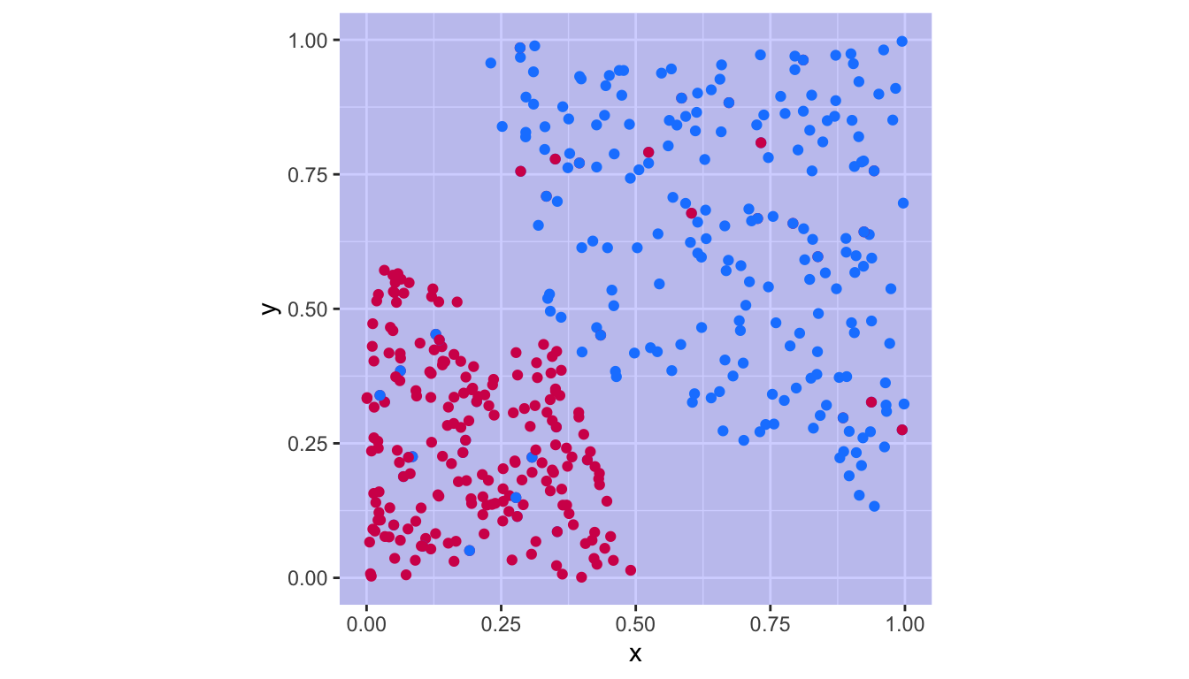
Figure 5.15: Support vector classifier with the cost parameter obtained by cross-validation.
5.3 Support Vector Machines
In this section, we will look at a solution to classification problems when the classes are not linearly separable. The basic idea is to convert a linear classifier into a classifier that produced non-linear decision boundaries.
Let us consider the following illustrative example. Let us generate some data.
set.seed(1234)
x_1 <- runif(n = 90, 0, 10)
x_2 <- 2*x_1+3 + rnorm(n = length(x_1))

df <- tibble(x_1 = x_1, x_2 = x_2) %>%
  arrange(x_1)
Now, let us assign a class to each observation.
df <-
  df %>%
  slice(16:30) %>%
  mutate(class = "blue") %>%
  bind_rows(
    df %>%
      slice(31:60) %>%
      mutate(class = "magenta")
  ) %>%
  bind_rows(
    df %>%
      slice(61:75) %>%
      mutate(class = "blue")
  ) %>%
  mutate(class = factor(class))
The data can be visualised:
ggplot(data = df, aes(x = x_1, y = x_2, colour = class)) +
  geom_point() +
  scale_colour_manual(
    NULL, values = c("blue" = "#1A85FF", "magenta" = "#D41159")) +
  coord_equal(xlim = c(1, 10), ylim = c(5,20)) +
  theme(legend.position = "none")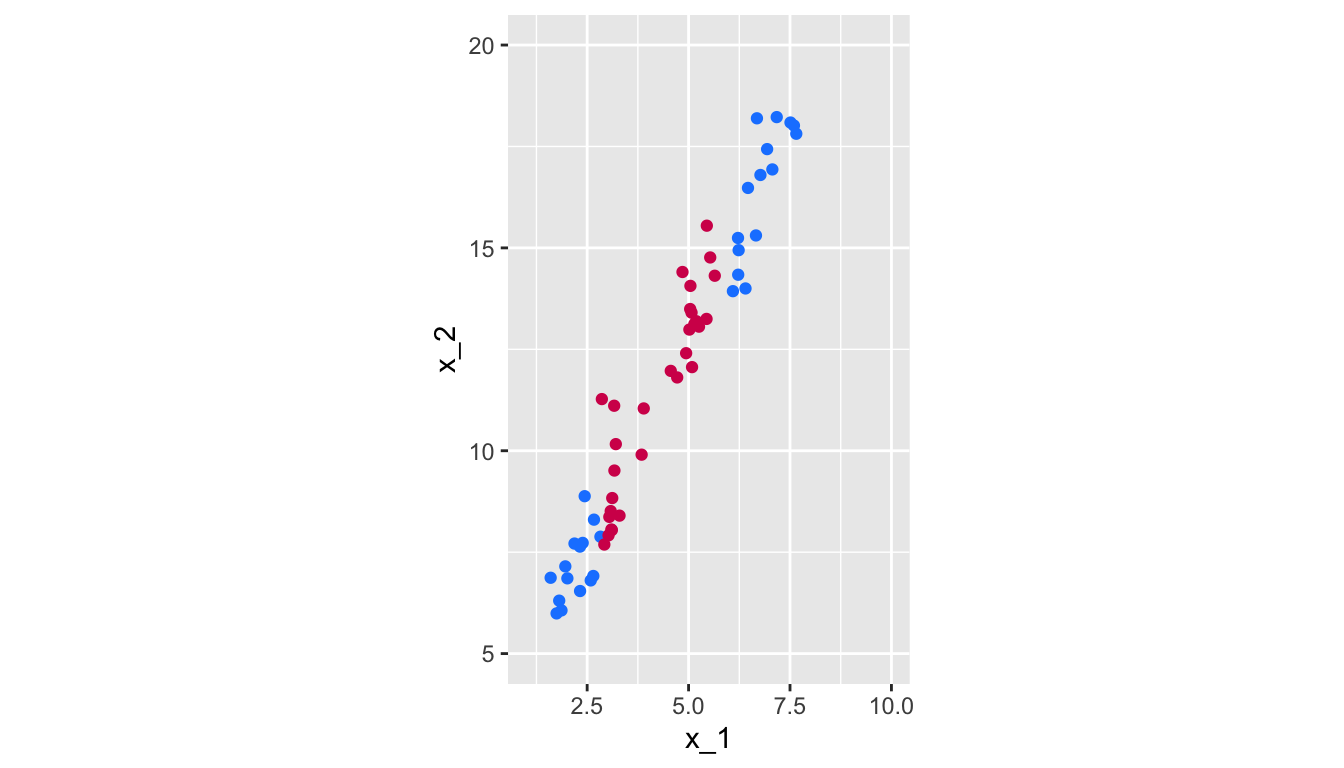
Figure 5.16: Non linearly-separable data.
Let us try to fit a support vector classifier:
svm_fit_lin <-
  svm(class~x_1+x_2, data = df, kernel = "linear", scale = FALSE)
beta_0 <- -svm_fit_lin$rho
beta_1 <- sum(svm_fit_lin$coefs * df$x_1[svm_fit_lin$index])
beta_2 <- sum(svm_fit_lin$coefs * df$x_2[svm_fit_lin$index])
intercept <- -beta_0/beta_2
slope = -beta_1/beta_2
f <- function(x) slope*x+interceptggplot() +
geom_polygon(
data = tibble(x = c(-2, 12, 12), y = c(f(-2), f(12), f(-2))),
aes(x=x, y = y), fill = "magenta", alpha = .2) +
geom_polygon(
data = tibble(x = c(-2, -2, 12), y = c(f(-2), f(12), f(12))),
aes(x=x, y = y), fill = "blue", alpha = .2) +
geom_point(data = df, aes(x = x_1, y = x_2, colour=class)) +
scale_colour_manual(
NULL, values = c("blue" = "#1A85FF", "magenta" = "#D41159")) +
scale_fill_manual(
NULL, values = c("blue" = "#1A85FF", "magenta" = "#D41159")) +
geom_abline(intercept = -beta_0/beta_2, slope = -beta_1/beta_2,
colour = "black") +
geom_abline(slope = slope, intercept = (-beta_0-1)/beta_2,
colour = "black", linetype = "dashed") +
geom_abline(slope = slope, intercept = (-beta_0+1)/beta_2,
colour = "black", linetype = "dashed") +
coord_equal(xlim = c(1, 10), ylim = c(5,20)) +
theme(legend.position = "none")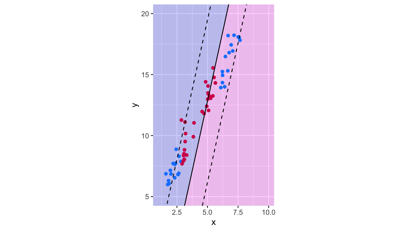
Figure 5.17: Decision boundary of the Support Vector Classifier trained on non linearly-separable data.
Obviously, the results give poor predictive performances.
To account for non-linear boundaries, it is possible to add more dimensions to the observation space, either by adding polynomial functions of the predictors, or by adding interaction terms between the predictors. However, as the number of predictors is enlarged, the computations become harder…
The support vector machine allows to enlarge the number of predictors while keeping efficient computations. The idea of the support vector machine is to fit a separating hyperplane in a space with a higher dimension than the predictor space. Instead of using the set of predictors, the idea is to use a kernel.
The solution of the optimization problem given by Eq. (5.6) to Eq. (5.9) involves only the inner products of the observations. The inner product of two observations \(x_1\) and \(x_2\) is given by \(\langle x_1,x_2 \rangle = \sum_{j=1}^{p} x_{1j} x_{2j}\).
The linear support vector classifier can be represented as: \[\begin{align} f(x) = \beta_0 + \sum_{i=1}^{n} \alpha_i \langle x, x_i \rangle, \tag{5.10} \end{align}\]
where the \(n\) parameters \(\alpha_i\) need to be estimated, as well as the parameter \(\beta_0\). This requires to compute all the \(\binom{n}{2}\) inner products \(\langle x_i, x_{i^\prime} \rangle\) between all pairs of training observations.
We can see in Eq. (5.10) that if we want to evaluate the function \(f\) for a new point \(x_0\), we need to compute the inner product between \(x_0\) and each of the points \(x_i\) from the training sample. If a point \(x_i\) from the training sample is not from the set \(\mathcal{S}\) of the support vectors, then it can be shown that \(\alpha_i\) is equal to zero.
Hence, Eq. (5.10) eventually writes: \[\begin{align} f(x) = \beta_0 + \sum_{i\in \mathcal{S}} \alpha_i \langle x, x_i \rangle, \tag{5.11} \end{align}\]
thus reducing the computational effort to perform when evaluating \(f\).
Now, rather than using the actual inner product \(\langle x_i,x_{i^\prime} \rangle = \sum_{j=1}^{p} x_{ij} x_{i^\prime j}\) when it needs to be computed, let us assume that we replace it with a generalization of the inner product, following some functional form \(K\) known as a kernel: \(K(x_i, x_{i^\prime})\).
A kernel will compute the similarities of two observations. For example, if we pick the following functional form: \[\begin{align} K(x_i, x_{i^\prime}) = \sum_{j=1}^{p} x_{ij} x_{i^\prime j}, \end{align}\]
it leads back to the support vector classifier (or the linear kernel).
5.3.1 Polynomial Kernel
We can use a non-linear kernel, for example a polynomial kernel of degree \(d\): \[\begin{align} K(x_i, x_{i^\prime}) = \left( 1+ \sum_{j=1}^{p} x_{ij} x_{i^\prime j}\right)^d, \end{align}\]
If we do so, the decision boundary will be more flexible. The functional form of the classifier becomes: \[\begin{align} f(x) = \beta_0 + \sum_{i \in \mathcal{S}} \alpha_i K(x, x_i) \end{align}\]
an is such a case, when the support vector classifier is combined with a non-linear kernel, the resulting classifier is known as a support vector machine.
In R, with the function svm(), all we need to do is to specify the argument kernel with the desired kernel. For the polynomial kernel, we need to set kernel = "polynomial". The degree of the polynomial is set through the degree argument.
For example, with a 10th order polynomial kernel:
degree <- 10
svm_fit_poly <-
  svm(class~x_1+x_2, data = df, kernel = "polynomial",
      degree = degree,
      scale = FALSE, cost=1000, coef0=1)
To visualise the decision boundary, we can create a grid and then use the predict() method to predict the class on each point of the grid.
grid <-
  expand_grid(x_1=seq(0, 11, length.out = 300),
              x_2=seq(4, 21, length.out = 300)) %>%
  tbl_df()
The predicted class:
grid$pred <- predict(svm_fit_poly, newdata = grid)
head(grid)
## # A tibble: 6 × 3
## x_1 x_2 pred
## <dbl> <dbl> <fct>
## 1 0 4 blue
## 2 0 4.06 blue
## 3 0 4.11 blue
## 4 0 4.17 blue
## 5 0 4.23 blue
## 6 0 4.28 blueggplot() +
geom_tile(data = grid, aes(x = x_1, y = x_2, fill = pred), alpha = .2) +
geom_point(data = df, aes(x = x_1, y = x_2, colour=class)) +
scale_colour_manual(
NULL, values = c("blue" = "#1A85FF", "magenta" = "#D41159")) +
scale_fill_manual(
NULL, values = c("blue" = "#1A85FF", "magenta" = "#D41159")) +
coord_equal(xlim = c(1, 10), ylim = c(5,20)) +
theme(legend.position = "none") +
geom_contour(data = grid %>%
mutate(pre_val = as.numeric(pred)),
mapping = aes(x = x_1, y = x_2, z=pre_val),
breaks = 1.5, colour = "black", linetype = "solid")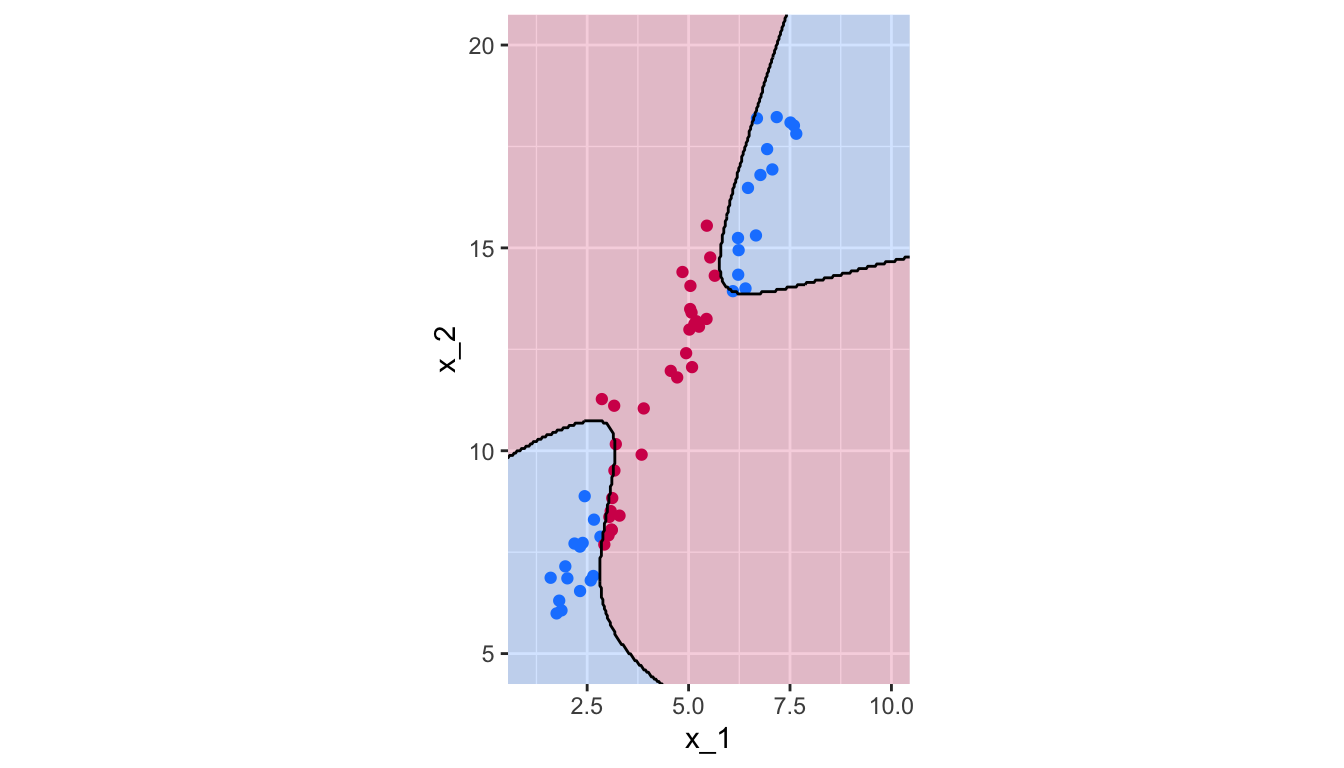
Figure 5.18: Polynomial Kernel, degree 10.
Let us use 10-fold cross-validation to select the couple degree/cost among tested values in a grid search:
hyperparam_grid <- list(
  cost = 10^seq(3, -2, length = 50),
  degree = seq(2, 10, by = 2)
)
Then the tune() can be used, again:
tune_out <- tune(svm,
                 train.x = class~x_1+x_2,
                 data=df,
                 kernel="polynomial",
                 ranges=hyperparam_grid)
The results of the cross-validation:
tune_out##
## Parameter tuning of 'svm':
##
## - sampling method: 10-fold cross validation
##
## - best parameters:
## cost degree
## 29.47052 2
##
## - best performance: 0And the selected hyperparameters:
tune_out$best.parameters## cost degree
## 16 29.47052 2The confusion table:
confusion_t <-
  table(observed = df$class, predicted = predict(tune_out$best.model, df))
confusion_t
## predicted
## observed blue magenta
## blue 30 0
## magenta 0 30There are thus 0 missclassified observations.
1 - sum(diag(confusion_t)) / sum(confusion_t)## [1] 0The predicted class for each observation on our grid of points:
grid$pred <- predict(tune_out$best.model, newdata = grid)ggplot() +
geom_tile(data = grid, aes(x = x_1, y = x_2, fill = pred), alpha = .2) +
geom_point(data = df, aes(x = x_1, y = x_2, colour=class)) +
scale_colour_manual(
NULL, values = c("blue" = "#1A85FF", "magenta" = "#D41159")) +
scale_fill_manual(
NULL, values = c("blue" = "#1A85FF", "magenta" = "#D41159")) +
coord_equal(xlim = c(1, 10), ylim = c(5,20)) +
theme(legend.position = "none") +
geom_contour(data = grid %>%
mutate(pre_val = as.numeric(pred)),
mapping = aes(x = x_1, y = x_2, z=pre_val),
breaks = 1.5, colour = "black", linetype = "solid")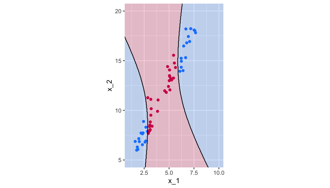
Figure 5.19: Polynomial Kernel, degree 2.
5.3.2 Radial kernel
Other kernels are possible, such as the radial kernel: \[\begin{align} K(x_i, x_{i^\prime}) = \exp\left( -\gamma \sum_{j=1}^{p} \left(x_{ij} - x_{i^\prime j}\right)^2\right), \end{align}\]
where \(\gamma\) is a positive constant that accounts for the smoothness of the decision boundary (and also controls the variance of the model):
- very large values lead to fluctuating decision boundaries that accounts for high variance (and may lead to overfitting)
- small values lead to smoother boundaries and low variance.
If a test observation \(x_0\) is far (considering the Euclidean distance) from a training observation \(x_i\):
- \(\sum_{j=1}^{p}(x_{0j} - x_{ij})^2\) will be large
- hence \(K(x_0, x_{i}) = \exp\left( -\gamma \sum_{j=1}^{p} \left(x_{0j} - x_{i j}\right)^2\right)\) will be really small
- hence \(x_i\) will play no role in \(f(x_0)\)
So, observations far from \(x_0\) will play no role in its predicted class: the radial kernel therefore has a local behaviour.
Once again, in R, we need to specify the kernel argument of the svm() function, and provide a value to the argument gamma.
gamma <- .1
svm_fit_poly <-
  svm(class~x_1+x_2, data = df, kernel = "radial", gamma = .1,
      scale = FALSE, cost=1000)
Again, let us define a grid of points for which the predictions will be made using the SVM, to visually observe the decision boundaries.
grid <-
  expand_grid(
    x_1=seq(0, 11, length.out = 300),
    x_2=seq(4, 21, length.out = 300)) %>%
  tbl_df()

grid$pred <- predict(svm_fit_poly, newdata = grid)
The decision boundaries can be plotted:
ggplot() +
  geom_tile(data = grid,
            mapping = aes(x = x_1, y = x_2, fill = pred),
            alpha = .2) +
  geom_point(data = df,
             mapping = aes(x = x_1, y = x_2, colour=class)) +
  scale_colour_manual(
    NULL, values = c("blue" = "#1A85FF", "magenta" = "#D41159")) +
  scale_fill_manual(
    NULL, values = c("blue" = "#1A85FF", "magenta" = "#D41159")) +
  coord_equal(xlim = c(1, 10), ylim = c(5,20)) +
  theme(legend.position = "none") +
  geom_contour(data = grid %>%
                 mutate(pre_val = as.numeric(pred)),
               mapping = aes(x = x_1, y = x_2, z=pre_val),
               breaks = 1.5, colour = "black", linetype = "solid")
Figure 5.20: Radial Kernel, \(\gamma=.1\).