Course homepage

Data Visualization with R

Chapter 5 – Comparing groups

Ewen Gallic

September 28, 2026

Disclaimers

  1. I used Claude Sonnet 5 while creating those slides.

A Note on the race Variable, Again

Please Read Before We Start

Several examples in this course use a dataset from the United States (law school students, Wightman (1998)) that contains a variable called race.

  • In France, the word “race” is heavily loaded. It evokes a dark history, and collecting data on it is tightly restricted. Seeing it in a dataset can feel uncomfortable, and that reaction is legitimate.
  • Biologically, there are no human races. Genetic variation within any so-called “racial group” is far larger than the variation between groups. The idea of distinct human races has no scientific basis.
  • We treat race as a social construct. The categories are defined by society, they change across countries and time periods, and in this dataset they are self-reported.
  • Why keep it in the analysis? Because these social categories have real consequences (in education, in the labour market, in the justice system), and measuring them is how inequalities can be documented.

What This Means for Us

Whenever we compare groups defined by race, we describe differences between social categories. We do not attribute these differences to biology, and a difference in a plot is never an explanation in itself.

Roadmap for This Chapter

Comparing Distributions and Proportions

  1. Categorical \(\times\) numerical
  2. Categorical \(\times\) categorical
  3. Many groups at once

Comparing Reliably and Honestly

  1. Uncertainty: are the differences reliable?
  2. Numerical \(\times\) numerical, within and across groups
  3. Misleading group comparisons

The Recurring Pattern of This Chapter

Almost every plot in this chapter follows the same three steps:

group_by() \(\rightarrow\) summarise() (or count()) \(\rightarrow\) ggplot()

First shape the data for the question you want to ask (Chapter 2), then choose the graph that answers it (Chapters 3 and 4).

From Describing to Comparing

  • In Chapter 4, we described the distribution of one variable, and briefly split it by sex in a bonus question.

  • Most real questions are comparative: does this differ across groups?

  • Comparing groups adds two difficulties that a single distribution does not have:

    1. Choosing the right encoding: the graph that shows a difference clearly is not always the one that shows it honestly.
    2. Judging reliability: groups have different sizes, so a gap between two groups may just be noise.

Our Guiding Question

Do students from different groups (sex, race, region_first) differ in their LSAT score, undergraduate GPA, or bar exam success (first_pf)? And how can we show it honestly?

Loading the Data

Same law dataset as before . This time, we convert sex and first_pf into labelled factors once and for all, so that plots and legends are readable.

library(tidyverse) ; library(here)

law <- read_csv(file = here("data", "law_data.csv")) |>
  mutate(
    sex = factor(sex, levels = c(1, 2), labels = c("Female", "Male")),
    first_pf_fct = factor(first_pf, levels = c(0, 1), labels = c("Fail", "Pass"))
  ) |> 
  filter(region_first != "PO") |> 
  left_join(
    tibble(
      region_first = c("FW","GL","MS","MW","Mt","NE","NG","NW","SC","SE"),
      freion_first_long = c(
        "Far West", "Great Lakes", "Midsouth", "Midwest",
        "Mountain West", "Northeast", "New Englant", "Northwest",
        "South Central", "Southeast")
    ),
    by = "region_first"
  )

# Colours used for sex throughout the chapter (colourblind-friendly)
sex_cols <- c("Female" = "#D55E00", "Male" = "#009E73")

# Applies a theme to every plot that follows
theme_set(theme_minimal(base_size = 14) + theme(plot.title.position = "plot"))
Variable Type Description
race character Self-reported race (8 categories)
sex factor Female / Male
LSAT, UGPA, ZFYA numeric LSAT score, undergraduate GPA, standardized first-year average
region_first character Region of the first bar examination (10 categories)
first_pf numeric 1 = passed the bar exam on the first trial, 0 = failed

Part 1: Categorical \(\times\) Numerical

The Question

Question

Do men and women have the same distribution of LSAT scores?

There are two main strategies to compare the distribution of a numerical variable across groups:

  • Superimpose the groups on the same panel (same axes, one colour/shape per group).
  • Separate the groups into several panels (small multiples, with facet_wrap()).

Neither is always better. Let us see when each one works.

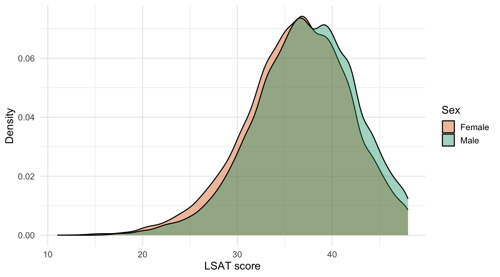
Strategy 1: Superimpose the Distributions

ggplot(
  data = law,
  mapping = aes(x = LSAT, fill = sex)
) +
  geom_density(alpha = 0.4) +
  scale_fill_manual(values = sex_cols) +
  labs(x = "LSAT score", y = "Density", fill = "Sex")
  • Groups are directly comparable: same axes, same panel.
  • Transparency (alpha) is needed, otherwise the front group hides the back one.
  • This strategy usually work well with two or three groups.
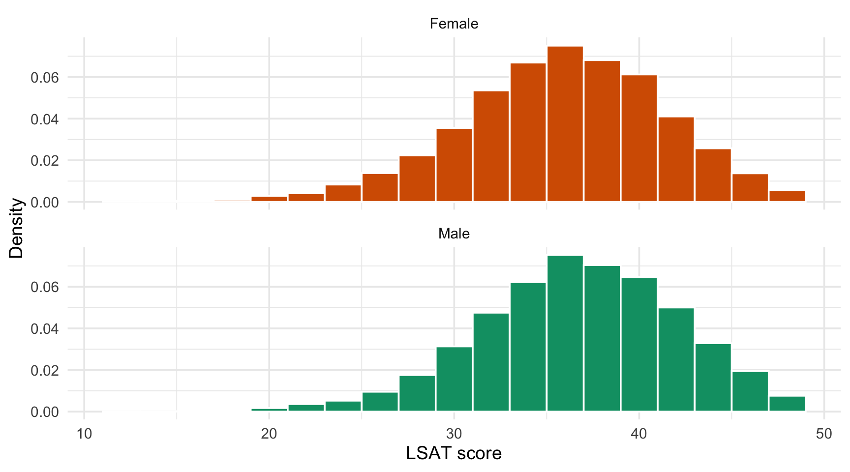
Strategy 2: Separate Into Panels

ggplot(
  data = law,
  mapping = aes(x = LSAT, fill = sex)
) +
  geom_histogram(
    mapping = aes(y = after_stat(density)),
    binwidth = 2, colour = "white"
  ) +
  scale_fill_manual(values = sex_cols) +
  facet_wrap(facets = vars(sex), ncol = 1) +
  guides(fill = "none") +
  labs(x = "LSAT score", y = "Density")
  • Each panel stays readable even with many groups.
  • Stack the panels vertically so the x-axes line up and shifts are easy to spot.
  • The colour is redundant with the facet: we hide the legend with guides().
Use after_stat(density) When Group Sizes Differ

With raw counts (default with geom_histogram()), a larger group would look “taller” even if its distribution had the same shape. Densities put every group on the same scale.

Boxplots and Violins: Many Groups Side by Side

When there are many groups, superimposing densities becomes unreadable.

In such cases, it may be better to use boxplots or violins that place one distribution per position on the categorical axis.
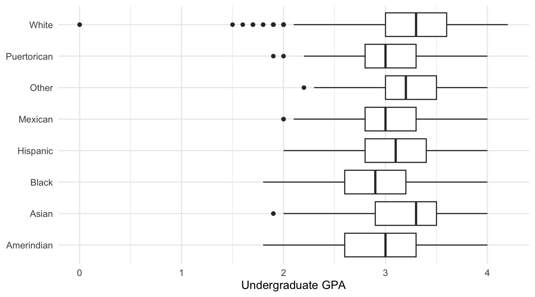
ggplot(
  data = law,
  mapping = aes(x = race, y = UGPA)
) +
  geom_boxplot() +
  coord_flip() +
  labs(x = NULL, y = "Undergraduate GPA")

The default order is usually not the desired one

In the figure above, the order of the categories is alphabetical, which carries no information. Let us change this!

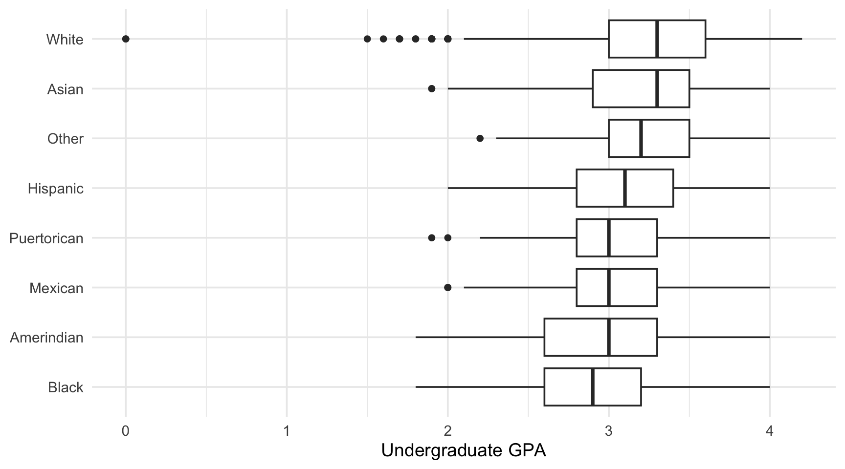
Order the Groups by What You Compare

fct_reorder() (from {forcats}, part of the tidyverse) reorders the levels of a factor according to a statistic computed on another variable.

ggplot(
  data = law,
  mapping = aes(
    x = fct_reorder(race, UGPA, .fun = median),
    y = UGPA
  )
) +
  geom_boxplot() +
  coord_flip() +
  labs(x = NULL, y = "Undergraduate GPA")

Now the eye can follow a gradient from the lowest to the highest median.
Rule of Thumb

Unless the categories have a natural order (age groups, months…), never leave them in alphabetical order. Order them by the statistic you want the reader to compare. By default, the median of the variabled given as the second argument is used.

Showing More Than a Box

A boxplot summarises a distribution with five numbers and hides its shape. Combine layers to show more (using violins).

ggplot(
  data = law,
  mapping = aes(
    x = fct_reorder(race, UGPA, .fun = median),
    y = UGPA
  )
) +
  geom_violin(fill = "grey90", colour = "grey60") +
  geom_boxplot(width = 0.15, outlier.shape = NA) +
  stat_summary(
    fun = mean, geom = "point",
    colour = "#CC79A7", size = 2.5
  ) +
  coord_flip() +
  labs(x = NULL, y = "Undergraduate GPA")
  • Violin: full shape of the distribution.
  • Box: median and quartiles.
  • Red dot: the mean, via stat_summary().
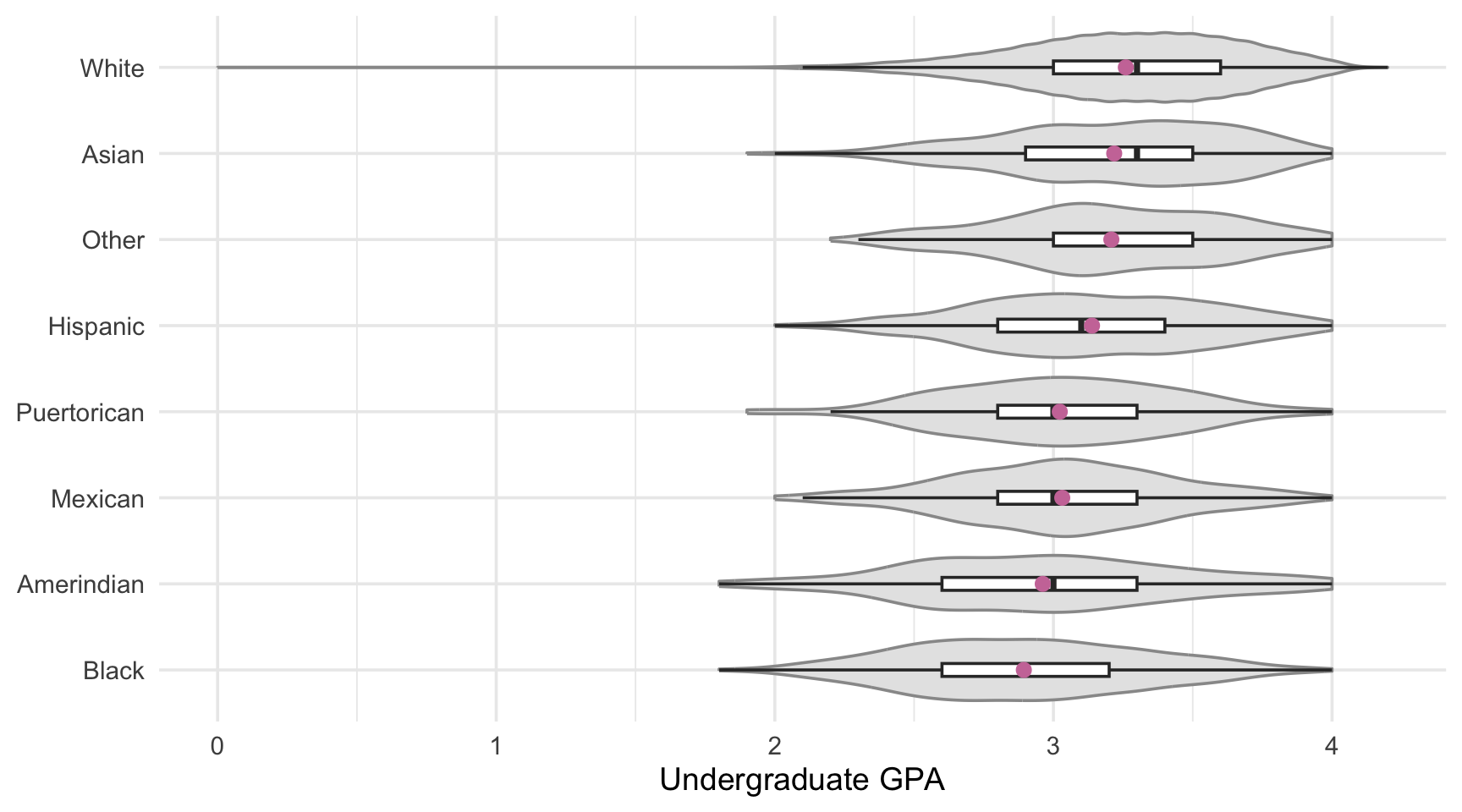
  • outlier.shape = NA: the outliers may densify the plot, they may be removed.

Connecting the Picture to the Numbers

A group comparison plot should always be consistent with the corresponding summary table. The group_by() + summarise() pattern allows us to get that table.

law |>
  group_by(race) |>
  summarise(
    n      = n(),
    mean   = mean(UGPA, na.rm = TRUE),
    median = median(UGPA, na.rm = TRUE),
    sd     = sd(UGPA, na.rm = TRUE),
    .groups = "drop"
  ) |>
  arrange(desc(median))
# A tibble: 8 × 5
  race            n  mean median    sd
  <chr>       <int> <dbl>  <dbl> <dbl>
1 Asian         845  3.22    3.3 0.411
2 White       18284  3.26    3.3 0.401
3 Other         293  3.21    3.2 0.395
4 Hispanic      488  3.14    3.1 0.414
5 Amerindian     99  2.96    3   0.484
6 Mexican       389  3.03    3   0.393
7 Puertorican   110  3.02    3   0.397
8 Black        1282  2.89    2.9 0.429

Read the n Column

Here, the groups have very different sizes. The picture of a group with a very small number of students is far less trustworthy than that of a group with thousands. We will come back to this later.

Task 1: Choose the Right Comparison Plot

Using the law dataset:

  1. Compare the distribution of LSAT between students who passed and failed the bar exam on their first attempt (first_pf_fct). Produce two versions: one superimposing the groups, one with facets. Which one do you prefer, and why?
  2. Compare the distribution of ZFYA across the race groups with a plot of your choice. The categories must be ordered by median ZFYA.
  3. Compute the mean, median and number of students of ZFYA for each race group. Does the table agree with your plot?
  4. Which of the summary statistics (mean or median) tells a different story for some groups? What does this reveal about the shape of the distribution?

Solution 1: Two Versions

p_super <- ggplot(
  data = law,
  mapping = aes(x = LSAT, fill = first_pf_fct)
) +
  geom_density(alpha = 0.4) +
  labs(x = "LSAT score", y = "Density", fill = "First attempt")

p_facet <- ggplot(
  data = law,
  mapping = aes(x = LSAT, fill = first_pf_fct)
) +
  geom_histogram(
    mapping = aes(y = after_stat(density)),
    binwidth = 2, colour = "white"
  ) +
  facet_wrap(facets = vars(first_pf_fct), ncol = 1) +
  guides(fill = "none") +
  labs(x = "LSAT score", y = "Density")
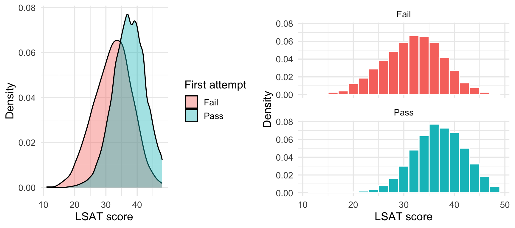
With only two groups, superimposing is more direct: the shift between the two densities is visible at a glance.

Facets are more useful when a third or fourth group would make the overlay too busy.

Solution 1: Ordered Comparison of ZFYA

ggplot(
  data = law,
  mapping = aes(
    x = fct_reorder(race, ZFYA, .fun = median),
    y = ZFYA
  )
) +
  geom_boxplot() +
  coord_flip() +
  labs(x = NULL, y = "Standardized first-year average")

The summary table:

law |>
  group_by(race) |>
  summarise(
    n = n(), mean = mean(ZFYA), median = median(ZFYA),
    .groups = "drop"
  ) |>
  arrange(median)
# A tibble: 8 × 4
  race            n    mean median
  <chr>       <int>   <dbl>  <dbl>
1 Black        1282 -0.829  -0.91 
2 Puertorican   110 -0.626  -0.785
3 Amerindian     99 -0.600  -0.58 
4 Mexican       389 -0.506  -0.55 
5 Hispanic      488 -0.314  -0.4  
6 Asian         845 -0.288  -0.34 
7 Other         293 -0.0408 -0.08 
8 White       18284  0.213   0.19 
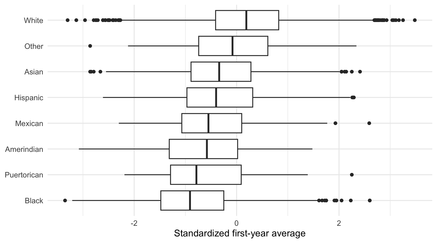
Where the mean and the median of a group differ greatly, the distribution is skewed (or has outliers). In this kind of situation, the choice of the summary statistic matters, and the boxplot or violin shows why.

Part 2: Categorical \(\times\) Categorical

Proportions, Not Counts

Question

Is the racial composition of the students the same across regions? And does the bar exam success rate differ across regions?

  • Comparing counts across groups of very different sizes is misleading: a large group always has larger counts.

  • We want proportions: the share of each category within each group.

  • Two ways to obtain them, you can either:

    1. Compute them explicitly with count() + group_by() + mutate() (as in Chapter 2), then use geom_col();
    2. Let geom_bar() do it with position = "fill" (the solution we use here, for simplicity).

Stacked, Dodged, or Filled Bars?

The same data can be encoded in three ways. Each one answers a different question.
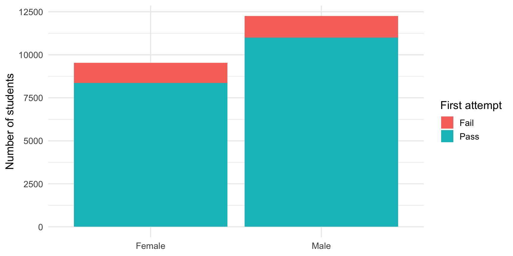
ggplot(data = law, mapping = aes(x = sex, fill = first_pf_fct)) +
  geom_bar(position = "stack") +
  labs(x = NULL, y = "Number of students", fill = "First attempt")

Question answered: how many students in each group, and how is the total split?

Group sizes are visible, proportions are hard to read.

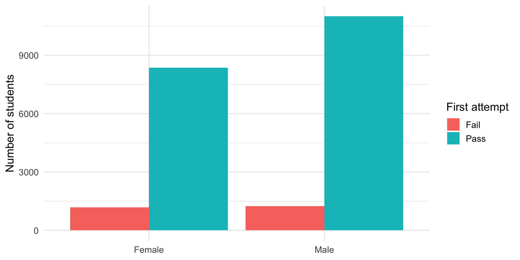
ggplot(data = law, mapping = aes(x = sex, fill = first_pf_fct)) +
  geom_bar(position = "dodge") +
  labs(x = NULL, y = "Number of students", fill = "First attempt")

Question answered: how do the counts of each category compare within a group?

Proportions are still hidden by the differences in group sizes.
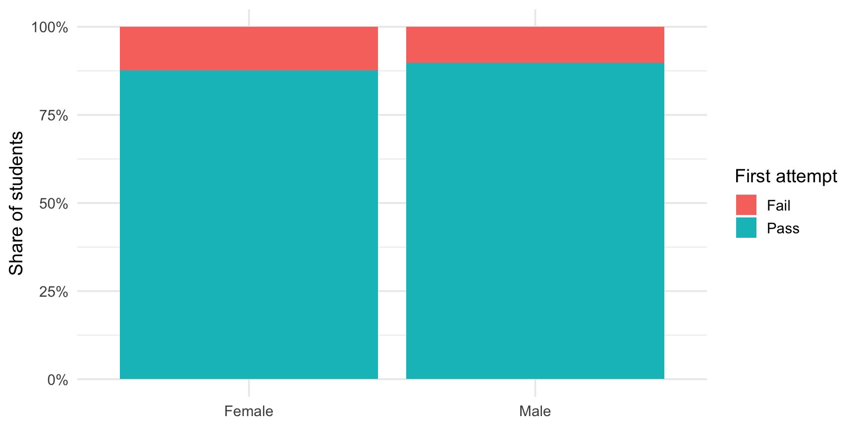
ggplot(data = law, mapping = aes(x = sex, fill = first_pf_fct)) +
  geom_bar(position = "fill") +
  scale_y_continuous(labels = scales::percent) +
  labs(x = NULL, y = "Share of students", fill = "First attempt")

Question answered: how do the proportions differ between groups?

Group sizes are hidden, which is why the n should be reported elsewhere.
Composition Across Many Groups: Lump Rare Categories

In the law dataset, race`{.R} has 8 categories, most of them very small. A stacked bar with 8 colours would be unreadable.

Depending on the question asked, it may be a good idea to keep large groups as is and group the small ones into a single category. This is what fct_lump_n() does.

law <- law |>
  mutate(race_grp = fct_lump_n(race, n = 3, other_level = "Other"))

law |> count(race_grp, sort = TRUE)
# A tibble: 4 × 2
  race_grp     n
  <fct>    <int>
1 White    18284
2 Other     1379
3 Black     1282
4 Asian      845

Related Tools from {forcats}

  • fct_lump_prop(): lump levels below a given proportion.
  • fct_collapse(): merge levels by hand, with names you choose.
  • fct_infreq(): order levels by frequency.

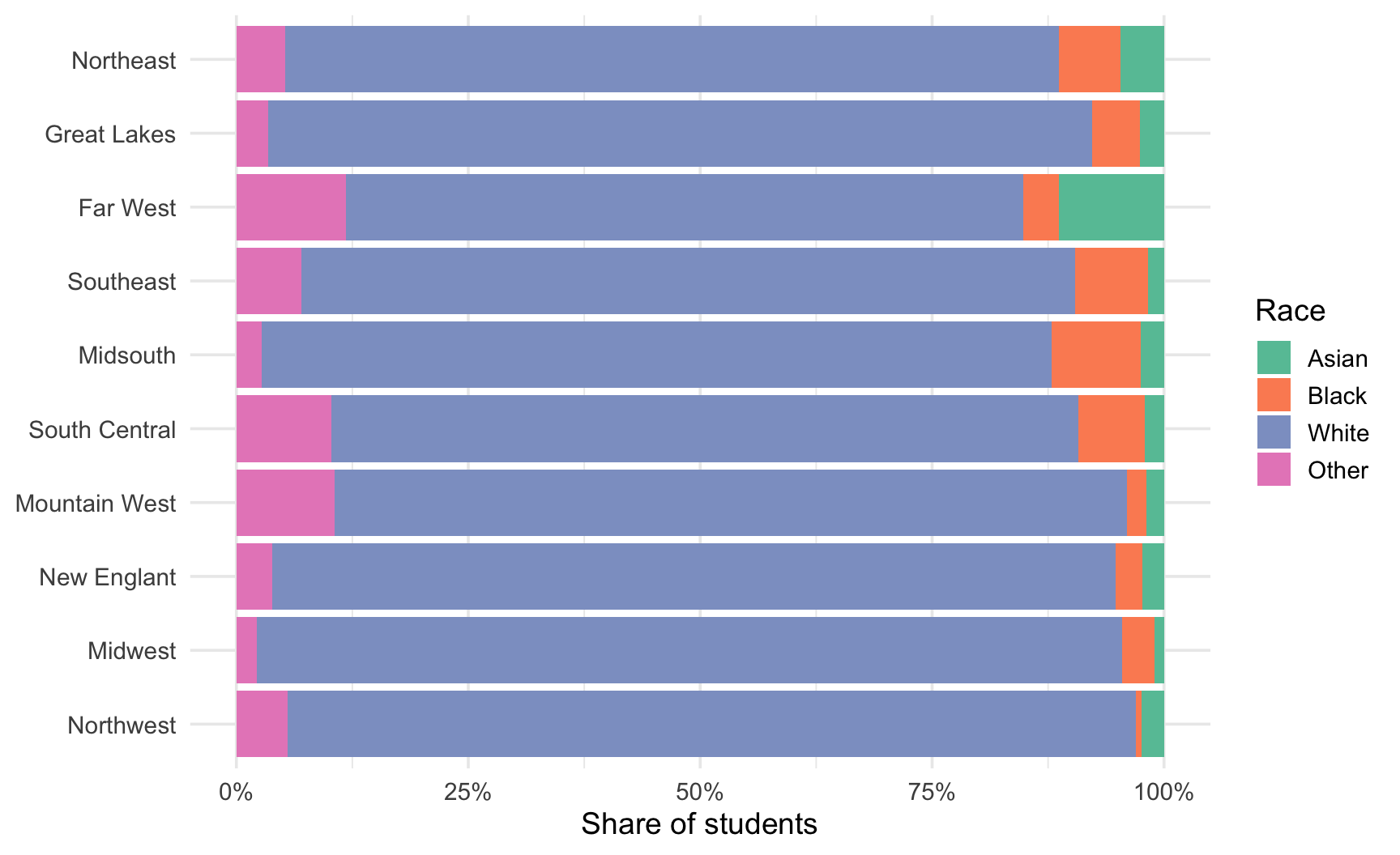
Racial Composition by Region

ggplot(
  data = law,
  mapping = aes(
    y = fct_rev(fct_infreq(freion_first_long)),
    fill = race_grp
  )
) +
  geom_bar(position = "fill") +
  scale_x_continuous(labels = scales::percent) +
  scale_fill_brewer(palette = "Set2") +
  labs(x = "Share of students", y = NULL, fill = "Race")
  • Regions on the y-axis: horizontal bars leave room for long labels.
  • Regions ordered by number of students with fct_infreq().
  • A qualitative palette, since the categories have no order.
Success Rate by Region: Compute First, Then Plot

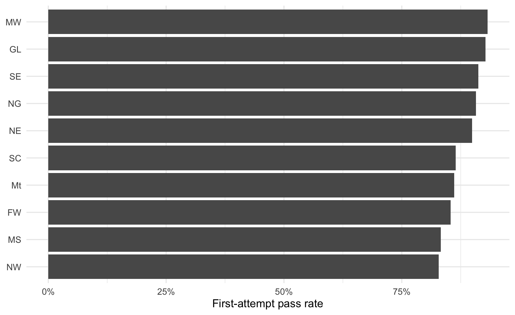
When the quantity of interest is the rate of a single category (here the pass rate), a filled bar with two colours is wasteful. Compute the rate and plot it directly.

pass_region <- law |>
  group_by(region_first) |>
  summarise(
    n = n(),
    pass_rate = mean(first_pf),
    .groups = "drop"
  )

ggplot(
  data = pass_region,
  mapping = aes(
    x = pass_rate,
    y = fct_reorder(region_first, pass_rate)
  )
) +
  geom_col() +
  scale_x_continuous(labels = scales::percent) +
  labs(x = "First-attempt pass rate", y = NULL)
Stay Careful With the Bar Axis

Recall from the introduction of the class that a bar’s length encodes its value: the axis of a bar chart must start at zero.

A Word on Pie Charts

  • A pie chart encodes proportions with angles and areas, which, as stated in the introduction, humans compare far less accurately than lengths aligned on a common baseline (bars).
  • With more than two or three slices, or when comparing several pies side by side, readers cannot tell which slice is larger.
  • A sorted bar chart shows the same information, and makes the ranking obvious.

Task 2: Proportions Across Groups

Using the law dataset (with the race_grp variable created earlier):

  1. Using count(), group_by() and mutate(), compute the proportion of women and men within each race_grp.
  2. Plot these proportions with geom_col(), one bar per race_grp, filled by sex. Which position argument ("stack" or "dodge") do you choose, and why?
  3. Reproduce the same plot directly from the raw data using geom_bar() and position = "fill".
  4. Compute the first-attempt pass rate by race_grp and plot it as horizontal bars, ordered from highest to lowest.
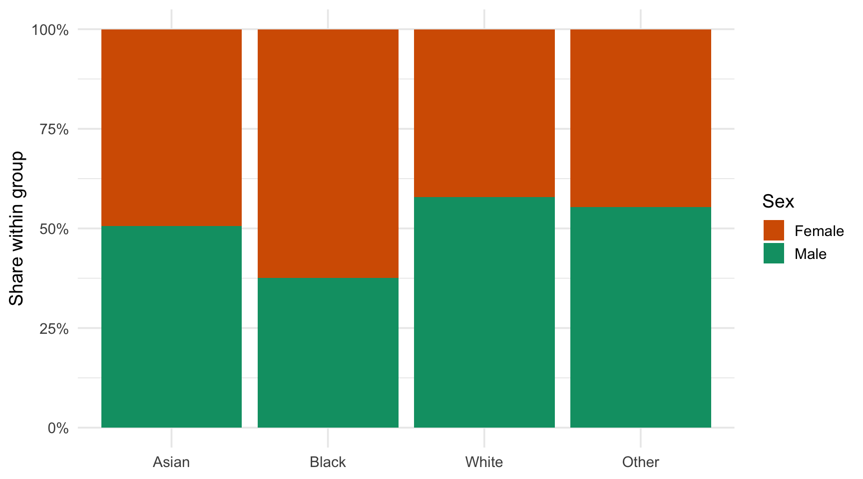
  5. Which statement do you find easier to defend after looking at your plots: “the sex composition differs a lot across racial groups” or “the pass rate differs a lot across racial groups”? Justify in one sentence.

Solution 2: Composition Within Groups

# Q1
sex_race <- law |>
  count(race_grp, sex) |>
  group_by(race_grp) |>
  mutate(prop = n / sum(n)) |>
  ungroup()

# Q2
p_col <- ggplot(
  data = sex_race,
  mapping = aes(x = race_grp, y = prop, fill = sex)
) +
  geom_col(position = "stack") +
  scale_y_continuous(labels = scales::percent) +
  scale_fill_manual(values = sex_cols) +
  labs(x = NULL, y = "Share within group", fill = "Sex")
# Q3
p_fill <- ggplot(
  data = law,
  mapping = aes(x = race_grp, fill = sex)
) +
  geom_bar(position = "fill") +
  scale_y_continuous(labels = scales::percent) +
  scale_fill_manual(values = sex_cols) +
  labs(x = NULL, y = "Share within group", fill = "Sex")

The two shares add up to a whole. Hence, stacking the proportions is natural.

Dodging would place two bars per group, which makes the comparison between groups harder.

Solution 2: Pass Rate by Race

pass_race <- law |>
  group_by(race_grp) |>
  summarise(
    n = n(),
    pass_rate = mean(first_pf),
    .groups = "drop"
  )

ggplot(
  data = pass_race,
  mapping = aes(
    x = pass_rate,
    y = fct_reorder(race_grp, pass_rate)
  )
) +
  geom_col() +
  scale_x_continuous(labels = scales::percent) +
  labs(x = "First-attempt pass rate", y = NULL)
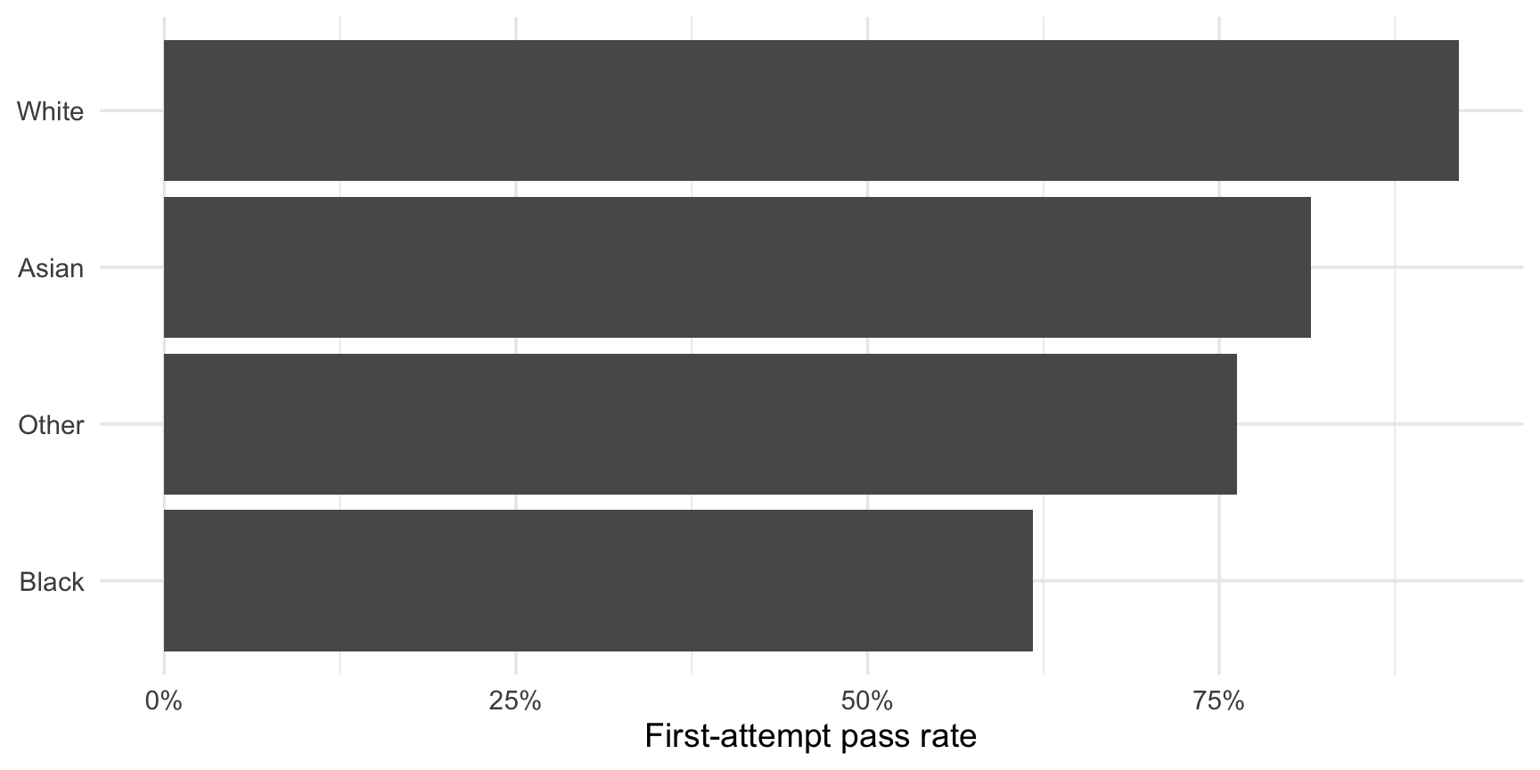
The pass rate differences between racial groups are much larger than the differences in sex composition. That does not tell us why (this is a descriptive plot), but it is a striking pattern that deserves a careful presentation.

Part 3: Many Groups at Once

When There Are Too Many Groups

  • region_first has 10 categories, race has 8. Crossing the two produces 80 combinations.

  • Colour, bar positions and facets all become hard to read as the number of groups grows.

  • Some strategies, from the simplest to the most advanced:

    1. Lump rare categories (fct_lump_n(), fct_collapse());
    2. Order the groups by the statistic being compared;
    3. Replace bars by dots, which use less ink and allow more groups;
    4. Use a heatmap when two categorical variables are crossed;
    5. Use ridgeline plots to compare many distributions at once.

Dot Plots and Lollipops

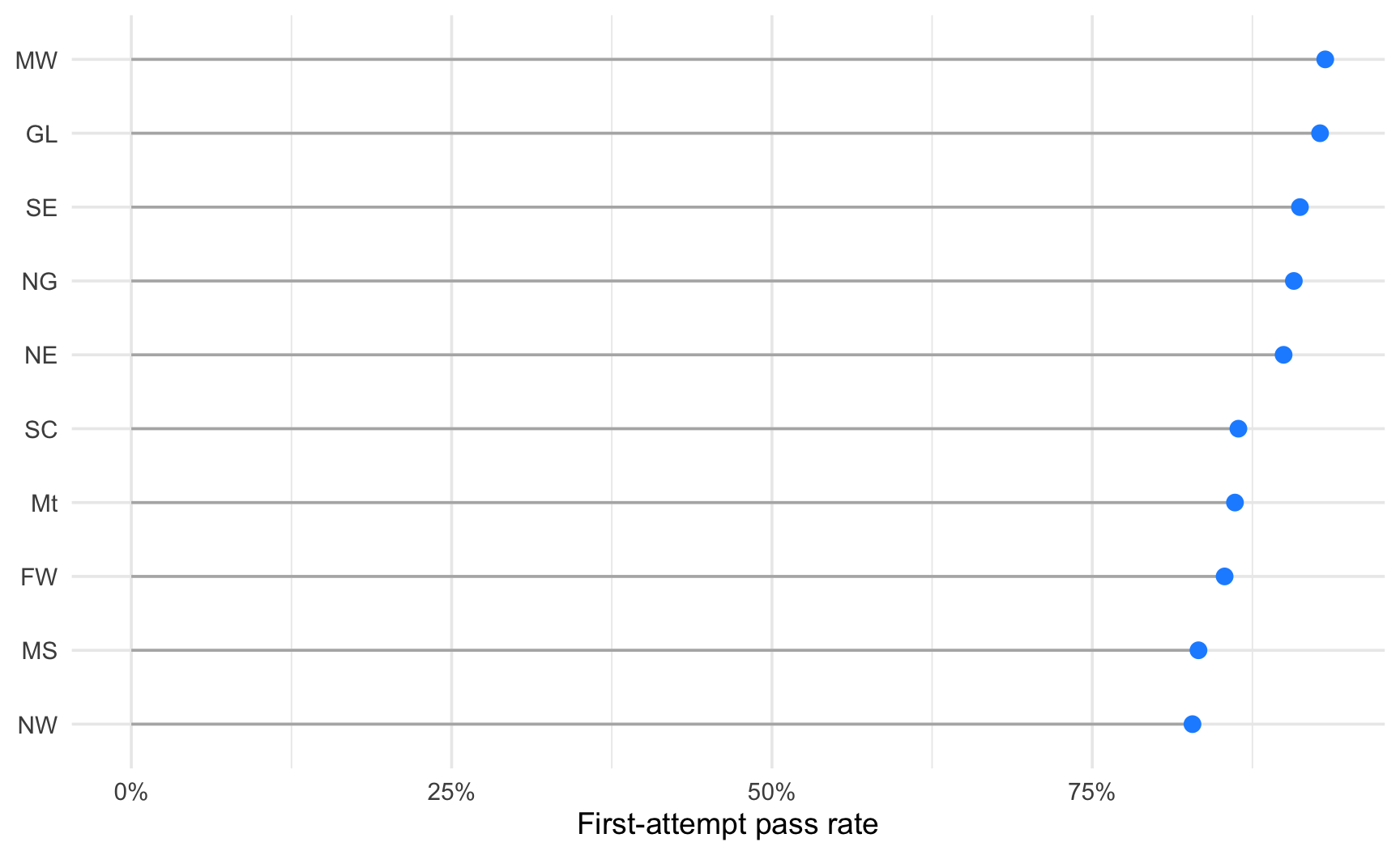
Bars use a lot of ink for a single number. A dot on a light grid line carries the same information with less clutter, and the axis no longer has to start at zero (dots encode position, not length).

pass_region <- law |>
  group_by(region_first) |>
  summarise(
    n = n(),
    pass_rate = mean(first_pf),
    .groups = "drop"
  ) |>
  mutate(region_first = fct_reorder(region_first, pass_rate))

ggplot(
  data = pass_region,
  mapping = aes(x = pass_rate, y = region_first)
) +
  geom_segment(
    mapping = aes(
      x = 0, xend = pass_rate,
      y = region_first, yend = region_first
    ),
    colour = "grey70"
  ) +
  geom_point(colour = "dodgerblue", size = 3) +
  scale_x_continuous(labels = scales::percent) +
  labs(x = "First-attempt pass rate", y = NULL)
A Question to Keep in Mind

Some of these dots are computed on a small number of students, others on thousands. Should we trust them equally? We come back to this in Part 4.

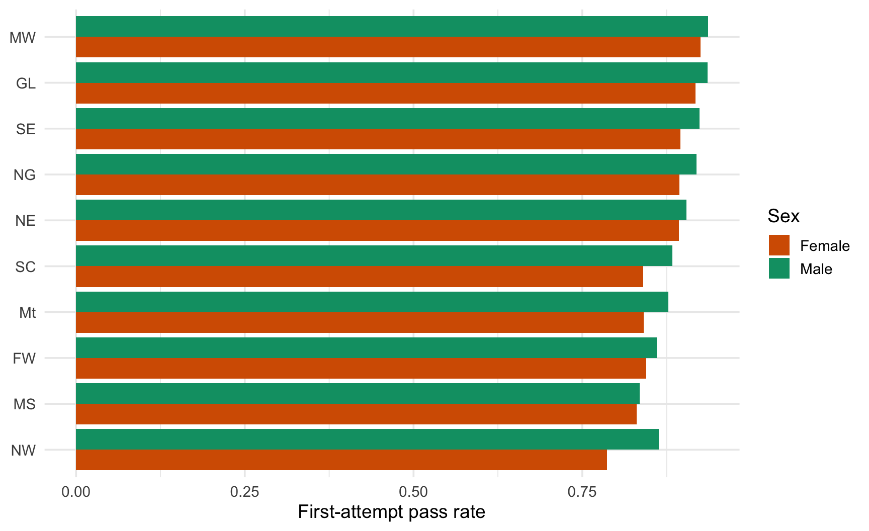
Two Grouping Variables: Colour Inside a Dot Plot

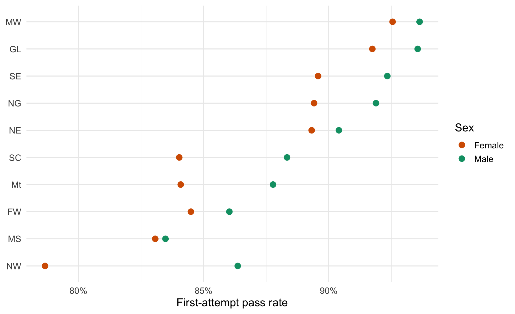
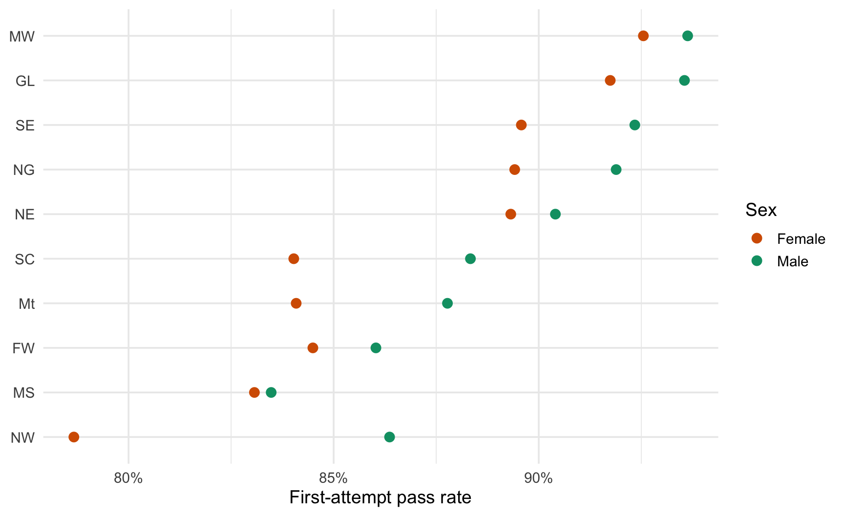
To compare men and women within each region, put the two dots on the same line: the gap between them is the quantity of interest.

pass_rs <- law |>
  group_by(region_first, sex) |>
  summarise(
    n = n(), pass_rate = mean(first_pf), .groups = "drop"
  )

ggplot(
  data = pass_rs,
  mapping = aes(
    x = pass_rate,
    y = fct_reorder(region_first, pass_rate, .fun = mean),
    colour = sex
  )
) +
  geom_point(size = 3) +
  scale_colour_manual(values = sex_cols) +
  scale_x_continuous(labels = scales::percent) +
  labs(x = "First-attempt pass rate", y = NULL, colour = "Sex")
Heatmaps for Two Categorical Variables

When two categorical variables are crossed and the outcome is a number, geom_tile() draws one coloured cell per combination. Since the pass rate is a continuous variable without a meaningful midpoint, we use a sequential scale (Chapter 3).

pass_heat <- law |>
  group_by(region_first, race_grp) |>
  summarise(
    n = n(), pass_rate = mean(first_pf), .groups = "drop"
  )

ggplot(
  data = pass_heat,
  mapping = aes(x = race_grp, y = region_first, fill = pass_rate)
) +
  geom_tile(colour = "white") +
  geom_text(
    mapping = aes(label = scales::percent(pass_rate, accuracy = 1)),
    colour = "white", size = 3.5
  ) +
  scale_fill_viridis_c(labels = scales::percent) +
  labs(x = NULL, y = NULL, fill = "Pass rate")
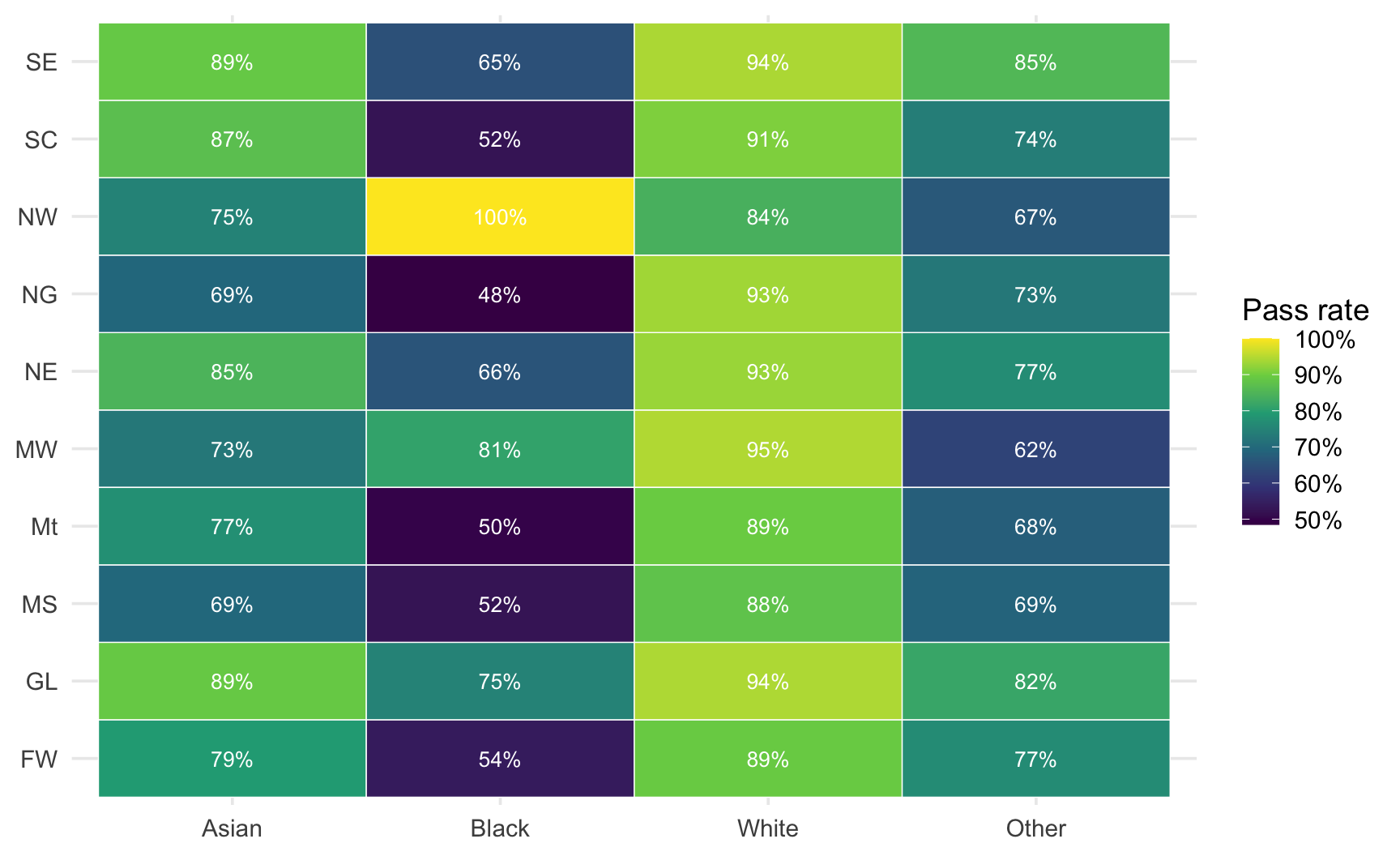
Each Cell Is Not Equally Reliable

Some cells contain thousands of students, others only a handful. The heatmap treats them all the same. This is exactly the issue tackled in Part 4.

Ridgeline Plots for Many Distributions

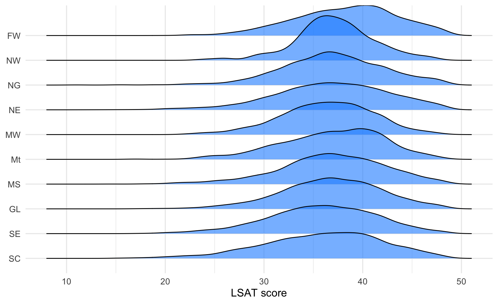
{ggridges} stacks density curves vertically with slight overlap. It is a good alternative to superimposed densities when you have many groups (typically more than 4).

# install.packages("ggridges")
library(ggridges)

ggplot(
  data = law,
  mapping = aes(
    x = LSAT,
    y = fct_reorder(region_first, LSAT, .fun = median)
  )
) +
  geom_density_ridges(fill = "dodgerblue", alpha = 0.6) +
  labs(x = "LSAT score", y = NULL)

The groups are ordered by median: shifts in location are obvious, differences in shape too.
Task 3: Many Groups

We want to study the relationship between the first-attempt pass rate, the region, and the sex of the student.

  1. Using group_by() and summarise(), compute the pass rate and the number of students for each combination of region_first and sex.
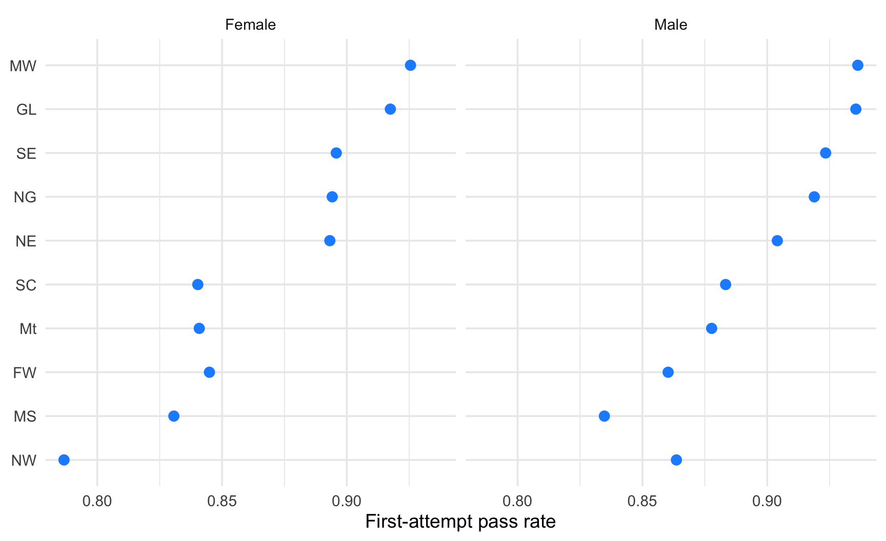
  2. Produce the graph using three different encodings: (a) dodged bars, (b) a dot plot with one colour per sex, (c) facets by sex with a dot plot in each.
  3. Which one makes it easiest to see whether women and men have a similar ranking of the regions? Which one makes it easiest to see the size of the gap within one region?
  4. Order the regions in a meaningful way (not alphabetically) in each of your plots.
  5. Bonus: Compute the difference between the pass rate of men and women in each region (pivot_wider() may help) and plot it. What is the advantage of plotting the gap directly?

Solution 3: Three Encodings

p_a <- ggplot(
  data = pass_rs, 
  mapping = aes(
    x = pass_rate, 
    y = fct_reorder(region_first, pass_rate, .fun = mean), fill = sex
  )
) +
  geom_col(position = "dodge") +
  scale_fill_manual(values = sex_cols) +
  labs(x = "First-attempt pass rate", y = NULL, fill = "Sex")

p_b <- 
ggplot(
  data = pass_rs,
  mapping = aes(
    x = pass_rate,
    y = fct_reorder(region_first, pass_rate, .fun = mean),
    colour = sex
  )
) +
  geom_point(size = 3) +
  scale_colour_manual(values = sex_cols) +
  scale_x_continuous(labels = scales::percent) +
  labs(x = "First-attempt pass rate", y = NULL, colour = "Sex")
p_c <- ggplot(
  data = pass_rs, 
  mapping = aes(
    x = pass_rate, 
    y = fct_reorder(region_first, pass_rate, .fun = mean)
  )
) +
  geom_point(colour = "dodgerblue", size = 3) +
  facet_wrap(facets = vars(sex)) +
  labs(x = "First-attempt pass rate", y = NULL)

  • The facets (c) make the ranking of regions easy to compare across sexes, because the vertical order is shared by both panels.
  • The dot plot with two colours (b) makes the within-region gap easy to read: the two dots are on the same line.
  • The dodged bars (a) use the most ink and are the hardest to read with 10 regions.

Solution 3: Bonus, Plot the Gap Directly

gap_region <- pass_rs |>
  select(region_first, sex, pass_rate) |>
  pivot_wider(names_from = sex, values_from = pass_rate) |>
  mutate(gap = Male - Female)

ggplot(
  data = gap_region,
  mapping = aes(
    x = gap,
    y = fct_reorder(region_first, gap)
  )
) +
  geom_vline(xintercept = 0, colour = "grey50") +
  geom_point(size = 3, colour = "dodgerblue") +
  labs(
    x = "Pass rate gap (Male - Female)",
    y = NULL
  )
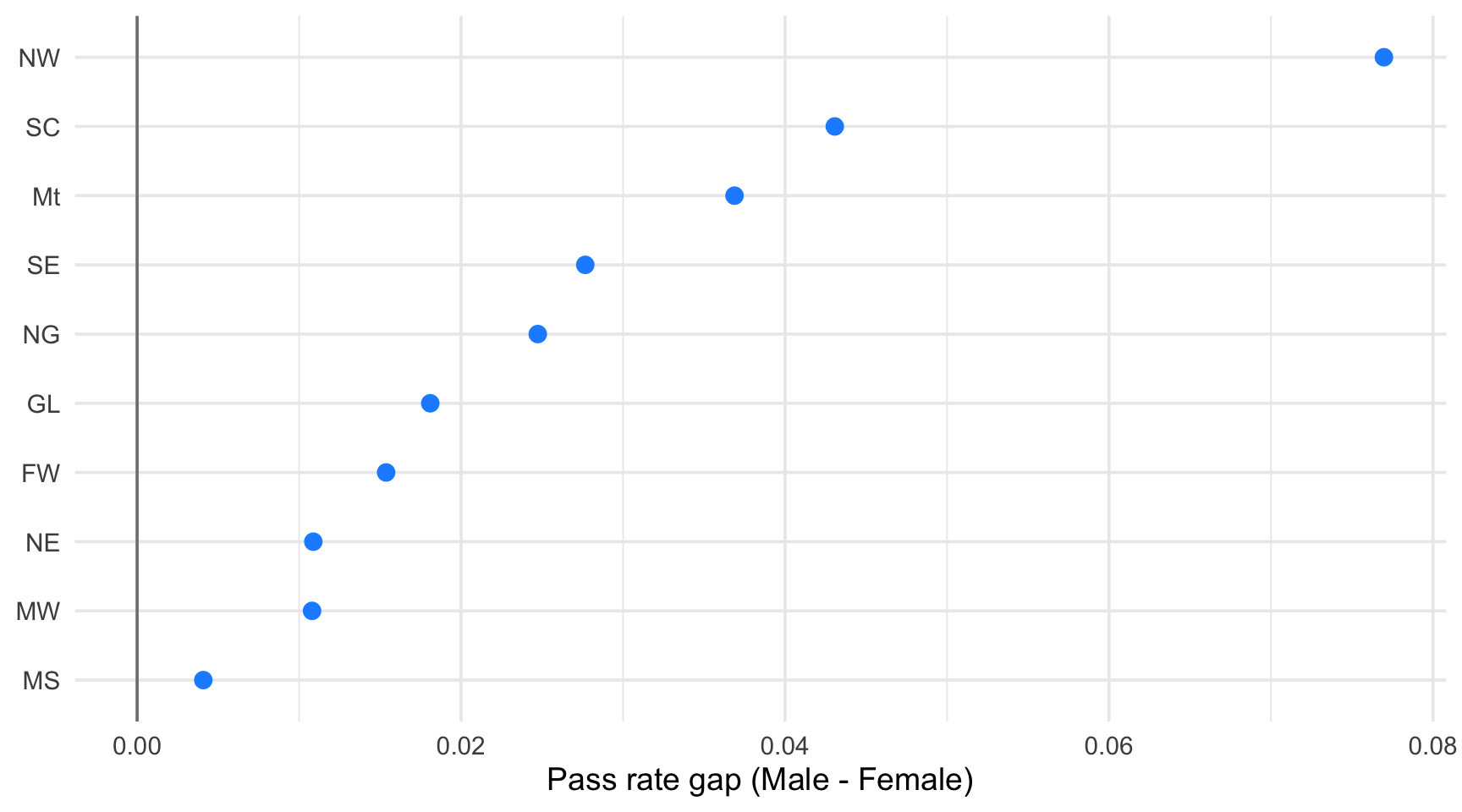
Plotting the gap directly makes the quantity of interest the position on the axis, compared against a meaningful reference (zero).

The price to pay is that the levels of the two groups are no longer shown, and that we cannot yet tell whether a small gap is a real difference or just noise: that question is the subject of Part 4!

Part 4: Uncertainty

Are the Differences Reliable?

Question

Suppose one region has a pass rate of 100% and another 88%. Is the first region really better?

  • A rate computed on 12 students and a rate computed on 2,000 students are not equally informative.

  • Yet in a bar chart or a dot plot, they look exactly the same.

  • Two complementary strategies:

    1. Show the sample size next to each group.
    2. Show the uncertainty around each estimate, with an interval.

Step 1: Show the Sample Size

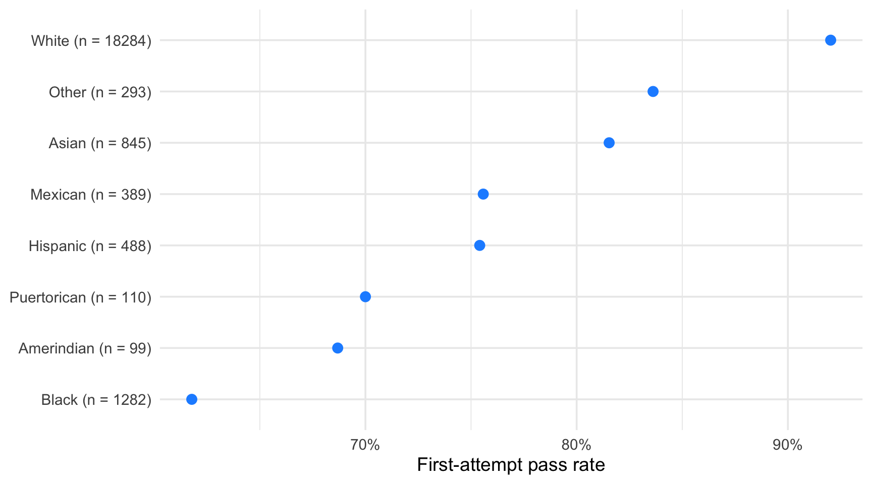
A simple and honest fix: put the number of observations in the label of each group.

pass_race_all <- law |>
  group_by(race) |>
  summarise(
    n = n(), pass_rate = mean(first_pf), .groups = "drop"
  ) |>
  mutate(label = str_c(race, " (n = ", n, ")"))

ggplot(
  data = pass_race_all,
  mapping = aes(
    x = pass_rate,
    y = fct_reorder(label, pass_rate)
  )
) +
  geom_point(size = 3, colour = "dodgerblue") +
  scale_x_continuous(labels = scales::percent) +
  labs(x = "First-attempt pass rate", y = NULL)
Step 2: Quantify the Uncertainty of a Proportion

For a proportion \(\widehat{p}\) estimated on \(n\) observations, the standard error is

\[ \text{se}(\widehat{p}) = \sqrt{\frac{\widehat{p}\,(1-\widehat{p})}{n}} \]

and an approximate 95% confidence interval is \(\widehat{p} \pm 1.96 \times \text{se}(\widehat{p})\).

pass_ci <- law |>
  group_by(race) |>
  summarise(
    n         = n(),
    pass_rate = mean(first_pf),
    se        = sqrt(pass_rate * (1 - pass_rate) / n),
    lower     = pmax(pass_rate - 1.96 * se, 0),
    upper     = pmin(pass_rate + 1.96 * se, 1),
    .groups   = "drop"
  )
# A tibble: 8 × 6
  race            n pass_rate      se lower upper
  <chr>       <int>     <dbl>   <dbl> <dbl> <dbl>
1 Amerindian     99     0.687 0.0466  0.596 0.778
2 Asian         845     0.815 0.0133  0.789 0.842
3 Black        1282     0.618 0.0136  0.591 0.644
4 Hispanic      488     0.754 0.0195  0.716 0.792
5 Mexican       389     0.756 0.0218  0.713 0.798
6 Other         293     0.836 0.0216  0.794 0.879
7 Puertorican   110     0.7   0.0437  0.614 0.786
8 White       18284     0.920 0.00200 0.916 0.924

A Simple Approximation

Note that this normal approximation is a good pedagogical tool but becomes unreliable for very small groups or proportions very close to 0 or 1 (which is the case of some of our groups). In practice, prefer an interval designed for proportions such as the Wilson interval (prop.test(), Hmisc::binconf()).

Step 2: Quantify the Uncertainty of a Proportion

Hmisc::binconf() computes a confidence interval for a proportion directly, without us writing the formula by hand. By default it uses the Wilson interval (Wilson 1927), which stays reliable even for small groups or proportions close to 0 or 1, unlike the normal approximation used in the previous slide.

# install.packages("Hmisc")
pass_counts <- law |>
  group_by(race) |>
  summarise(
    n         = n(),
    successes = sum(first_pf),
    .groups   = "drop"
  )

pass_ci <- pass_counts |>
  bind_cols(
    Hmisc::binconf(
      x = pass_counts$successes, n = pass_counts$n, 
      method = "wilson"
    ) |>
      as_tibble() |>
      rename(pass_rate = PointEst, lower = Lower, upper = Upper)
  )
pass_ci
# A tibble: 8 × 6
  race            n successes pass_rate lower upper
  <chr>       <int>     <dbl>     <dbl> <dbl> <dbl>
1 Amerindian     99        68     0.687 0.590 0.770
2 Asian         845       689     0.815 0.788 0.840
3 Black        1282       792     0.618 0.591 0.644
4 Hispanic      488       368     0.754 0.714 0.790
5 Mexican       389       294     0.756 0.711 0.796
6 Other         293       245     0.836 0.789 0.874
7 Puertorican   110        77     0.7   0.609 0.778
8 White       18284     16826     0.920 0.916 0.924

Arguments of binconf()

  • x: number of successes (here, successes, the count of students who passed).
  • n: number of trials (here, the group size).
  • method = "wilson": the type of interval. Other options include "exact" (Clopper-Pearson, more conservative) and "asymptotic" (the normal approximation).

Step 3: Plot the Intervals

geom_pointrange() draws a point with a vertical (or, after coord_flip(), horizontal) interval. It requires ymin and ymax.

ggplot(
  data = pass_ci |> 
    mutate(label = str_c(race, " (n = ", n, ")")),
  mapping = aes(
    x = fct_reorder(label, pass_rate),
    y = pass_rate, ymin = lower, ymax = upper
  )
) +
  geom_pointrange(colour = "dodgerblue") +
  coord_flip() +
  scale_y_continuous(labels = scales::percent) +
  labs(
    x = NULL, y = "First-attempt pass rate",
    caption = "Points: observed rate. Bars: approximate 95% CI."
  )
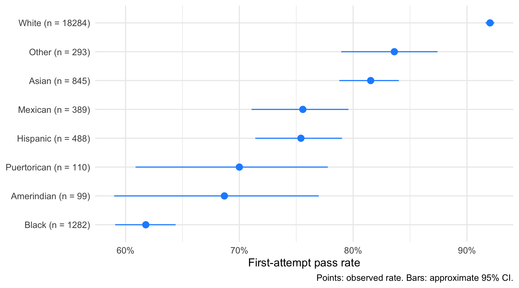
Small groups have wide intervals. Intervals that overlap heavily warn us against reading too much into the ranking.

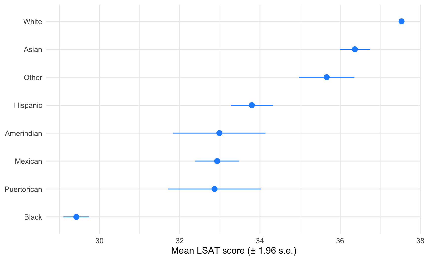
Uncertainty on a Mean: stat_summary()

For a numerical variable, stat_summary() computes and draws an interval directly from the raw data, without a prior summarise().

ggplot(
  data = law,
  mapping = aes(
    x = fct_reorder(race, LSAT, .fun = mean),
    y = LSAT
  )
) +
  stat_summary(
    fun.data = mean_se, fun.args = list(mult = 1.96),
    colour = "dodgerblue"
  ) +
  coord_flip() +
  labs(
    x = NULL, y = "Mean LSAT score (± 1.96 s.e.)"
  )
  • mean_se computes the mean and its standard error; mult = 1.96 turns it into an approximate 95% interval.
  • mean_cl_normal (also from {Hmisc}) is a closely related alternative, using a \(t\)-based interval instead of a normal one, more appropriate for smaller samples.
Showing Uncertainty is Important

  • An estimate without a measure of uncertainty is misleading, especially for small groups.

  • Whenever you compare group means or rates, show the interval or, at least, the number of observations.

Task 4: Reliable or Not?

Using the law dataset:

  1. Compute the first-attempt pass rate, the number of students, and a Wilson 95% confidence interval (Hmisc::binconf()) for each combination of region_first and sex.
  2. Plot the result with geom_pointrange(): one panel per region (facet_wrap()), the two sexes on the x-axis, colour by sex.
  3. In which regions do the intervals of women and men overlap clearly? In which regions is there a visible gap?
  4. Which regions have the widest intervals? What do they have in common?
  5. Redraw the heatmap of the pass rate by region and race_grp from Part 3, but remove the cells with fewer than 30 students (set them to NA). What changes?

Solution 4: Intervals by Region and Sex

pass_rs_counts <- law |>
  group_by(region_first, sex) |>
  summarise(
    n         = n(),
    successes = sum(first_pf),
    .groups   = "drop"
  )

pass_rs_ci <- pass_rs_counts |>
  bind_cols(
    Hmisc::binconf(pass_rs_counts$successes, pass_rs_counts$n, method = "wilson") |>
      as_tibble() |>
      rename(pass_rate = PointEst, lower = Lower, upper = Upper)
  )

ggplot(
  data = pass_rs_ci,
  mapping = aes(
    x = sex, y = pass_rate, ymin = lower, ymax = upper,
    colour = sex
  )
) +
  geom_pointrange() +
  scale_colour_manual(values = sex_cols) +
  scale_y_continuous(labels = scales::percent) +
  facet_wrap(facets = vars(region_first), ncol = 5) +
  guides(colour = "none") +
  labs(x = NULL, y = "First-attempt pass rate")
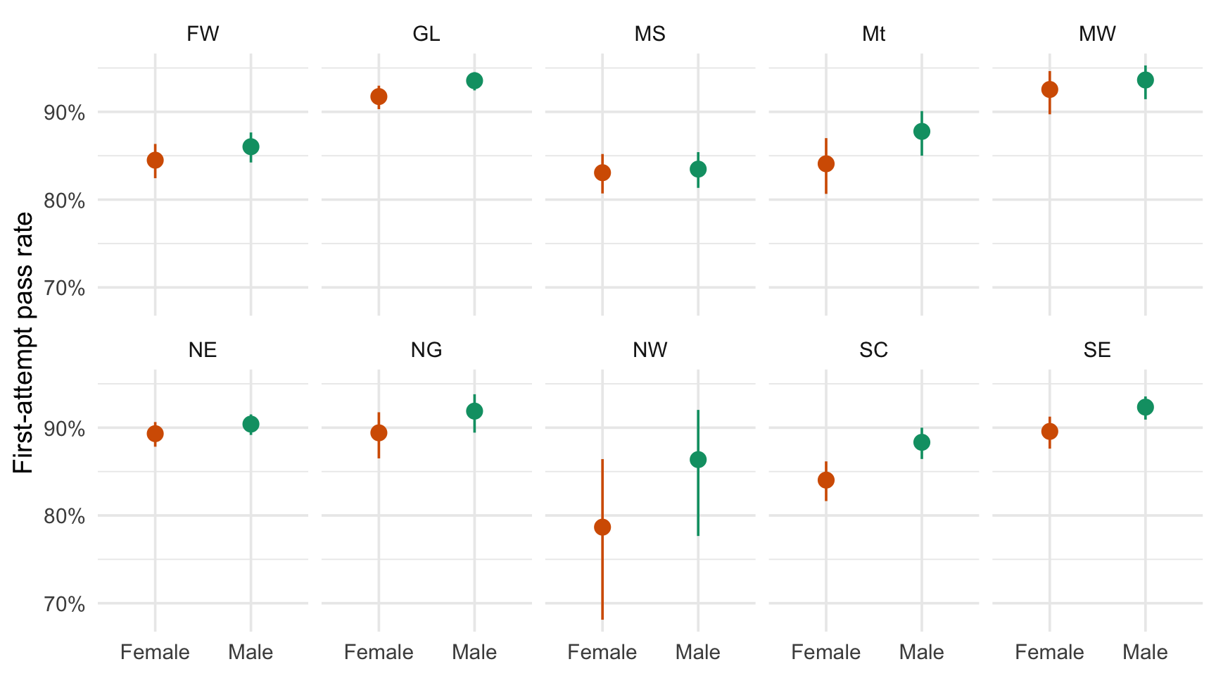
  • The regions with the fewest students have the widest intervals.
  • For those regions, the point estimates differ the most between sexes.
  • Consequently, a large part of the visible gap is compatible with noise.

Solution 4: Removing Small Cells from the Heatmap

pass_heat |>
  mutate(pass_rate = if_else(n < 30, NA_real_, pass_rate)) |>
  ggplot(mapping = aes(x = race_grp, y = region_first, fill = pass_rate)) +
  geom_tile(colour = "white") +
  scale_fill_viridis_c(labels = scales::percent, na.value = "grey90") +
  labs(
    x = NULL, y = NULL, fill = "Pass rate",
    caption = "Cells with less than 30 students are removed."
  )
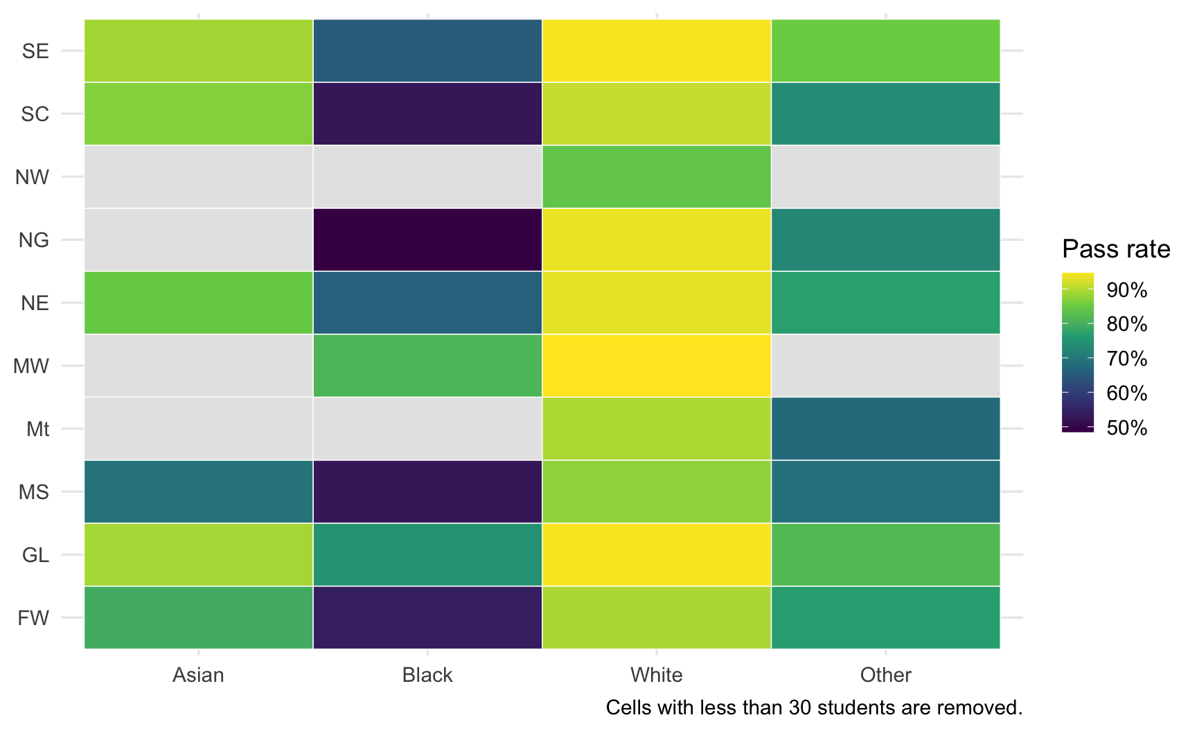
  • Cells with too few students are now shown in grey rather than as a misleading colour.
  • A threshold like 30 is a convention, not a rule. What matters is being explicit about it (state it in a caption).
  • Another possibility is to keep all cells and map the size of the tile or the transparency (alpha) to n.

Part 5: Numerical \(\times\) Numerical

Relationships Between Two Numerical Variables

Question

Is a student’s LSAT score related to their first-year average in law school (ZFYA)? Is that relationship the same for all groups?

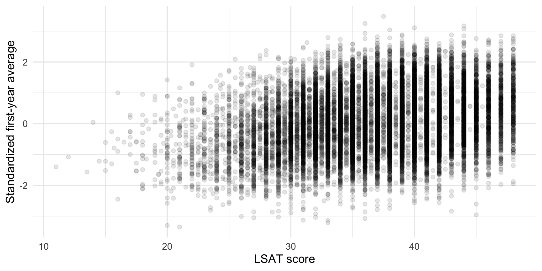
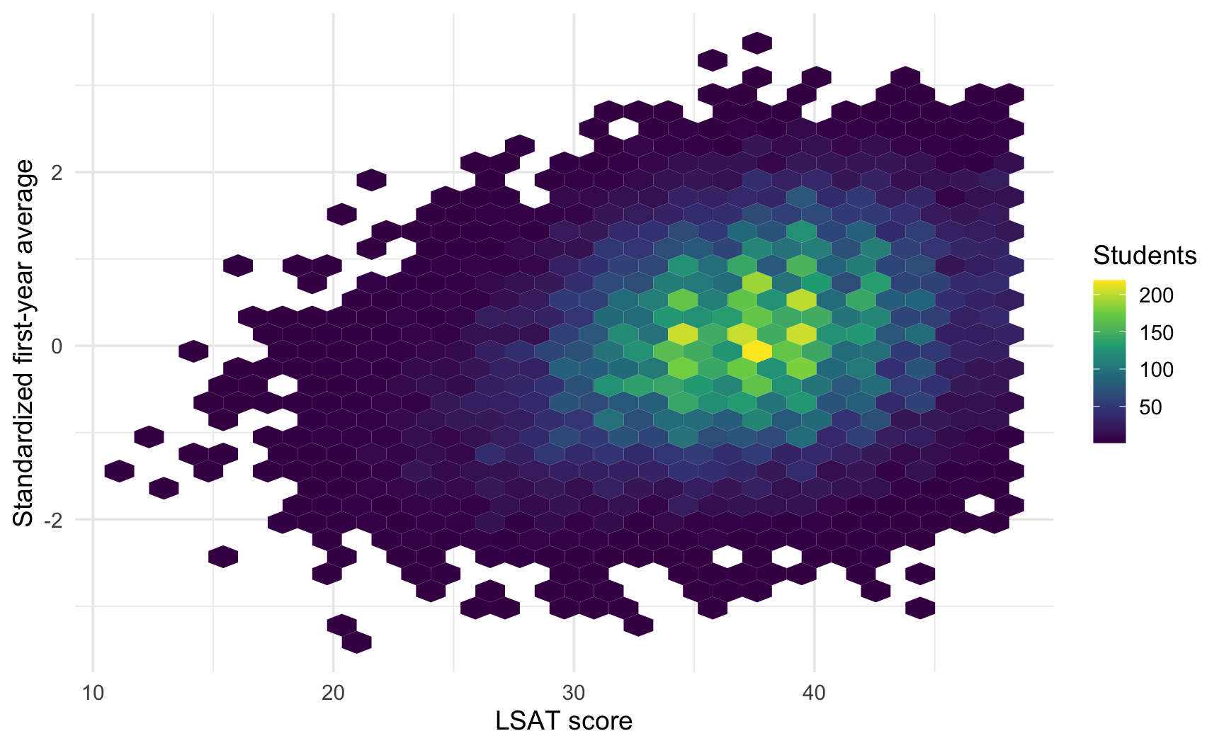
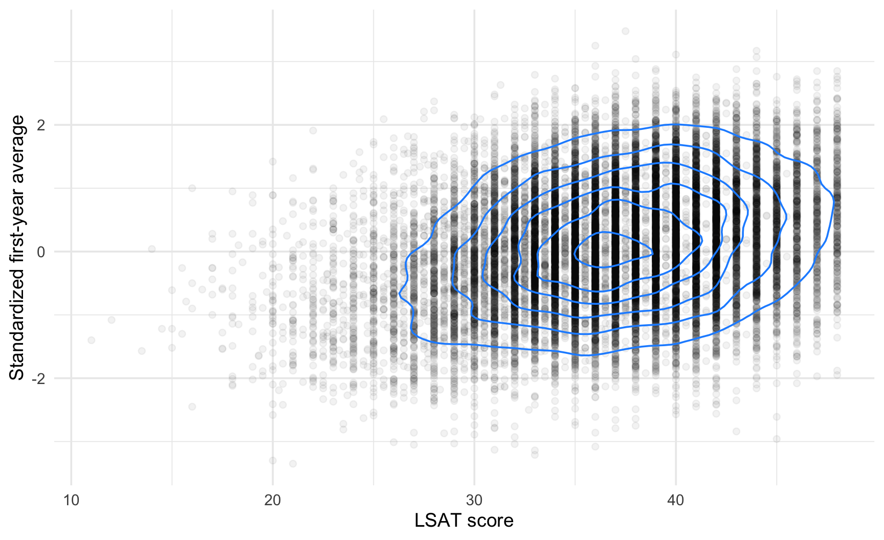
A scatterplot is the natural starting point (see the decision tree in Chapter 3), but with more than 20,000 students, two problems arise:

  1. Overplotting: points pile up and hide the density of the data.
  2. Trend: the eye cannot extract a trend from a cloud of points, we need to add one.

Overplotting: Three Fixes

ggplot(data = law, mapping = aes(x = LSAT, y = ZFYA)) +
  geom_point(alpha = 0.1) +
  labs(
    x = "LSAT score", 
    y = "Standardized first-year average"
  )

# install.packages("hexbin")
ggplot(data = law, mapping = aes(x = LSAT, y = ZFYA)) +
  geom_hex(bins = 30) +
  scale_fill_viridis_c() +
  labs(
    x = "LSAT score", 
    y = "Standardized first-year average", 
    fill = "Students"
  )

ggplot(data = law, mapping = aes(x = LSAT, y = ZFYA)) +
  geom_point(alpha = 0.05) +
  geom_density_2d(colour = "dodgerblue") +
  labs(
    x = "LSAT score", 
    y = "Standardized first-year average"
  )

geom_hex() and geom_bin2d() count the observations in each cell (this is a stat at work, a seen in Chapter 3): the fill encodes a count rather than a raw observation.

Adding a Trend: Linear or Flexible?

ggplot(
  data = law,
  mapping = aes(x = LSAT, y = ZFYA)
) +
  geom_point(alpha = 0.1) +
  geom_smooth(
    method = "lm", colour = "#D81B60", fill = "#D81B60"
  ) +
  geom_smooth(colour = "#1E88E5", fill = "#1E88E5") +
  labs(
    x = "LSAT score", y = "Standardized first-year average",
    caption = "Red: linear fit; Blue: GAM fit"
  )
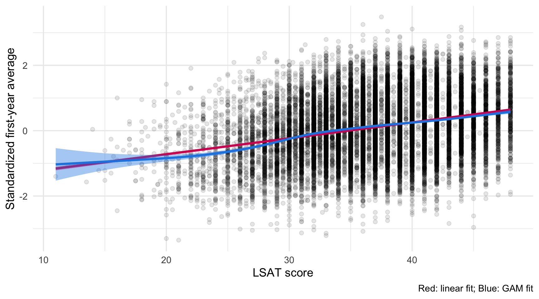
  • Red: linear fit (method = "lm").
  • Blue: flexible fit. For large datasets, the default method of geom_smooth() is a generalized additive model (GAM).
  • The band is a confidence interval around the fitted curve, not a range containing most of the observations.
The Band Is Not the Spread of the Data

  • With a large sample, the confidence band is very narrow, while the observations are widely scattered around the line.

  • Do not confuse uncertainty on the trend with variability of the outcome.

The Same Relationship, Group by Group

Mapping a discrete variable to colour creates one trend per group (the groups mechanism from Chapter 3).

ggplot(
  data = law,
  mapping = aes(x = LSAT, y = ZFYA, colour = sex)
) +
  geom_point(alpha = 0.05) +
  geom_smooth(method = "lm") +
  scale_colour_manual(values = sex_cols) +
  labs(
    x = "LSAT score", y = "Standardized first-year average",
    colour = "Sex"
  )

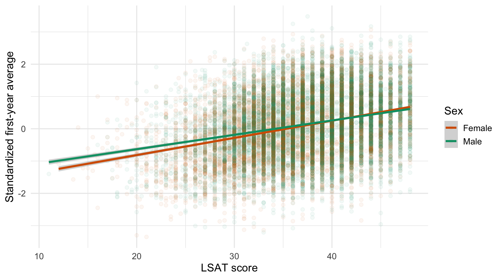
Both lines are nearly parallel: the relationship between LSAT and ZFYA looks similar for women and men.
More Groups: Facets

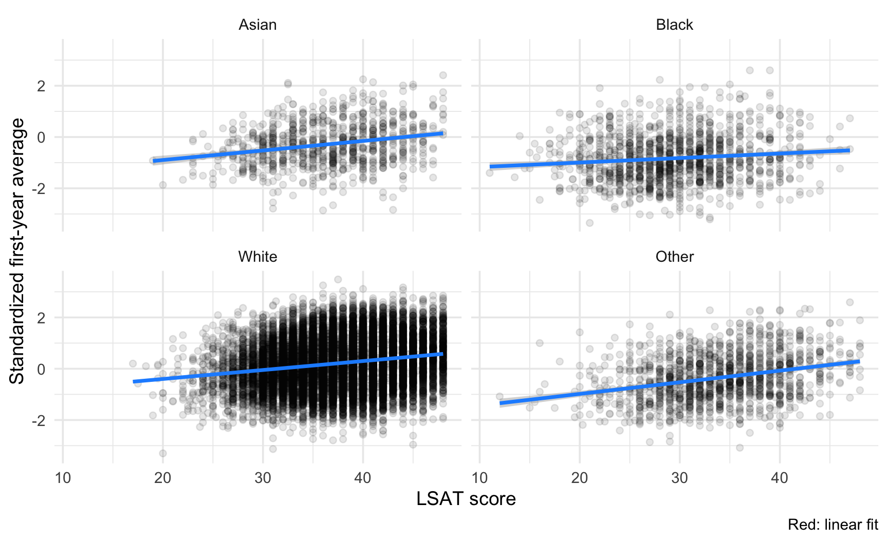
With more groups, colours become confusing. Use facets and keep the trend line in each panel.

ggplot(
  data = law,
  mapping = aes(x = LSAT, y = ZFYA)
) +
  geom_point(alpha = 0.1) +
  geom_smooth(method = "lm", colour = "dodgerblue") +
  facet_wrap(facets = vars(race_grp), ncol = 2) +
  labs(
    x = "LSAT score", 
    y = "Standardized first-year average",
    caption = "Red: linear fit"
  )

The slopes can be compared across panels because the scales are shared (default scales = "fixed").
Connecting the Picture to the Numbers

Again, the plot should agree with a numerical summary: the correlation, or the slope of a linear fit, computed group by group.

law |>
  group_by(race_grp) |>
  summarise(
    n           = n(),
    correlation = cor(LSAT, ZFYA),
    slope       = coef(lm(ZFYA ~ LSAT))[["LSAT"]],
    .groups     = "drop"
  )
# A tibble: 4 × 4
  race_grp     n correlation  slope
  <fct>    <int>       <dbl>  <dbl>
1 Asian      845       0.245 0.0372
2 Black     1282       0.111 0.0176
3 White    18284       0.193 0.0350
4 Other     1379       0.292 0.0454

Pooled vs. Within-Group Relationships

The relationship computed on the whole sample can differ from the relationship within each group (this is known as Simpson’s paradox (see Charpentier 2025)). This is one more reason to look at the groups separately before drawing conclusions.

Correlation Is Not Causation

Be Careful With the Words You Choose

The plot shows that students with higher LSAT tend to have a higher ZFYA. It does not show that a higher LSAT causes a higher ZFYA (see Morgan Raux’s course).

  • Both variables may reflect a common factor (preparation, prior schooling, study habits…).
  • The relationship is estimated on students who were admitted to law school: those with a very low LSAT are under-represented (selection bias).
  • In your storytelling, wording matters: prefer “students with higher LSAT tend to have…” to “a higher LSAT leads to…”.
  • You can also use terms such as “is associated with…” / “is a marker of…”

Recall the lesson of Chapter 4: a visual pattern is a description, and its interpretation needs judgment.

Task 5: Relationships Within Groups

Using the law dataset:

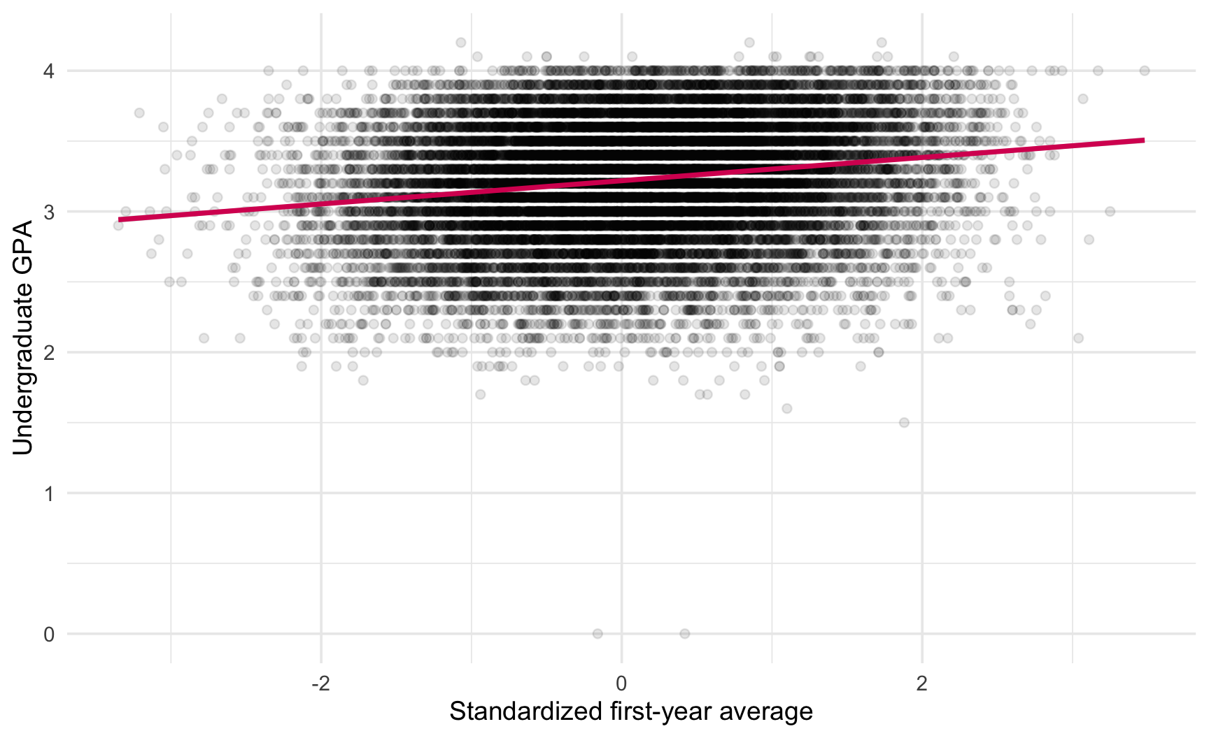
  1. Produce a scatterplot of UGPA (undergraduate GPA) against ZFYA (standardized first-year average). Deal with overplotting using one of the three strategies from the slides.
  2. Add a linear trend. Does the relationship between UGPA and ZFYA look similar to the one between LSAT and ZFYA?
  3. Repeat the plot separately for each sex, using colour, then using facets. Which version do you find clearer?
  4. Compute, for each race_grp, the slope of the linear regression of ZFYA on UGPA. Do the slopes agree with the trend lines in your facetted plot?
  5. In one or two sentences, write a caption for your plot that describes the pattern without implying causation.

Solution 5: A Possible Answer

# Q2
ggplot(
  data = law,
  mapping = aes(x = ZFYA, y = UGPA)
) +
  geom_point(alpha = .1) +
  geom_smooth(method = "lm", colour = "#D81B60") +
  labs(
    x = "Standardized first-year average",
    y = "Undergraduate GPA", 
  )

Solution 5: A Possible Answer

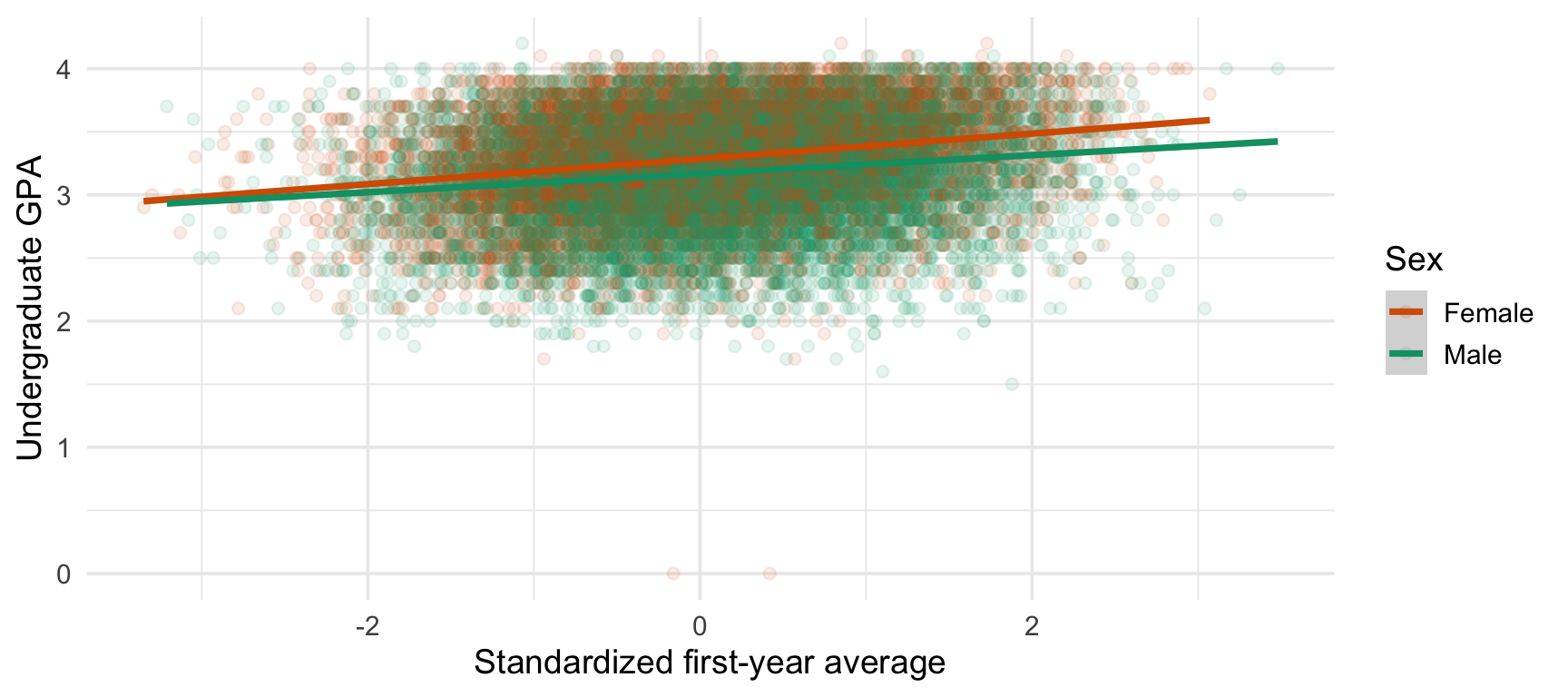
# Q3
ggplot(
  data = law,
  mapping = aes(x = ZFYA, y = UGPA, colour = sex)
) +
  geom_point(alpha = .1) +
  geom_smooth(method = "lm") +
  scale_colour_manual(values = sex_cols) +
  labs(
    x = "Standardized first-year average",
    y = "Undergraduate GPA", 
    colour = "Sex"
  )

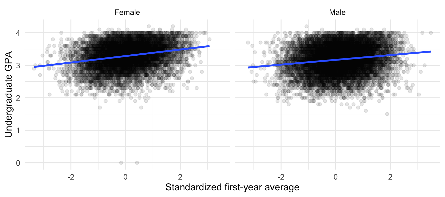
# Q3
ggplot(
  data = law,
  mapping = aes(x = ZFYA, y = UGPA)
) +
  geom_point(alpha = .1) +
  geom_smooth(method = "lm") +
  facet_wrap(facets = vars(sex)) +
  labs(
    x = "Standardized first-year average",
    y = "Undergraduate GPA", 
    colour = "Sex"
  )

Since there are only two groups, the two trends on the same graph makes the comparison easier.

Solution 5: A Possible Answer

# Q4
ggplot(
  data = law,
  mapping = aes(x = UGPA, y = ZFYA)
) +
  geom_point(alpha = 0.05) +
  geom_smooth(method = "lm", colour = "#D81B60") +
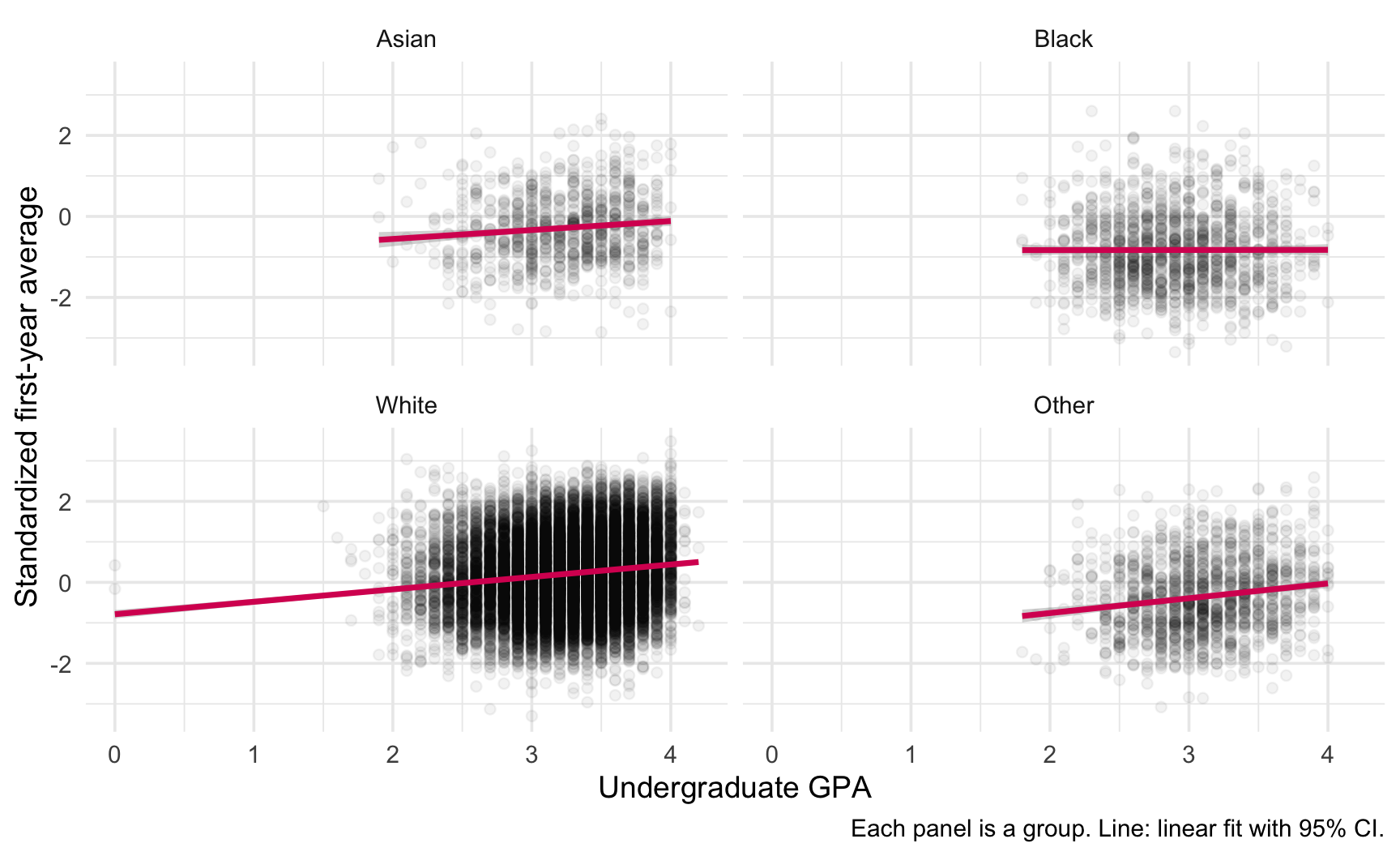
  facet_wrap(facets = vars(race_grp), ncol = 2) +
  labs(
    x = "Undergraduate GPA",
    y = "Standardized first-year average",
    caption = "Each panel is a group. Line: linear fit with 95% CI."
  )
law |>
  group_by(race_grp) |>
  summarise(
    slope = coef(lm(ZFYA ~ UGPA))[["UGPA"]],
    .groups = "drop"
  )
# A tibble: 4 × 2
  race_grp   slope
  <fct>      <dbl>
1 Asian    0.221  
2 Black    0.00314
3 White    0.307  
4 Other    0.366  

Possible caption: “Students with a higher undergraduate GPA tend to have a higher first-year average, in each of the four groups. This is a descriptive association, not a causal effect.”

Part 6: Misleading Group Comparisons

Back to Misleading Graphics

In the introduction, we saw two famous examples: an inverted y-axis (Reuters graphic) and a truncated axis for a barplot (Maclean’s graphic about the poll in Canada).

Group comparisons are especially exposed to such problems, because the goal is to make a difference visible. Here are four traps to watch for:

  1. Truncated axes on bar charts: the visual difference is amplified.
  2. Free scales across facets: panels look comparable when they are not.
  3. Hidden sample sizes: tiny groups look as solid as huge ones.
  4. Means alone: two groups with the same mean can have very different distributions.

Trap 1: The Truncated Bar Axis

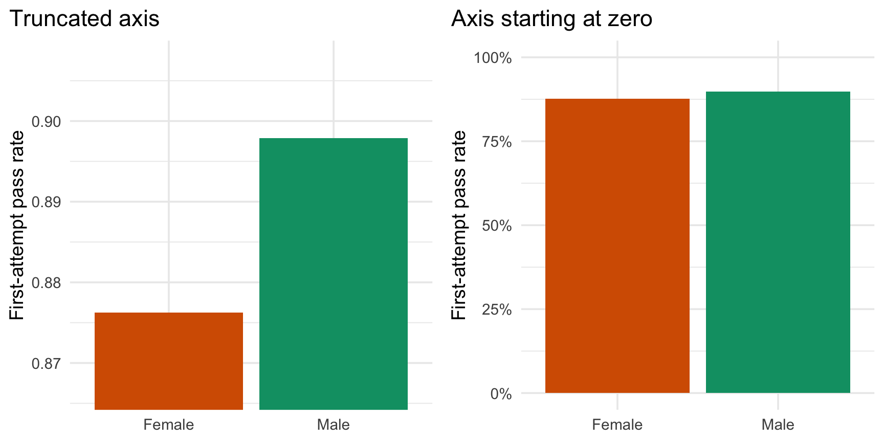
Same data, two different axes. The pass rates of women and men are close, but the left-hand graph makes the gap look substantial.

pass_sex <- law |>
  group_by(sex) |>
  summarise(pass_rate = mean(first_pf), .groups = "drop")

p_base <- ggplot(pass_sex, aes(x = sex, y = pass_rate, fill = sex)) +
  geom_col() +
  scale_fill_manual(values = sex_cols) +
  guides(fill = "none") +
  labs(x = NULL, y = "First-attempt pass rate")

p_trunc <- p_base +
  coord_cartesian(ylim = c(min(pass_sex$pass_rate) - 0.01, max(pass_sex$pass_rate) + 0.01)) +
  labs(title = "Truncated axis")

p_zero <- p_base +
  scale_y_continuous(limits = c(0, 1), labels = scales::percent) +
  labs(title = "Axis starting at zero")

cowplot::plot_grid(p_trunc, p_zero)

(The plots are printed in the next slide.)

Trap 1: The Truncated Bar Axis

The Rule

  • For bars, the axis must start at zero because the length of the bar is the encoding.

  • For dots or intervals (position encodings), a non-zero axis can be acceptable, as long as it is clearly labelled.

Trap 2: Free Scales Across Facets

  • In Chapter 3, we saw that scales = "free_y" lets each panel zoom on its own data.

  • For group comparisons, this is dangerous: a bump that looks large in one panel may be tiny in absolute terms.

    • Fixed scales allow direct comparison across panels.
    • Free scales reveal the shape within each panel.

A Good Habit

  • Use fixed scales by default when your goal is to compare groups.
  • If you switch to free scales, say so explicitly in the caption or the subtitle.

Traps 3 and 4: Hidden \(n\) and Hidden Distributions

  • Hidden sample sizes: report n in labels or captions, and add intervals (as in Part 4).

  • Means alone: a bar of means hides the spread, the skewness, the presence of outliers.

    • Prefer showing the distribution (boxplot, violin, jitter) with the mean overlaid, as we did in Part 1.
    • When space forces a summary, show at least the mean and an interval.

A Good Habit

Before publishing a group comparison, ask yourself: what would a sceptical reader ask? How many observations? Is the axis honest? Are the groups comparable? What does the distribution look like?

Task 6: Fix This Graph

The following code compares the first-attempt pass rates across racial groups. It has several problems.

law |>
  group_by(race) |>
  summarise(pass_rate = mean(first_pf), .groups = "drop") |>
  ggplot(mapping = aes(x = race, y = pass_rate)) +
  geom_col(fill = "steelblue") +
  coord_cartesian(ylim = c(0.6, 1)) +
  labs(title = "Big gaps in pass rates!")
  1. List at least four problems with this graph (think of the four traps).
  2. Produce an improved version.
  3. Replace the title by a descriptive title, and add a caption with the data source (LSAC National Longitudinal Bar Passage Study (Wightman, 1998)).
  4. Compare your final version to the original. Would a reader draw the same conclusions from both?

Solution 6: Problems and a Fix

Problems: (1) the axis is truncated on a bar chart; (2) the categories are in alphabetical order; (3) the sample sizes are not shown; (4) no uncertainty interval, although some groups are very small; (5) the title is a conclusion, not a description.

pass_ci |>
  mutate(label = str_c(race, " (n = ", n, ")")) |>
  ggplot(
    mapping = aes(
      x = fct_reorder(label, pass_rate),
      y = pass_rate, ymin = lower, ymax = upper
    )
  ) +
  geom_pointrange(colour = "dodgerblue") +
  coord_flip() +
  scale_y_continuous(labels = scales::percent) +
  labs(
    title = "First-attempt bar exam pass rate, by racial group",
    subtitle = "Points: observed rate. Bars: approximate 95% CI.",
    x = NULL, y = "Pass rate",
    caption = "Source: LSAC National Longitudinal Bar Passage Study (Wightman, 1998)."
  )
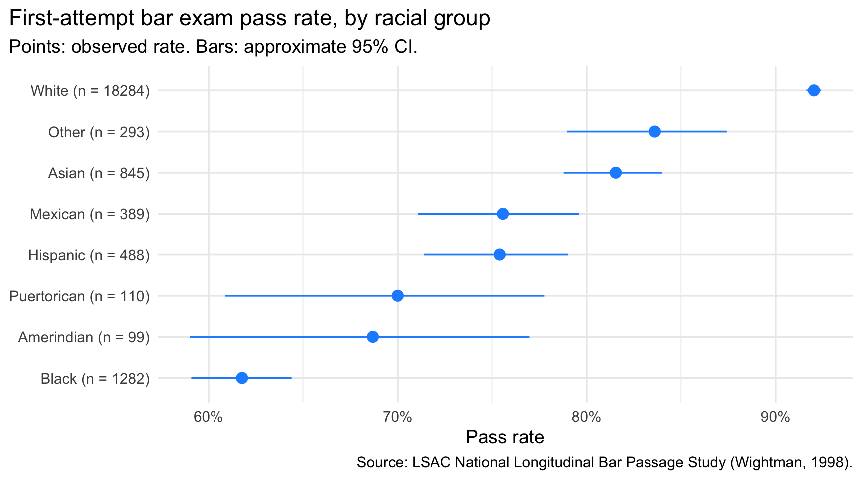
The new version conveys the same ranking, but a reader can now judge how much each gap is worth, and how many students stand behind each point.

Wrap-Up

From Question to Graph

Question Suitable graph Recurring pitfall
How does a numerical variable differ across groups? Densities (few groups), boxplots / violins (many groups), ridgelines Alphabetical order of groups
How do proportions differ across groups? Bars with position = "fill", or plot the rate directly Comparing counts of unequal groups
Many groups, or two crossed categorical variables Ordered dot plot, lollipop, heatmap Too many colours
Are the differences reliable? Intervals (geom_pointrange()), n in labels Point estimates alone
Relationship between two numerical variables Scatter + trend, hexbin, facets by group Overplotting, causal wording
Is my graph honest? Zero-based bars, fixed scales, visible n Truncated axes

A Final Note

  • Comparing groups is about choosing the right question and the right encoding: the same data can support very different visual impressions.
  • The reliable recipe is group_by() \(\rightarrow\) summarise() (or count()) \(\rightarrow\) ggplot(). The table you compute and the plot you draw must agree.
  • Differences between groups are only as meaningful as the groups are large: show n and the uncertainty.
  • A critical eye, developed in the introduction, applies to your own graphs as much as to those of others.

References

Charpentier, Arthur. 2025. “When Numbers Mislead Us.” https://arxiv.org/abs/2507.03628.
Wightman, Linda F. 1998. “LSAC National Longitudinal Bar Passage Study. LSAC Research Report Series.” In. https://api.semanticscholar.org/CorpusID:151073942.
Wilson, Edwin B. 1927. “Probable Inference, the Law of Succession, and Statistical Inference.” Journal of the American Statistical Association 22 (158): 209–12. https://doi.org/10.1080/01621459.1927.10502953.