Chapter 4 – Exploring Distributions, From Data to Predictions
Ewen Gallic
September 14, 2026
Disclaimers
I used Claude Sonnet 5 while creating those slides.
This Chapter: A Hands-On Session
Most of what this chapter touches on (distributions, mean vs. median, logistic regression, ROC/AUC) builds on things you already know from your economics/econometrics training.
The goal here is to apply those notions on one dataset, in R, and to build judgment about when a single metric used to summarise data is misleading you.
This chapter presents two short reference slides for the R syntax you have not used yet, then three long guided labs. Most of the session is yours to work through the law dataset.
Warning
Part 2 of this chapter is a bit more technical than the rest of the course. We will go through two important plots used to assess the quality of fit of a binary classifier: the ROC curve and the calibration curve.
Loading the Data
Again, we use the law dataset introduced in earlier chapters.
LSAT score received by the student (measured on a 10 to 48 scale)
UGPA
numeric
Undergraduate GPA of the student (from 0 to 4.33)
region_first
character
Geographic region where the student took their first bar examination (Far West, Great Lakes, Midsouth, Midwest, Mountain West, Northeast, New England, Northwest, South Central, South East)
ZFYA
numeric
Standardized First-Year Average law school grades (FYA)
sander_index
numeric
Composite index weighting LSAT and UGPA (\(200 \times \text{UGPA} + \text{LSAT}\))
first_pf
numeric
Binary indicator for passing the bar exam on the first trial (1 = Pass, 0 = Fail)
R Syntax You will Need
Distributions
Function
What it does
geom_density(bw = ...)
Smoothed density estimate; bw controls how smooth the curve is
stat_ecdf()
Empirical cumulative distribution function, no binning choice needed
ntile(x, n)
Splits a numeric vector into n equal-sized groups (used later, in Part 3)
Models
Function
What it does
glm(y ~ x, data = ..., family ="binomial")
Logistic regression
broom::tidy(model)
One row per coefficient
broom::augment(model, type.predict ="response")
One row per observation, adds a .fitted column (predicted probability)
pROC::roc(observed, predicted)
Builds a ROC curve object
pROC::auc(roc_obj)
Area under the ROC curve
ggroc(list(...))
Plots one or several ROC curves at once
Part 1: Describing Distributions
Lab 1: From Numbers to Shape
Using the law dataset, pick two numeric variables among LSAT, UGPA, ZFYA, and sander_index. For each of them:
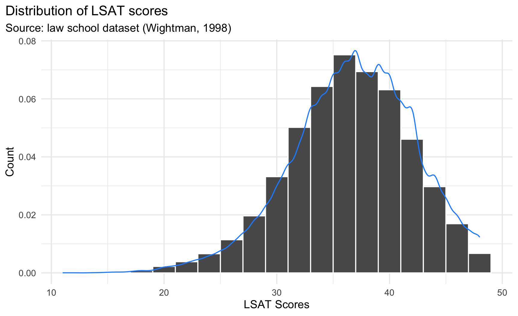
Plot a histogram and a density curve (on the same graph). Try at least two different bins/bw values for each.
Overlaying Histogram and Density
Set aes(y =after_stat(density)) inside geom_histogram() so both layers share the same vertical scale, then add geom_density() on top to compare the two at once.
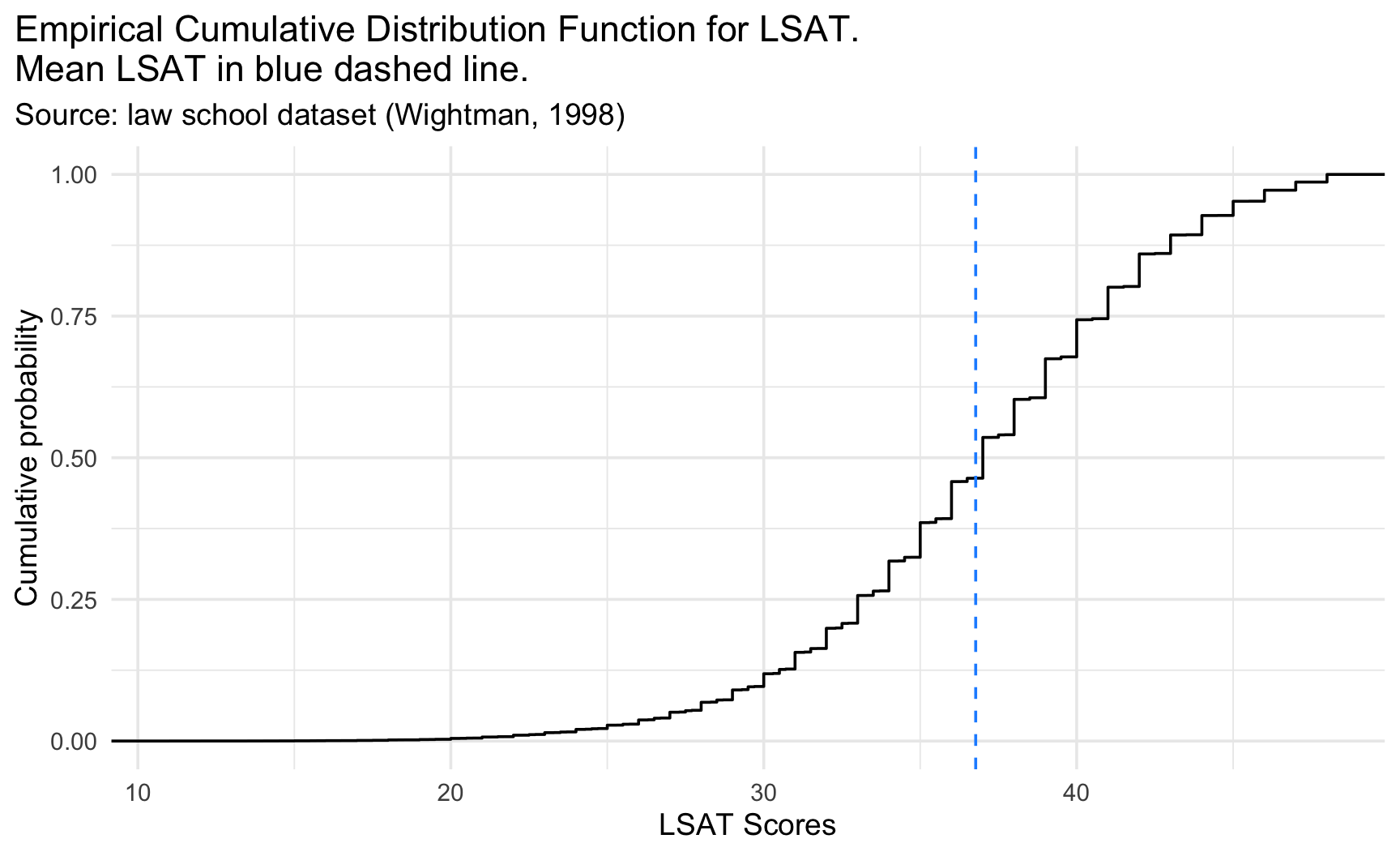
Plot the ECDF with stat_ecdf(). Use it to read off the proportion of students below the variable’s mean.
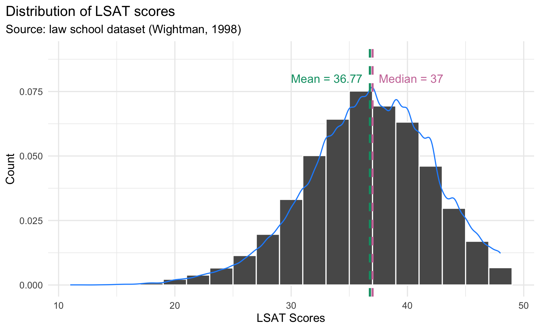
Compute the mean and the median. Locate both on your plot from Question 1 (using geom_vline().
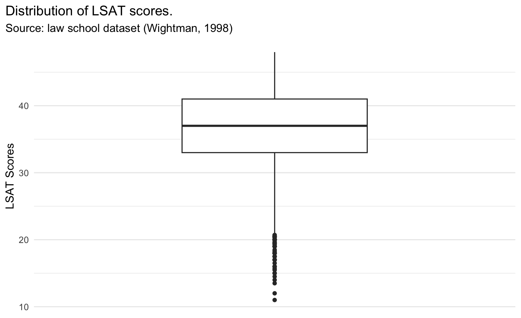
Plot a boxplot. Does it flag outliers? Cross-check against the histogram.
Write two or three sentences describing the distribution: center, spread, shape, anything notable.
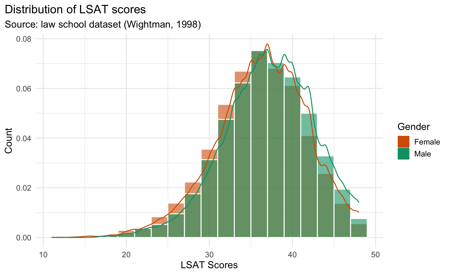
Bonus, if you have time: split one of your variables by sex or race (e.g., fill =factor(sex) in geom_density()). Does the shape differ across groups?
Debrief: What Did You Notice?
Some questions you can ask yourself:
Did any variable surprise you, mean far from median, unexpected outliers?
Did changing bins or bw ever change your conclusion about the shape, not just the picture?
For the bonus question: did splitting by a group reveal something the pooled distribution hid?
A Solution: Question 1
p_1 <-ggplot(data = law,mapping =aes(x = LSAT)) +geom_histogram(mapping =aes(y =after_stat(density)),colour ="white",binwidth =2 ) +geom_density(colour ="dodgerblue", bw = .5) +labs(title ="Distribution of LSAT scores",subtitle ="Source: law school dataset (Wightman, 1998)",x ="LSAT Scores", y ="Count" ) +theme_minimal(base_size =14) +theme(plot.title.position ="plot")
A Solution: Question 2
ecdf_lsat <-ecdf(law$LSAT) # ECDF for the LSAT variable# proportion of students below the variable's mean:prop_below_lsat_mean <-ecdf_lsat(mean(law$LSAT, na.rm =TRUE))p_2 <-ggplot(data = law,mapping =aes(x = LSAT)) +stat_ecdf() +geom_vline(xintercept =mean(law$LSAT, na.rm =TRUE), linetype ="dashed", colour ="dodgerblue" ) +labs(title ="Empirical Cumulative Distribution Function for LSAT.\nMean LSAT in blue dashed line.",subtitle ="Source: law school dataset (Wightman, 1998)",x ="LSAT Scores", y ="Cumulative probability" ) +theme_minimal(base_size =14) +theme(plot.title.position ="plot")
In this part, we want to investigate if LSAT, UGPA, and other variables can predict whether a student passes the bar exam on the first attempt (first_pf)?
Two separate questions follow from any such model:
Discrimination: does the model rank observations (here, students) correctly?
Calibration: are the predicted probabilities themselves trustworthy?
A model’s predicted probabilities are, themselves, just another distribution, the same tools from Part 1 apply.
The next few slides are a quick refresher on four notions you have seen before in your coursework: classifier, confusion matrix, AUC, calibration. Then it is your turn.
The Logistic Regression Equation
For a binary outcome such as first_pf, logistic regression models the log-odds of passing as a linear function of the predictors:
The left-hand side is the logit: the log of the odds of passing vs. not passing.
\(\beta_0\) is the log-odds of passing when LSAT and UGPA are both 0 (rarely meaningful on its own, since 0 is outside the observed range of either variable).
\(\beta_1\), \(\beta_2\) are the change in log-odds for a one-unit increase in LSAT or UGPA, holding the other fixed.
Estimation with glm()
The glm() (Generalized Linear Models) function from {stats} allows to estimate the coefficients \(\boldsymbol{\beta}\).
m_demo <-glm(first_pf ~ LSAT + UGPA, data = law, family ="binomial")broom::tidy(m_demo)
The augment() function from {broom} also allows to estimate those probabilities. It produces a column named .fitted that contains the predicted values. For the predicted values to be the estimated probabilities, the type.predict argument needs to be set to "response".
At first glance this looks like the natural, single-number way to judge a classifier. The next slide shows why it can be dangerously misleading.
Accuracy Can Be Misleading with an Unbalanced Outcome
mean(law$first_pf)
[1] 0.8884402
About 88.8% of students pass on their first attempt, first_pf is far from balanced. Now consider a classifier that ignores every predictor and just predicts “pass” for everyone:
law |>mutate(predicted_naive =1) |>summarise(accuracy =mean(predicted_naive == first_pf))
# A tibble: 1 × 1
  accuracy
     <dbl>
1    0.888
This naive rule reaches 88.8% accuracy without ever looking at LSAT or UGPA. Whenever one class dominates, accuracy can look impressive purely by exploiting the imbalance, not by discriminating between the two groups.
Do not Trust Accuracy Alone
Any model should be compared against this naive baseline. Here, a model with 89% accuracy that barely beats always predicting “pass” has learned very little. This gap is filled by the AUC, introduced on the next slides.
True positive rate: number of true positive (predicted positive when the actual condition is positive) over the overall number of positives.
Here: proportion of actual passers correctly flagged.
\[
\text{Specificity}(t) = \frac{TN}{TN+FP} = \\\frac{\#\{i : \widehat{y}_i(t) = 0 \text{ and } y_i = 0\}}{\#\{i : y_i = 0\}}
\]True negative rate: number of true negative (predicted negative when the actual condition is negative) over the overall number of negative.
Here: proportion of actual failers correctly flagged.
Raising \(\tau\): fewer students get classified as 1, sensitivity falls, specificity rises.
Lowering \(\tau\): more students get classified as 1, sensitivity rises, specificity falls.
There is no single \(\tau\) that maximizes both at once: this is the sensitivity/specificity trade-off.
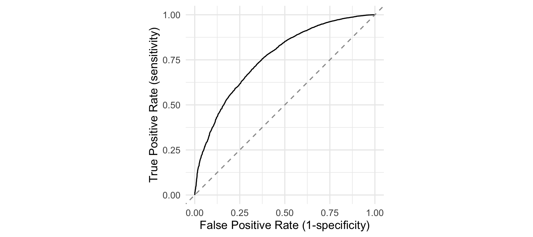
Instead of picking one \(\tau\) and reporting one pair of numbers, the ROC curve plots \((1 - \text{Specificity}(\tau), \text{Sensitivity}(\tau))\) for every\(\tau\) between 0 and 1 at once.
Hence, it looks at sensitivity and specificity across every threshold at once.
AUC condenses the curve into one number: the probability that a randomly chosen passer receives a higher predicted probability than a randomly chosen non-passer. 0.5 is random guessing (see next slides), 1 is perfect separation.
Baseline 1, Random Guessing Traces the Diagonal
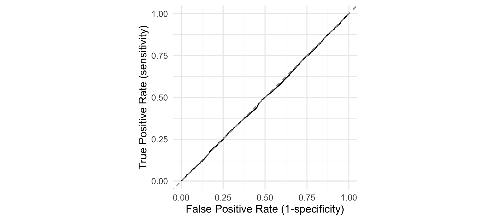
Suppose a “model” assigns each student a score with no relationship to whether they actually pass, pure random noise.
If the score is independent of \(Y\) (which is the case when assigning a score at random), then conditioning on \(Y=1\) or \(Y=0\) does not change the distribution of the score at all:
In such a case, for every \(\tau\), we expect \(\text{TPR}(\tau)=\text{FPR}(\tau)\).
Sweeping \(\tau\) from 1 down to 0 traces out the full diagonal, continuously, one different point at a time: visually, this corresponds to the diagonal in the ROC curve, i.e., the “no discrimination” reference line on every ROC plot.
Baseline 1, Random Guessing Traces the Diagonal
set.seed(42)law_random <- law |>mutate(random_score =runif(n()))roc_random <-roc(law_random$first_pf, law_random$random_score)auc(roc_random)
With sample size, the curve converges to the diagonal closely at every point along its length.
Small wiggles are sampling noise, not signal.
Baseline 2, “Always Pass” Only Ever Visits Two Points
Consider now the case where every student gets the exact same score \(c\), so there is only one meaningful cutoff behaviour, not a fixed point for every \(\tau\):
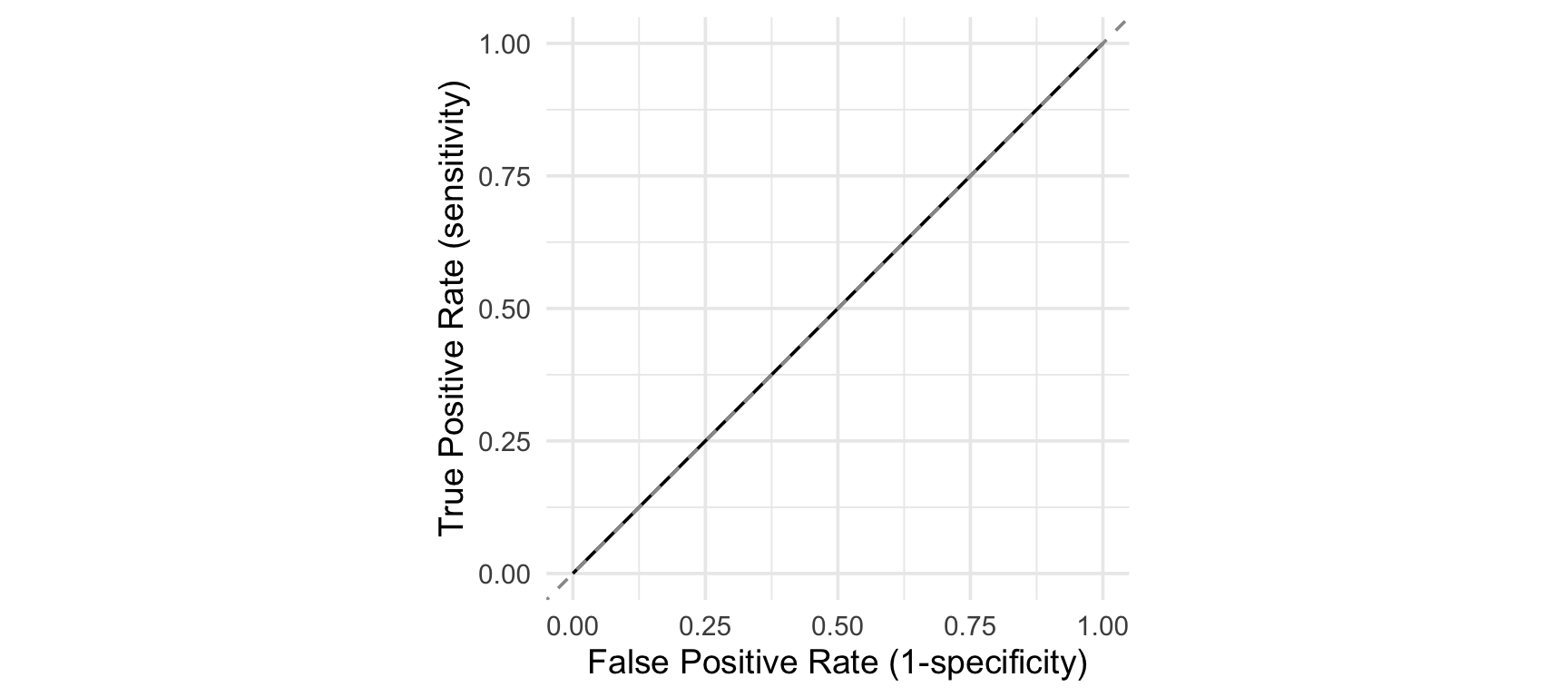
As \(\tau\) sweeps from 1 down to 0, the point sits at \((0,0)\), then jumps straight to \((1,1)\) the instant \(\tau\) crosses \(c\), and stays there. No intermediate point is ever reached, because there is no intermediate score to threshold on.
Baseline 2, “Always Pass” Only Ever Visits Two Points
law_naive <- law |>mutate(constant_score =1)roc_naive <-roc(law_naive$first_pf, law_naive$constant_score)auc(roc_naive)
The two previous special cases landed an AUC equal to 0.5.
Baseline 1: random guessing visits a different point on the diagonal at every \(\tau\), because it is equally uninformative everywhere.
Baseline 2: the naive classifier only ever visits two points: the trivial corners \((0,0)\) and \((1,1)\), and connecting those two endpoints happens to reproduce the same diagonal line, not because it behaves like a coin flip at each threshold, but because it has no usable threshold to vary at all.
Note that the AUC does not inflate itself just because one class is rare (remember we face a the 88.8%/11.2% class split in our example), which is good news!
Lab 2: Fit, Predict, Discriminate
Split law into a training set (80% of students), law_train, and a test set (the remaining 20%), law_test. Fix a seed (use 1234) so your split is reproducible.
Fit three logistic regressions on first_pf using onlylaw_train:
m_1 (LSAT only),
m_2 (+ UGPA),
m_3 (+ race).
For each model, use the augment() function to get aug_1, aug_2, aug_3, the tibbles with predictions on students the model never saw while fitting (i.e., those in law_test ; use the newdata= argument).
For aug_3, plot the distribution of .fitted split by first_pf (e.g., fill =factor(first_pf)). What would you want this plot to look like if the model were useful?
Build roc_1, roc_2, roc_3 with pROC::roc() on the test-set predictions, and compare their auc().
Plot all three ROC curves together with ggroc().
Fit a fourth specification m_4 on law_train, adding region_first. Get aug_4 the same way, via newdata = law_test, and add its ROC curve and AUC to the comparison.
Rank the four models by AUC. Is the ranking what you expected?
Discussion: what would happen to each AUC if you had instead evaluated the models on law_train rather than law_test? Would you expect it to be higher, lower, or about the same, and why?
Solution 1: Train/Test Split
The seed makes the split reproducible, everyone in the room gets the same partition.
library(broom)set.seed(1234)
For convenience, we can track the students by assigning them an ID:
law_id <- law |>mutate(row_id =row_number())law_train <- law_id |>slice_sample(prop =0.8)law_test <- law_id |>anti_join(law_train, by ="row_id")
We can have a look at the number of observation in each resulting dataset:
nrow(law_train) # 80% of the student
[1] 17432
nrow(law_test) # 20% remaining students
[1] 4359
Solution 2: Fit Three Models
The models is estimated (trained) on the training set:
m_1 <-glm(first_pf ~ LSAT, data = law_train, family ="binomial")m_2 <-glm(first_pf ~ LSAT + UGPA, data = law_train, family ="binomial")m_3 <-glm(first_pf ~ LSAT + UGPA + race, data = law_train, family ="binomial")tidy(m_3)
The modelsummary() from {modelsummary} offers nice features to display regression results.
# install.packages("modelsummary")modelsummary::modelsummary(list("LSAT only"= m_1, "+ UGPA"= m_2, "+ race"= m_3),stars =TRUE, # show significance starsgof_map =c("nobs", "aic", "bic"), # which fit stats to showcoef_omit ="race", # hide the race dummies to keep it shortexponentiate =TRUE# show odds ratios instead of log-odds)
Notice that in m_3, both LSAT and UGPA keep large positive, significant coefficients on the log-odds of passing once race is added. This suggests that race may capture additional variation but does not explain away the other two predictors.
Calling augment(m_3, type.predict ="response")withoutnewdata silently re-predicts on law_train, the data the model was fit on. We used a train/test split approach to avoid measuring quality of fit on data on which the model has learnt. To do so, we pass newdata = law_test explicitly to the augment() function.
Solution 4: Distribution of Predicted Probabilities
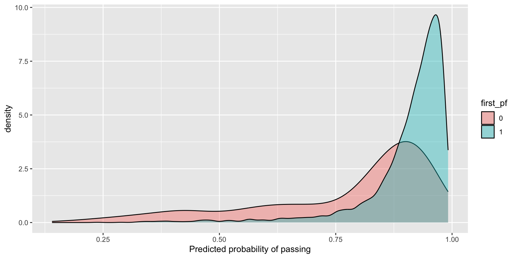
ggplot(data = aug_3, mapping =aes(x = .fitted, fill =factor(first_pf))) +geom_density(alpha =0.4) +labs(fill ="first_pf", x ="Predicted probability of passing")
A binary classifier that will be able to discriminate (statistically speaking) will produce two densities that will be shifted apart: .fitted concentrated near 1 for students who passed (first_pf =1), and shifted toward lower values for those who did not.
Here the overlap is still substantial (the base pass rate, mean(aug_3$.fitted) is about 89%). The model, while being able to discriminate a bit, is still far from being perfect (which is the norm when modeling human behavior/outcomes).
Each added predictor increases AUC, UGPA adds more discrimination than race does on top of UGPA, but neither addition is dramatic: LSAT alone is already carrying most of the discriminative power.
Solution 6: Plotting the ROC Curves Together
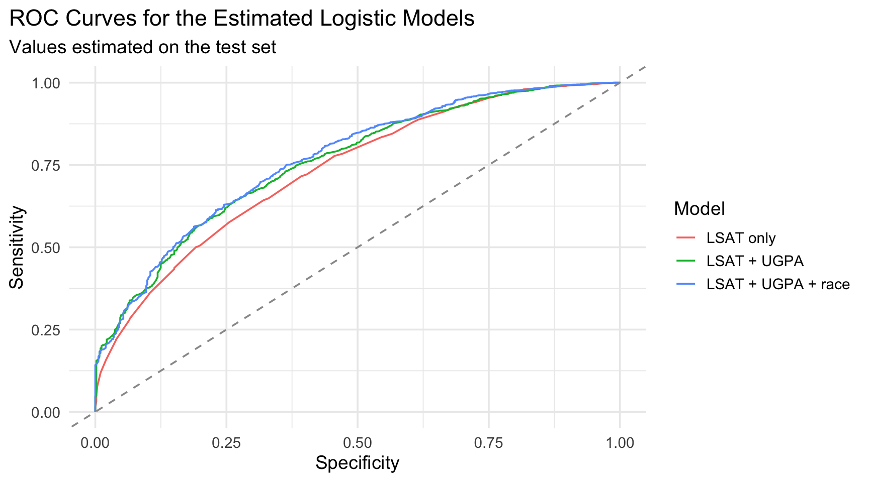
p_roc <-ggroc(data =list("LSAT only"= roc_1,"LSAT + UGPA"= roc_2,"LSAT + UGPA + race"= roc_3 ),legacy.axes =TRUE) +geom_abline(intercept =0, slope =1, linetype ="dashed", color ="grey60" ) +labs(x ="Specificity", y ="Sensitivity", color ="Model",title ="ROC Curves for the Estimated Logistic Models",subtitle ="Values estimated on the test set" ) +theme_minimal(base_size =14) +theme(plot.title.position ="plot")
The three curves are very close from one another. Since they are all above the diagonal, we can say that each model offers a gain (although modest) from a random guessing.
Also, we can visually confirm what the AUC values hinted: we observe a modest gains from UGPA and race on top of LSAT.
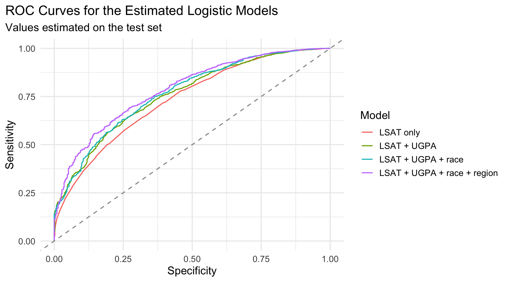
Adding region_first produces a jump in AUC. Region apparently captures meaningful variation in first-attempt pass rates that LSAT, UGPA, and race together do not.
p_roc <-ggroc(data =list("LSAT only"= roc_1,"LSAT + UGPA"= roc_2,"LSAT + UGPA + race"= roc_3,"LSAT + UGPA + race + region"= roc_4 ),legacy.axes =TRUE) +geom_abline(intercept =0, slope =1, linetype ="dashed", color ="grey60" ) +labs(x ="Specificity", y ="Sensitivity", color ="Model",title ="ROC Curves for the Estimated Logistic Models",subtitle ="Values estimated on the test set" ) +theme_minimal(base_size =14) +theme(plot.title.position ="plot")
Ranking, best to worst: m_4\(>\)m_3\(>\)m_2\(>\)m_1.
This matches expectations: each specification is nested inside the next (every predictor in m_1 is also in m_4), so AUC can only stay the same or improve on the training data.
On held-out test data an improve in the AUC is not guaranteed as more variables are added, but here it does for every addition.
That is not a general guarantee, it happens because a 3-predictor logistic regression on over 17,000 training rows has very little room to overfit. With a richer model (many more predictors, interactions, or a flexible non-linear method) or a smaller training set, train AUC would typically look noticeably higher than test AUC, since the model would have more opportunity to fit noise specific to the training sample.
Part 3: Calibration
What about Calibration?
The AUC only asks whether the model ranks students correctly.
Calibration asks a different question: are the predicted probabilities themselves believable as probabilities?
A model is well calibrated if, for every predicted probability \(p\),
\[
\mathbb{E}\big[Y \mid \hat{P}(Y=1 \mid \boldsymbol{X})=p\big]=p
\] In our example: \[
\mathbb{E}\left[\,\text{first_pf} \mid \widehat{P}(\text{first_pf} = 1 \mid X) = p\,\right] = p
\] In words: among students who received a predicted probability of \(p\), the expected (average) value of first_pf, i.e. the actual pass rate, is \(p\) itself.
Calibration in Practice
The previous definition of calibration conditions on students who share the exact predicted probability \(p\).
In practice, a logistic regression with continuous predictors like LSAT and UGPA almost never assigns the exact same \(\widehat{P}(\text{first_pf} = 1 \mid X) = p\) to more than a handful of students, often to just one.
With one student per value of \(p\), the empirical pass rate at that \(p\) is either \(0\) or \(1\): it tells us nothing about calibration, it just reflects a single outcome. Empirically:
We need groups large enough for the average to be a stable estimate, but grouping strictly by predicted probability does not guarantee that.
Calibration in Practice: Quantile-Based Bins
Instead of conditioning on an exact value of \(p\), we usually condition on an interval of predicted probabilities, chosen so that every bin contains roughly the same number of students:
A well calibrated model has mean_predicted close to mean_observed in every bin. The next exercise illustrate this!
Lab 3: Build and Compare Calibration Plots
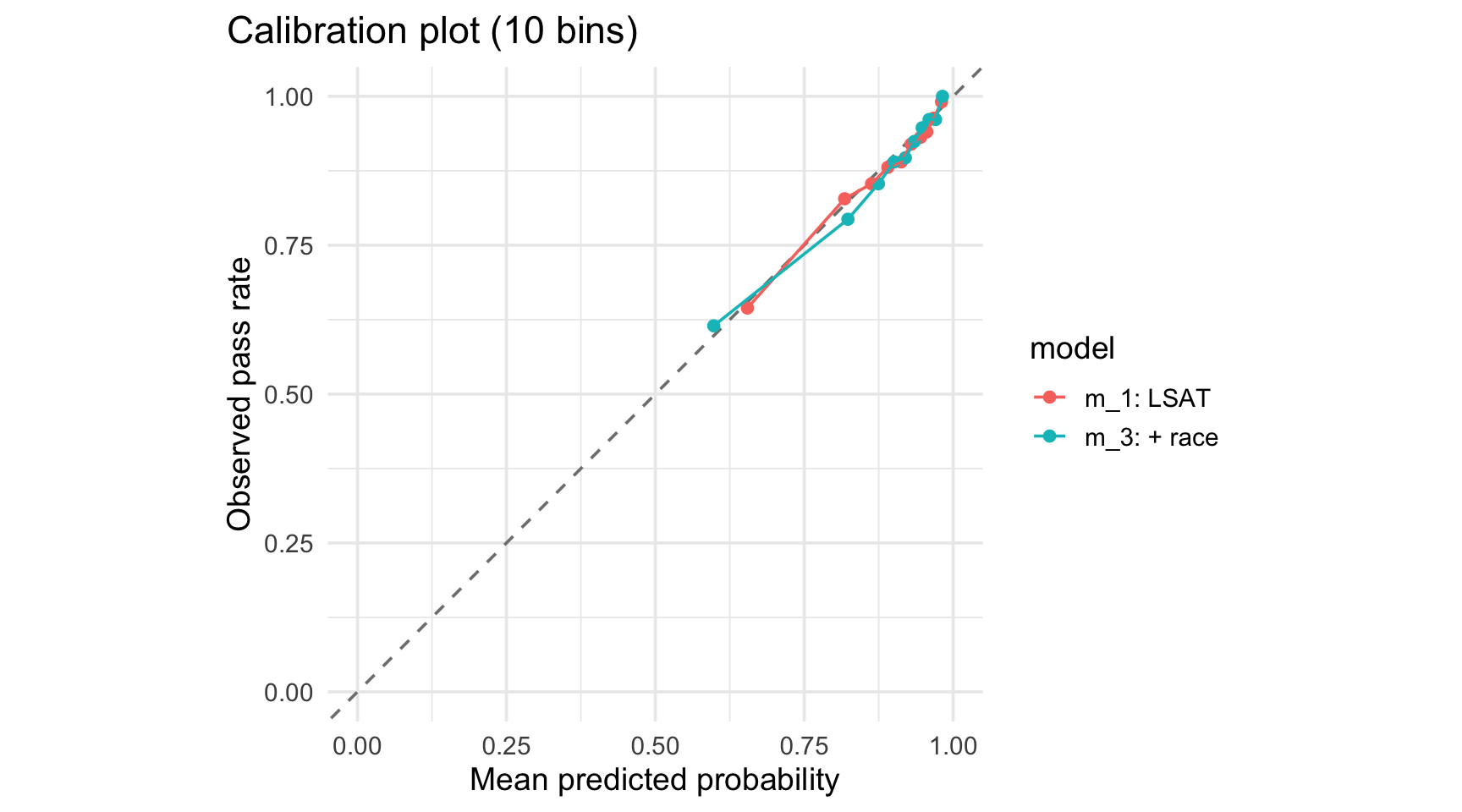
On aug_3, use ntile(.fitted, 10) to bin students into deciles of predicted probability. Within each bin, compute the mean predicted probability and the mean observed first_pf.
Plot mean observed against mean predicted, one point per bin, with a 45-degree reference line (geom_abline(slope =1, intercept =0)).
Repeat steps 1 to 2 for aug_1 (and aug_4 if you have time). Which specification stays closest to the diagonal?
Compare this ranking to your AUC ranking from Lab 2. Is the model with the highest AUC also the best calibrated? Is that necessarily true in general?
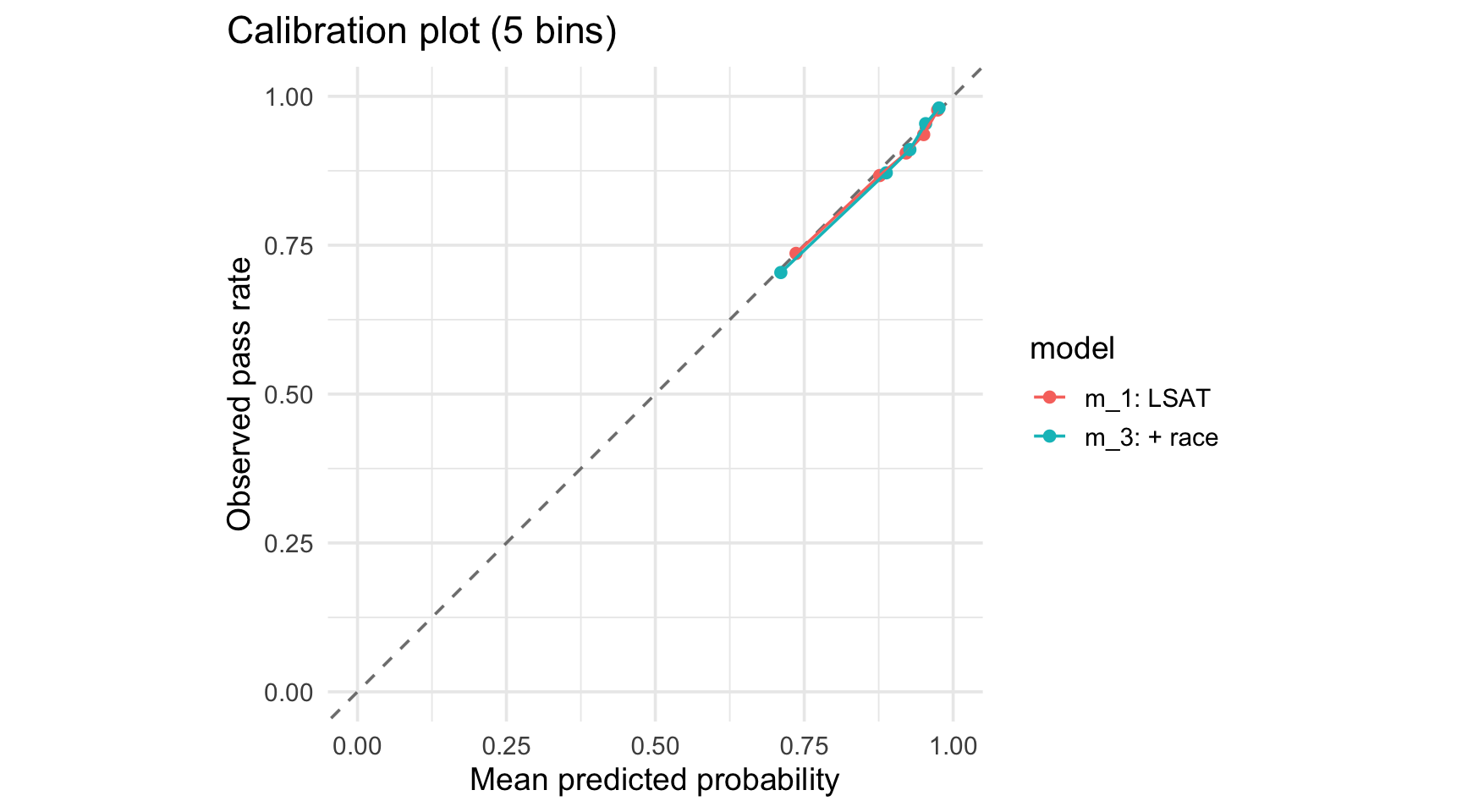
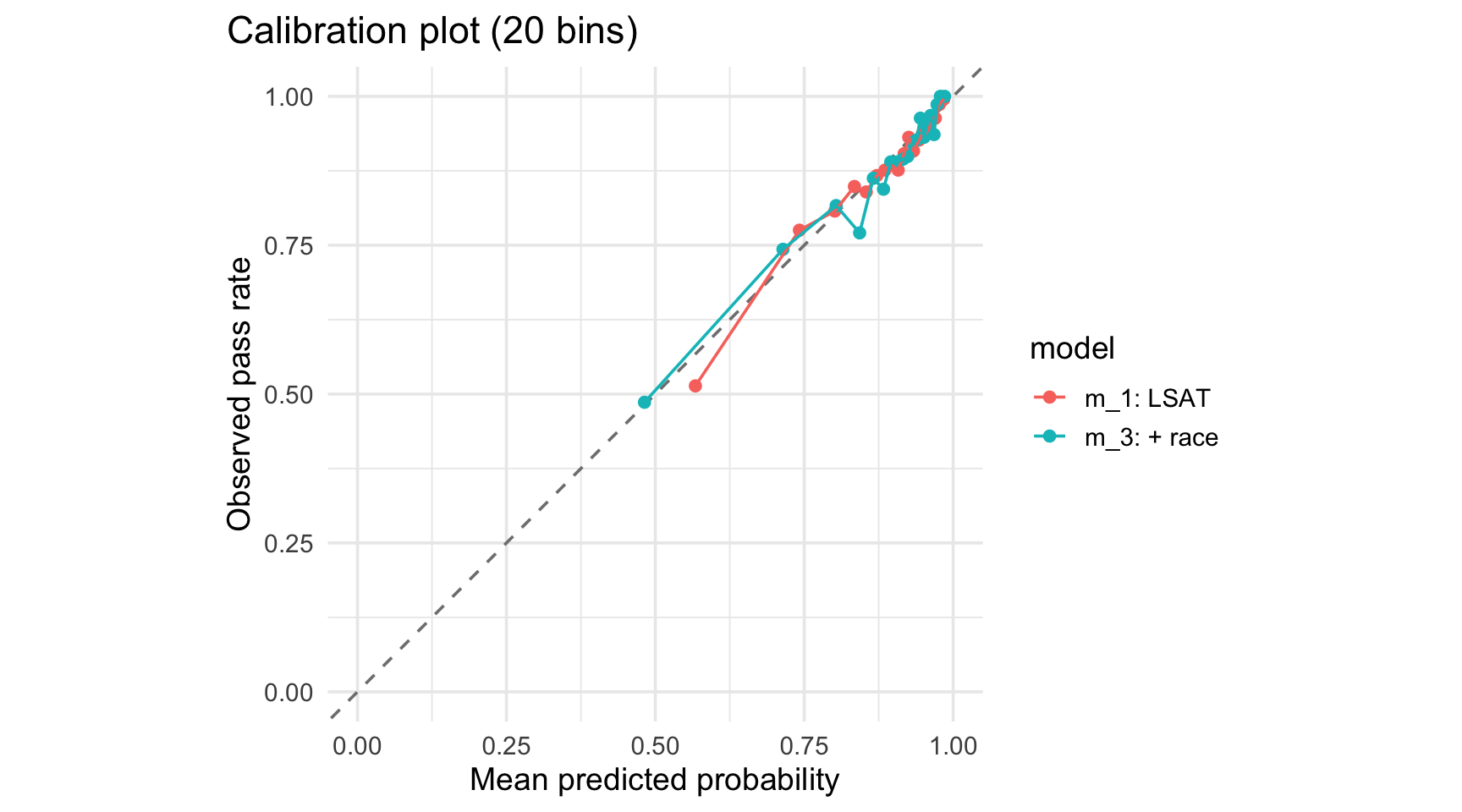
Try ntile(.fitted, 5) and ntile(.fitted, 20) on one model. What changes, and why? What would happen with too many bins?
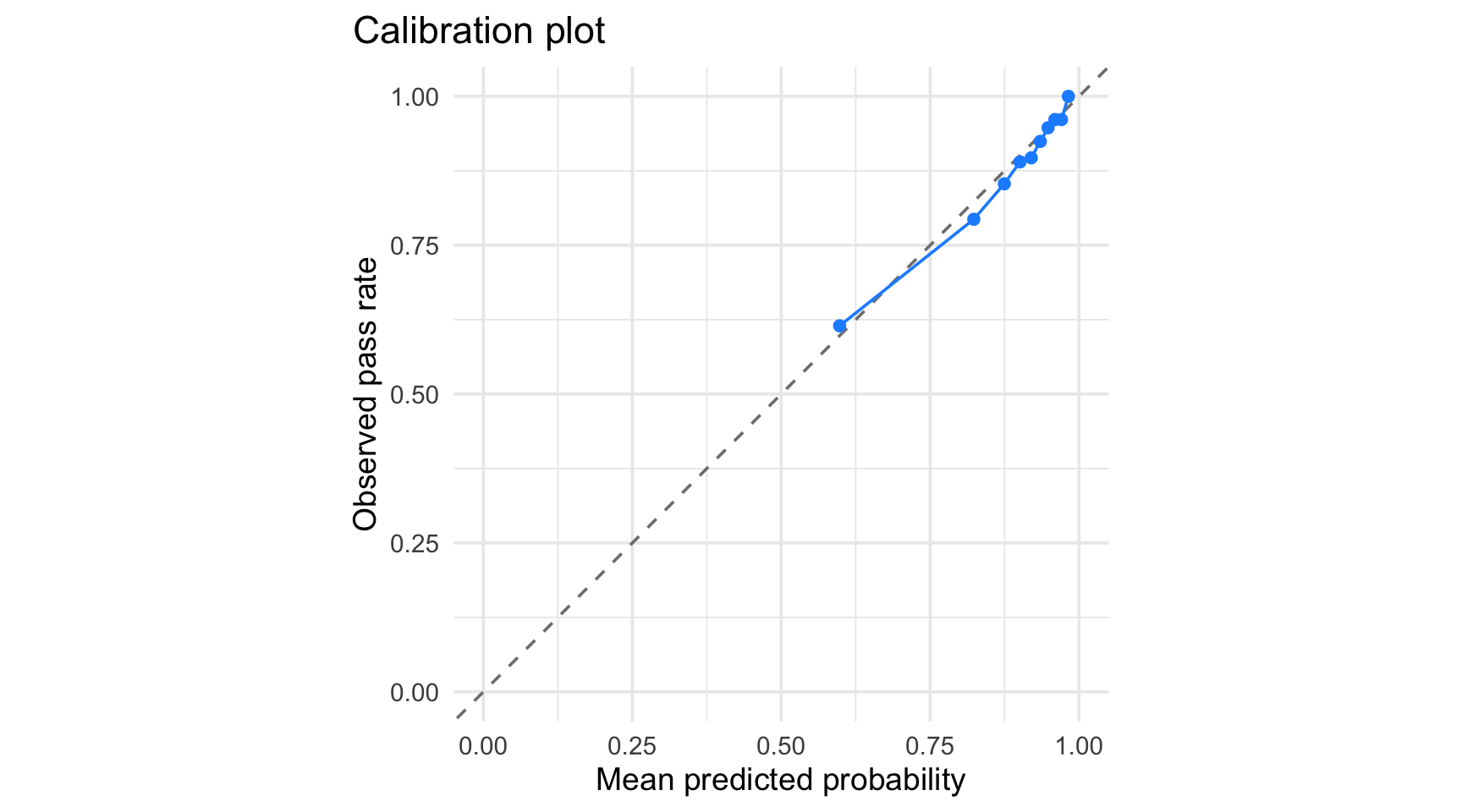
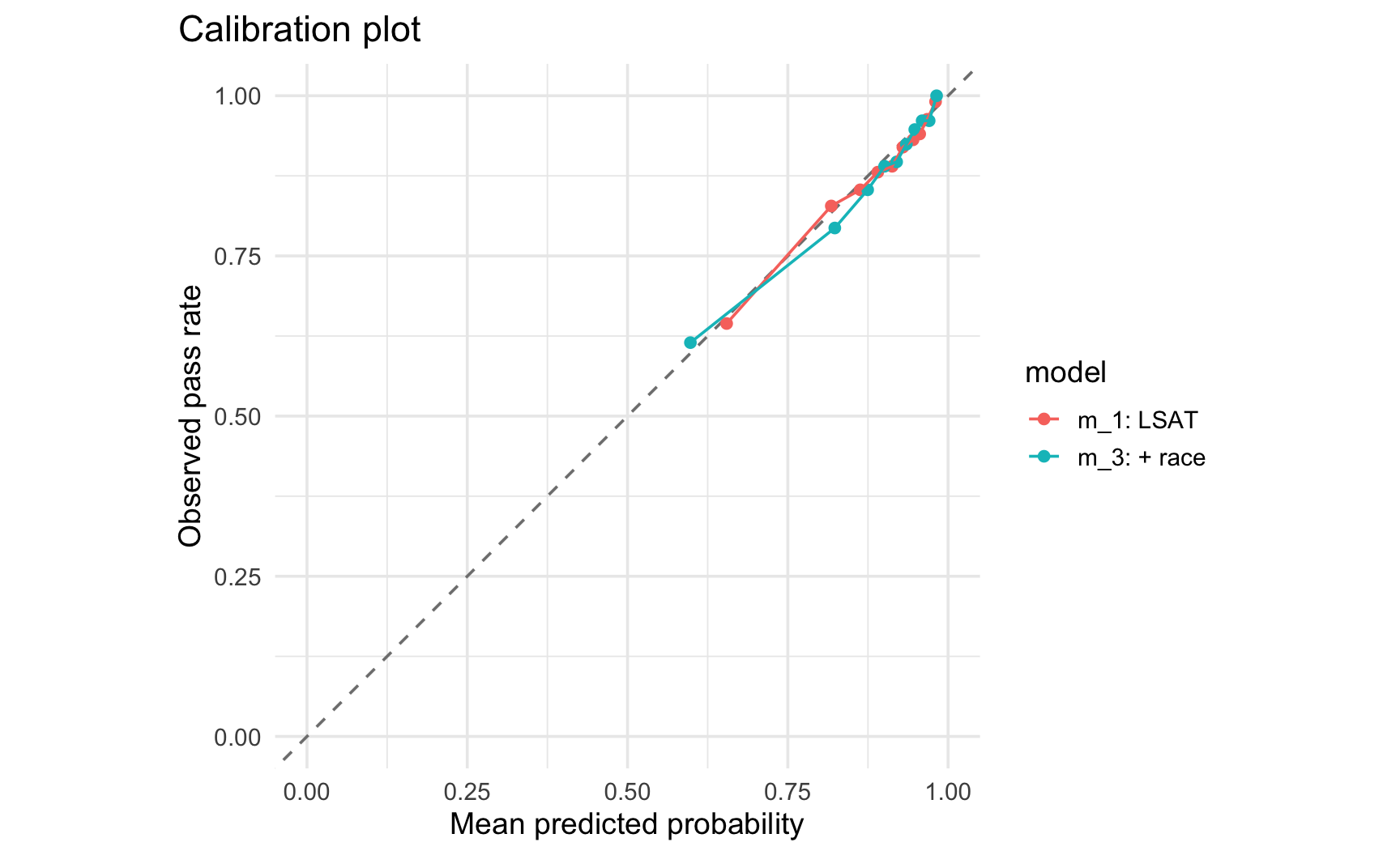
Bin 1 (lowest predicted probabilities, around 0.60) already has an observed pass rate close by (around 0.61). Bin sizes are roughly 430 to 450 students each, plenty to make each bin’s average a stable estimate.
All ten points sit close to the 45-degree line across the full range of predicted probabilities, m_3 is reasonably well calibrated on this test set (recall it was also reasonably good at ranking students according to the AUC).
Both models track the diagonal about equally well here. The simlicity of m_1 does not cost it much calibration, even though Lab 2 showed it clearly loses on discrimination (AUC 0.734 vs. 0.767).
Calibration (Solution 3): m_1 and m_3 are both close to the diagonal, calibration does not track the same ranking as AUC.
In general the two rankings need not agree. Logistic regression fit by maximum likelihood tends to be well calibrated on data similar to its training data almost regardless of which predictors it has. Consequently, a high-AUC model is not automatically the best-calibrated one. Both metrics need to be checked.
Actually, if the model is well specified, the logistic model will be well calibrated.
When using a machine learning model instead of a logistic regression, a random forest for example, calibration may be harder to achieve.
Note that calibration will matter if ranking is not enough (if you want to estimate a probability, calibration matters).
Solution 5: Changing the Number of Bins
calib_bins <-function(aug, n_bins) { aug |>mutate(bin =ntile(.fitted, n_bins)) |>group_by(bin) |>summarise(mean_predicted =mean(.fitted), mean_observed =mean(first_pf), n =n(), .groups ="drop" )}
With only 5 bins (about 870 students each), the estimates are very stable. However, we cannot tell whether calibration holds up evenly across the full range of predicted probabilities.
With 20 bins (about 210 to 245 students each), individual points start to wander further off the diagonal (e.g., one bin’s observed rate lands nearly 3 points above its predicted rate) purely from sampling noise in smaller groups, not necessarily from real miscalibration.
Too few bins hides structure, too many bins manufactures the appearance of miscalibration out of noise.