Course homepage

Data Visualization with R

Chapter 3 – Visualisation with {ggplot2}

Ewen Gallic

September 3, 2026

Disclaimers

  1. I used Claude Sonnet 5 to help producing the slides (assistance in organizing content and producing clearer sentences).

Roadmap for This Chapter

Building a Plot, Layer by Layer

  1. The grammar of graphics
  2. Aesthetic mappings (aes())
  3. Geometries (geom_*)
  4. Statistical transformations (stat_*)
  5. Scales (sacle_)
  6. Groups

Refining & Sharing a Plot

  1. Facets
  2. Coordinate systems
  3. Annotations
  4. Labs (titles, axis labels, captions)
  5. Themes
  6. Exporting a plot (ggsave(), PNG vs. PDF)

Why Learn {ggplot2} Yourself?

Generative AI tools (ChatGPT, Claude, Gemini…) can already write a {ggplot2} call for you in seconds. So, why bother learning it?

  • Knowing the grammar makes you faster and more autonomous at using these tools.

  • An AI-written plot is rarely exactly what you need :

    • without knowing the grammar, a small change (different color scale, extra facet, flipped axis, etc.) means going back to the chatbot and hoping it gets it right. This is time and resource consuming,
    • AI-generated code sometimes looks plausible but is subtly wrong (wrong group, wrong stat, a mapping that should have been a fixed value). You need to be able to spot mistakes.
  • You need to be able to read/understand a plot’s code to know whether it does what you think it does, and whether it is misleading.

  • Describing a precise visualization request to an AI tool is much easier once you know the vocabulary (aesthetics, geoms, facets, scales) rather than describing it in vague terms.

Introducing {ggplot2}

From Base R to {ggplot2}

Base R Plotting

  • Imperative: you describe, step by step, how to draw each element.
  • Plots are built by successive side-effect calls (plot(), then points(), then abline(), …).
  • Fast for quick, throwaway looks at data, but customization quickly becomes verbose.

{ggplot2}

  • Declarative: you describe what the data means visually, and {ggplot2} figures out how to draw it.
  • Plots are built by adding layers with +.
  • Part of the tidyverse, consistent with {dplyr} syntax you already know.

Same Idea, Different Style

Just like {dplyr} gave you a small grammar of verbs for wrangling (filter(), mutate(), …), {ggplot2} gives you a grammar of visual building blocks.

The Grammar of Graphics

  • The term comes from Wilkinson (2011) The Grammar of Graphics: any statistical graphic can be described as a combination of independent components.
  • Hadley Wickham implemented this idea in R as {ggplot2} (the “gg” stands for Grammar of Graphics).
  • Instead of memorizing one function per chart type (barplot(), boxplot(), scatterplot()…), you learn a small set of building blocks that recombine to produce virtually any chart.

Mastering the Grammar of Graphics Makes You Efficient

Once you know the grammar, learning a new type of plot is mostly a matter of swapping one component (e.g., one geom) rather than learning an entirely new function.

Key Reference

  • To learn with a book: Wickham (2016).

The Layers of a Plot

flowchart LR
    A["<b>Data</b><br/><br/>Your tibble"]
    B["<b>Aesthetics</b><br/><br/><code>aes()</code><br/>map variables to visuals"]
    C["<b>Geometry</b><br/><br/><code>geom_*()</code><br/>what shape represents data"]
    D["<b>Statistics</b><br/><br/><code>stat_*()</code><br/>transform before plotting"]
    E["<b>Scales</b><br/><br/><code>scale_*()</code><br/>data space → visual space"]
    F["<b>Facets</b><br/><br/><code>facet_*()</code><br/>small multiples"]
    G["<b>Coordinates</b><br/><br/><code>coord_*()</code><br/>how axes are laid out"]
    H["<b>Theme</b><br/><br/><code>theme_*()</code><br/>non-data ink"]

    A --> B --> C --> D --> E --> F --> G --> H

    style A fill:#ffe5cc,stroke:#cc6600
    style B fill:#e6f0ff,stroke:#3366cc
    style C fill:#e6f0ff,stroke:#3366cc
    style D fill:#e6f0ff,stroke:#3366cc
    style E fill:#e6f0ff,stroke:#3366cc
    style F fill:#e6f0ff,stroke:#3366cc
    style G fill:#e6f0ff,stroke:#3366cc
    style H fill:#e5f5e5,stroke:#339933

  • Not every layer is required.
  • Every {ggplot2} plot has data, aesthetics, and a geometry.
  • The rest (stats, scales, facets, coordinates, theme) have sensible defaults and only need to be touched when you want something different.

Reading a {ggplot2} “Sentence”

A {ggplot2} call reads almost like a sentence describing the plot:

\[ \underbrace{\texttt{ggplot(data, mapping=aes(x, y, ...))}}_{\text{“Using this data and these mappings...”}} \; \mathbf{+} \; \underbrace{\texttt{geom_point()}}_{\text{“...draw points.”}} \]

  • Each + adds one more layer to the plot, in the order it is written.
  • This mirrors the pipe (|>) you used with {dplyr} and lets you write a sequence of small (and readable) steps. The difference is that layers are stacked visually rather than passed forward as data.

+ Goes at the End of the Line

# Correct: '+' at the end of the line
ggplot(law, aes(x = LSAT, y = UGPA)) +
  geom_point()

# Wrong: '+' at the start of the next line will error
ggplot(law, aes(x = LSAT, y = UGPA))
  + geom_point()

A First Look, Before the Details

We will spend the rest of this chapter unpacking each layer. As a preview, here is a complete (yet minimal) {ggplot2} plot using our law dataset:
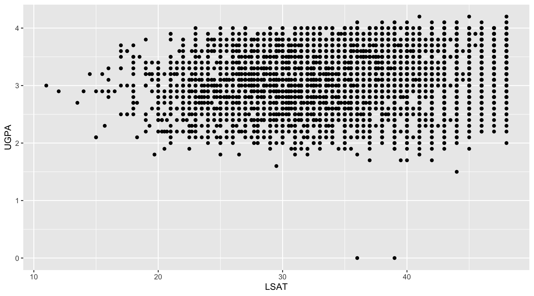
library(tidyverse)
library(here)
law <- read_csv(file = here("data", "law_data.csv"))

ggplot(
  data = law,
  mapping = aes(x = LSAT, y = UGPA)
) +
  geom_point()

Task 1: Reading the Grammar

Without running any code, look at the following {ggplot2} call:

ggplot(data = law, mapping = aes(x = region_first, y = LSAT)) +
  geom_boxplot()
  1. Which variable is mapped to x? Is it categorical or numeric?
  2. Which variable is mapped to y? Is it categorical or numeric?
  3. Based on the grammar diagram, which layer is responsible for choosing the shape used to represent the data (boxes, in this case)?
  4. Sketch (on paper, or describe in words) what you expect this plot to look like before running it. How many boxes do you expect to see?
  5. Now run the code and compare it to your prediction.

Anatomy of a ggplot() call

The Two Required Ingredients

Every {ggplot2} plot needs at minimum:

  1. Data: a data frame or tibble.
  2. A geometry: at least one geom_*() layer, telling R what shape should represent your data.

Aesthetic mappings (aes()) are technically optional at the top level, but in practice you almost always need to tell R which columns go where.

ggplot(data = <DATA>, mapping = aes(<MAPPINGS>)) +
  geom_<TYPE>()

Named Arguments, By Convention

Experienced R users often drop data = and mapping = and rely on argument position, since ggplot() expects data first and mappings second:

ggplot(law, aes(x = LSAT, y = UGPA)) +
  geom_point()

I do not like this practice as it makes it harder to understand the code when reading it.

Where Can aes() Live?

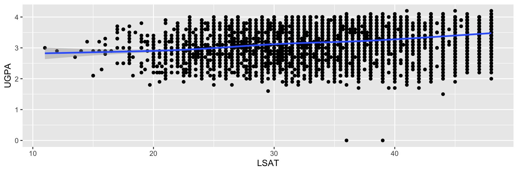
aes() can be supplied in two places, with different consequences:

In ggplot()

Mappings apply to every layer added afterwards (inheritance property).
ggplot(
  data = law,
  mapping = aes(x = LSAT, y = UGPA)
) +
  geom_point() +
  geom_smooth()

In a geom_*()

Mappings apply only to that layer.

ggplot(data = law) +
  geom_point(
    mapping = aes(x = LSAT, y = UGPA)
  ) +
  geom_smooth(
    mapping = aes(x = LSAT, y = UGPA)
  )

Building a Plot, One Layer at a Time

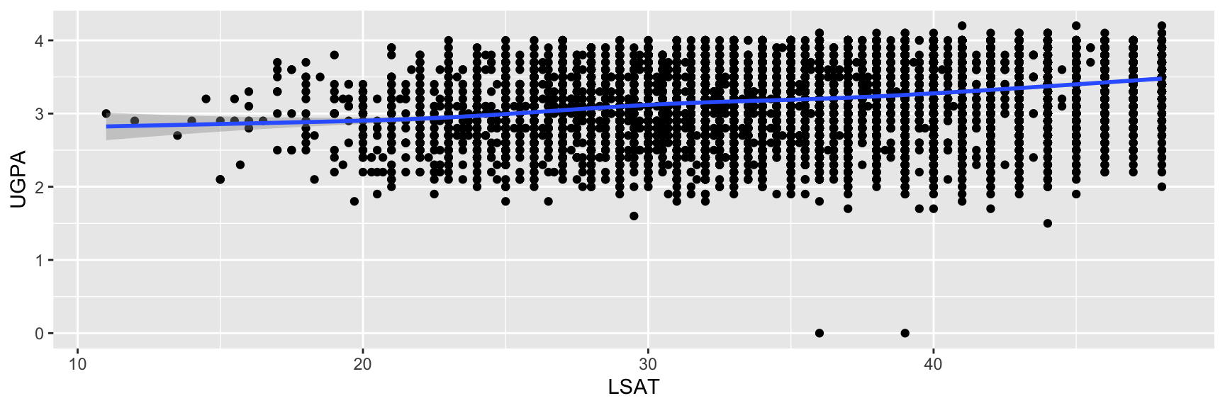
Layers stack visually in the order they are added with +. Consider the same base plot with layers added one by one:
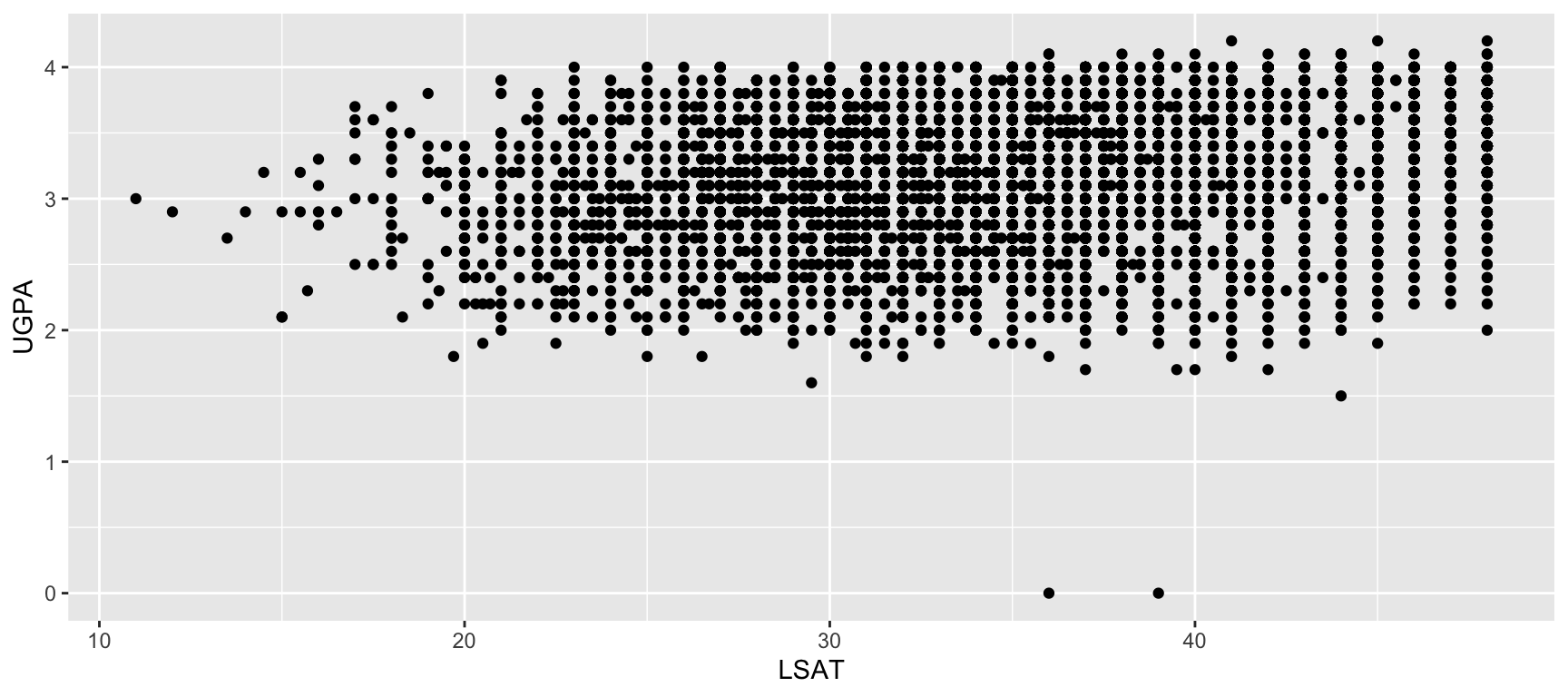
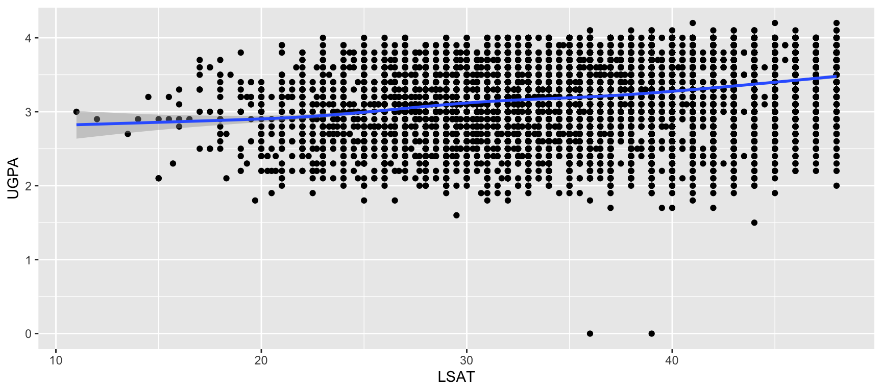
ggplot(
  data = law,
  mapping = aes(x = LSAT, y = UGPA)
) +
  geom_point()
ggplot(
  data = law,
  mapping = aes(x = LSAT, y = UGPA)
) +
  geom_point() +
  geom_smooth()

Order Matters for Drawing, Not for Mapping

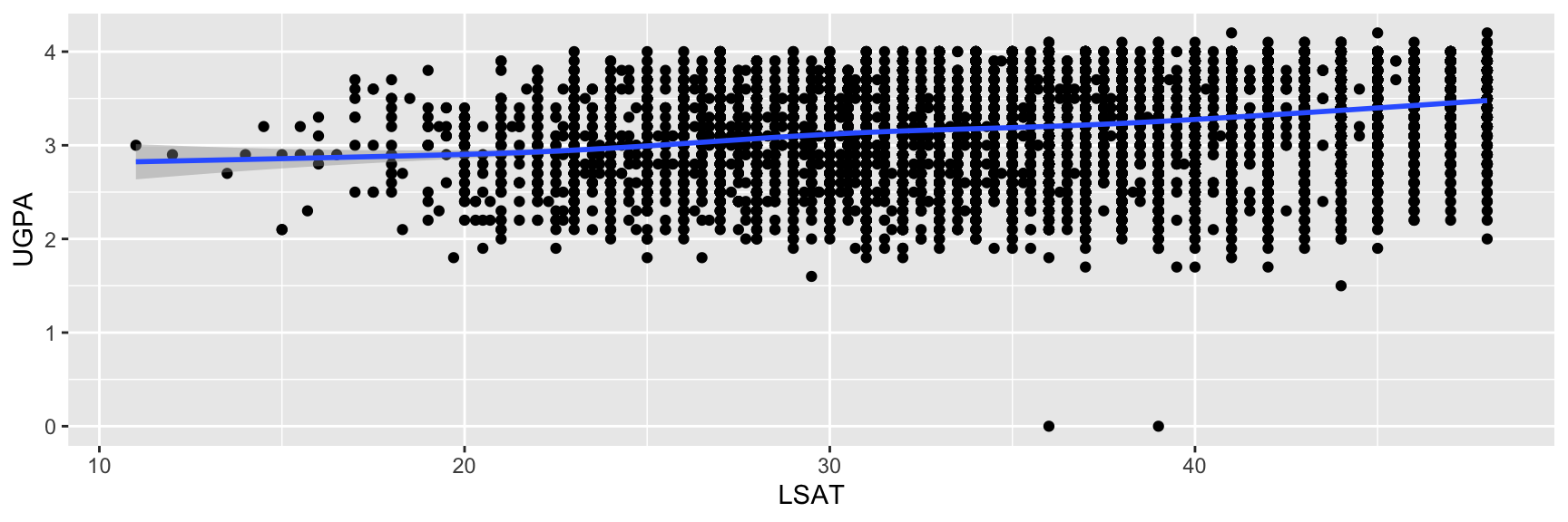
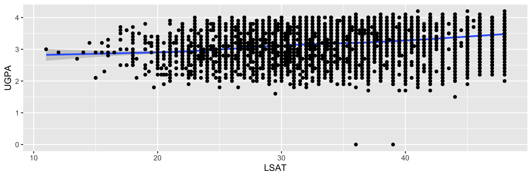
  • Layers are drawn in the order they are added, so a later layer can be drawn on top of an earlier one.

  • This matters visually (for example, points hidden behind a smoothing band) even though the mappings themselves do not depend on layer order.
ggplot(
  data = law,
  mapping = aes(x = LSAT, y = UGPA)
) +
  geom_point() +
  geom_smooth()

ggplot(
  data = law,
  mapping = aes(x = LSAT, y = UGPA)
) +
  geom_smooth() +
  geom_point()

Saving a Plot as an Object

Just like any other R object, a plot can be assigned with <- instead of being printed immediately.

p <- ggplot(data = law, mapping = aes(x = LSAT, y = UGPA)) +
  geom_point(alpha = 0.3)
  • Assigning to p builds the plot but does not display it.
  • Call p on its own line to display it (usual behavior of an assignment).
  • Layers can be added to a saved plot later:
p + geom_smooth()

Why You Should Care About This

Saving intermediate versions of a plot avoids retyping the same ggplot() call when you want to compare a few variations, and will be especially handy once we reach facets, scales, and themes later in this chapter.

Task 2: Build Your First Plot

Using the law dataset:

  1. Create a scatterplot with sander_index on the x-axis and ZFYA on the y-axis. Assign it to an object named p1.
  2. Display p1.
  3. Add a geom_smooth() layer to p1 without overwriting the original object (that is, do not reassign the result back to p1).
  4. Now create p2, a version of the same scatterplot p1 where the mapping is defined inside geom_point() rather than inside ggplot(). Confirm that p2 looks the same as p1.
  5. Try adding geom_smooth() to p2. What happens, and why, given what you now know about where aes() was defined?

Aesthetic Mappings

What Is an Aesthetic Mapping?

  • An aesthetic is any visual property of a plot that can represent a variable: position, colour, size, shape, transparency, line type.
  • aes() is where you tell {ggplot2} which column of your data controls which visual property.
aes(x = LSAT, y = UGPA, colour = region_first)

Reading the Mapping Above

  • x position encodes LSAT.
  • y position encodes UGPA.
  • colour encodes region_first.

Every value inside aes() must be a column name (or an expression built from column names) found in the data. This is what lets {ggplot2} automatically build legends and adapt the plot when the data changes.

Mapping vs. Setting

This is one of the most common sources of confusion for beginners.

Mapping (inside aes())

A variable determines the visual property. Values in the data drive what is shown.
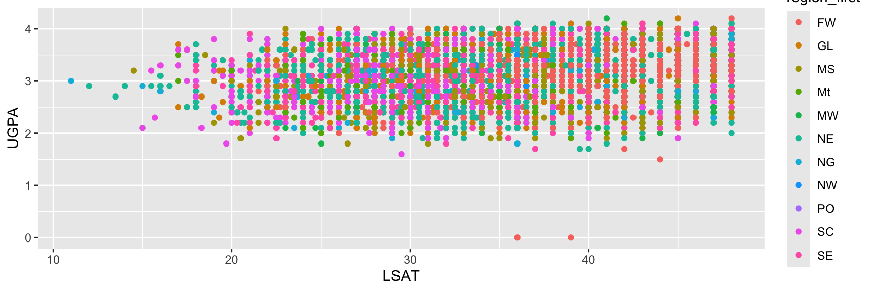
ggplot(
  data = law,
  mapping = aes(
    x = LSAT, y = UGPA,
    colour = region_first
  )
) +
  geom_point()

Result: one colour per region, with a legend.
Setting (outside aes())

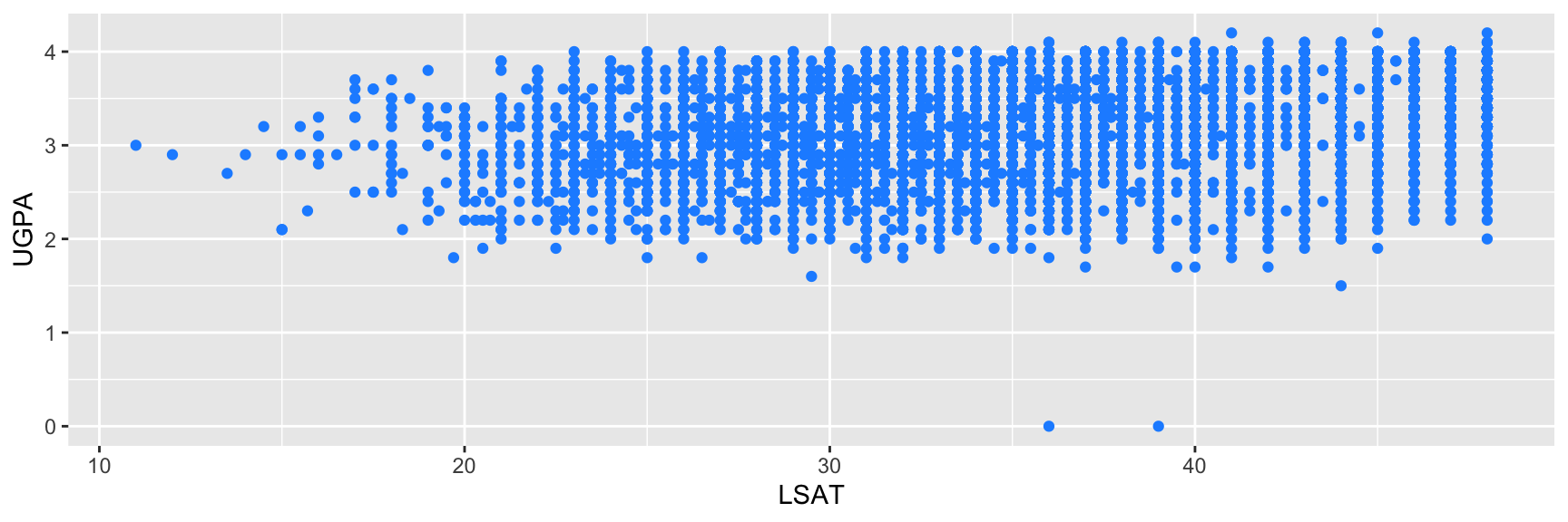
A fixed value is applied to every geometry, regardless of the data.

ggplot(
  data = law,
  mapping = aes(
    x = LSAT, y = UGPA
  )
) +
  geom_point(colour = "dodgerblue")

Result: every point is the same colour, no legend.

A Classic Mistake

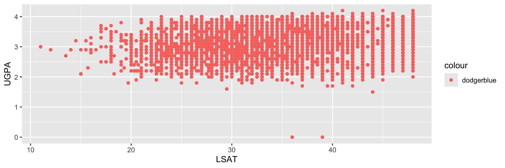
  • Writing colour = "dodgerblue" inside aes() does not do what most beginners expect.
  • It creates a legend with a single category literally named "steelblue", and colours every point using the default colour palette (every observation has a single value mapped to the colour argument: "steelblue") rather than actually painting them blue.
ggplot(
  data = law,
  mapping = aes(
    x = LSAT, y = UGPA,
    colour = "dodgerblue"
  )
) +
  geom_point()

Rule of Thumb

Ask yourself: does this visual property depend on a column in my data?

  • If yes, it belongs inside aes().
  • If it is a single fixed choice you are making yourself, it belongs outside aes(), as a plain argument to the geom_*().

Common Aesthetics

Aesthetic Controls Works well with
x, y Position Any variable type
colour Outline / point / line colour Categorical or continuous
fill Interior colour (bars, areas, boxplots) Categorical or continuous
size Point or line size Continuous (typically)
shape Point symbol Categorical, few levels only
alpha Transparency (0 = invisible to 1 = opaque) Continuous, or fixed for overplotting
linetype Solid, dashed, dotted line, … Categorical, few levels only

colour vs. fill

For geometries with an interior area (bars, boxplots, polygons), colour affects only the border while fill affects the interior. For points and lines, which have no interior, colour is the one that matters.

Continuous vs. Discrete Mappings

The same aesthetic behaves differently depending on the type of variable mapped to it.
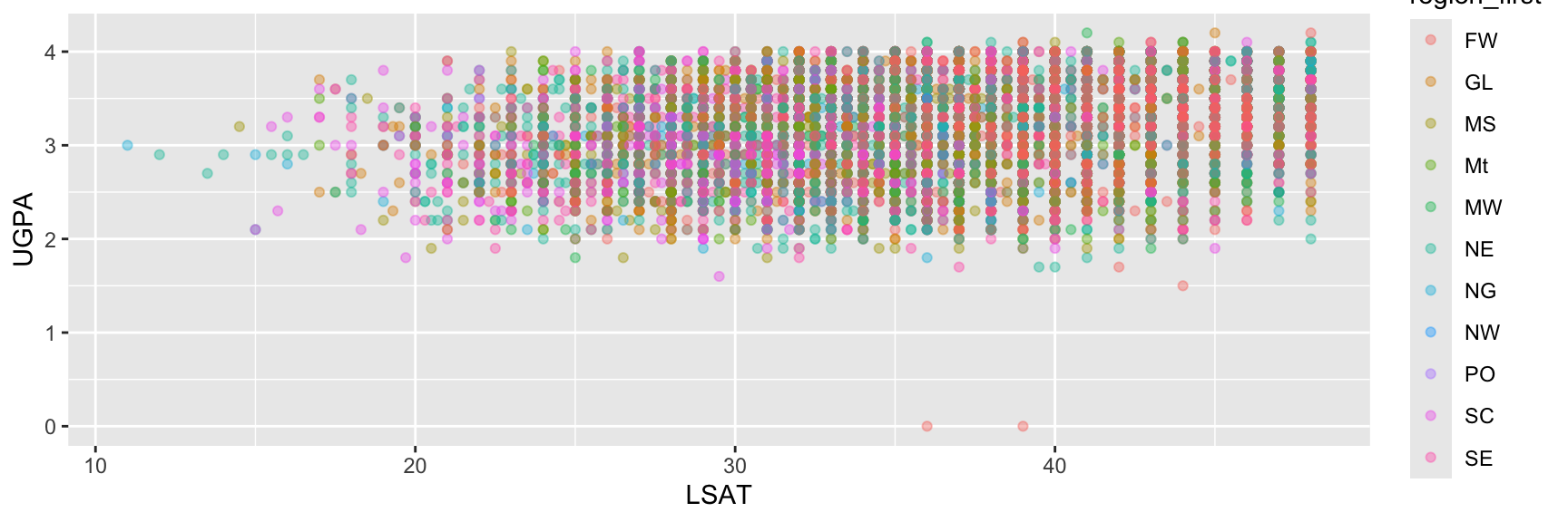
Discrete Variable

ggplot(
  data = law,
  mapping = aes(
    x = LSAT, y = UGPA,
    colour = region_first
  )
) +
  geom_point(alpha = 0.4)

A distinct colour per category, with a discrete legend.

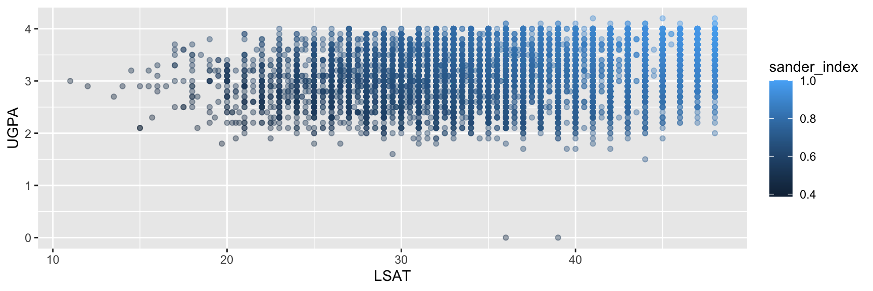
Continuous Variable

ggplot(
  data = law,
  mapping = aes(
    x = LSAT, y = UGPA,
    colour = sander_index
  )
) +
  geom_point(alpha = 0.4)

A gradient, with a continuous colour bar legend.

Preview

We will come back to this distinction in much more depth in the section on scales and colour choices later in this chapter (sequential vs. diverging vs. qualitative palettes).

Overplotting: When alpha Is Set, Not Mapped

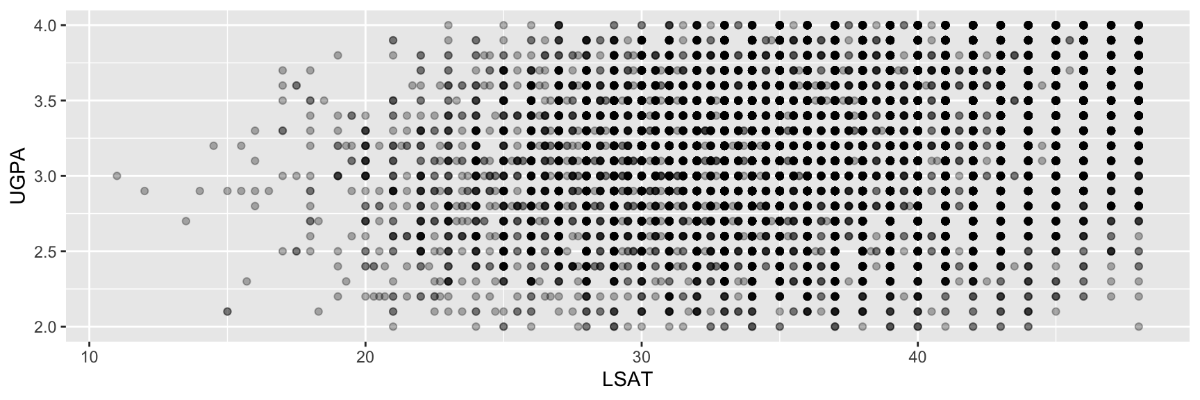
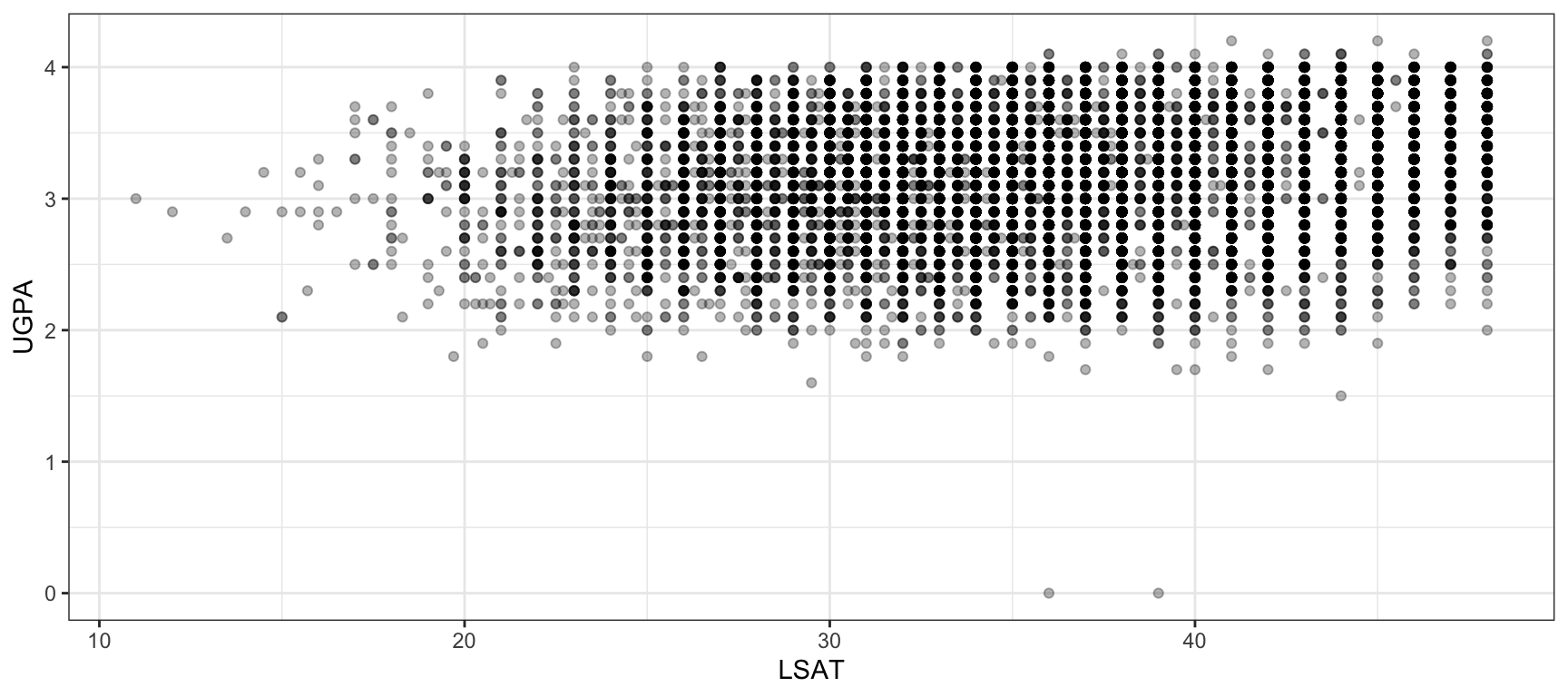
With many overlapping points, a fixed transparency is a common and effective fix, and a good example of setting rather than mapping an aesthetic.
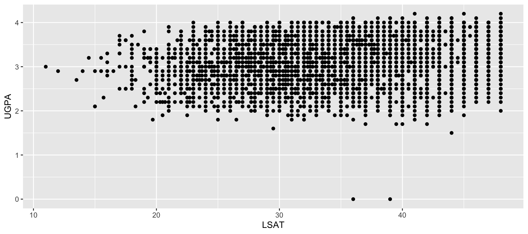
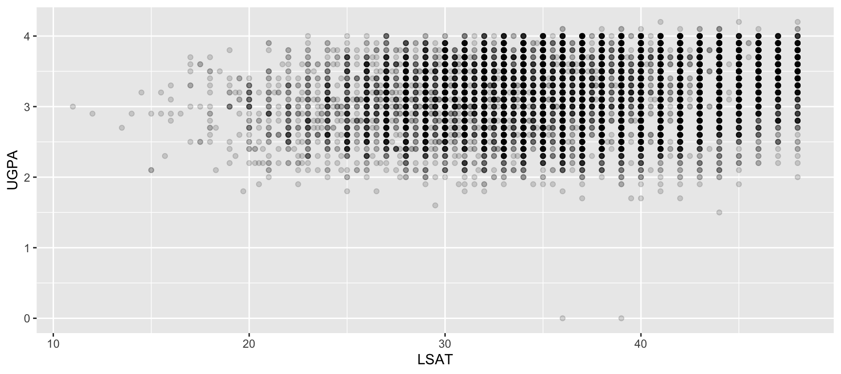
# Too many overlapping points
ggplot(
  data = law,
  mapping = aes(x = LSAT, y = UGPA)
) +
  geom_point()

# alpha set as a fixed value
ggplot(
  data = law,
  mapping = aes(x = LSAT, y = UGPA)
) +
  geom_point(alpha = 0.15)

Task 3: Mapping vs. Setting

The following code is meant to produce a scatterplot of LSAT against UGPA, with every point coloured "forestgreen", but it does not behave as intended:

ggplot(
  data = law,
  mapping = aes(
    x = LSAT, y = UGPA,
    colour = "forestgreen"
  )
) +
  geom_point(size = 2)
  1. Run the code above. What does the resulting legend say, and why?
  2. Fix the code so that every point is actually coloured forest green, with no legend produced.
  3. Now write another version of the plot where colour is mapped to first_pf (whether the student passed the bar on the first attempt), so that passing and failing students appear in different colours.
  4. In your version from Question 3, is first_pf treated as continuous or discrete by default? Look at the legend to decide, and explain why this might not be what you want given that first_pf is a 0/1 indicator.
  5. first_pf is really a categorical indicator (pass or fail), even though it is stored as numeric in the dataset. Use mutate() to create a new column, first_pf_fct, converting first_pf to a factor. Redraw the plot from Question 3, mapping colour to first_pf_fct instead. How does the legend change?

Rule of Thumb, in Practice

Recall from the previous section: put a mapping in ggplot() if every layer should use it, and inside a specific geom_*() if only that layer needs it. Aesthetics make this concrete.

Question

What happens if we want to colour the points by region_first, but keep a single overall trend line rather than one trend line per region?
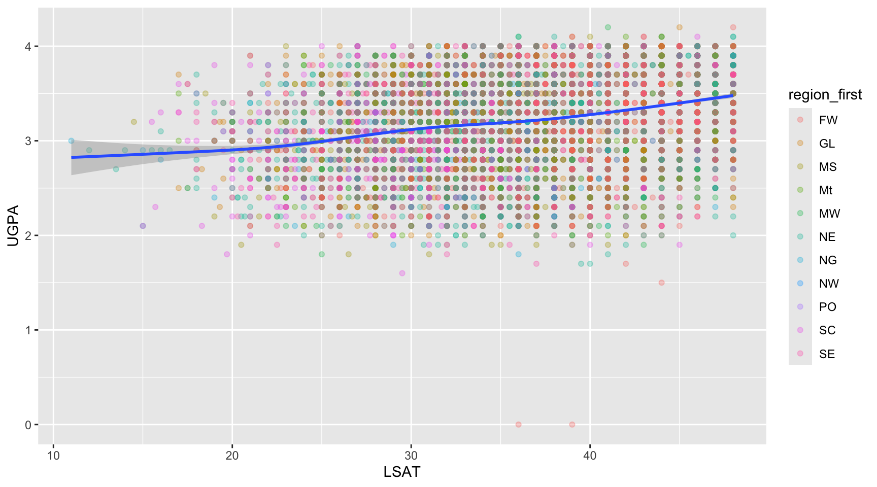
# colour mapped only inside geom_point()
ggplot(data = law, mapping = aes(x = LSAT, y = UGPA)) +
  geom_point(
    mapping = aes(colour = region_first),
    alpha = 0.3
  ) +
  geom_smooth()

What Would Have Happened Otherwise

Had colour = region_first been mapped inside ggplot() instead of inside geom_point(), geom_smooth() would inherit that mapping too, producing one trend line per region instead of a single overall one. We will see this same mechanism again when we cover groups later in this chapter.

Geometries

What Is a Geometry?

  • A geometry (geom_*()) determines the visual shape used to represent your data: points, lines, bars, boxes…
  • The mapping (aes()) tells {ggplot2} which variables to use. The geometry tells it how to draw them.
  • A single plot can combine several geometries as separate layers, as we already saw with geom_point() plus geom_smooth().

Same Data, Different Geometry

Nothing prevents you from mapping the exact same aes() to different geometries and comparing the result. This is often a good way to explore which geometry best communicates a given pattern.

Common Geometries

Geometry Draws Typical use
geom_point() Individual points Relationship between two continuous variables
geom_line() Connected points, ordered by x Trends over time or another ordered variable
geom_col() Bars with heights from data Comparing pre-computed values across categories
geom_bar() Bars with heights counted (by R) from raw data Counting occurrences of a categorical variable
geom_histogram() Binned bars Distribution of one continuous variable
geom_boxplot() Boxes with whiskers Distribution of a continuous variable across groups
geom_smooth() A fitted trend line with uncertainty band Overall trend in noisy data
geom_area() Filled area under a line Cumulative or stacked trends over time
geom_text() / geom_label() Text labels at given coordinates Annotating specific points

geom_col() vs. geom_bar()

These two are commonly confused. geom_bar() counts rows for you (one bar per category, height = number of rows). geom_col() expects you to have already computed the bar heights yourself, typically with a prior summarise(). We will return to this distinction when we cover statistical transformations.

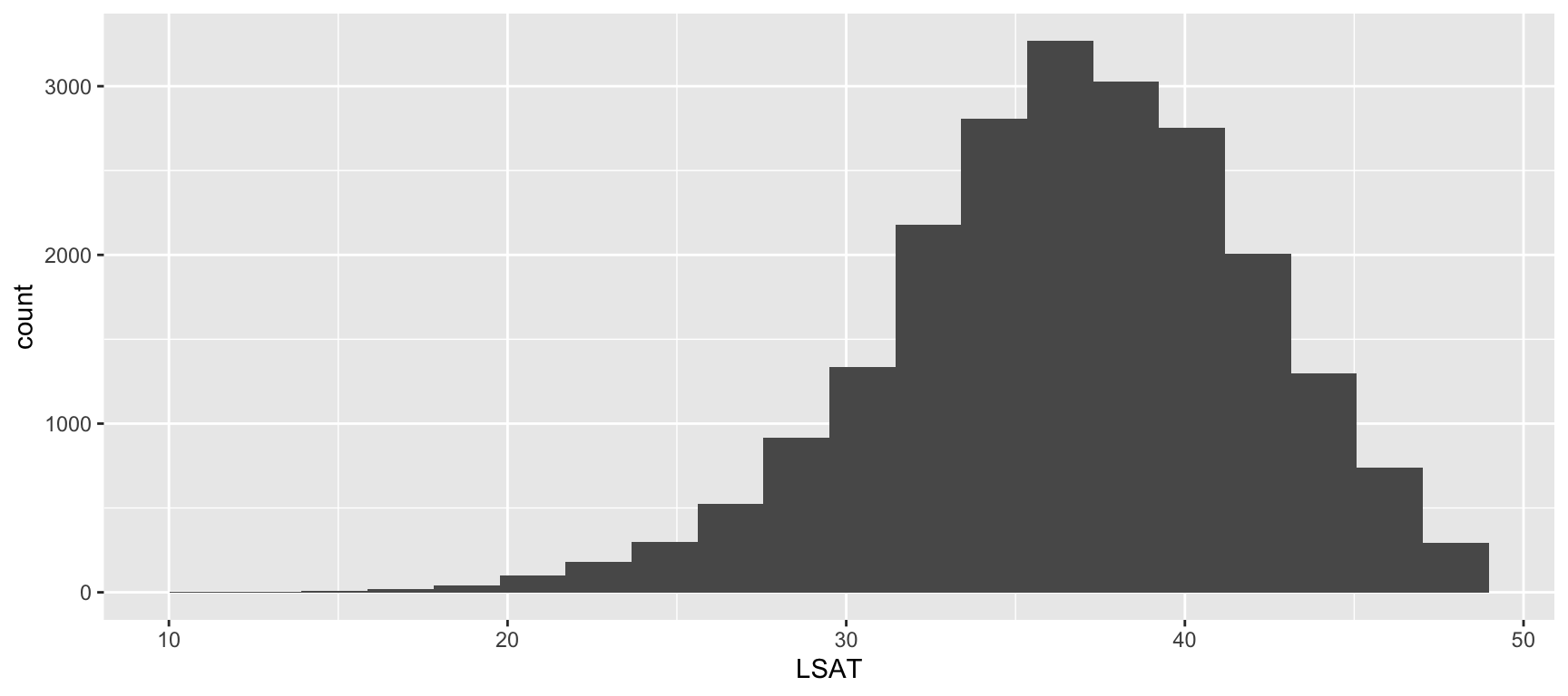
Some Geometries with the law Dataset
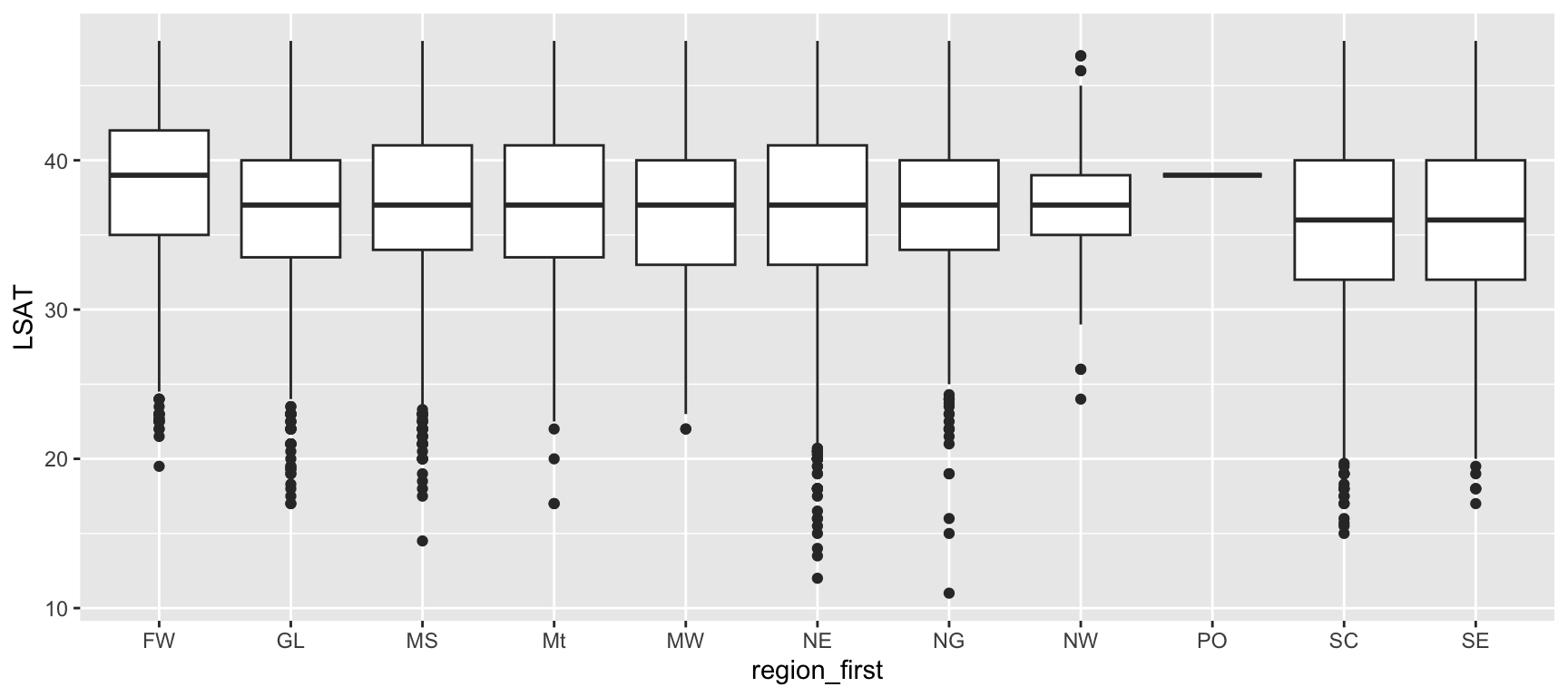
ggplot(
  data = law,
  mapping = aes(x = LSAT)
) +
  geom_histogram(bins = 20)

ggplot(
  data = law,
  mapping = aes(x = region_first, y = LSAT)
) +
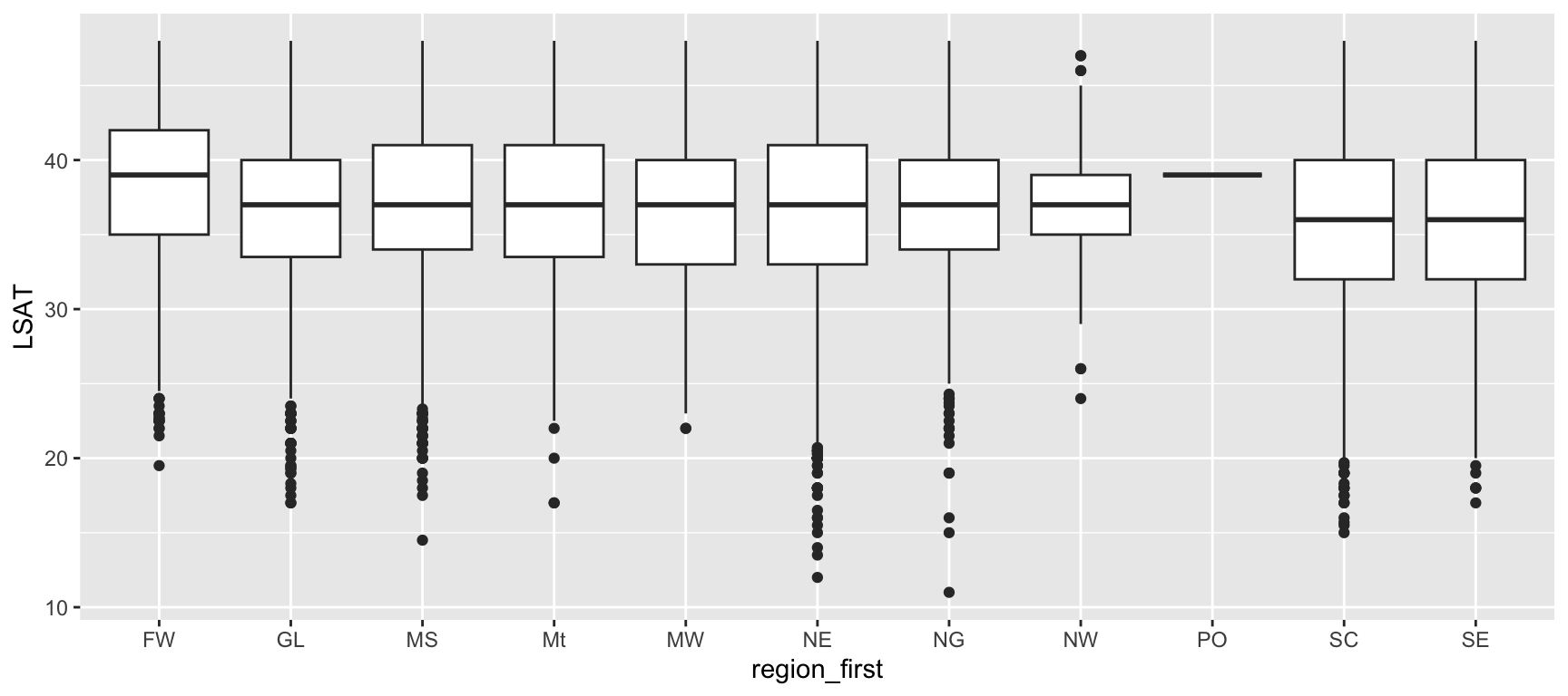
  geom_boxplot()

How to Choose the Right Geometry? Start From the Data

  • Before picking a geometry, ask yourself: how many variables am I plotting, and what type is each one (categorical or continuous)?

  • The answer almost always narrows the choice down to one or two sensible geometries.

  • Choosing a geometry is usually not a matter of taste. It follows directly from the types of the variables you want to display.

A Decision Tree for Common Cases

Situation Recommended geometry Example (law)
1 categorical variable geom_bar() Count of students per region_first
1 continuous variable geom_histogram() or geom_density() Distribution of LSAT
1 categorical x 1 continuous geom_boxplot() or geom_violin() LSAT by region_first
2 continuous variables geom_point(), optionally with geom_smooth() LSAT vs. UGPA
2 categorical variables geom_count() or a filled geom_bar() region_first vs. first_pf
Continuous variable over an ordered / time index geom_line() Average LSAT across successive cohorts
Pre-computed summary values per category geom_col() Mean UGPA per region_first, after summarise()

Common Mistake

Using geom_point() when one variable is categorical often produces an uninformative plot (points stacked in vertical strips). If one of your two variables is categorical, a boxplot, violin plot, or bar chart is almost always more informative than a scatterplot.

Same Question, Different Geometries

Suppose we want to compare UGPA across regions. Several geometries can technically answer this question, but they emphasize different things.
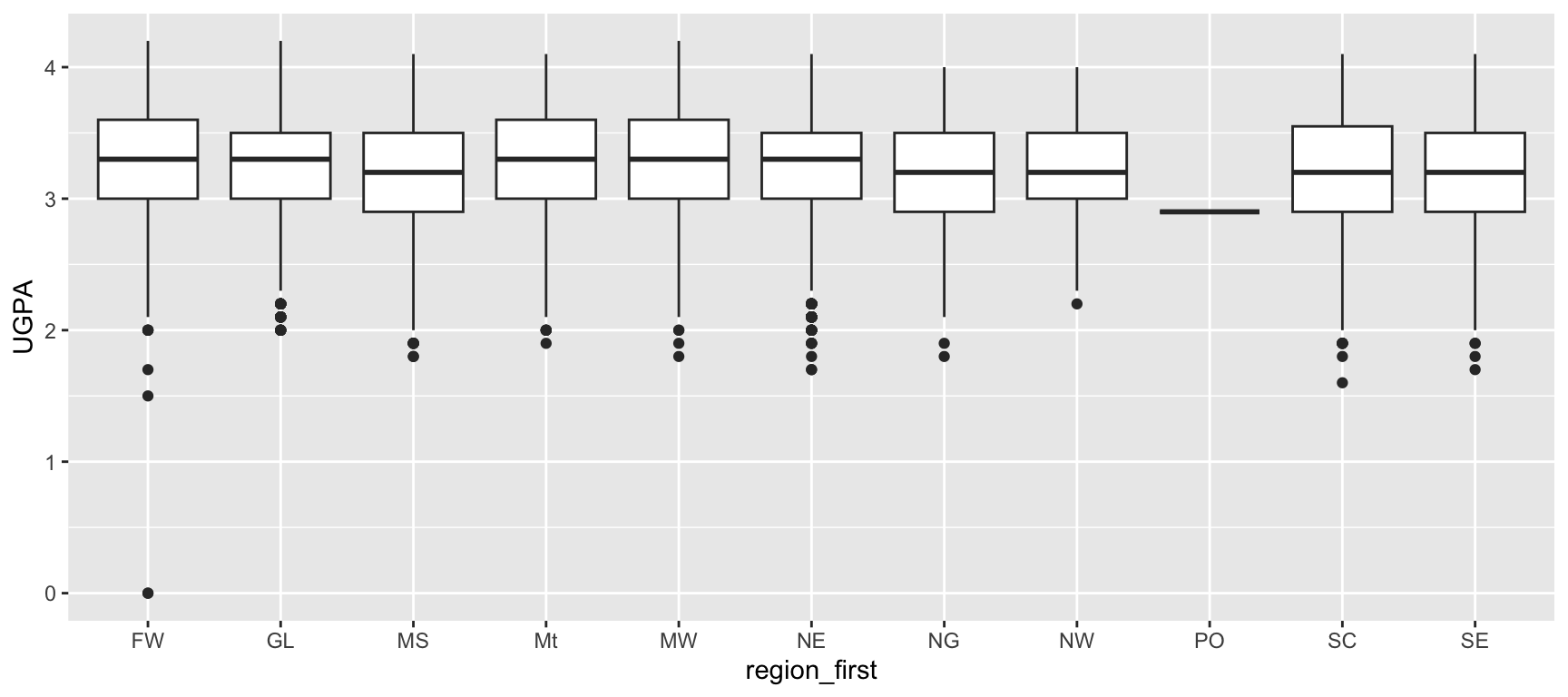
ggplot(
  data = law,
  mapping = aes(
    x = region_first, y = UGPA
  )
) +
  geom_boxplot()

Shows median, spread, and outliers.

ggplot(
  data = law,
  mapping = aes(
    x = region_first, y = UGPA
  )
) +
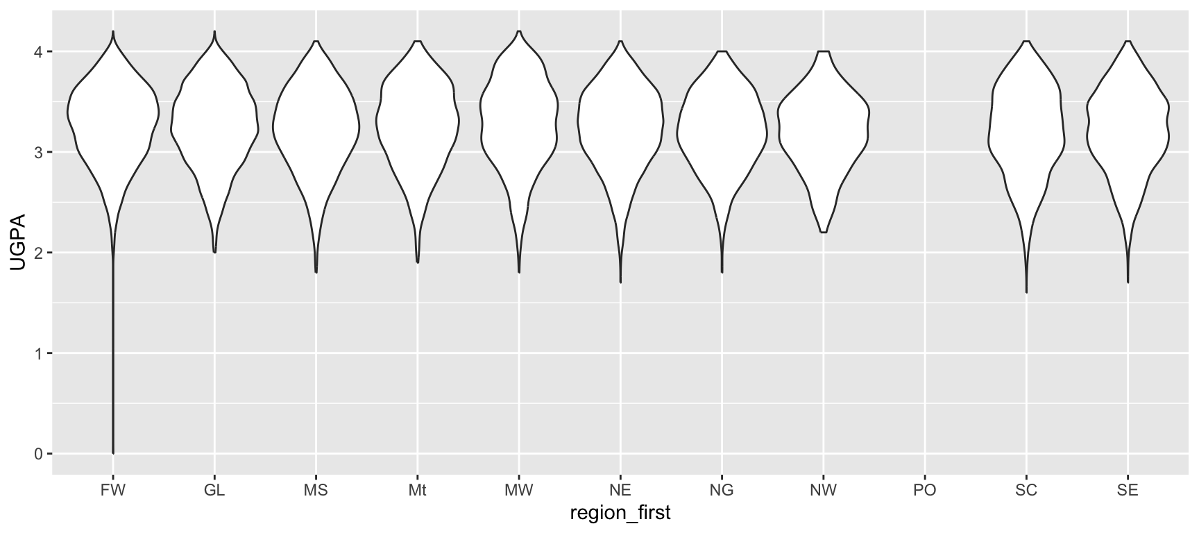
  geom_violin()

Shows the full shape of the distribution.
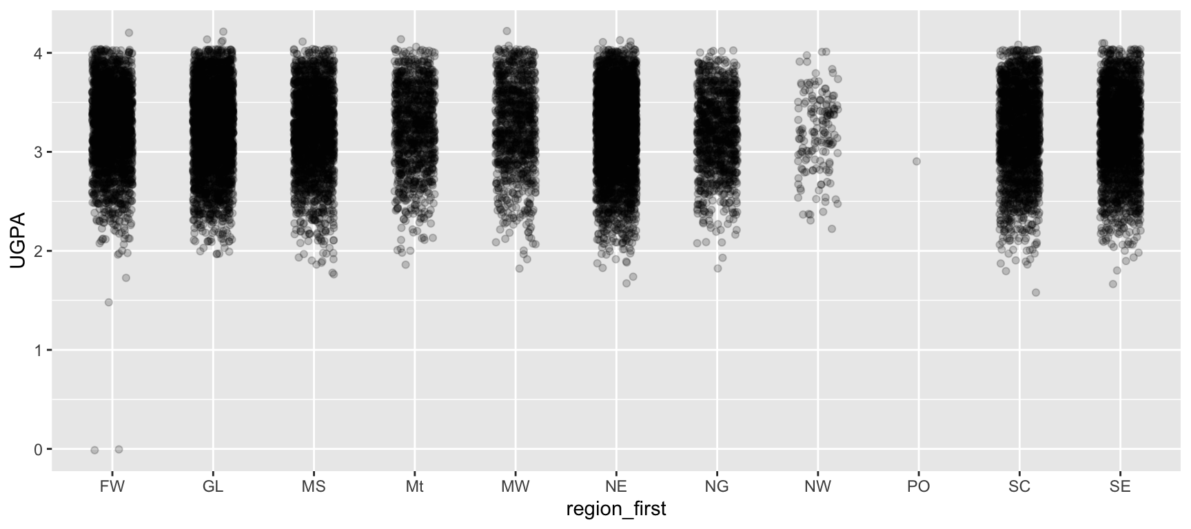
ggplot(
  data = law,
  mapping = aes(
    x = region_first, y = UGPA
  )
) +
  geom_jitter(alpha = 0.2, width = 0.2)

Shows every individual observation.

There is no single right answer. The right choice depends on what you want the readers to notice.

Task 4: Picking the Right Geometry

For each of the following questions about the law dataset, without writing any code yet: (a) identify the type of each variable involved (categorical or continuous), and (b) name the geometry you would use to answer it.

  1. How many students are there in each region_first?
  2. What does the distribution of sander_index look like across the whole dataset?
  3. Do students in the "Far West" tend to have a higher LSAT than students in the "Northeast"?
  4. Is there a relationship between UGPA and ZFYA?
  5. What proportion of students passed the bar on the first attempt (first_pf), broken down by sex?

Once you have answered (a) and (b) for all five questions, write and run the corresponding {ggplot2} code for questions 3 and 4.

Check Your Reasoning

Compare your answers with a neighbour before writing any code. If you picked different geometries for the same question, discuss why, there may be more than one reasonable answer.

Statistical Transformations

Every Geometry Has a Default stat

  • Behind every geom_*() is a statistical transformation (stat_*()) that decides what is actually computed from your data before it is drawn.
  • Most of the time this happens invisibly, which is why you have already been using stats without naming them.

Two Examples You Have Already Used

  • geom_histogram() does not draw your raw data:

    • it first counts how many observations fall into each bin (stat_bin()), then draws bars.
  • geom_bar() does not draw your raw data either:

    • it first counts how many rows fall into each category (stat_count()), then draws bars.

Seeing the Default stat at Work

The bins argument of geom_histogram() is really an argument of its underlying stat_bin(), controlling how many intervals the data is grouped into.
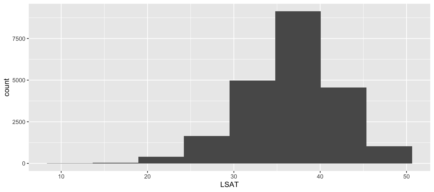
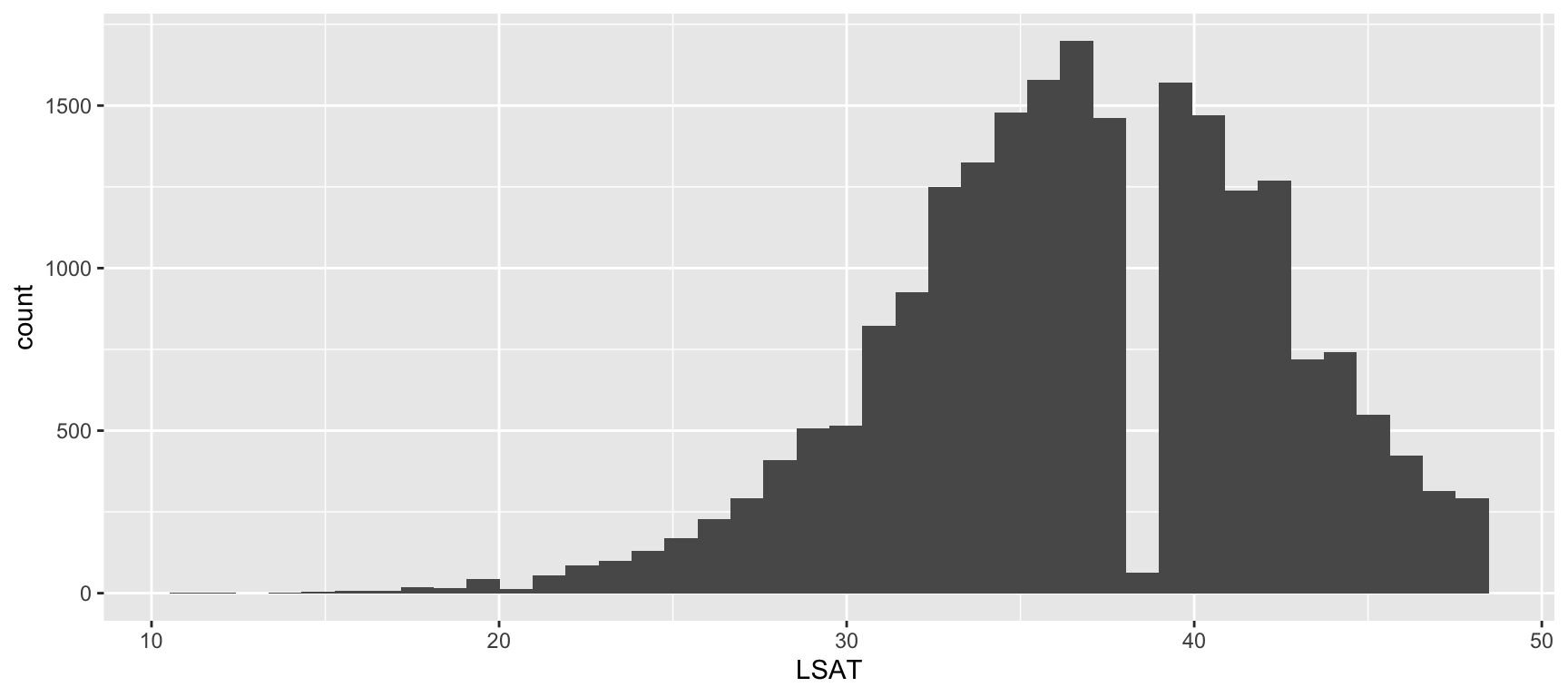
ggplot(
  data = law,
  mapping = aes(x = LSAT)
) +
  geom_histogram(bins = 8)

Few, wide bins.

ggplot(
  data = law,
  mapping = aes(x = LSAT)
) +
  geom_histogram(bins = 40)

Many, narrow bins.

Changing bins does not change the data, only how the stat summarizes it before drawing. Always try a few different bin counts before settling on one.

When Your Data Is Already Summarized

Sometimes you have already computed the values you want to plot (for example, with a prior summarise()), and you do not want {ggplot2} to count or aggregate anything further.
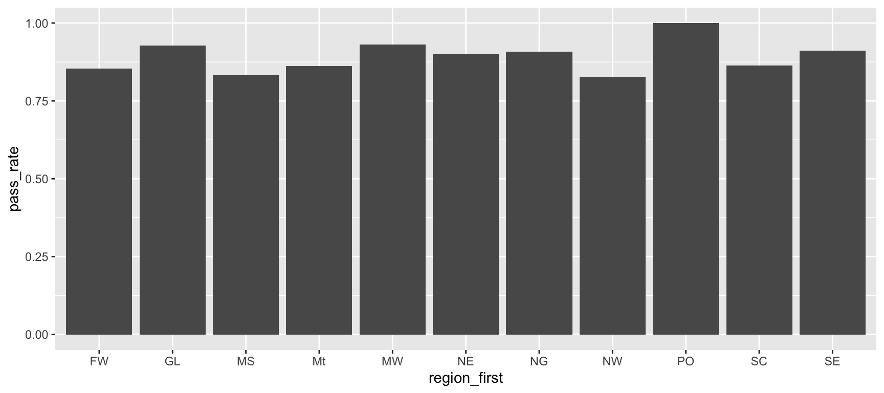
region_pass_rate <- law |>
  group_by(region_first) |>
  summarise(
    pass_rate = mean(first_pf, na.rm = TRUE), 
    .groups = "drop"
  )

ggplot(
  data = region_pass_rate,
  mapping = aes(x = region_first, y = pass_rate)
) +
  geom_col()

geom_col() vs. geom_bar(), Revisited

geom_col() uses stat_identity(): it trusts that the y value you provide is already the bar height, and draws it as-is, with no counting or aggregation. This is why geom_col() always needs both x and y mapped, while geom_bar() only needs x.

Overriding the Default stat

Every geom_*() has a stat argument that can be changed. This lets you skip an explicit summarise() step and compute a summary directly inside the plot.
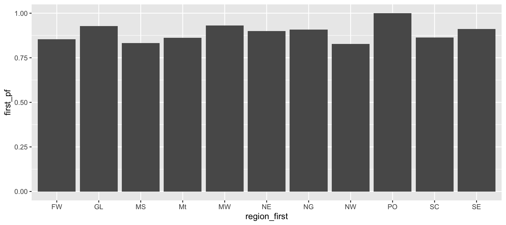
ggplot(
  data = law,
  mapping = aes(x = region_first, y = first_pf)
) +
  geom_bar(stat = "summary", fun = "mean")

Reading This Code

  • stat = "summary" tells geom_bar() not to count rows, but to compute a summary value instead.
  • fun = "mean" tells it which summary to compute, here the mean of first_pf within each region_first group.
  • The result is the same bar chart as the pass-rate plot on the previous slide, but without a separate summarise() step beforehand.

Two Equivalent Paths

Summarising first with {dplyr} then plotting with geom_col(), or plotting directly from raw data with geom_bar(stat = "summary", fun = "mean"), produce the same result. The {dplyr} path is often clearer to read and debug; the direct path is faster when you just want a quick look.

Task 5: Choosing the Right Geometry

The following code raises an error:

region_pass_rate <- law |>
  group_by(region_first) |>
  summarise(pass_rate = mean(first_pf, na.rm = TRUE), .groups = "drop")

ggplot(
  data = region_pass_rate,
  mapping = aes(x = region_first, y = pass_rate)
) +
  geom_bar()
  1. Run the code and read the error message. What is geom_bar() trying to do with pass_rate that causes the problem?
  2. Fix the code so that it correctly displays one bar per region, with bar height equal to pass_rate.
  3. As a sanity check, produce the same plot a different way: starting from the raw law dataset (not the summarised region_pass_rate), use geom_bar() with stat = "summary" and fun = "mean" on first_pf, following the pattern shown earlier in this section. Confirm the two plots look identical.

Scales

What Does a Scale Do?

  • A scale controls how values in your data are translated into values you can actually see: positions on an axis, shades of colour, sizes of points.

  • Every aesthetic you map has a scale attached to it, even when you never call one explicitly. {ggplot2} picks sensible defaults automatically.

  • Naming convention: scale_<aesthetic>_<type>(). For example:

    • scale_x_continuous() or scale_colour_manual().

You Have Already Been Using Scales

Every time an x axis showed numbers, or a colour mapping produced a legend, a default scale was working behind the scenes. Calling scale_*() explicitly lets you override that default.

Continuous vs. Discrete Scales

Continuous Scale

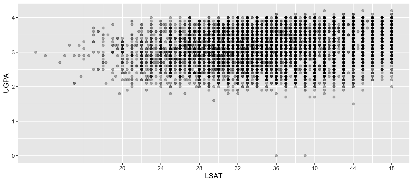
Used for numeric variables. Produces evenly spaced tick marks or a colour gradient.
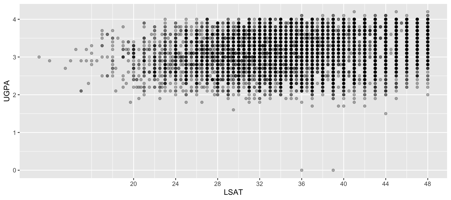
ggplot(
  data = law,
  mapping = aes(x = LSAT, y = UGPA)
) +
  geom_point(alpha = 0.3) +
  scale_x_continuous(breaks = seq(20, 48, by = 4))

Discrete Scale

Used for categorical variables. Produces one distinct position, colour, or shape per category.

ggplot(
  data = law,
  mapping = aes(x = region_first, y = LSAT)
) +
  geom_boxplot() +
  scale_x_discrete(
    labels = abbreviate
  )

Adjusting Axis Breaks and Limits

Two arguments come up constantly when adjusting a continuous scale:

  • breaks: where tick marks and labels appear.
  • limits: the range of values displayed.
ggplot(
  data = law,
  mapping = aes(x = LSAT, y = UGPA)
) +
  geom_point(alpha = 0.3) +
  scale_y_continuous(
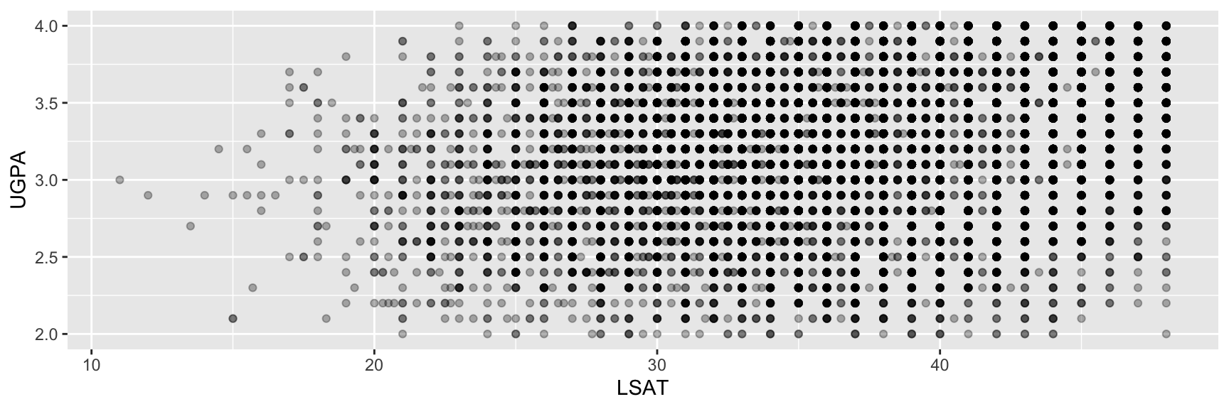
    limits = c(2, 4), breaks = seq(2, 4, by = 0.5)
  )

limits Can Silently Drop Data

  • Setting limits on a scale removes any data point falling outside that range before drawing (with a warning).

  • If you only want to zoom in without discarding data, use coord_cartesian(ylim = ...) instead, which we will cover in the section on coordinate systems.

Log Scales for Skewed Data

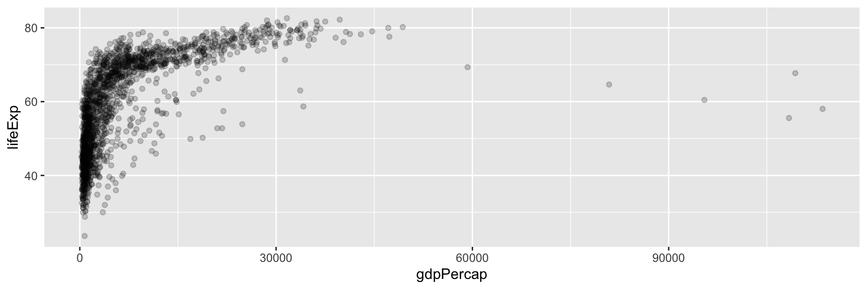
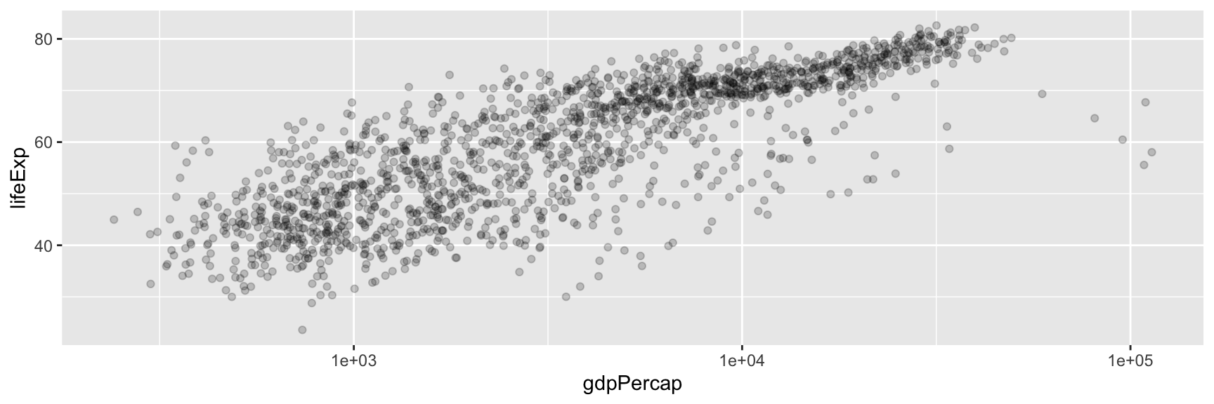
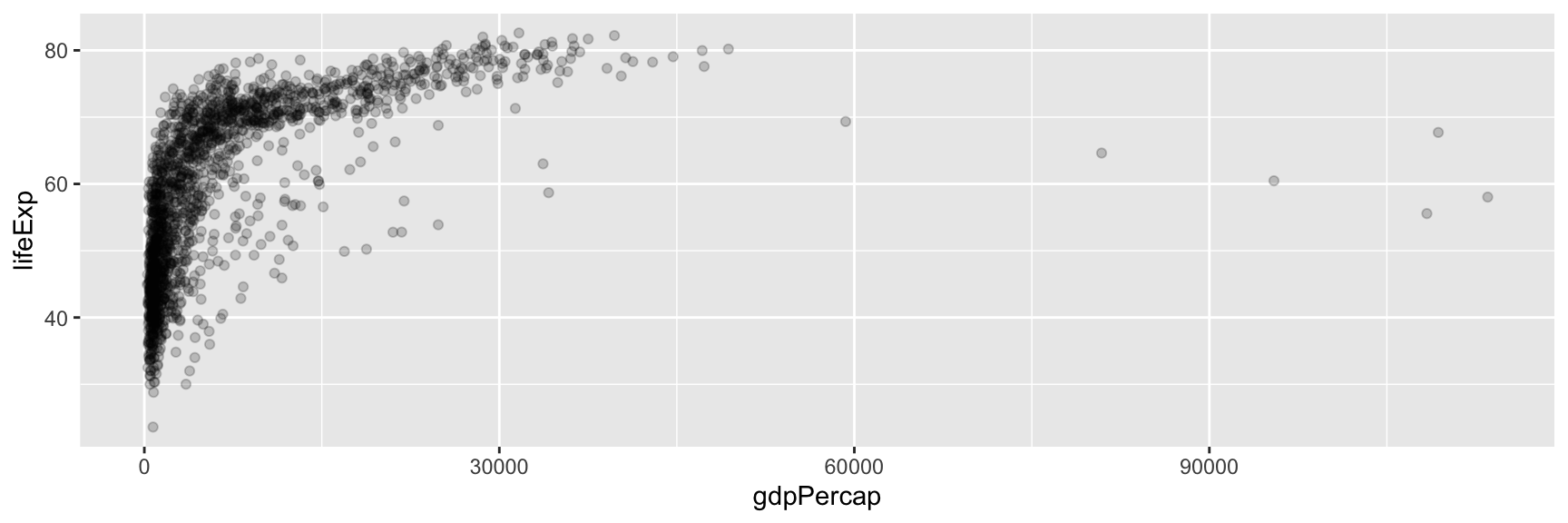
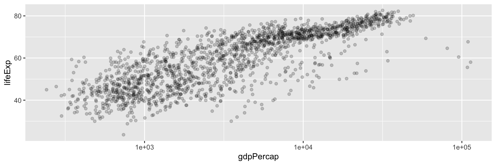
Some variables (income, population, GDP) span several orders of magnitude and are hard to read on a linear axis. A log scale can help.

data(gapminder, package = "gapminder")

ggplot(
  data = gapminder,
  mapping = aes(x = gdpPercap, y = lifeExp)
) +
  geom_point(alpha = 0.2)

Most countries crowded near the left.

ggplot(
  data = gapminder,
  mapping = aes(x = gdpPercap, y = lifeExp)
) +
  geom_point(alpha = 0.2) +
  scale_x_log10()

Spread out, easier to compare.

When to Reach for a Log Scale?

Consider scale_x_log10() or scale_y_log10() whenever a variable is strictly positive and heavily right-skewed.

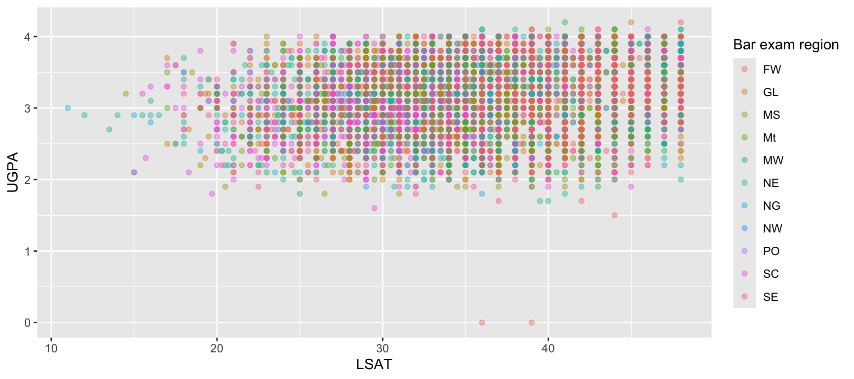
Renaming Legend Titles Through Scales

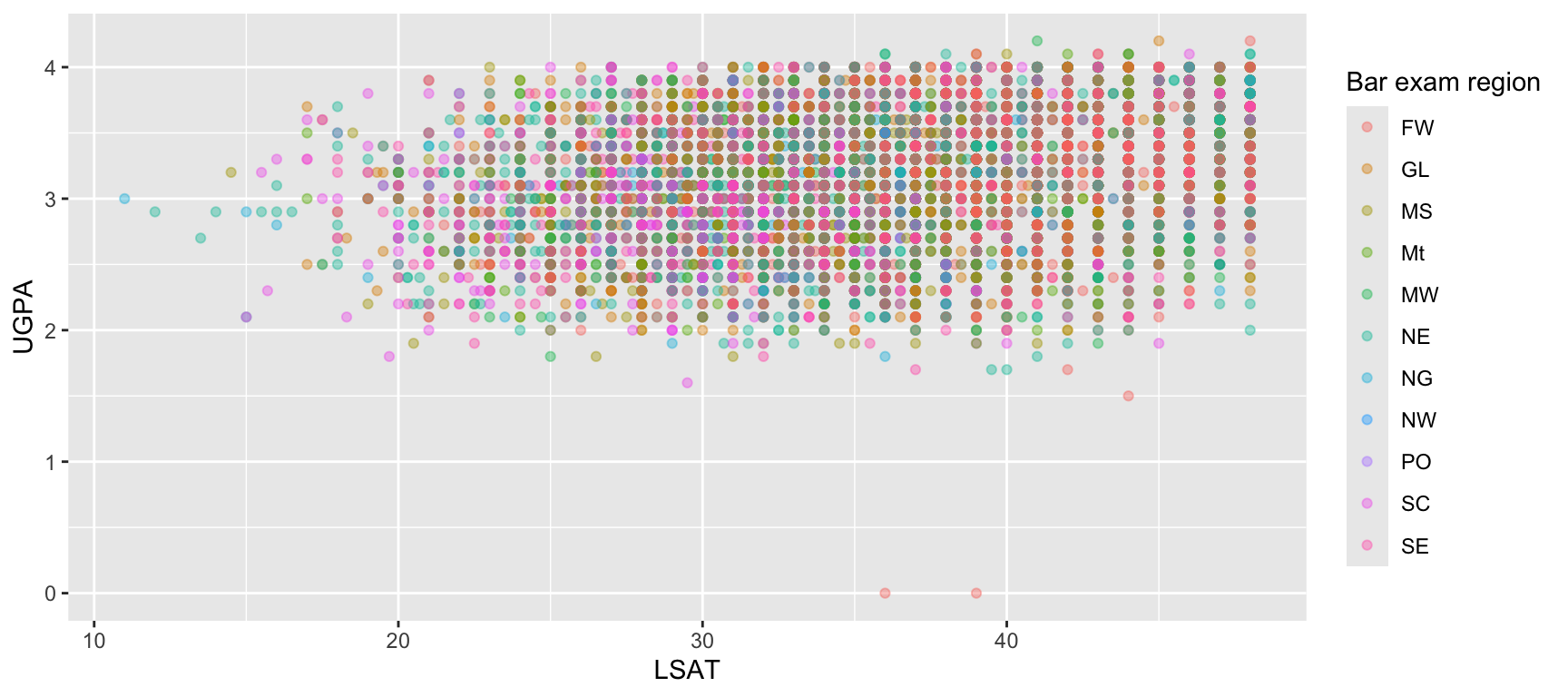
Since a mapped aesthetic’s legend is produced by its scale, the scale is also where you rename that legend, not labs() alone (though labs() offers a shortcut, covered later in this chapter).

ggplot(
  data = law,
  mapping = aes(x = LSAT, y = UGPA, colour = region_first)
) +
  geom_point(alpha = 0.4) +
  scale_colour_discrete(name = "Bar exam region")

Task 6: Adjusting Scales

Using the gapminder dataset (data(gapminder, package = "gapminder")):

  1. Create a scatterplot of gdpPercap (x-axis) against lifeExp (y-axis).
  2. Apply a log scale to the x-axis.
  3. Adjust the x-axis breaks so that they appear at 100, 1000, 10000, and 100000.
  4. Map continent to colour, and rename the resulting legend title to "Continent" using the appropriate scale_*() function.
  5. Restrict the y-axis to the range 30 to 85 using scale_y_continuous(limits = ...). Does this remove any data? How could you check?

Scales

What Does a Scale Do?

  • A scale controls how values in your data are translated into values you can actually see: positions on an axis, shades of colour, sizes of points.

  • Every aesthetic you map has a scale attached to it, even when you never call one explicitly. {ggplot2} picks sensible defaults automatically.

  • Naming convention: scale_<aesthetic>_<type>(). For example:

    • scale_x_continuous() or scale_colour_manual().

You Have Already Been Using Scales

Every time an x axis showed numbers, or a colour mapping produced a legend, a default scale was working behind the scenes. Calling scale_*() explicitly lets you override that default.

Continuous vs. Discrete Scales

Continuous Scale

Used for numeric variables. Produces evenly spaced tick marks or a colour gradient.
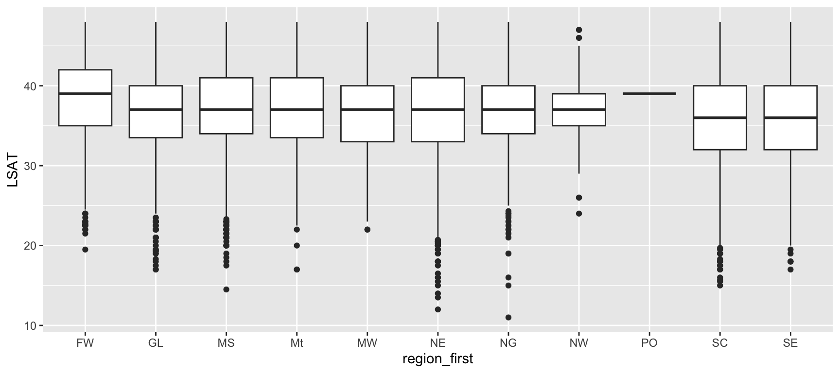
ggplot(
  data = law,
  mapping = aes(x = LSAT, y = UGPA)
) +
  geom_point(alpha = 0.3) +
  scale_x_continuous(breaks = seq(20, 48, by = 4))

Discrete Scale

Used for categorical variables. Produces one distinct position, colour, or shape per category.

ggplot(
  data = law,
  mapping = aes(x = region_first, y = LSAT)
) +
  geom_boxplot() +
  scale_x_discrete(
    labels = abbreviate
  )

Adjusting Axis Breaks and Limits

Two arguments come up constantly when adjusting a continuous scale:

  • breaks: where tick marks and labels appear.
  • limits: the range of values displayed.
ggplot(
  data = law,
  mapping = aes(x = LSAT, y = UGPA)
) +
  geom_point(alpha = 0.3) +
  scale_y_continuous(
    limits = c(2, 4), breaks = seq(2, 4, by = 0.5)
  )

limits Can Silently Drop Data

  • Setting limits on a scale removes any data point falling outside that range before drawing (with a warning).

  • If you only want to zoom in without discarding data, use coord_cartesian(ylim = ...) instead, which we will cover in the section on coordinate systems.

Log Scales for Skewed Data

Some variables (income, population, GDP) span several orders of magnitude and are hard to read on a linear axis. A log scale can help.
data(gapminder, package = "gapminder")

ggplot(
  data = gapminder,
  mapping = aes(x = gdpPercap, y = lifeExp)
) +
  geom_point(alpha = 0.2)

Most countries crowded near the left.

ggplot(
  data = gapminder,
  mapping = aes(x = gdpPercap, y = lifeExp)
) +
  geom_point(alpha = 0.2) +
  scale_x_log10()

Spread out, easier to compare.

When to Reach for a Log Scale?

Consider scale_x_log10() or scale_y_log10() whenever a variable is strictly positive and heavily right-skewed.

Renaming Legend Titles Through Scales

Since a mapped aesthetic’s legend is produced by its scale, the scale is also where you rename that legend, not labs() alone (though labs() offers a shortcut, covered later in this chapter).
ggplot(
  data = law,
  mapping = aes(x = LSAT, y = UGPA, colour = region_first)
) +
  geom_point(alpha = 0.4) +
  scale_colour_discrete(name = "Bar exam region")

Task 6: Adjusting Scales

Using the gapminder dataset (data(gapminder, package = "gapminder")):

  1. Create a scatterplot of gdpPercap (x-axis) against lifeExp (y-axis).
  2. Apply a log scale to the x-axis.
  3. Adjust the x-axis breaks so that they appear at 100, 1000, 10000, and 100000.
  4. Map continent to colour, and rename the resulting legend title to "Continent" using the appropriate scale_*() function.
  5. Restrict the y-axis to the range 30 to 85 using scale_y_continuous(limits = ...). Does this remove any data? How could you check?

Colour Choices

Why Colour Deserves Special Attention

  • Colour is one of the most frequently mapped aesthetics, and one of the easiest to get wrong.
  • A poor colour choice can make a plot unreadable for colourblind readers, or visually imply relationships that are not in the data.
  • Choosing a colour scale is not a matter of taste: it depends on the type of variable being encoded.

Three Questions to Ask

  1. Is the variable categorical or continuous?
  2. If continuous, does it have a meaningful zero or midpoint (a natural point to diverge from)?
  3. Will this plot be viewed by colourblind readers, or printed in greyscale?

Three Families of Colour Scales

Qualitative

For categorical variables with no inherent order. Colours should be visually distinct, not ordered.

Example: region_first, continent

Sequential

For continuous variables where only magnitude matters, low to high.

Example: gdpPercap, population density

Diverging

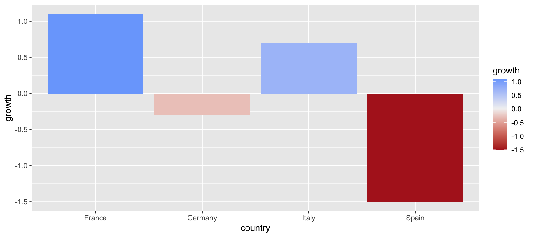
For continuous variables with a meaningful midpoint, where values above and below are qualitatively different.

Example: GDP growth (positive vs. negative), temperature anomaly (above vs. below average)

Do Not Use a Diverging Palette Without a Midpoint

A diverging palette (for example, red to white to blue) implies that the middle of your data is special. Using one on a variable without a natural zero or reference point (like LSAT scores) misleadingly suggests two opposite categories where none exist.

Sequential vs. Diverging, in Practice

Sequential: UGPA (No Natural Midpoint)
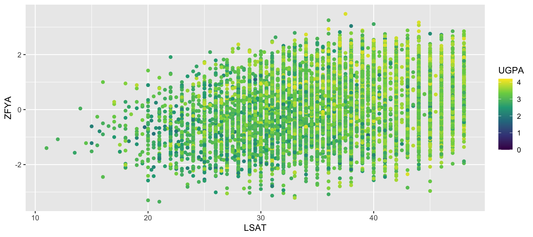
ggplot(
  data = law,
  mapping = aes(x = LSAT, y = ZFYA, colour = UGPA)
) +
  geom_point() +
  scale_colour_viridis_c()

Diverging: growth (Meaningful Zero)

growth <- tibble(
  country = c("France", "Germany", "Italy", "Spain"),
  growth = c(1.1, -0.3, 0.7, -1.5)
)

ggplot(
  data = growth,
  mapping = aes(x = country, y = growth, fill = growth)
) +
  geom_col() +
  scale_fill_gradient2(
    low = "firebrick", mid = "grey95", high = "dodgerblue",
    midpoint = 0
  )

A Quick Refresher: RGB

  • RGB (Red, Green, Blue) is the most common way computer screens represent colour: every colour is a mix of three light intensities.
  • Each channel typically ranges from 0 to 255 (or 0 to 1 on a normalized scale).
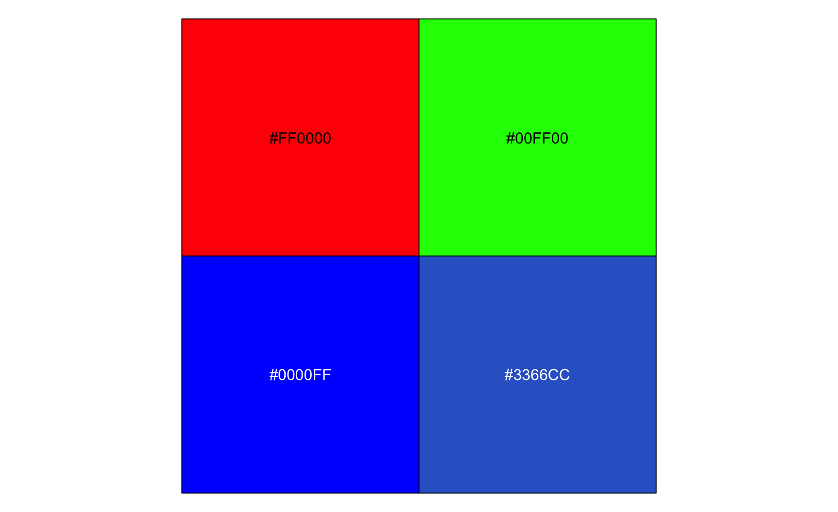
  • R lets you specify colours directly in RGB, for example with rgb() or hexadecimal codes like "#3366CC".
rgb_examples <- tibble(
  name = c(
    "Pure red", "Pure green", 
    "Pure blue", "A mix"
  ),
  hex = c(
    rgb(1, 0, 0),
    rgb(0, 1, 0),
    rgb(0, 0, 1),
    rgb(0.2, 0.4, 0.8)
  )
)

scales::show_col(rgb_examples$hex, labels = TRUE)

Why RGB Is Not Suitable for Choosing Palettes

  • RGB describes how a screen produces a colour, not how a human perceives it.

  • Two RGB colours with the exact same “distance” between their numeric values can look wildly different in perceived brightness or intensity, depending on which channel changed.

    • We will consider in the next slide two colours that each move 50 points along one channel:
      • a baseline colour (grey): (120, 120, 120)
      • +50 on the red channel: (170, 120, 120)
      • +50 on the blue channel: (120, 120, 170)
  • This makes it hard to build a palette in RGB where every colour looks equally distinct or equally important, as can be seen in the example in the next slide.

Same Numeric Distance, Different Perceived Change

Take a single starting grey, and move 50 points (out of 255) along just one RGB channel at a time. Each shift is numerically identical in size.

base <- c(120, 120, 120) # Starting grey #787878

shifts <- tibble(
  name = c(
    "Base grey",
    "+50 on Red channel",
    "+50 on Green channel",
    "+50 on Blue channel"
  ),
  hex = c(
    rgb(base[1], base[2], base[3], maxColorValue = 255),
    rgb(base[1] + 50, base[2], base[3], maxColorValue = 255),
    rgb(base[1], base[2] + 50, base[3], maxColorValue = 255),
    rgb(base[1], base[2], base[3] + 50, maxColorValue = 255)
  )
)

scales::show_col(shifts$hex, labels = TRUE)
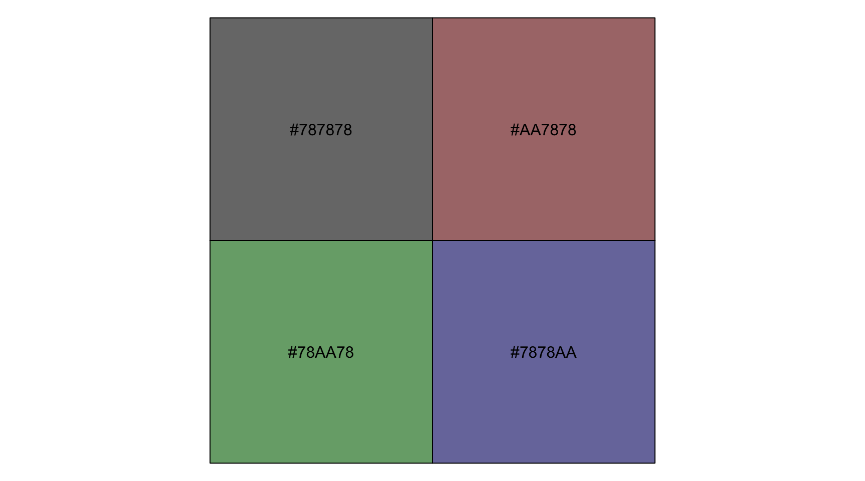
  • All three shifts move a single channel by exactly the same numeric amount.

  • Yet the green shift looks noticeably brighter than the base grey, while the blue shift barely changes perceived brightness at all. Human vision is far more sensitive to green than to blue, a fact the raw RGB numbers do not encode in any way.

Making the Perceptual Gap Explicit

We can quantify this using a standard formula for perceived luminance (the brightness of a colour) from RGB values, which weights each channel very differently:

\[ \text{Luminance} = 0.2126 \times R + 0.7152 \times G + 0.0722 \times B \]

base <- c(120, 120, 120) # Starting grey #787878
luminance <- function(r, g, b) {
  0.2126 * r + 0.7152 * g + 0.0722 * b
}
shifts |>
  mutate(
    perceived_luminance = c(
      luminance(base[1], base[2], base[3]),
      luminance(base[1] + 50, base[2], base[3]),
      luminance(base[1], base[2] + 50, base[3]),
      luminance(base[1], base[2], base[3] + 50)
    ),
    shift = c(perceived_luminance - 120)
  ) |>
  select(name, perceived_luminance, shift)
# A tibble: 4 × 3
  name                 perceived_luminance shift
  <chr>                              <dbl> <dbl>
1 Base grey                           120   0   
2 +50 on Red channel                  131. 10.6 
3 +50 on Green channel                156. 35.8 
4 +50 on Blue channel                 124.  3.61
  • The +50 on green moves perceived luminance about ten times as much as the +50 on blue, despite being numerically identical shifts.
  • HCL (Hue, Chroma, Luminance), another way to represent colours, is designed to avoid this.
  • In HCL, moving the luminance dimension by a given amount produces a consistent perceived brightness change, regardless of hue.

A Simplification, for Teaching Purposes

The full standard first applies a correction step to each channel before this weighted sum. We skip this step for teching purposes without changing the core point that the three channels contribute very unequally to perceived brightness.

The HCL Colour Space

{ggplot2}’s default palette is built using HCL (Hue, Chroma, Luminance), a colour space designed to match how humans actually perceive colour, unlike RGB, which is designed for how screens produce it.

Hue

The type of colour: red, green, blue, purple… Represented as an angle, from 0 to 360 degrees around a wheel.

Chroma

The intensity or saturation of the colour: low chroma looks grey and muted, high chroma looks vivid.

Luminance

The brightness of the colour: low luminance is dark (near black), high luminance is light (near white).

The Hue Wheel

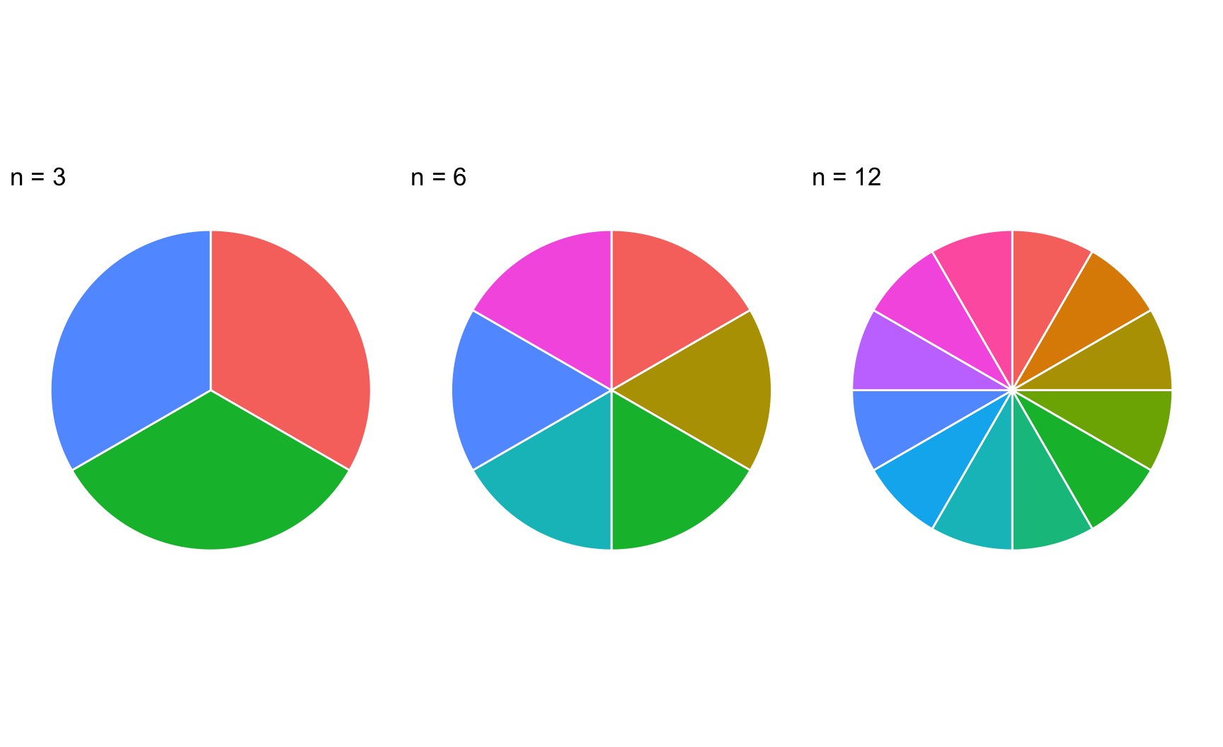
scale_*_hue(), the default discrete colour scale, fixes chroma and luminance and picks n hues evenly spaced in degrees around the wheel, where n is the number of categories.

n <- 6
hue_wheel <- tibble(
  hue = seq(0, 360, length.out = 361)[-361],
  category = cut(hue, breaks = n, labels = FALSE)
)

# Colours actually used by ggplot2's default
# palette for n = 6 categories
default_hues <- scales::hue_pal()(n)

ggplot(hue_wheel, aes(x = hue, y = 1, fill = hue)) +
  geom_tile() +
  scale_fill_gradientn(
    colours = scales::hue_pal()(360),
    guide = "none"
  ) +
  coord_polar() +
  theme_void()


# The n hues ggplot2 picks for a variable with n categ.
scales::show_col(default_hues)

Evenly Spaced in Angle, Not in Perception

Although the hues are mathematically equidistant around the wheel, some adjacent colours (yellows and greens, in particular) look closer together than others (blues and oranges).

This is exactly why the default palette becomes hard to read once you have many categories, and why colourblind readers, who lose an entire dimension of hue discrimination, struggle with it even sooner.

The Same Wheel, More or Fewer Categories

library(patchwork)

show_n_hues <- function(n) {
  cols <- scales::hue_pal()(n)
  tibble(x = seq_len(n), fill = cols) |>
    ggplot(aes(x = x, y = 1, fill = fill)) +
    geom_col(width = 1, colour = "white") +
    scale_fill_identity() +
    coord_polar() +
    theme_void() +
    labs(title = paste0("n = ", n))
}

show_n_hues(3) + show_n_hues(6) + show_n_hues(12)
A Practical Rule of Thumb

As n grows, hues get packed closer together and become harder to tell apart. Beyond roughly 8 categories, consider an alternative encoding entirely (facets, for example) rather than relying on colour alone.

Colourblind-Friendly Palettes

Roughly 1 in 12 men and 1 in 200 women have some form of colour vision deficiency, most commonly difficulty distinguishing red from green.

viridis

Perceptually uniform, colourblind-safe by design, works for both sequential and qualitative data.
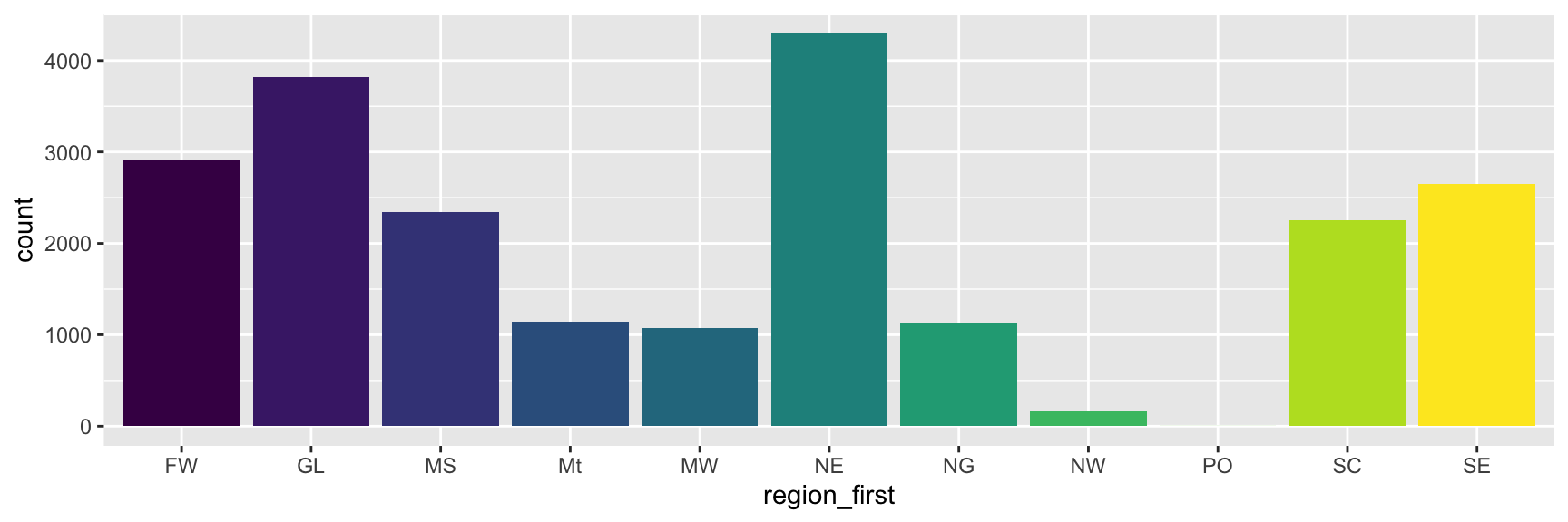
ggplot(
  data = law,
  mapping = aes(x = region_first, fill = region_first)
) +
  geom_bar() +
  scale_fill_viridis_d() +
  guides(fill = "none")

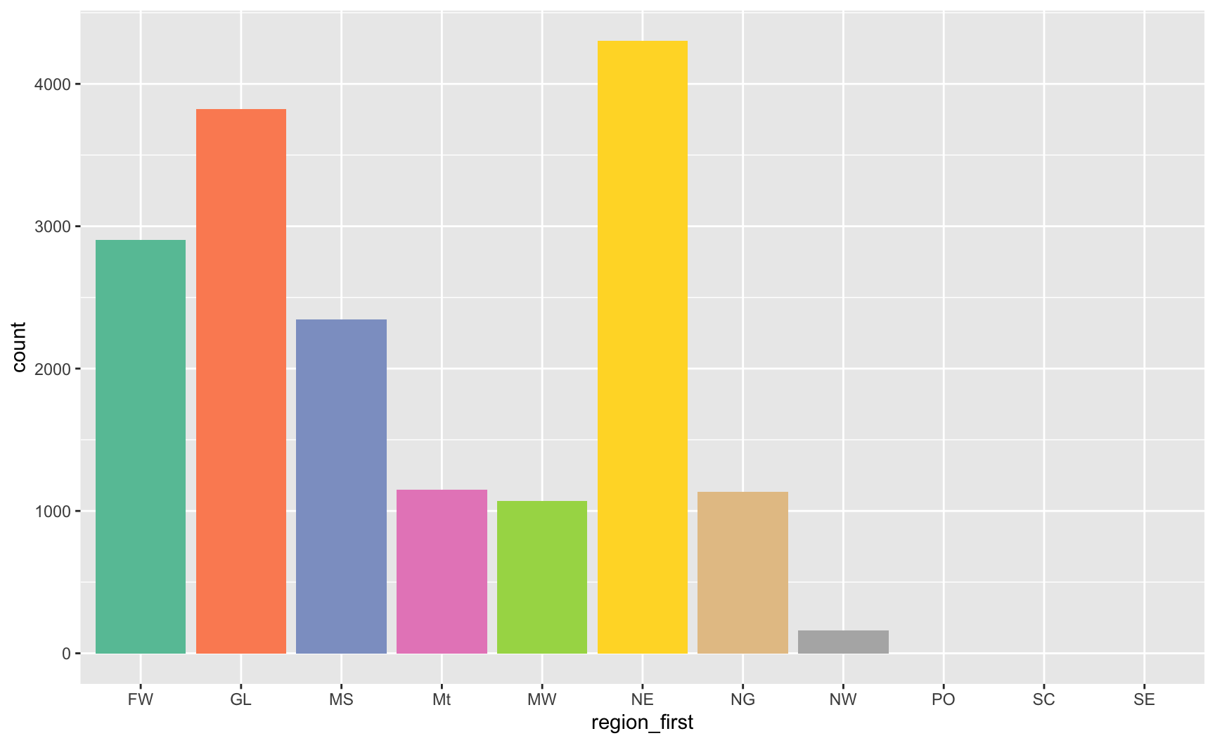
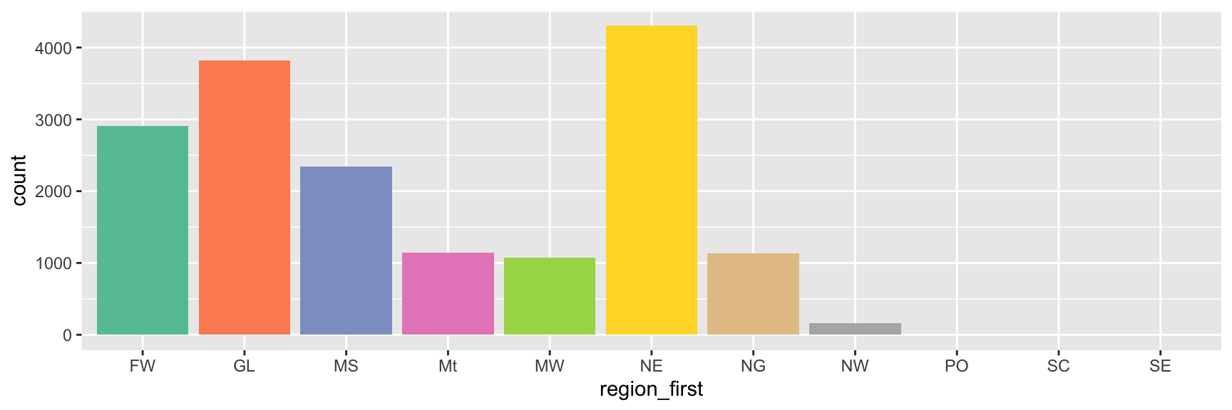
ColorBrewer

Curated palettes for qualitative, sequential, and diverging data, several explicitly colourblind-safe.

ggplot(
  data = law,
  mapping = aes(x = region_first, fill = region_first)
) +
  geom_bar() +
  scale_fill_brewer(palette = "Set2") +
  guides(fill = "none")

More Details on ColorBrewer

ColorBrewer is a widely used set of palettes originally designed for maps, and built into {ggplot2} via scale_*_brewer() (discrete) and scale_*_distiller() (continuous).

  • Palettes are organised into the same three families discussed earlier: qualitative, sequential, and diverging, so picking one is a matter of matching your variable type to the right family.
  • Each palette has a name (for example "Set2", "Blues", "RdBu") and the ColorBrewer website flags which palettes are colourblind-safe, print-friendly, and photocopy-safe.
  • RColorBrewer::display.brewer.all() displays every available palette at once, grouped by family, directly in R.
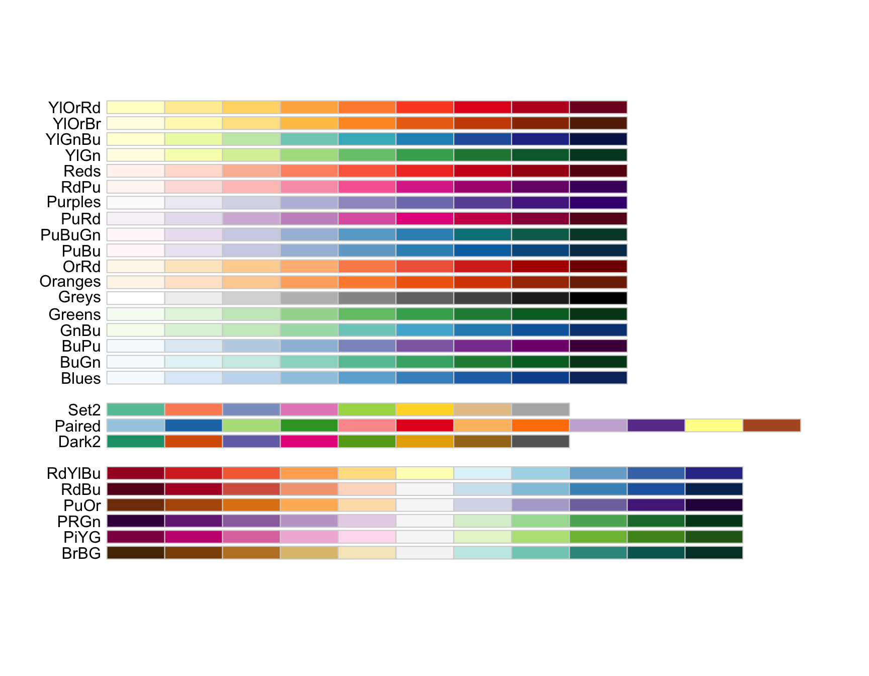
The colorblind-friendly palettes from RColorBrewer:

RColorBrewer::display.brewer.all(colorblindFriendly = TRUE)

Two Reliable Defaults

  • When in doubt:

    • reach for scale_colour_viridis_c() / scale_fill_viridis_c() for continuous data,
    • or scale_colour_viridis_d() / scale_fill_viridis_d() for discrete data.
  • They are colourblind-friendly and print reasonably well in greyscale.

  • For more on colour blindness, including some additional palettes, check this tool https://davidmathlogic.com/colorblind (Nichols 2018)

Checking Your Own Plots

It is good practice to check what a plot looks like to a colourblind reader before sharing it widely.

  • The {colorblindr} package can simulate common types of colour vision deficiency on an existing {ggplot2} plot.
  • A quick manual check: if you can still tell every category apart after converting the plot to greyscale, colourblind readers will likely fare reasonably well too.

Checking Your Own Plots

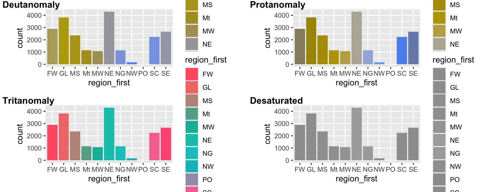
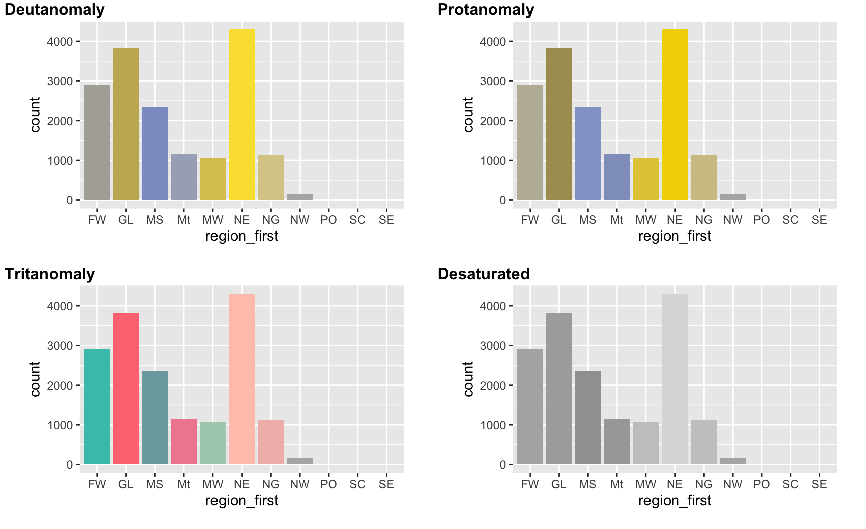
  • The cvd_grid() function from {colorblindr} will apply color vision deficiency simulations to a ggplot object (eutanopia, protanopia, tritanopia simulations).
  • cvd_grid() also displays a complete desaturation which allows to preview images as they would appear printed by black/white printers.
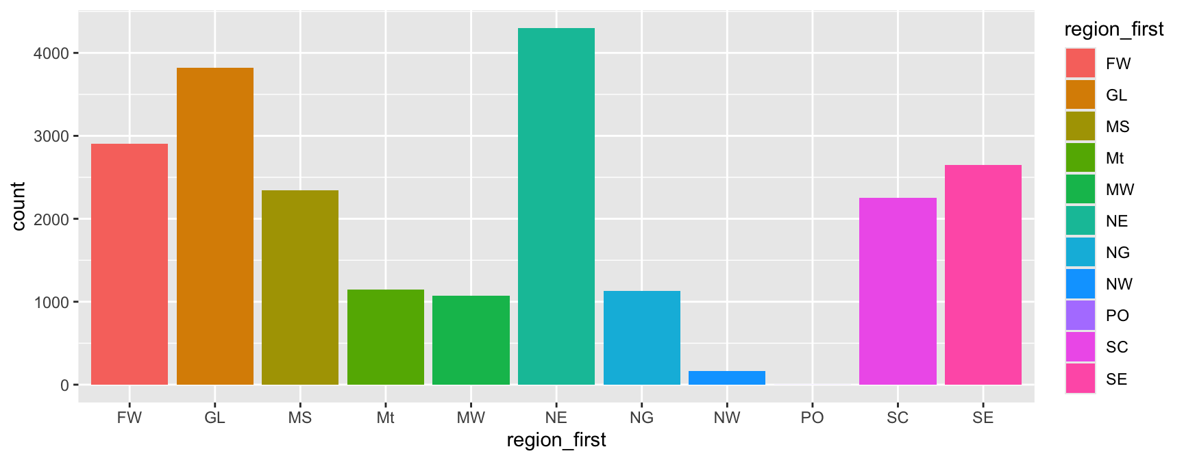
p <- ggplot(
  data = law,
  mapping = aes(x = region_first, fill = region_first)
) +
  geom_bar()
p

# remotes::install_github("wilkelab/cowplot")
# remotes::install_github("clauswilke/colorblindr")
library(colorblindr)
cvd_grid(p)

Checking Your Own Plots

p_2 <- ggplot(
  data = law,
  mapping = aes(x = region_first, fill = region_first)
) +
  geom_bar() +
  scale_fill_brewer(palette = "Set2") +
  guides(fill = "none")
p_2

cvd_grid(p_2)

Task 7: Choosing a Colour Scale

For each situation below, decide whether a qualitative, sequential, or diverging colour scale is appropriate, and justify your choice in one sentence:

  1. Mapping sex to colour in a scatterplot of LSAT against UGPA.
  2. Mapping sander_index (a composite score, always positive) to colour.
  3. Mapping a variable measuring each region’s pass rate relative to the national average (positive means above average, negative means below).
  4. Mapping region_first to colour in a bar chart.

Then, using the law dataset:

  1. Produce the plot from Question 1, using a colourblind-friendly qualitative palette of your choice (viridis or ColorBrewer).
  2. Produce a plot mapping sander_index to colour (any two continuous variables of your choice on x and y), using an appropriate sequential viridis scale.

Groups

The Problem Groups Solve

Some geometries need to know which rows belong together before they can draw anything sensible, most obviously geom_line(), which has to decide in what order to connect points.

A Motivating Question

Suppose we track average LSAT across successive region_first groups over some ordered index. If we simply map x and y with no further information, how does {ggplot2} know which points belong to the same line?

By default, {ggplot2} assumes all rows belong to a single group, unless something in the plot tells it otherwise.

When Discrete Aesthetics Create Groups For You

Mapping a discrete aesthetic (colour, fill, linetype, shape) automatically splits the data into groups, one per level, and most geometries handle each group separately without any extra work.
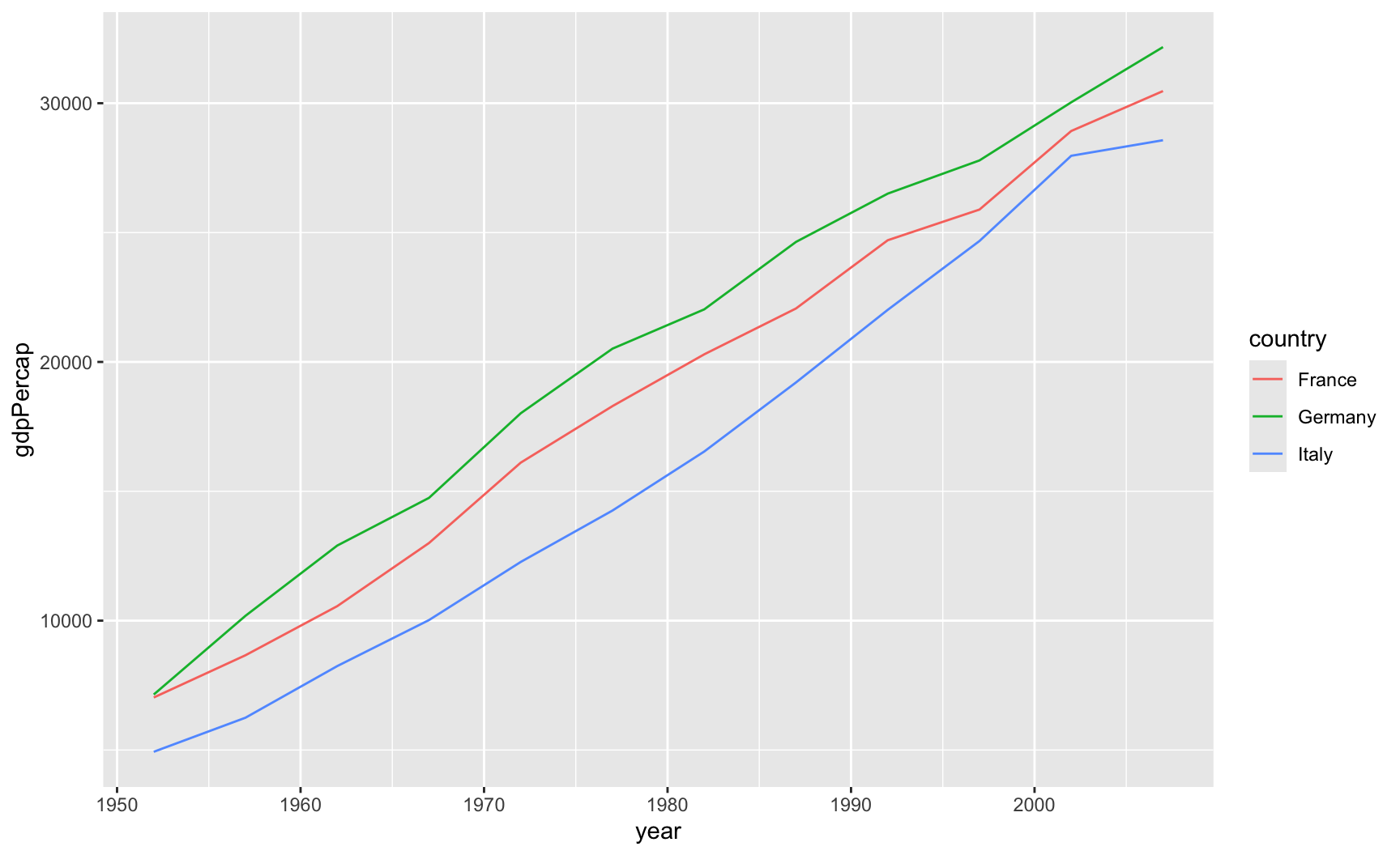
europe_gdp <- gapminder |>
  filter(
    continent == "Europe", 
    country %in% c("France", "Germany", "Italy")
  )

ggplot(
  data = europe_gdp,
  mapping = aes(
    x = year, y = gdpPercap, 
    colour = country
  )
) +
  geom_line()

  • Mapping colour = country implicitly groups the data by country as well.
  • geom_line() draws one connected line per group, which is exactly what we want here.

No Discrete Aesthetic Mapped

If you want multiple lines but have not mapped any discrete aesthetic (for example, because colour is not needed, or is mapped to something continuous), {ggplot2} has no way to know the data should be split. The group aesthetic solves this issue.
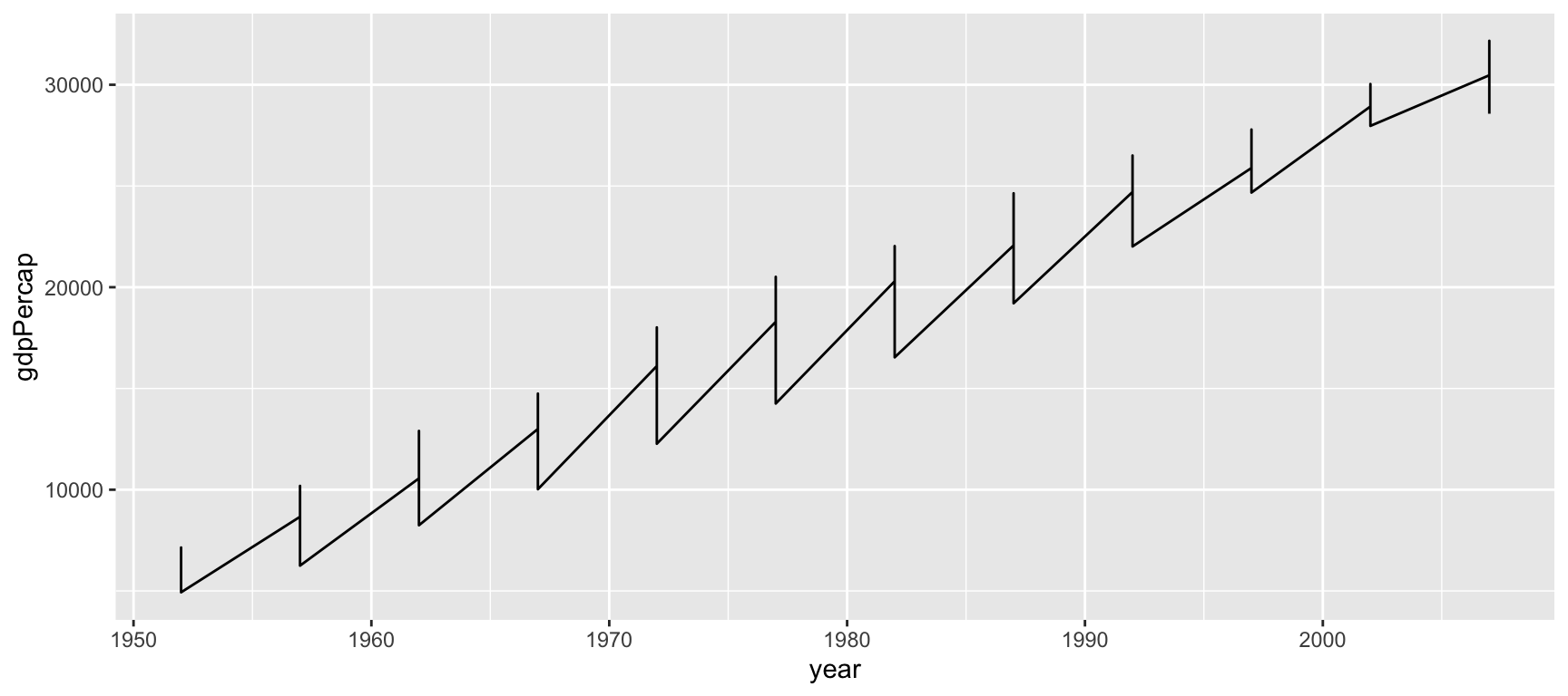
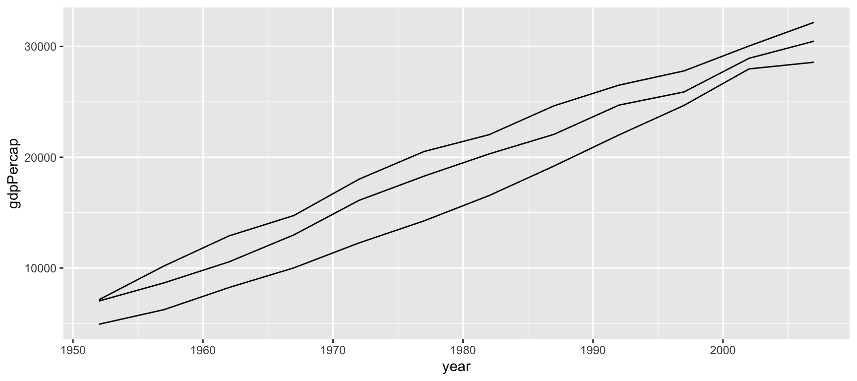
# No group information: one big zig-zag
ggplot(
  data = europe_gdp,
  mapping = aes(x = year, y = gdpPercap)
) +
  geom_line()

# Explicit group fixes it
ggplot(
  data = europe_gdp,
  mapping = aes(
    x = year, y = gdpPercap, group = country
  )
) +
  geom_line()

group: An Aesthetic With No Visual Effect of Its Own

  • group is unusual: mapping it does not change how anything looks directly (no new colour, no new shape).
  • It only tells geometries which rows to treat together when computing lines, boxplots, or other group-wise elements.
  • You can map group on its own, independently of any visible aesthetic, when you want separate lines or boxes without a legend.
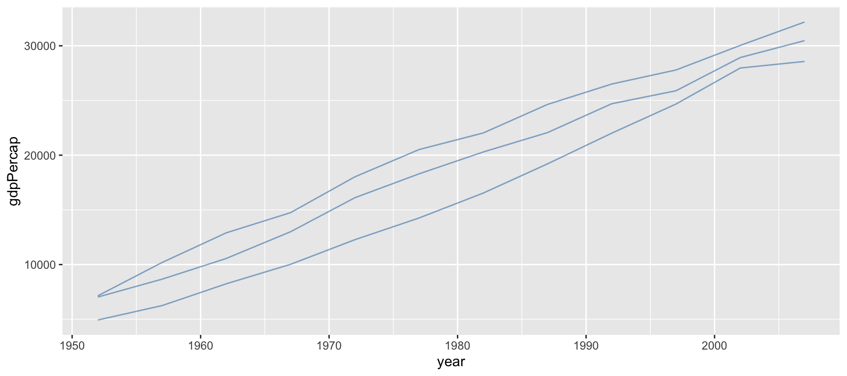
ggplot(
  data = europe_gdp,
  mapping = aes(x = year, y = gdpPercap, group = country)
) +
  geom_line(colour = "steelblue", alpha = 0.6)

Same Grouping, No Legend

Here every line is the same fixed colour (colour is set, not mapped), yet the three countries are still drawn as three separate lines because group = country tells geom_line() how to split the data.
Groups Interact With Every Layer Independently

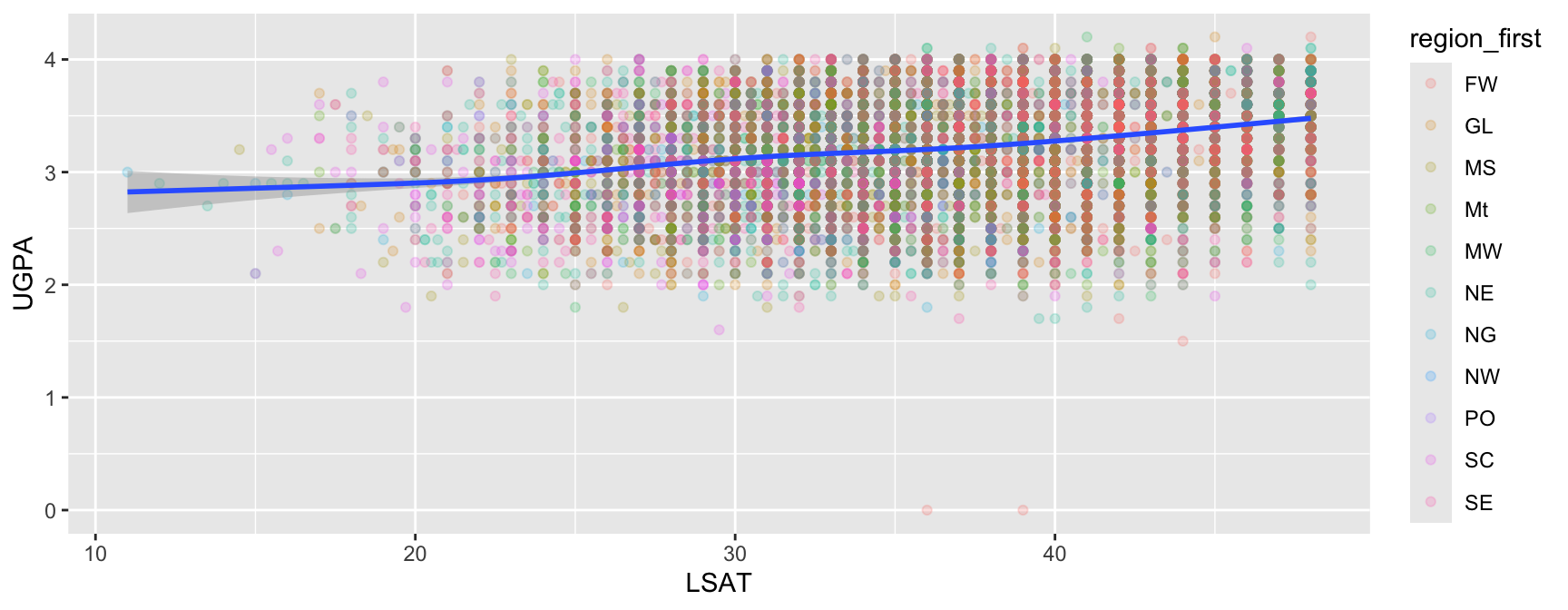
This is the point we previewed at the end of the aesthetics section: a mapping placed in ggplot() applies, and therefore groups, every layer, while a mapping placed inside one geom_*() groups only that layer.
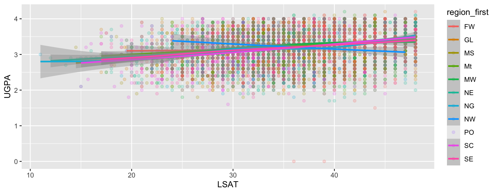
# colour mapped in ggplot():
# every layer is grouped by region
ggplot(
  data = law,
  mapping = aes(
    x = LSAT, y = UGPA, colour = region_first
  )
) +
  geom_point(alpha = 0.2) +
  geom_smooth()

One trend line per region.

# colour mapped only in geom_point():
# geom_smooth() is not grouped
ggplot(data = law) +
  geom_point(
    mapping = aes(
      x = LSAT, y = UGPA, colour = region_first
    ),
    alpha = 0.2
  ) +
  geom_smooth(mapping = aes(x = LSAT, y = UGPA))

One overall trend line.

Overriding Grouping Explicitly

Sometimes you want a discrete aesthetic mapped (for colour, say) but want a different grouping for a specific layer. You can set group explicitly inside that layer to override the default.
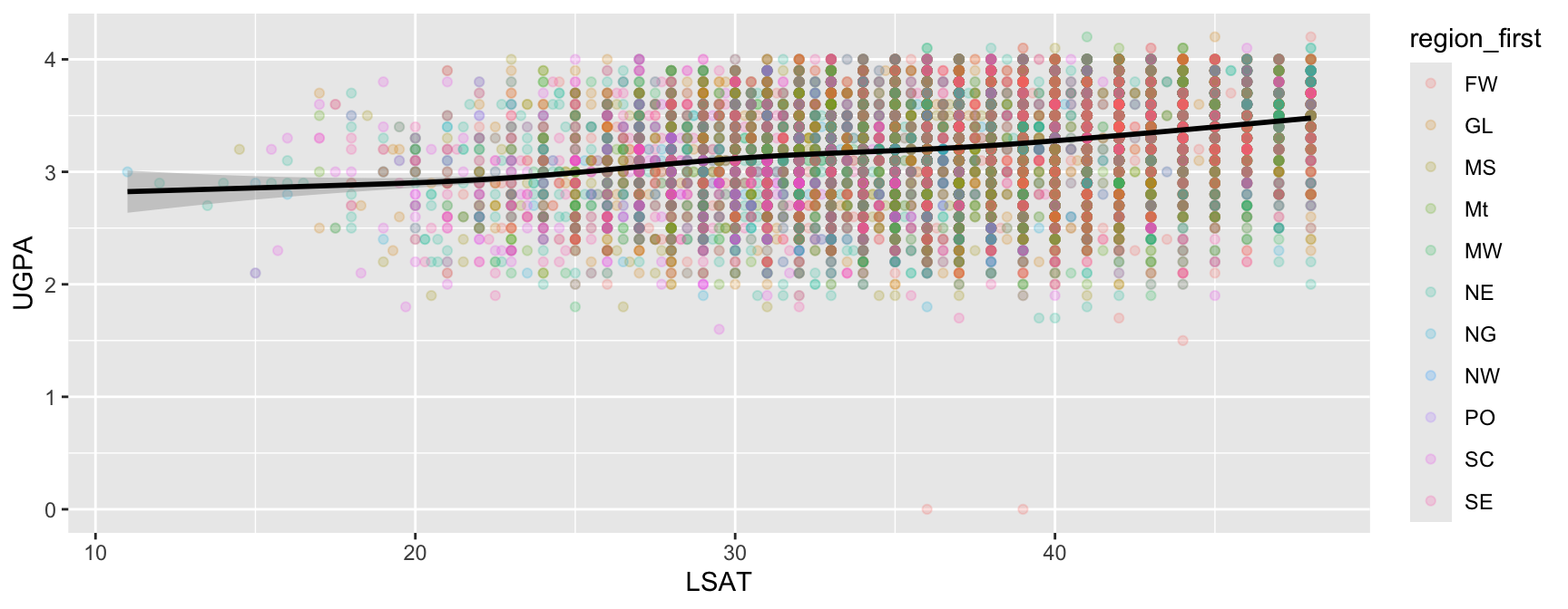
ggplot(
  data = law,
  mapping = aes(
    x = LSAT, y = UGPA, colour = region_first
    )
) +
  geom_point(alpha = 0.2) +
  geom_smooth(
    mapping = aes(group = 1), colour = "black"
  )

Reading group = 1

Mapping group to a single constant value (here, 1, but any value can be chosen) tells {ggplot2} to treat every row as one group, regardless of what other aesthetics are mapped. This is a common idiom for forcing a single overall summary line even when colour is mapped elsewhere.

Task 8: Fixing a Broken Line Plot

Using the gapminder dataset, restricted to Asian countries:

asia_gdp <- gapminder |>
  filter(continent == "Asia")
  1. Create a line plot of gdpPercap (y-axis) against year (x-axis) using asia_gdp, with no colour or group mapped. Describe what goes wrong.
  2. Fix the plot by mapping colour to country. Does the legend help or hurt readability here, given how many countries asia_gdp contains?
  3. Produce an alternative fix using group instead of colour, so that each country is drawn as a separate line, all in the same fixed colour, and with no legend.
  4. Add a geom_smooth() layer showing a single overall trend line across all Asian countries combined, on top of the per-country lines from Question 3. (Hint: think about what group value the smooth layer needs, independently of the lines underneath it.)

Facets

The Problem Facets Solve

The exercise from the previous section hinted at a limitation: mapping colour to a variable with many levels produces a crowded legend.

An Alternative to Cramming Everything Into One Plot

Instead of encoding a categorical variable with colour on a single plot, small multiples split of the data into several side-by-side panels can be made, one per category, each showing the same x/y relationship.

  • This idea is called faceting in {ggplot2}.
  • It trades one crowded plot for several simple ones.
  • Usually, this makes patterns easier to compare across categories.

facet_wrap(): One Variable, Automatic Layout

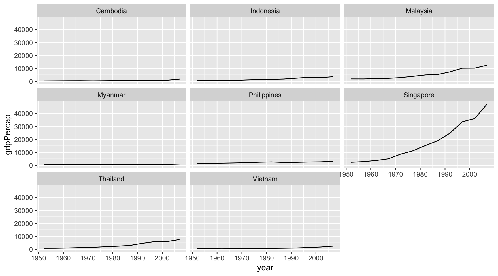
facet_wrap() splits a plot into panels based on one categorical variable, and automatically arranges them into a grid.

se_asia_gdp <- gapminder |>
  filter(country %in% c(
    "Cambodia", "Indonesia", "Malaysia", 
    "Myanmar", "Philippines", "Singapore", 
    "Thailand", "Vietnam")
  )

ggplot(
  data = se_asia_gdp,
  mapping = aes(
    x = year, y = gdpPercap, group = country
  )
) +
  geom_line() +
  facet_wrap(facets = vars(country))

Each country gets its own small panel.
facet_wrap(): Controlling the Grid

ggplot(
  data = se_asia_gdp,
  mapping = aes(
    x = year, y = gdpPercap, group = country
  )
) +
  geom_line() +
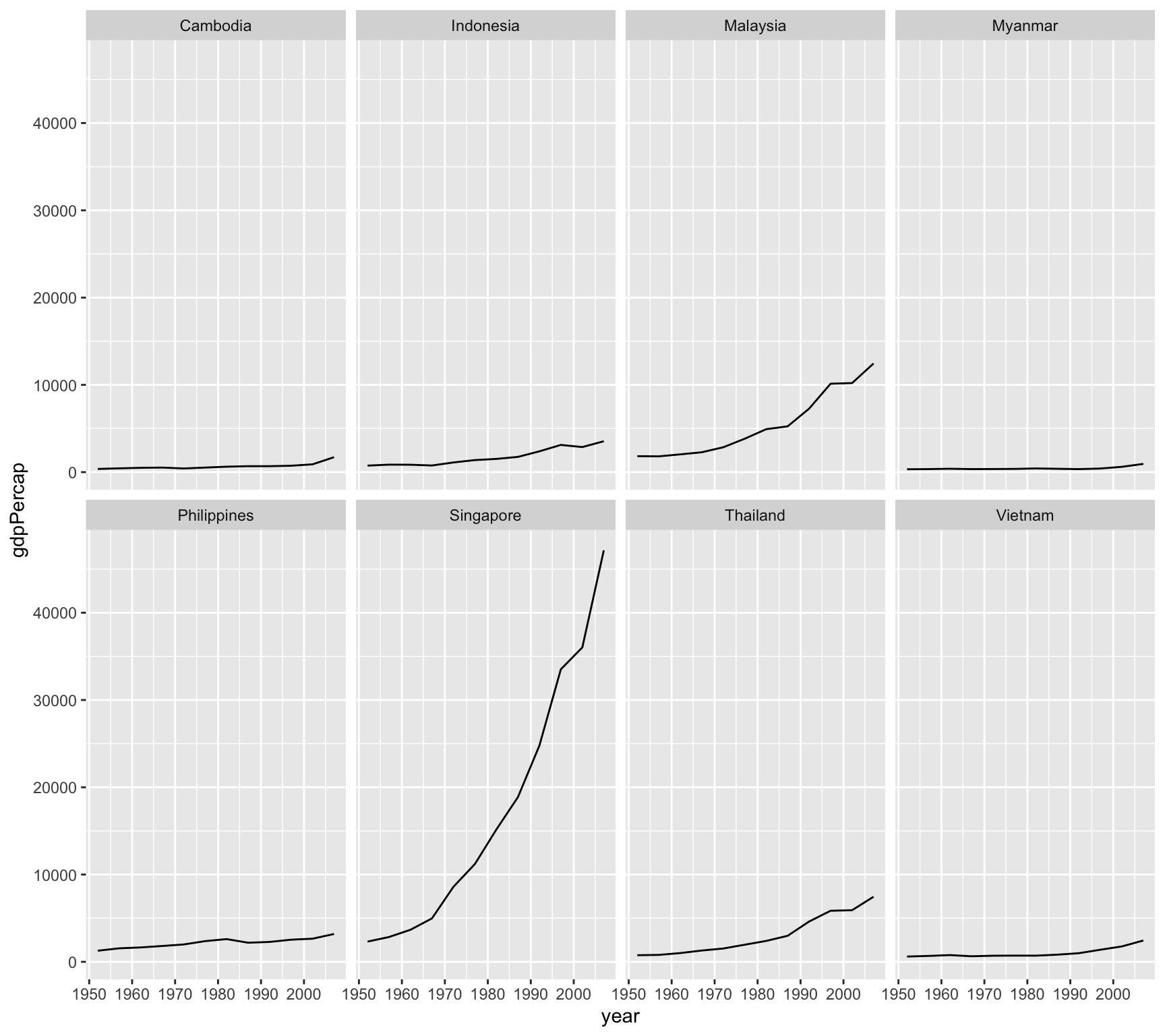
  facet_wrap(facets = vars(country), ncol = 4)

Key Arguments

  • facets = vars(<variable>): which variable defines the panels. Use vars() rather than bare column names.
  • ncol / nrow: control how many columns or rows the panels are arranged into.
facet_grid(): Two Variables, Fixed Layout

facet_grid() arranges panels in a strict grid defined by two categorical variables, one for rows and one for columns.
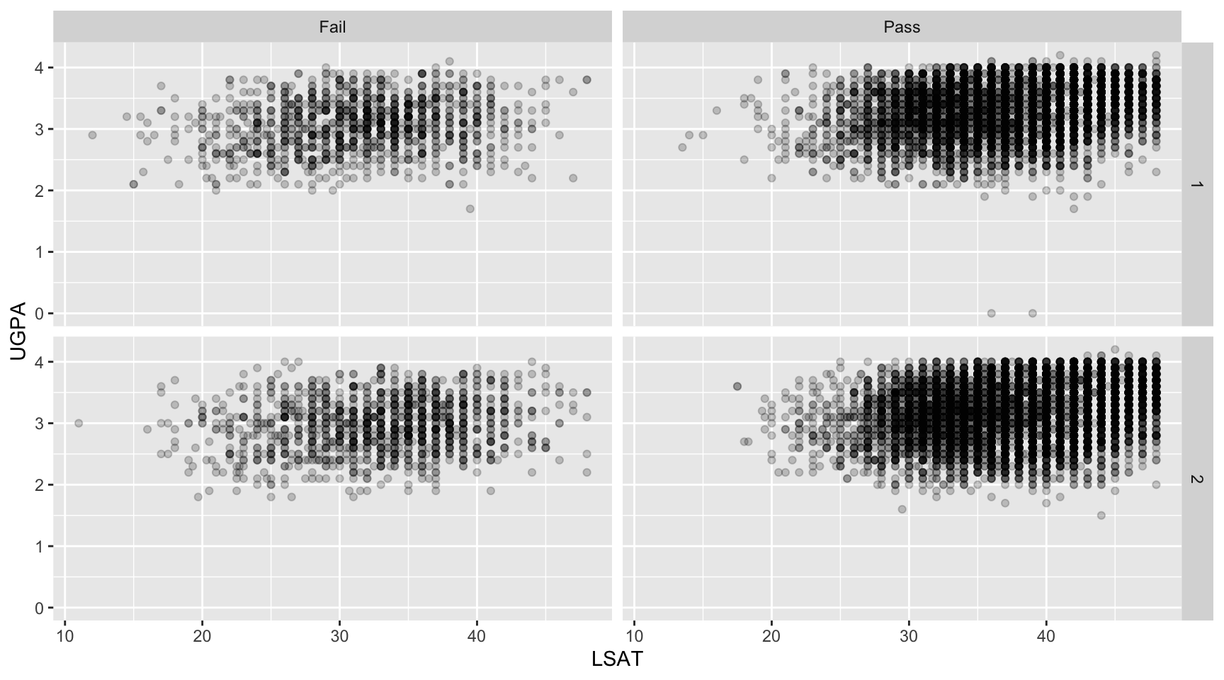
law <- law |> 
  mutate(
    first_pf_fct = factor(
      first_pf, labels = c("Fail", "Pass")
    )
  )

ggplot(
  data = law,
  mapping = aes(x = LSAT, y = UGPA)
) +
  geom_point(alpha = 0.2) +
  facet_grid(
    rows = vars(sex), cols = vars(first_pf_fct)
  )

facet_wrap() vs. facet_grid()

Use facet_wrap() for one variable, letting {ggplot2} decide the layout. Use facet_grid() for exactly two variables, when you specifically want their combinations laid out as a grid of rows and columns.

Independent Scales Across Panels: scales =

By default, every panel shares the same x and y axis ranges, which makes panels directly comparable but can hide detail within panels containing much smaller values.
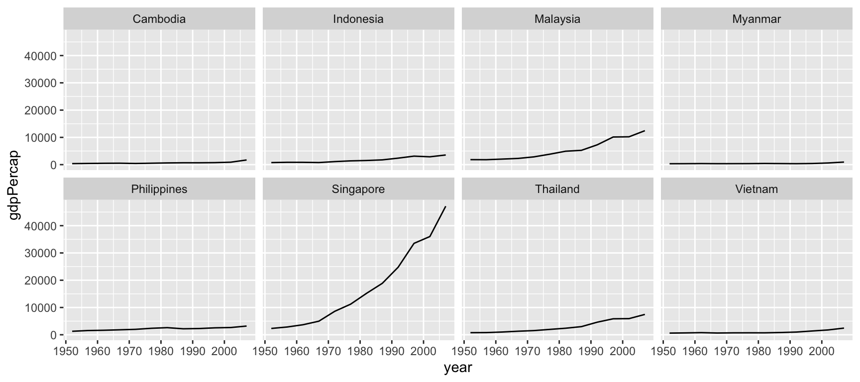
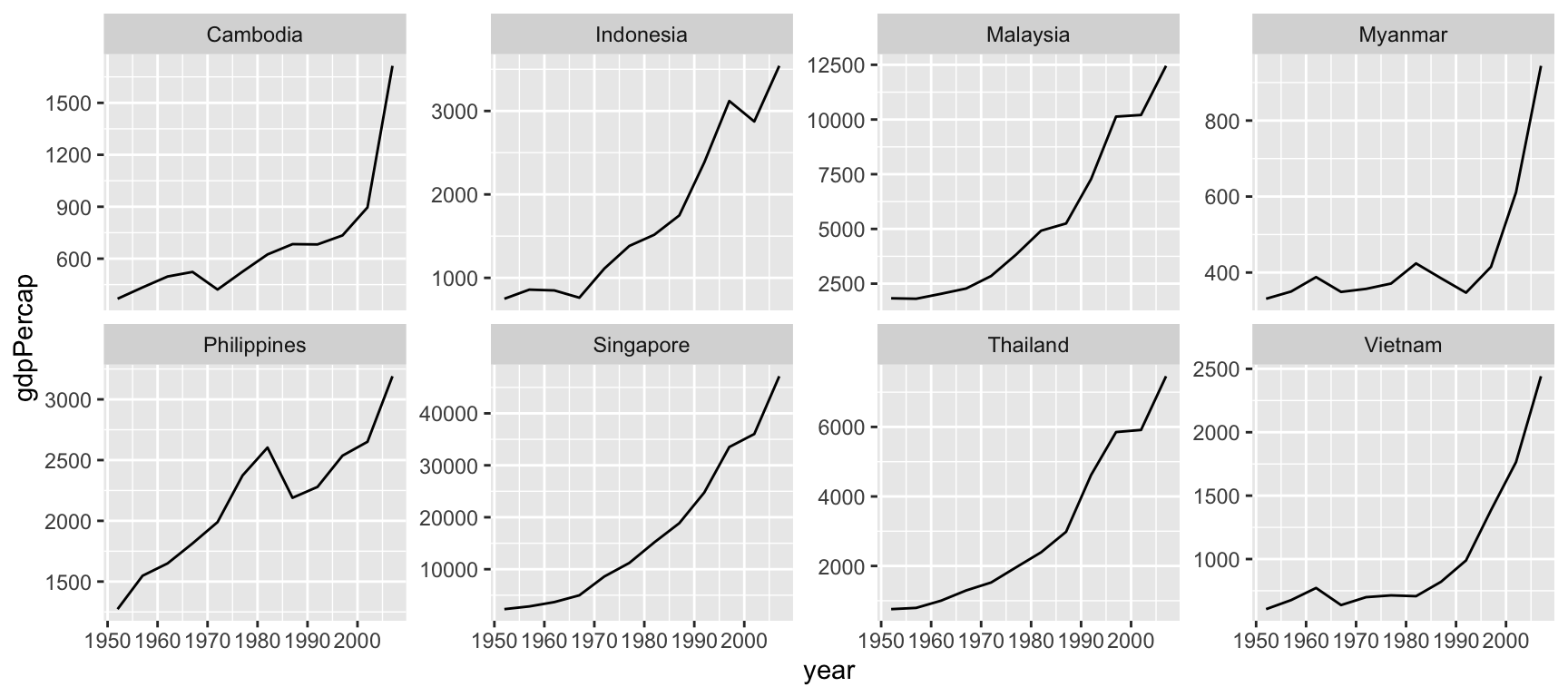
# Shared scales (default)
ggplot(
  data = se_asia_gdp,
  mapping = aes(x = year, y = gdpPercap, group = country)
) +
  geom_line() +
  facet_wrap(facets = vars(country), ncol = 4)

# Free y-axis per panel
ggplot(
  data = se_asia_gdp,
  mapping = aes(x = year, y = gdpPercap, group = country)
) +
  geom_line() +
  facet_wrap(
    facets = vars(country), ncol = 4,
    scales = "free_y"
  )

Independent Scales Across Panels: scales =

A Trade-off, Not a Free Improvement

  • scales = "free" (or "free_x", "free_y") lets each panel zoom to its own data range.
  • This reveals within-panel detail, but panels are no longer directly comparable to one another.
  • Choose deliberately based on whether comparing absolute values across panels or seeing shape within each panel matters more for your question.

Going Further: {ggh4x}

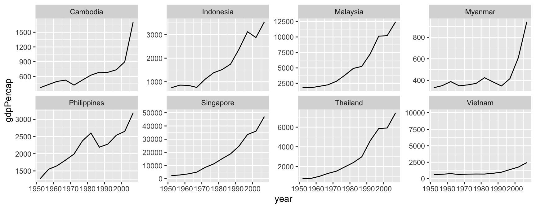
Standard facet_wrap()/facet_grid() only offer two extremes: every panel shares the exact same scale, or every panel gets a fully independent one. The {ggh4x} package fills the gap in between.

  • facetted_pos_scales() assigns a custom scale to each individual panel.
  • facet_grid2() and facet_wrap2() extend the base faceting functions with extra options, for example independent axis limits combined with strip customisation.

Not Required, But Good to Know

This course sticks to base {ggplot2} faceting, but {ggh4x} is worth keeping in mind whenever scales = "free" feels like both too much and not enough flexibility for what you need.

Going Further: {ggh4x}

  • Useful whenever some panels genuinely need a different scale (say, one country’s GDP dwarfs the others) but you still want most panels to remain comparable.
library(ggh4x)

ggplot(
  data = se_asia_gdp,
  mapping = aes(x = year, y = gdpPercap, group = country)
) +
  geom_line() +
  facet_wrap(
    facets = vars(country), ncol = 4, scales = "free_y"
  ) +
  facetted_pos_scales(
    y = list(
      country == "Singapore" ~ 
        scale_y_continuous(limits = c(0, 50000)),
      country == "Vietnam" ~ 
        scale_y_continuous(limits = c(0, 10000))
    )
  )
facet_wrap2() in Action

facet_wrap2() becomes useful when the y-axis labels need to be different for each panel.
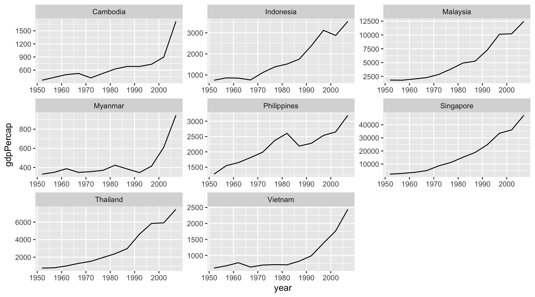
ggplot(
  data = se_asia_gdp,
  mapping = aes(
    x = year, y = gdpPercap, group = country
  )
) +
  geom_line() +
  facet_wrap2(
    facets = vars(country),
    axes = "all", 
    scales = "free_y"
  )

What axes = "all" Changes

By default, facet_wrap() only draws axis ticks and labels on the outer panels, to save space. Setting axes = "all" in facet_wrap2() draws them on every panel, which can make each panel individually readable without having to trace back to the edge of the grid.

Task 9: Small Multiples

Using the law dataset:

  1. Create a scatterplot of LSAT (x-axis) against UGPA (y-axis), faceted by region_first using facet_wrap().
  2. Adjust the layout so the panels are arranged in 2 rows.
  3. Recreate the same plot using facet_grid() instead of facet_wrap(), using region_first for columns and first_pf_fct (the factor version of first_pf created earlier in this section) for rows.
  4. Compare the facet_grid() plot to the facet_wrap() version. Which one makes it easier to compare pass vs. fail patterns within a region? Which makes better use of space?
  5. Try adding scales = "free_y" to your facet_wrap() plot from Question 2. Does this change your interpretation of any region’s pattern?

Coordinate Systems

What Does a Coordinate System Do?

  • The coordinate system (coord_*()) controls how x and y positions are actually laid out on the page.
  • By default, every {ggplot2} plot uses coord_cartesian(): the familiar rectangular grid, x horizontal, y vertical.
  • Changing the coordinate system does not change the data or the mapping, only how positions are displayed.

Not the Same as Changing a Scale

  • Scales (covered earlier in this chapter) control what values map to which position.
  • Coordinate systems control how positions themselves are arranged on the page.
  • Both can affect axis limits, which is exactly why the two are easy to confuse, as we’ll see shortly.

coord_flip(): Swapping Axes

Long category labels are often unreadable when squeezed along the x-axis. coord_flip() swaps x and y without changing the underlying mapping.

Consider the following countries for example:

long_name_countries <- gapminder |>
  filter(
    year == 2007,
    country %in% c(
      "Bosnia and Herzegovina", "Central African Republic",
      "Congo, Dem. Rep.", "Dominican Republic",
      "Equatorial Guinea", "Trinidad and Tobago"
    )
  )

coord_flip(): Swapping Axes

ggplot(
  data = long_name_countries,
  mapping = aes(x = country, y = lifeExp)
) +
  geom_col()

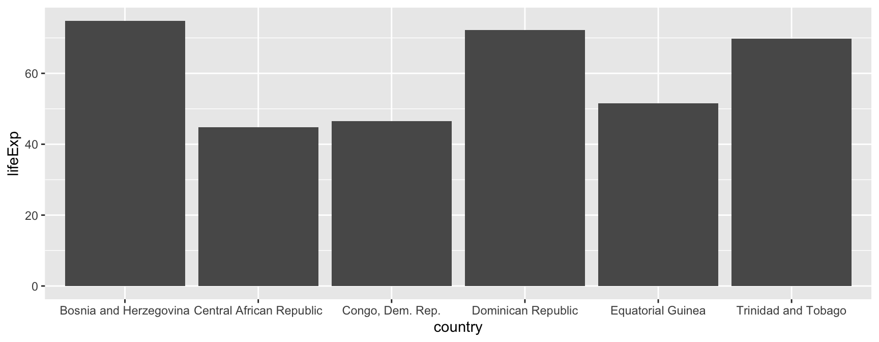
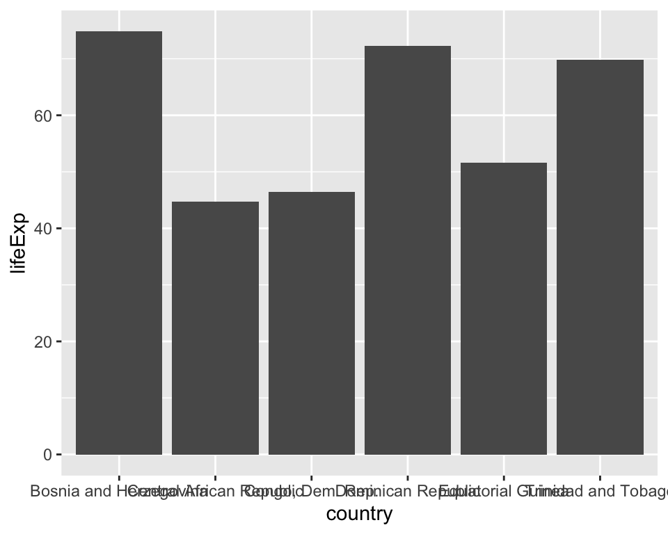
Long labels overlap and are unreadable.
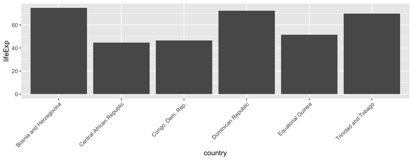
ggplot(
  data = long_name_countries,
  mapping = aes(x = country, y = lifeExp)
) +
  geom_col() +
  theme(axis.text.x = element_text(angle = 45, hjust = 1))

Rotating labels is not very efficient: it forces readers to tilt their head.

ggplot(
  data = long_name_countries,
  mapping = aes(x = country, y = lifeExp)
) +
  geom_col() +
  coord_flip()

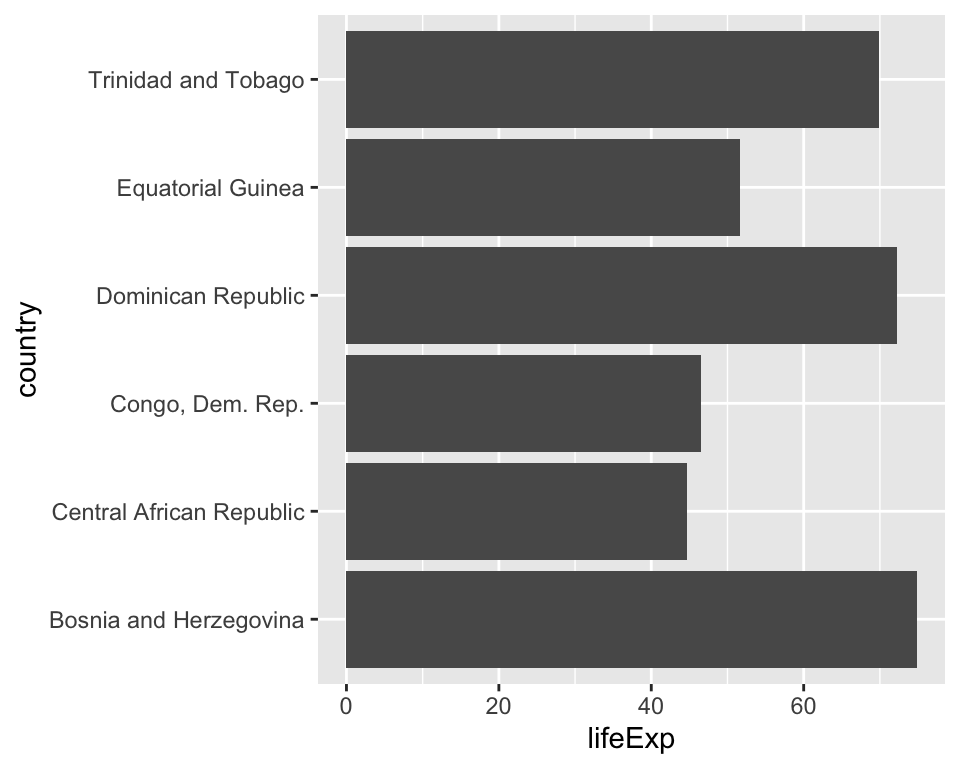
Same plot, fully readable labels.

Alternative Way

Swapping x and y directly in aes() achieves a similar visual result, but coord_flip() is often more convenient when reusing code originally written for the unflipped version.

An Alternative Worth Knowing

Swapping x and y directly in aes() achieves a similar visual result, but coord_flip() is often more convenient when reusing code originally written for the unflipped version.

ggplot(
  data = long_name_countries,
  mapping = aes(x = country, y = lifeExp)
) +
  geom_col()

Long labels overlap and are unreadable.
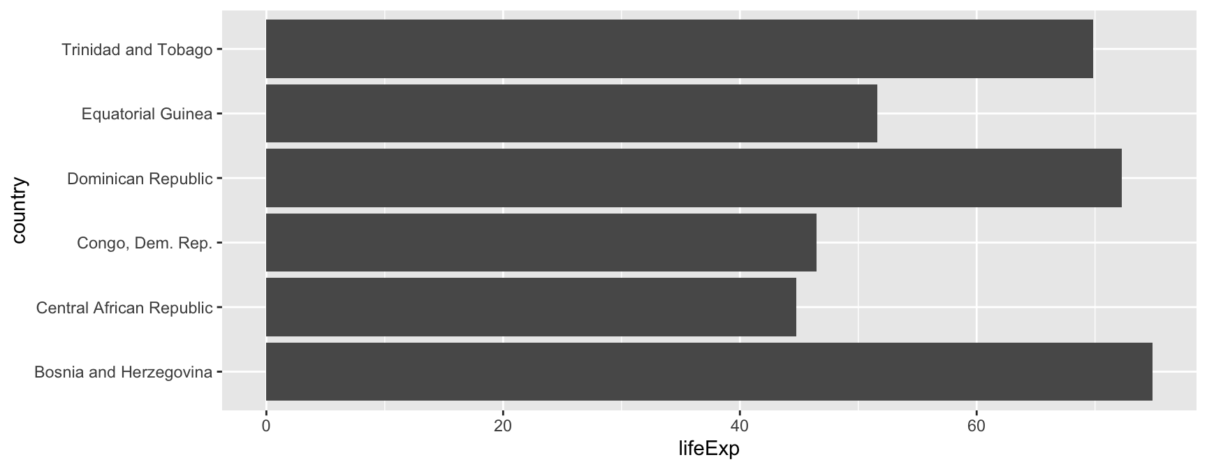
ggplot(
  data = long_name_countries,
  mapping = aes(x = country, y = lifeExp)
) +
  geom_col() +
  coord_flip()

Same plot, fully readable labels.

coord_cartesian(): Zooming Without Losing Data

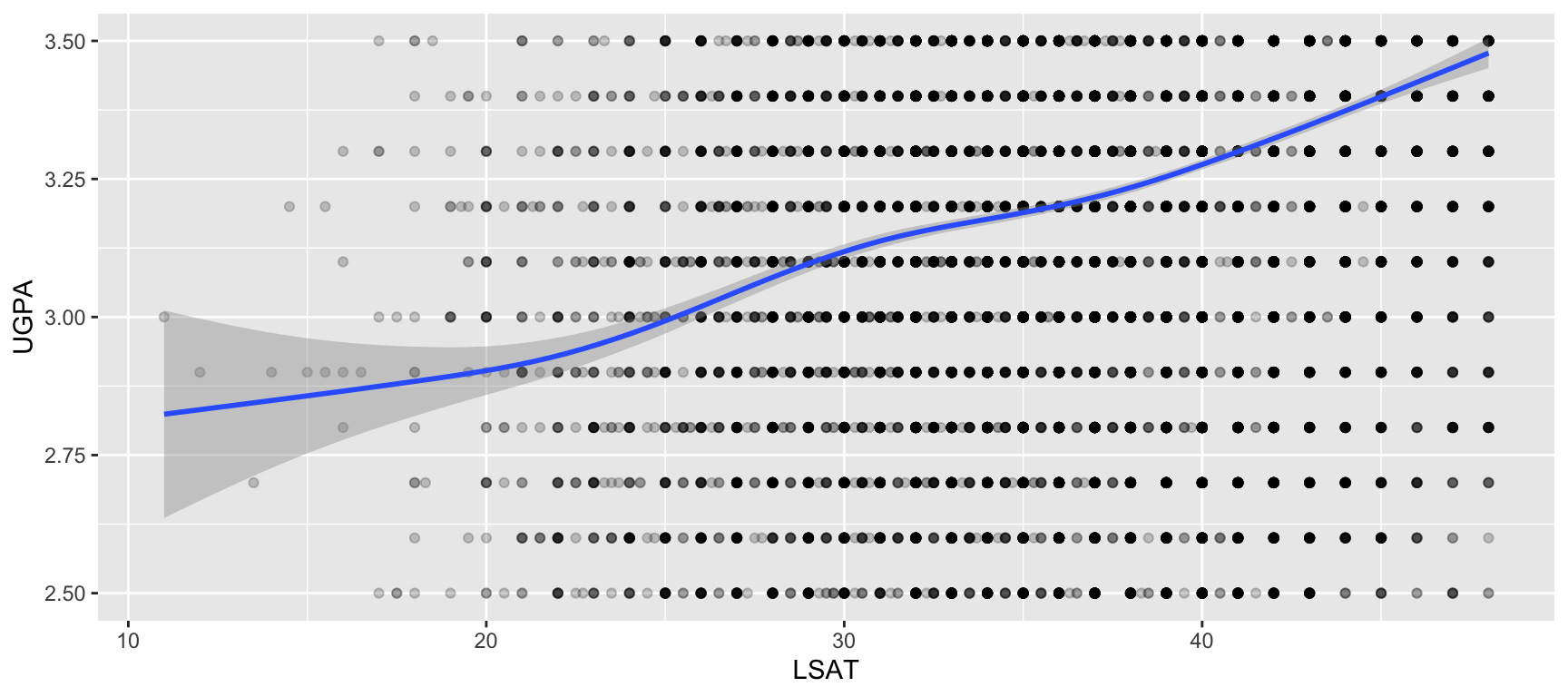
Recall from the section on scales: setting limits on a scale_*() removes data outside that range before any statistics (like geom_smooth()) are computed. coord_cartesian() instead zooms the view, keeping all data in the computation.
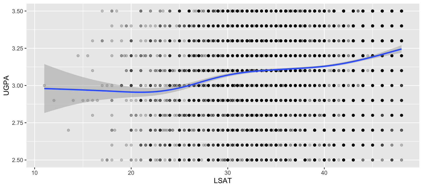
# scale limits: data outside is dropped
# before the trend line is fitted
ggplot(
  data = law,
  mapping = aes(x = LSAT, y = UGPA)
) +
  geom_point(alpha = 0.2) +
  geom_smooth() +
  scale_y_continuous(limits = c(2.5, 3.5))

# coord_cartesian: same trend line,
# just a zoomed-in view
ggplot(
  data = law,
  mapping = aes(x = LSAT, y = UGPA)
) +
  geom_point(alpha = 0.2) +
  geom_smooth() +
  coord_cartesian(ylim = c(2.5, 3.5))

Notice the Trend Line

On the left, geom_smooth() was fit only to the narrower slice of data that survived the scale’s limits, so the fitted line itself changes. On the right, geom_smooth() was still fit to all the data; only the visible window changed. When in doubt, prefer coord_cartesian() for zooming.

coord_fixed(): Enforcing an Aspect Ratio

By default, {ggplot2} stretches the plotting area to fill the available space, which can distort how a relationship actually looks. coord_fixed() forces a fixed ratio between one unit on x and one unit on y.
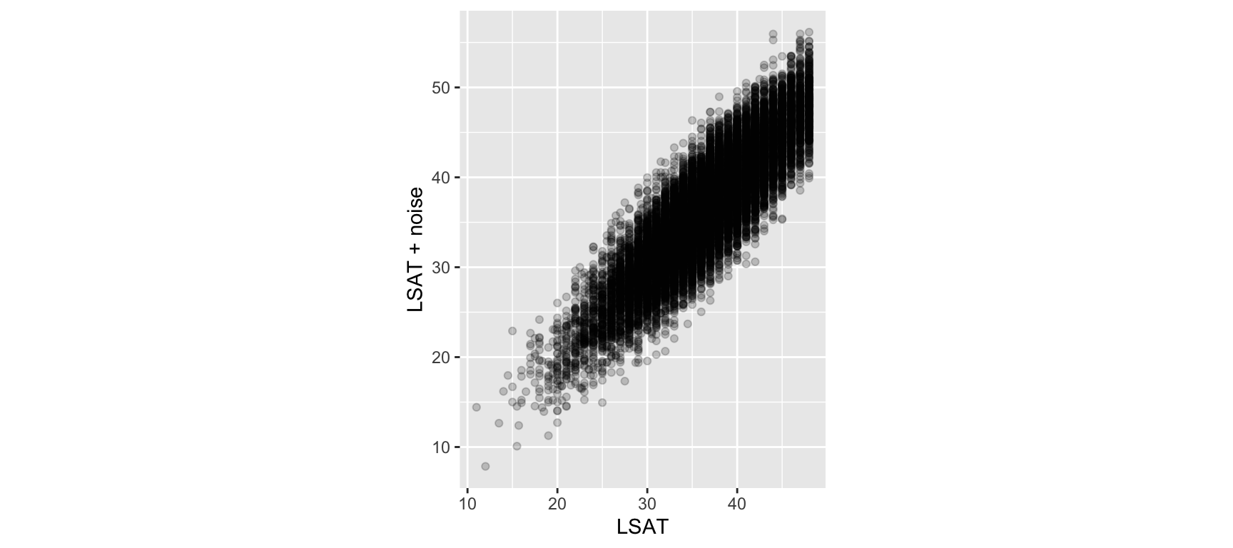
ggplot(
  data = law |> 
    mutate(LSAT_noisy = LSAT + rnorm(n(), sd = 3)),
  mapping = aes(x = LSAT, y = LSAT_noisy)
) +
  geom_point(alpha = 0.2) +
  labs(y = "LSAT + noise") +
  coord_fixed(ratio = 1)

When This Matters

coord_fixed() is especially important whenever x and y are measured in the same units and a visual 45-degree line should genuinely mean a 1-to-1 relationship, such as comparing predicted vs. actual values. Without it, the plot’s aspect ratio can visually exaggerate or understate agreement.

Task 10: Choosing a Coordinate System

Using the law dataset:

  1. Create a bar chart counting students per region_first, then use coord_flip() to flip the x- and y- axes.
  2. Create a scatterplot of sander_index (x-axis) against ZFYA (y-axis) with a geom_smooth() layer. Zoom the y-axis to the range -1 to 1 in two different ways: first using scale_y_continuous(limits = ...), then using coord_cartesian(ylim = ...). Compare the two trend lines.
  3. Based on your answer to Question 2, which approach would you recommend to a colleague who wants to zoom into a subset of their data without changing what the plot’s statistics are computed on?

Annotations

Why Annotate a Plot?

  • A plot’s geometry shows the general pattern in the data. Annotations let you point to something specific: a threshold, a notable observation, a reference value.
  • Annotations turn an exploratory plot into a communicative one, guiding the reader’s attention rather than leaving them to search for the point that matters.

A Preview of the Exploratory vs. Communicative Distinction

This distinction, between plots meant for you to explore data and plots meant to tell a reader something specific, will come back explicitly in the chapter on interactive visualisation.

Annotations are one of the main tools for moving from the first to the second.

Reference Lines: geom_hline(), geom_vline(), geom_abline()

These add straight lines at fixed positions, useful for thresholds or benchmarks.
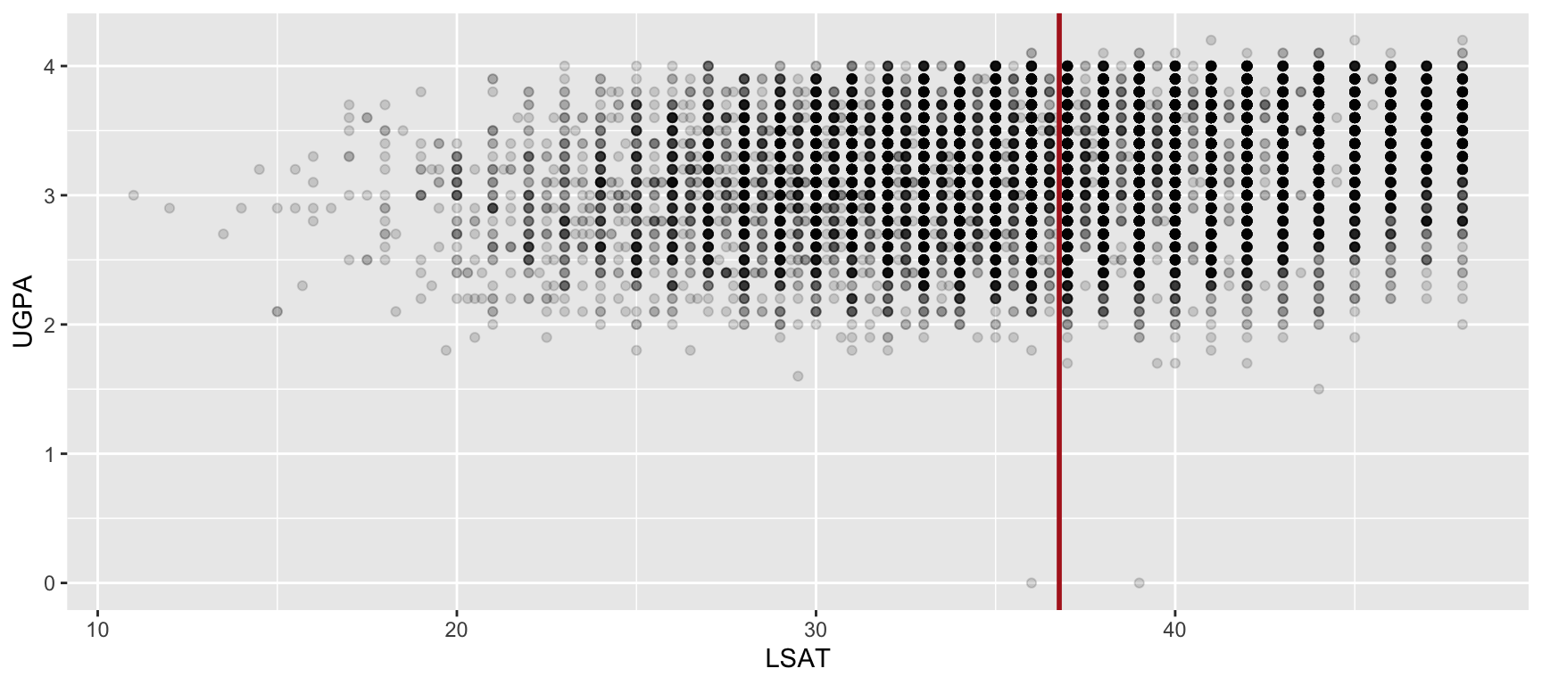
mean_lsat <- mean(law$LSAT, na.rm = TRUE)

ggplot(
  data = law,
  mapping = aes(x = LSAT, y = UGPA)
) +
  geom_point(alpha = 0.15) +
  geom_vline(
    xintercept = mean_lsat, 
    colour = "firebrick", linewidth = 1
  )

Three Related Functions

  • geom_hline(yintercept = ...): a horizontal line at a fixed y value.
  • geom_vline(xintercept = ...): a vertical line at a fixed x value.
  • geom_abline(intercept = ..., slope = ...): an arbitrary straight line, useful for a y = x reference.

annotate(): One-Off Elements Without a Data Frame

Unlike geom_*() layers, which draw marks by mapping columns of a data frame through aes(), annotate() takes the values to draw directly as arguments (no data and no aes() involved).
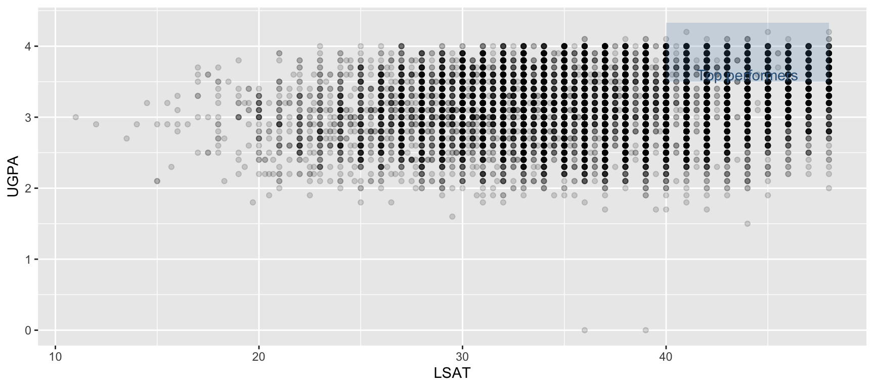
ggplot(
  data = law,
  mapping = aes(x = LSAT, y = UGPA)
) +
  geom_point(alpha = 0.15) +
  annotate(
    geom = "rect",
    xmin = 40, xmax = 48, ymin = 3.5, ymax = 4.33,
    fill = "steelblue", alpha = 0.2
  ) +
  annotate(
    geom = "text",
    x = 44, y = 3.6,
    label = "Top performers",
    colour = "steelblue4"
  )

annotate() vs. a geom_*() Layer

Use annotate() for a handful of fixed, one-off marks. If you find yourself building a small data frame just to label a few points, geom_text() (next slide) is usually the better tool.

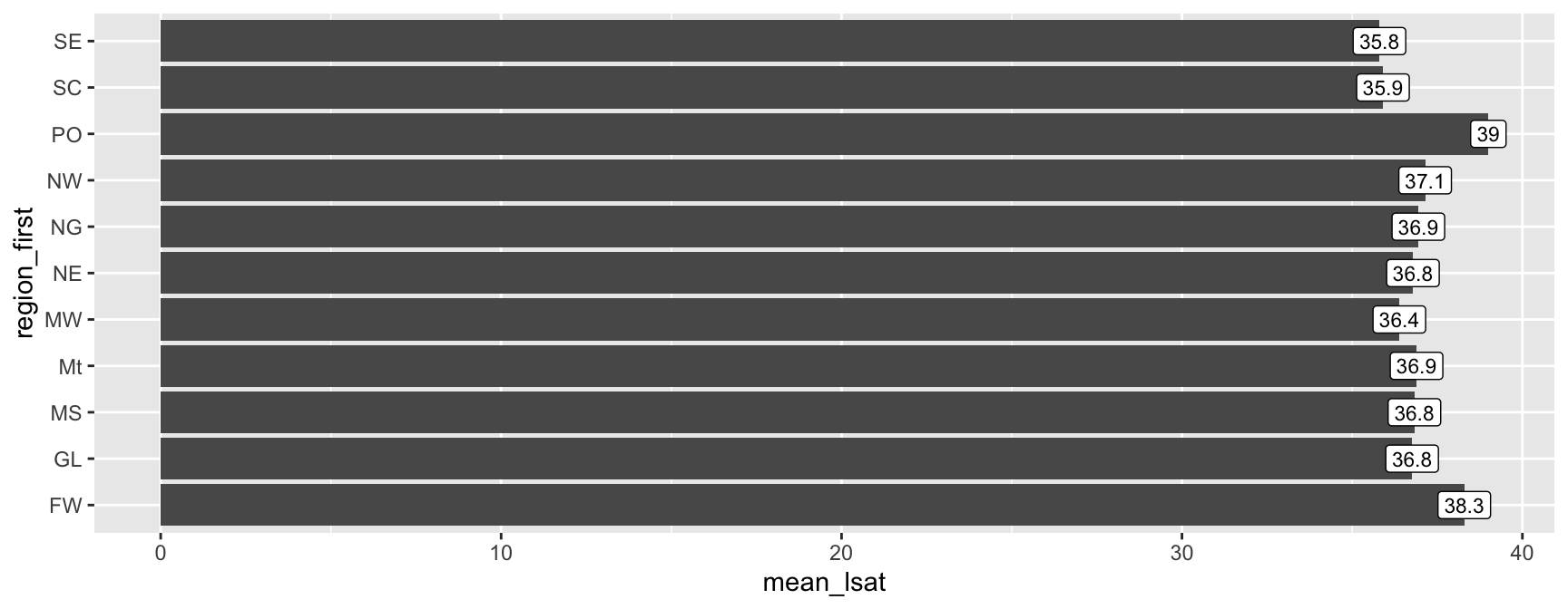
Labelling Points: geom_text() and geom_label()

To label points that come from your data rather than fixed coordinates, map label inside aes() and use geom_text() or geom_label().

top_regions <- law |>
  group_by(region_first) |>
  summarise(mean_lsat = mean(LSAT, na.rm = TRUE), .groups = "drop")

ggplot(
  data = top_regions,
  mapping = aes(x = region_first, y = mean_lsat)
) +
  geom_col() +
  geom_text(
    mapping = aes(label = round(mean_lsat, 1)), colour = "white",
    hjust = 1
  ) +
  coord_flip()
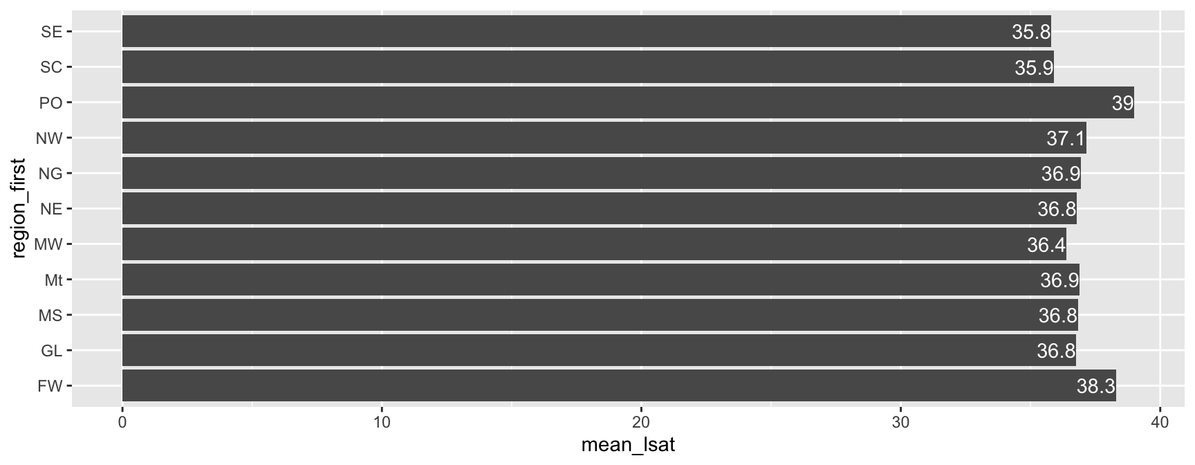
ggplot(
  data = top_regions,
  mapping = aes(x = region_first, y = mean_lsat)
) +
  geom_col() +
  geom_label(
    mapping = aes(label = round(mean_lsat, 1)),
    hjust = .5, size = 3
  ) +
  coord_flip()

Task 11: Annotating a Plot

Using the law dataset:

  1. Create a scatterplot of sander_index (x-axis) against ZFYA (y-axis).
  2. Add a horizontal reference line at ZFYA = 0 using geom_hline(), since a ZFYA of 0 represents an average first-year performance.
  3. Using filter(), identify the single student with the highest sander_index in the dataset. Highlight this student on the plot with a distinctly coloured point, larger than the rest.
  4. Add a text label near that highlighted point (using either annotate() or geom_text() with a one-row data frame) identifying it as "Highest sander_index".
  5. Which approach did you use for Question 4, annotate() or geom_text()? Would the other approach also have worked here? Why or why not.

Labs

Naming Every Part of a Plot: labs()

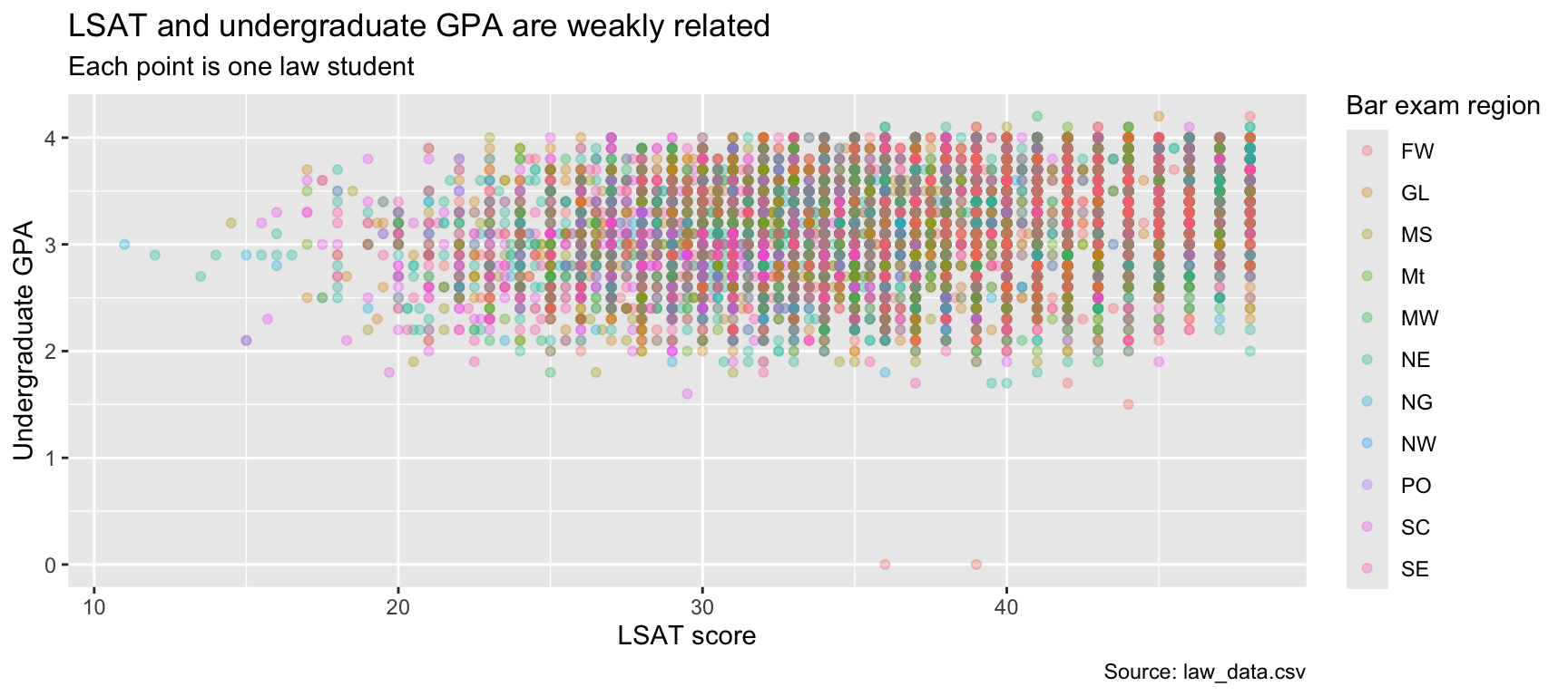
labs() controls the text surrounding a plot: titles, axis labels, legend titles, and captions, all in one place.

ggplot(
  data = law,
  mapping = aes(
    x = LSAT, y = UGPA, colour = region_first
  )
) +
  geom_point(alpha = 0.3) +
  labs(
    title = "LSAT and undergraduate GPA are weakly related",
    subtitle = "Each point is one law student",
    x = "LSAT score",
    y = "Undergraduate GPA",
    colour = "Bar exam region",
    caption = "Source: law_data.csv"
  )
Every Argument Is Optional

You do not need to fill in every argument of labs(). Supply only the ones relevant to your plot, for example just x and y for a quick exploratory look, and add title/subtitle/caption once the plot is ready to share.

Legend Titles: Two Equivalent Paths

We already saw, in the section on scales, that renaming a legend title can be done through the relevant scale_*() function. labs() offers a shortcut for the same thing.

Through the scale

ggplot(
  data = law,
  mapping = aes(
    x = LSAT, y = UGPA, colour = region_first
  )
) +
  geom_point() +
  scale_colour_discrete(name = "Bar exam region")

Through labs()

ggplot(
  data = law,
  mapping = aes(
    x = LSAT, y = UGPA, colour = region_first
  )
) +
  geom_point() +
  labs(colour = "Bar exam region")

Which One to Use?

labs() is more convenient when you only want to rename a legend title. Go through the scale_*() function directly when you also need to change something else about that scale at the same time, colours, breaks, limits, so everything about that aesthetic lives in one place.

Removing a Legend: guides()

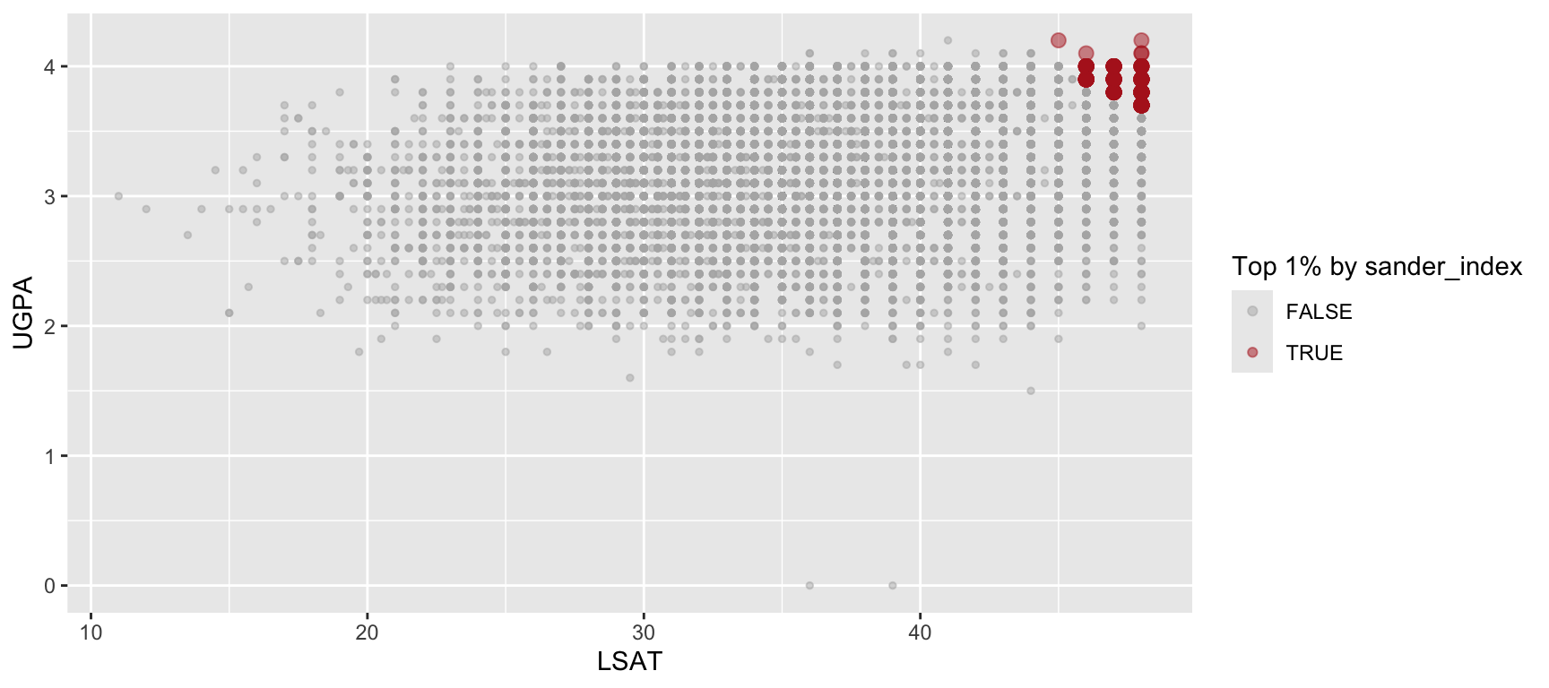
Not every mapped aesthetic needs a visible legend, for example when a second aesthetic (like size, used purely to emphasise points) would just repeat information already shown by colour.

law_highlighted <- law |>
  mutate(
    is_top = sander_index > quantile(sander_index, 0.99, na.rm = TRUE)
  )

ggplot(
  data = law_highlighted,
  mapping = aes(x = LSAT, y = UGPA, colour = is_top, size = is_top)
) +
  geom_point(alpha = 0.5) +
  scale_colour_manual(values = c("grey70", "firebrick")) +
  scale_size_manual(values = c(1, 2.5)) +
  guides(size = "none") +
  labs(colour = "Top 1% by sander_index")
Reading guides()

guides() takes one argument per aesthetic, matching the aesthetic’s name (colour, size, fill…). Setting an aesthetic to "none" suppresses its legend entirely, without affecting the plot itself. Here, size is mapped (so points are still drawn at two different sizes) but its legend is hidden, since the colour legend already explains what the two groups mean.

Task 12: Polishing a Plot

Starting from the following plot:

ggplot(
  data = law,
  mapping = aes(x = region_first, y = LSAT, fill = region_first)
) +
  geom_boxplot() +
  coord_flip()
  1. Add a title summarising what the plot shows, and a subtitle giving one extra sentence of context.
  2. Rename the x and y axis labels to something more descriptive than the raw column names.
  3. The fill legend currently repeats the same information already shown on the y-axis. Remove it using guides().
  4. Add a caption crediting the data source (Wightman, Linda F. 1998. “LSAC National Longitudinal Bar Passage Study. LSAC Research Report Series.” In. https://api.semanticscholar.org/CorpusID:151073942.).
  5. Compare your final plot to the original. Which single change made the biggest difference to readability?

Themes

What a Theme Controls

  • A theme (theme_*()) controls everything on a plot that is not determined by the data: background colour, gridlines, fonts, legend position.
  • Unlike scales or coordinate systems, changing the theme never changes how the data itself is represented, only the surrounding presentation.
  • The online help page from {ggplot2} is particularly rich.

{ggplot2}’s Default Theme

Every plot we have made so far used the default theme, theme_gray() (grey background, white gridlines). Switching themes is as simple as adding one more layer.

Ready-Made Themes

{ggplot2} ships with several complete themes. Three of the most commonly used:
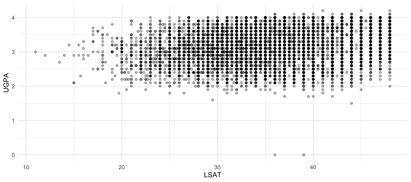
ggplot(
  data = law,
  mapping = aes(x = LSAT, y = UGPA)
) +
  geom_point(alpha = 0.3) +
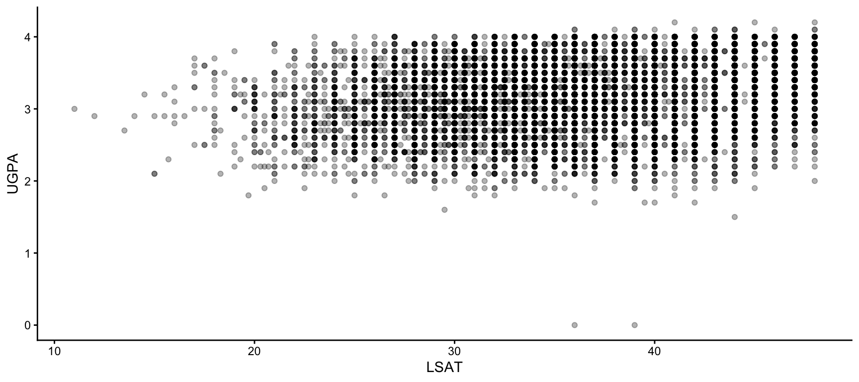
  theme_minimal()

theme_minimal()

ggplot(
  data = law,
  mapping = aes(x = LSAT, y = UGPA)
) +
  geom_point(alpha = 0.3) +
  theme_bw()

theme_bw()

ggplot(
  data = law,
  mapping = aes(x = LSAT, y = UGPA)
) +
  geom_point(alpha = 0.3) +
  theme_classic()

theme_classic()

A Reasonable Default

theme_minimal() is a good starting point for most reports and presentations: it removes visual clutter (no background panel, light gridlines) without hiding useful reference lines entirely.

A Few High-Value theme() Tweaks

Beyond a complete theme, theme() lets you adjust individual elements. A handful of arguments cover most everyday needs.
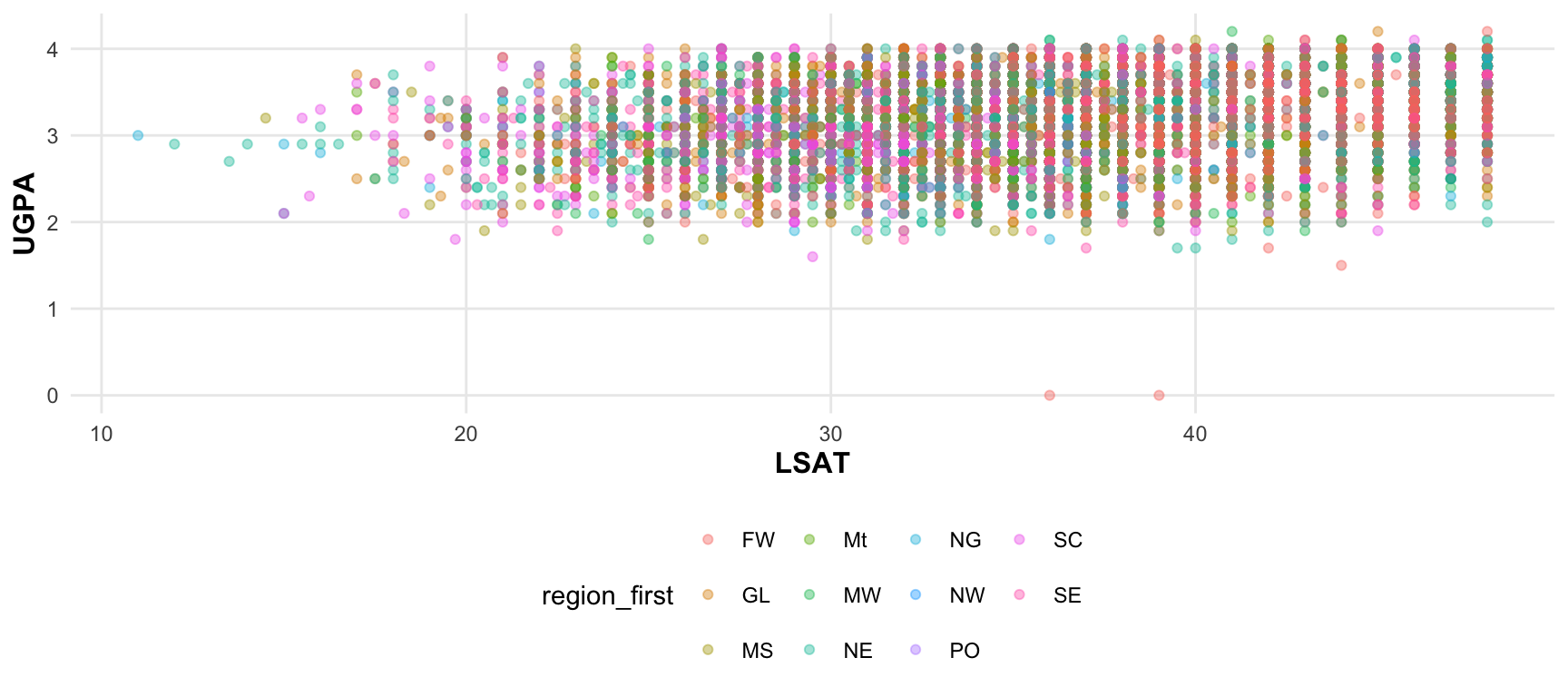
ggplot(
  data = law,
  mapping = aes(x = LSAT, y = UGPA, colour = region_first)
) +
  geom_point(alpha = 0.4) +
  theme_minimal() +
  theme(
    legend.position = "bottom",
    axis.title = element_text(size = 12, face = "bold"),
    panel.grid.minor = element_blank(),
    plot.title.position = "plot"
  )

Reading These Arguments

  • legend.position: where the legend sits ("bottom", "top", "right", "left", or "none" to remove it entirely).
  • axis.title: styling for axis label text, set with element_text().
  • panel.grid.minor: the finer gridlines between major ones, often worth removing with element_blank() to reduce visual noise.
  • legend.title.position: the position of the title.

Setting a Theme for an Entire Document

If every plot in a report or presentation should share the same look, theme_set() applies a theme globally, once, rather than repeating it on every plot.

theme_set(theme_minimal())

# From this point on, every plot uses theme_minimal()
# automatically, unless overridden locally
ggplot(data = law, mapping = aes(x = LSAT, y = UGPA)) +
  geom_point()

Useful at the Top of a Script or Quarto Document

Placing theme_set() once near the top of a script (or in an early code chunk of a Quarto document) keeps every subsequent plot visually consistent without repeating + theme_minimal() on every single one.

Exporting a Plot

Why Not Just Right-Click and “Save Image”?

  • The RStudio Plots pane lets you export a plot manually, but this is not reproducible: rerunning your script produces nothing on disk unless the export step is itself part of the code.
  • ggsave() saves a plot to a file as a single line of code, which means the export becomes part of your reproducible pipeline, just like any other step in this course.
p <- ggplot(
  data = law,
  mapping = aes(x = LSAT, y = UGPA)
) +
  geom_point(alpha = 0.3)

ggsave(filename = "figs/lsat_vs_ugpa.png", plot = p)

Ommited Arguments

ggsave() Without a plot Argument

  • If plot is omitted, ggsave() saves the last plot displayed.
  • This is convenient for quick work, but explicitly passing plot = is safer in a script or Quarto document, where several plots may have been created before the ggsave() call.

width and height Are Implicit Too

  • Just like the plot itself, width and height default to the size of your current plotting device whenever they are left unspecified, not to some fixed standard size.

  • This means the exact same ggsave() call can produce different-sized files depending on how large your RStudio Plots pane happened to be at the time.

  • We will come back to setting width and height explicitly on the next slide, precisely to avoid this kind of silent and environment-dependent behaviour.

Raster vs. Vector: PNG or PDF?

ggsave() infers the file format from the extension you give filename. The two you will use most are PNG and PDF, and they work very differently.

PNG (raster)

  • Stored as a grid of pixels.
  • File size depends on resolution (dpi), not on how much is drawn.
  • Looks blurry or pixelated if scaled up beyond its saved resolution.
  • Good for: web pages, slides, anywhere the image is displayed at a fixed, known size.

PDF (vector)

  • Stored as mathematical shapes (lines, curves, points), not pixels.
  • Scales to any size with no loss of quality.
  • File size depends on how much is drawn (number of points, lines), not on resolution.
  • Good for: papers, reports, anywhere the figure might be printed or resized.

Raster vs. Vector: PNG or PDF?

A Trade-off in the Other Direction

  • A PDF of a scatterplot with a very large number of points can become large and slow to render, since every point is stored individually as a vector object.

  • This happens with large datasets and frequently when plotting maps.

  • A PNG of the same plot stays a fixed size regardless of how many points it contains.

Key Arguments of ggsave()

ggsave(
  filename = "figs/lsat_vs_ugpa.pdf",
  plot = p,
  width = 7,
  height = 5,
  units = "in",
  dpi = 300
)

Reading These Arguments

  • width / height: the physical size of the saved figure.
  • units: the unit width/height are expressed in ("in", "cm", "mm", or "px").
  • dpi: dots per inch, resolution for raster formats (PNG, JPEG). Has no effect on a true vector format like PDF, since PDFs have no fixed pixel grid.

Choosing width/height Deliberately

Match width and height to where the figure will actually be used, a two-column journal figure and a full-slide plot need very different dimensions. Avoid leaving ggsave() to guess: an unspecified width/height defaults to the size of your current plotting device, which is rarely what you want in a script meant to be rerun elsewhere.

ggsave() and a Plot’s Own Aspect Ratio

If a plot already used coord_fixed() or coord_equal() (covered in the section on coordinate systems), the width/height you request may not be exactly what is produced, since {ggplot2} still respects the enforced aspect ratio.

Worth Checking, Not Memorising

If a saved figure looks stretched or oddly padded, this interaction between a fixed coordinate ratio and the requested width/height is a common cause. Opening the saved file to check is generally faster than reasoning about it in advance.

Task 13: Exporting a Plot

Using the law dataset:

  1. Create a boxplot of LSAT by region_first, with coord_flip() and a clean theme of your choice (see the previous section). Assign it to an object named p.
  2. Export p as a PNG file to figs/lsat_by_region.png, with width = 8, height = 5, units = "in", and dpi = 300.
  3. Export the same plot as a PDF file to figs/lsat_by_region.pdf, using the same width and height, but no dpi.
  4. Open both files. Zoom in significantly on each. What do you observe about how each format handles zooming?
  5. Check the file size of both exports (in RStudio’s Files pane, or with file.size()). Which is larger, and does that match what you would expect given what you now know about raster vs. vector formats?

Putting It All Together

Task 14: A Complete Analysis, Start to Finish

Using the law dataset, build a single, complete, polished plot answering the following question:

Does the relationship between LSAT and UGPA differ by sex, and does it look similar across geographic regions?

Work through the following steps, in order. Each step builds on the previous one, so keep your plot as an object (p <- ...) and add to it as you go.

  1. Wrangle: Using mutate(), create a factor version of sex with informative labels ("Female" / "Male" rather than 1/2).
  2. Base layer: Build a scatterplot of LSAT (x-axis) against UGPA (y-axis), with points coloured by your new sex factor.
  3. Geometry choice: Add a geom_smooth() layer per sex, and justify in one sentence why a scatterplot with a trend line is an appropriate geometry choice here, referring back to the decision tree from the geometries section.
  4. Colour: Replace the default colour scale with a colourblind-friendly discrete palette (viridis or ColorBrewer), and explain your choice in one sentence.
  5. Facets: Facet the plot by region_first, using whichever of facet_wrap() or facet_grid() you judge more appropriate, and justify your choice.
  6. Labs: Add a title, subtitle, informative axis labels, a legend title, and a caption crediting the data source.
  7. Theme: Apply a clean theme, and adjust at least one theme() element (legend position, gridlines, or text size).
  8. Export: Save the final plot as both a PNG (dpi = 300) and a PDF, with dimensions appropriate for a slide.
  9. Reflect: In two or three sentences, answer the original question based on what your finished plot shows.

References

Nichols, David. 2018. “Coloring for Colorblindness.” 2018. https://davidmathlogic.com/colorblind/.
Wickham, Hadley. 2016. Ggplot2: Elegant Graphics for Data Analysis, Second Edition. Springer Cham. https://doi.org/https://doi.org/10.1007/978-3-319-24277-4.
Wilkinson, Leland. 2011. “The Grammar of Graphics.” In Handbook of Computational Statistics: Concepts and Methods, 375–414. Springer.