11 Data Visualization
In this chapter, we will explore the basics of data visualization with the Matplotlib library.
For the moment, these notes will not talk about the dynamic graphics that can be created in connection with JavaScript libraries, such as D3.js. In a future version, we might see how to make graphs with seaborn. (https://seaborn.pydata.org/).
To have quick access to a type of graphic that you want to create, you can refer to this excellent gallery: https://python-graph-gallery.com/.
Fans of the R software and programming language will be happy to find a graphical grammar like the one proposed by the[R package ggplot2] (https://ggplot2.tidyverse.org/) introduced by Hadley Wickham. Indeed, there is a Python library called ggplot : http://ggplot.yhathq.com/.
To graphically explore one’ s data, it may be interesting to invest some time in the Altair library (https://altair-viz.github.io/). For a short video introduction, see: https://www.youtube.com/watch?v=aRxahWy-ul8.
11.1 Graphics with Matplotlib
To use the features offered by matplotlib (https://matplotlib.org/), some modules need to be loaded. The most common is the submodule pyplot, to which the alias plt is frequently assigned:
To make a graph with the pyplot function, we first create a figure by defining its range, then add and/or modify its elements using the functions offered by pyplot.
To illustrate the features of matplotlib, we will need to generate values, using the numpy library, which we load:
11.1.1 Geometries
11.1.1.1 Lines
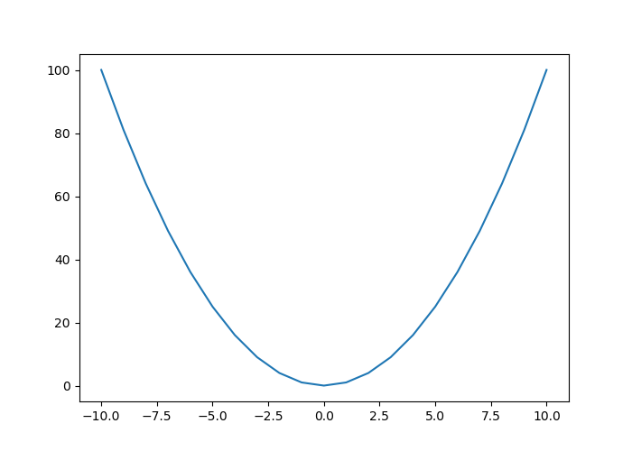
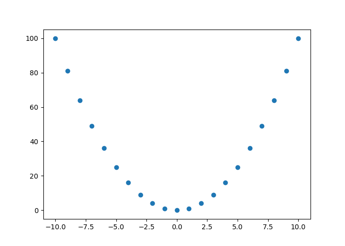
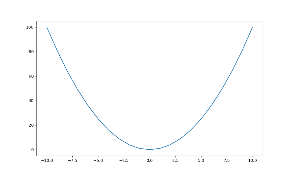
To draw lines on a Cartesian coordinate system, we can use the plot() function, to which we provide the coordinates of the x-axis and y-axis as the first two arguments, respectively. The third argument defines the geometry.
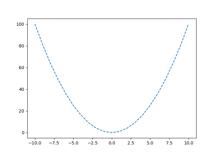
By default, the geometry is a curve:
Once the graph is displayed, it can be closed with the close() function:
Similarly, the geometry can be specified as follows:
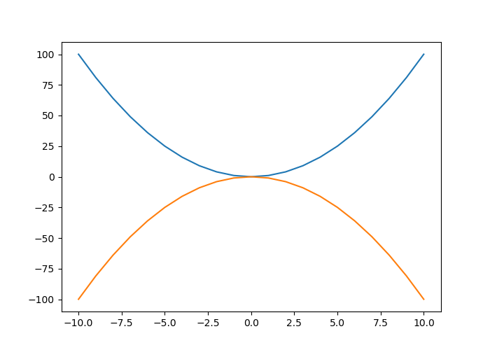
To add a curve to the graph, the plot() function is used several times:
11.1.1.1.1 Aesthetic Arguments
11.1.1.1.1.1 Line Color
To change the color of a line, the argument color is used:
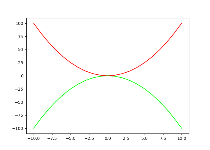
As can be seen, the reference to color can be done by using its name (the list of colors with a name is available on the matplotlib documentation). A hexadecimal code can also be used to refer to a color.
11.1.1.1.1.2 Line Thickness
Line thickness can be modified using the linewidth argument, to which a numerical value is provided:
11.1.1.1.1.3 Type of lines
To change the line type, the third argument of the function is modified. As we have seen on the previous example the default is a line. This corresponds to the value - being specified to the third argument. Table 11.1 indicates the different possible formats for the line.
| Value | Description |
|---|---|
- |
Solid line |
-- |
Dashed line |
-. |
Dots and dashs |
: |
Dots |
For example, to have a linear interpolation between our points with a graphical representation made using dashes :

The line type can also be specified using the linestyle parameter, by indicating one of the values given in Table 11.2
| Value | Description |
|---|---|
- ou solid |
Solid line |
-- ou dashed |
Dashed |
-. ou dashdot |
Dashes and dots |
: ou dotted |
Dots |
None |
No line plotted |
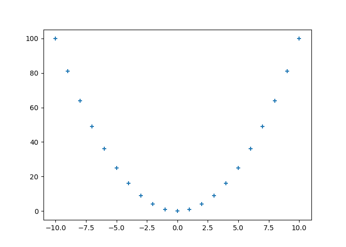
11.1.1.1.1.4 Markers
Table 11.3 shows formats that can be specified as markers at each point on the curve.
| Value | Description |
|---|---|
. |
Dots |
, |
Pixels |
o |
Empty circles |
v |
Triangles pointing down |
^ |
Triangles pointing up |
< |
Triangles pointing to the left |
> |
Triangles pointing to the right |
1 |
‘tri_down’ |
2 |
‘tri_up’ |
3 |
‘tri_left’ |
4 |
‘tri_right’ |
s |
Square |
p |
Pentagon |
* |
Asterisk |
h |
Hexagon 1 |
H |
Hexagon 2 |
+ |
Plus symbol |
x |
Multiply symbol |
D |
Diamond |
d |
Thin diamond |
| |
Vertical line |
_ |
Horizontal line |
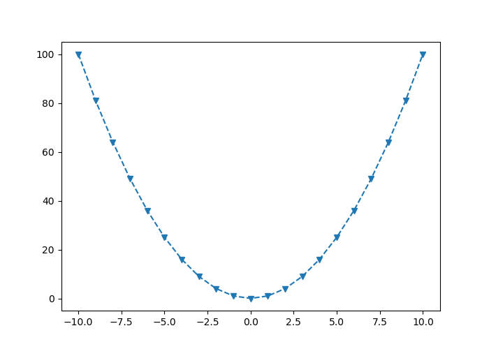
For example, with empty circles:
It can be noted that it is possible to combine the line types in 11.1 with marker types described in Table 11.3 :
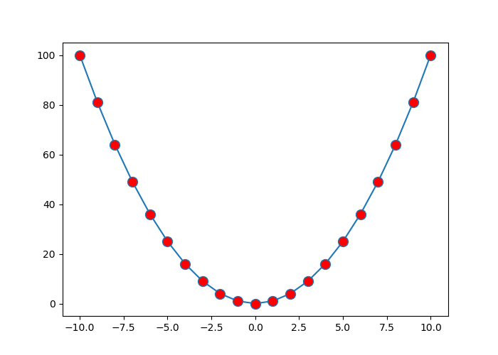
To control the markers more precisely, the following arguments can be used:
marker: indicates the type of marker (see Table 11.3)markerfacecolor: the desired color for the markersmarkersize: size of the markers.
11.1.1.2 Scatter Plots
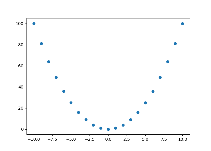
One of the graphs that we very frequently encounter is the scatterplot. To create one, we can use the scatter() function, which indicates the coordinates (x,y) of the points as well as some optional shape or aesthetic parameters.
scatter() function mentions that the plot() function (see Section 11.1.1.1) s faster to perform scatter plots in which the color or size of the points varies.
When we wish to change the shape of the markers, we specify it via the marker argument (see Table 11.3 for the possible values) :
11.1.1.3 Size and color
The size of the points is adjustable via the parameter s, while the color changes via the parameter color (or by its alias c):
A specific colour and size can be associated with each point:
x = np.random.rand(30)
y = np.random.rand(30)
z = np.random.rand(30)
colours = np.random.choice(["blue", "black", "red"], 30)
plt.scatter(x, y, marker="o", color = colours, s = z*100)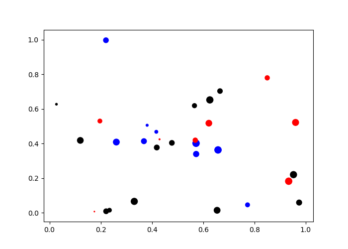
11.1.1.4 Histograms
To make a histogram with pyplot, the function hist() can be used:
## (array([ 17., 39., 85., 168., 235., 198., 136., 70., 40., 12.]), array([-2.62300428, -2.08431945, -1.54563461, -1.00694978, -0.46826494,
## 0.0704199 , 0.60910473, 1.14778957, 1.68647441, 2.22515924,
## 2.76384408]), <a list of 10 Patch objects>)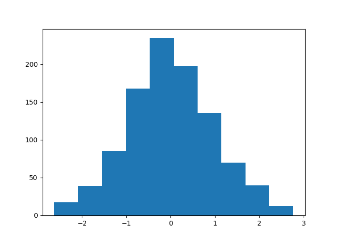
The bins argument is used to specify either the number of classes or their boundaries:
## (array([ 5., 4., 8., 6., 16., 17., 23., 27., 35., 50., 56., 62., 67.,
## 80., 88., 64., 78., 56., 51., 42., 43., 20., 27., 23., 18., 13.,
## 9., 3., 4., 5.]), array([-2.62300428, -2.44344267, -2.26388106, -2.08431945, -1.90475784,
## -1.72519622, -1.54563461, -1.366073 , -1.18651139, -1.00694978,
## -0.82738816, -0.64782655, -0.46826494, -0.28870333, -0.10914171,
## 0.0704199 , 0.24998151, 0.42954312, 0.60910473, 0.78866635,
## 0.96822796, 1.14778957, 1.32735118, 1.50691279, 1.68647441,
## 1.86603602, 2.04559763, 2.22515924, 2.40472086, 2.58428247,
## 2.76384408]), <a list of 30 Patch objects>)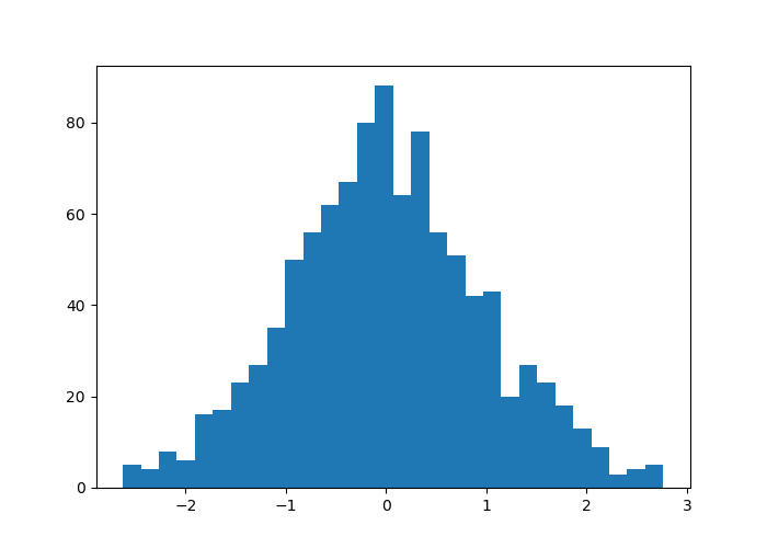
And with the boundaries:
## (array([ 0., 0., 0., 0., 0., 0., 0., 0., 0., 0., 0., 0., 0.,
## 1., 4., 1., 2., 4., 4., 3., 4., 11., 10., 3., 13., 14.,
## 15., 15., 18., 21., 30., 25., 37., 32., 30., 36., 38., 48., 42.,
## 38., 53., 33., 52., 39., 31., 34., 27., 27., 32., 18., 24., 16.,
## 11., 14., 15., 12., 12., 11., 8., 7., 8., 4., 2., 2., 3.,
## 1., 3., 2., 0., 0., 0., 0., 0., 0., 0., 0., 0., 0.,
## 0.]), array([-4.00000000e+00, -3.90000000e+00, -3.80000000e+00, -3.70000000e+00,
## -3.60000000e+00, -3.50000000e+00, -3.40000000e+00, -3.30000000e+00,
## -3.20000000e+00, -3.10000000e+00, -3.00000000e+00, -2.90000000e+00,
## -2.80000000e+00, -2.70000000e+00, -2.60000000e+00, -2.50000000e+00,
## -2.40000000e+00, -2.30000000e+00, -2.20000000e+00, -2.10000000e+00,
## -2.00000000e+00, -1.90000000e+00, -1.80000000e+00, -1.70000000e+00,
## -1.60000000e+00, -1.50000000e+00, -1.40000000e+00, -1.30000000e+00,
## -1.20000000e+00, -1.10000000e+00, -1.00000000e+00, -9.00000000e-01,
## -8.00000000e-01, -7.00000000e-01, -6.00000000e-01, -5.00000000e-01,
## -4.00000000e-01, -3.00000000e-01, -2.00000000e-01, -1.00000000e-01,
## 3.55271368e-15, 1.00000000e-01, 2.00000000e-01, 3.00000000e-01,
## 4.00000000e-01, 5.00000000e-01, 6.00000000e-01, 7.00000000e-01,
## 8.00000000e-01, 9.00000000e-01, 1.00000000e+00, 1.10000000e+00,
## 1.20000000e+00, 1.30000000e+00, 1.40000000e+00, 1.50000000e+00,
## 1.60000000e+00, 1.70000000e+00, 1.80000000e+00, 1.90000000e+00,
## 2.00000000e+00, 2.10000000e+00, 2.20000000e+00, 2.30000000e+00,
## 2.40000000e+00, 2.50000000e+00, 2.60000000e+00, 2.70000000e+00,
## 2.80000000e+00, 2.90000000e+00, 3.00000000e+00, 3.10000000e+00,
## 3.20000000e+00, 3.30000000e+00, 3.40000000e+00, 3.50000000e+00,
## 3.60000000e+00, 3.70000000e+00, 3.80000000e+00, 3.90000000e+00]), <a list of 79 Patch objects>)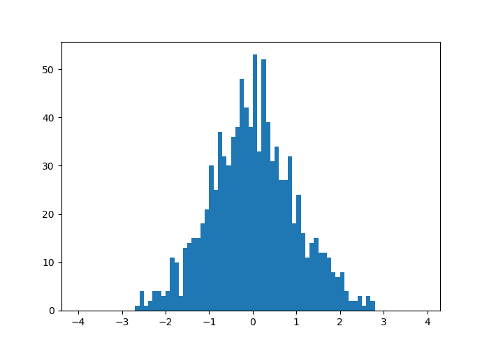
The orientation is changed via the orientation argument, indicating either vertical (by default) or horizontal.
## (array([ 17., 39., 85., 168., 235., 198., 136., 70., 40., 12.]), array([-2.62300428, -2.08431945, -1.54563461, -1.00694978, -0.46826494,
## 0.0704199 , 0.60910473, 1.14778957, 1.68647441, 2.22515924,
## 2.76384408]), <a list of 10 Patch objects>)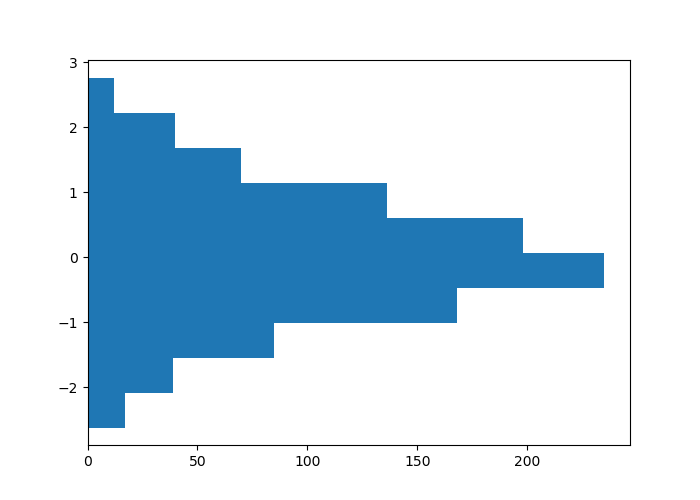
11.1.1.4.1 Aesthetic Arguments
To change the filling color, we use the color argument; to add a color delimiting the bars, we use the edgecolor argument; to define the contour thickness, we use the linewidth argument:
## (array([ 2., 2., 32., 79., 223., 272., 229., 109., 43., 9.]), array([-3.88089841, -3.18024506, -2.4795917 , -1.77893834, -1.07828499,
## -0.37763163, 0.32302172, 1.02367508, 1.72432844, 2.42498179,
## 3.12563515]), <a list of 10 Patch objects>)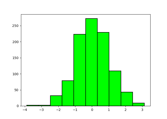
11.1.1.5 Bar Charts
To make bar graphs, pyplot offers the function bar().
pays = ["France", "Italie", "Belgique", "Allemagne"]
unemployment = [9.3, 9.7, 6.5, 3.4]
plt.bar(pays, unemployment)## <BarContainer object of 4 artists>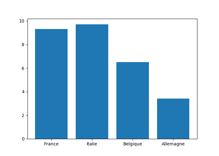
For a horizontal diagram, the barh() function is used in the same way:
## <BarContainer object of 4 artists>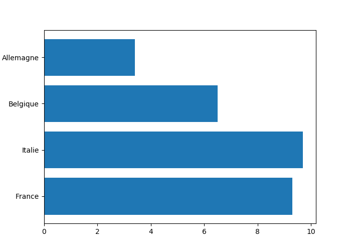
11.1.1.5.1 Several Series on a Bar Chart
To compare several side-by-side series, it is necessary to borrow concepts that will only be introduced in Section 11.1.3 (the code is provided here rather as a quick reference to perform this kind of graphs).
countries = ["France", "Italie", "Belgique", "Allemagne"]
unemp_f = [9.1, 11.2, 6.4, 2.9]
unemp_h = [9.5, 9, 6.6, 3.8]
# Position on the x-axis for each label
position = np.arange(len(countries))
# Bar widths
width = .35
# Creating the figure and a set of subgraphics
fig, ax = plt.subplots()
r1 = ax.bar(position - width/2, unemp_f, width)
r2 = ax.bar(position + width/2, unemp_h, width)
# Modification of the marks on the x-axis and their labels
ax.set_xticks(position)
ax.set_xticklabels(countries)## [<matplotlib.axis.XTick object at 0x13d78d390>, <matplotlib.axis.XTick object at 0x13d786c88>, <matplotlib.axis.XTick object at 0x13d7869e8>, <matplotlib.axis.XTick object at 0x13da6d208>]## [Text(0,0,'France'), Text(0,0,'Italie'), Text(0,0,'Belgique'), Text(0,0,'Allemagne')]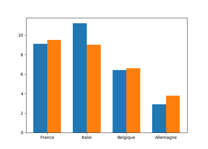
11.1.1.5.2 Stacked Bar Charts
To stack the values of the series, the starting value for the series is specified using the argument bottom:
countries = ["France", "Italie", "Belgique", "Allemagne"]
no_unemp_f = [1.307, 1.185, .577, .148]
no_unemp_h = [1.46, 1.338, .878, .179]
plt.bar(countries, no_unemp_f)
plt.bar(countries, no_unemp_h, bottom = no_unemp_f)## <BarContainer object of 4 artists>## <BarContainer object of 4 artists>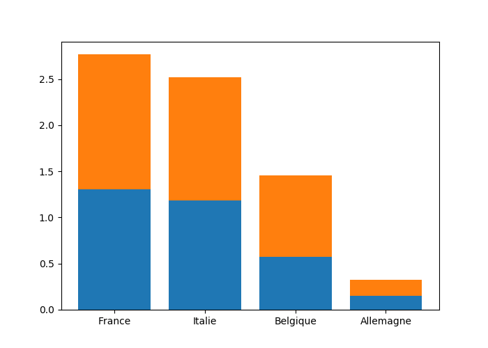
11.1.1.5.3 Aesthetic Arguments
To change the filling color, we use the color argument; for the contour color, we enter the edgecolor argument; for the contour width, we rely on the linewidth argument:
countries = ["France", "Italie", "Belgique", "Allemagne"]
no_unemp_f = [1.307, 1.185, .577, .148]
no_unemp_h = [1.46, 1.338, .878, .179]
plt.bar(countries, no_unemp_f, color = "purple",
edgecolor = "black", linewidth = 1.5)
plt.bar(countries, no_unemp_h, bottom = no_unemp_f)## <BarContainer object of 4 artists>## <BarContainer object of 4 artists>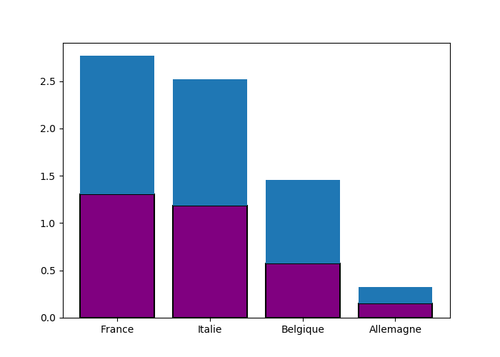
11.1.1.6 Boxplots
To make boxplot, pyplot offers the function boxplot() :
## {'whiskers': [<matplotlib.lines.Line2D object at 0x13db70cc0>, <matplotlib.lines.Line2D object at 0x13db79240>], 'caps': [<matplotlib.lines.Line2D object at 0x13db796a0>, <matplotlib.lines.Line2D object at 0x13db79b00>], 'boxes': [<matplotlib.lines.Line2D object at 0x13db70b70>], 'medians': [<matplotlib.lines.Line2D object at 0x13db79f60>], 'fliers': [<matplotlib.lines.Line2D object at 0x13db82400>], 'means': []}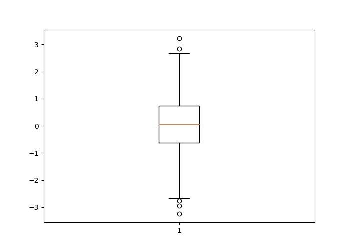
By specifying False as the value of the argument vert, the boxplot is plotted horizontally:
## {'whiskers': [<matplotlib.lines.Line2D object at 0x13de76b00>, <matplotlib.lines.Line2D object at 0x13de83080>], 'caps': [<matplotlib.lines.Line2D object at 0x13de834e0>, <matplotlib.lines.Line2D object at 0x13de83940>], 'boxes': [<matplotlib.lines.Line2D object at 0x13de769b0>], 'medians': [<matplotlib.lines.Line2D object at 0x13de83da0>], 'fliers': [<matplotlib.lines.Line2D object at 0x13de8a240>], 'means': []}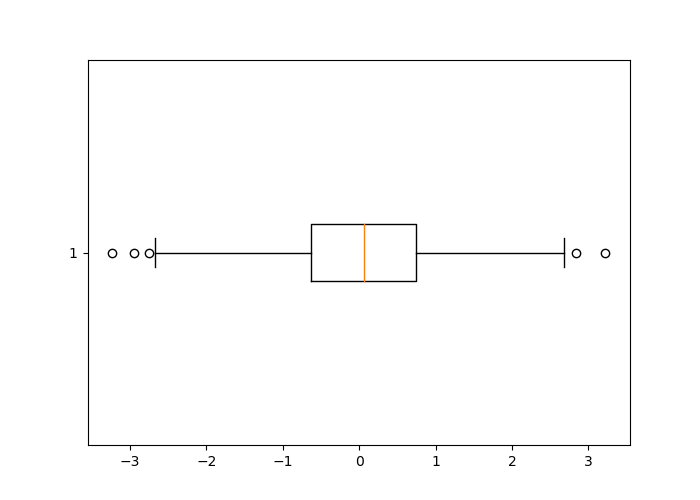
11.1.2 Several Graphs on a Figure
To place graphs next to each other, the function subplot() is used. The graphs will be placed as in a matrix, with a number of rows no_rows and a number of columns no_col. The dimensions of this matrix can be specified as arguments of the subplot() function, using the following syntax:
where current indicates the index of the active graph. Let’s look at an example of how it works:
x = np.arange(-10, 11)
y = -x**2
# 3x2 dimension matrix of graphs
# Row 1, column 1
plt.subplot(3, 2, 1)
plt.plot(x, y, color = "red")
# Row 1, column 2
plt.subplot(3, 2, 2)
plt.plot(x, y, color = "orange")
# Row 2, column 1
plt.subplot(3, 2, 3)
plt.plot(x, y, color = "yellow")
# Row 2, column 2
plt.subplot(3, 2, 4)
plt.plot(x, y, color = "green")
# Row 3, column 1
plt.subplot(3, 2, 5)
plt.plot(x, y, color = "blue")
# Row 3, column 2
plt.subplot(3, 2, 6)
plt.plot(x, y, color = "violet")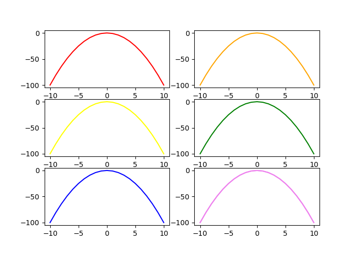
Remember that the matrices are filled line by line in Python, which allows a good understanding of the value of the active graph number.
By using the function subplots() (beware of the final “s” of the name of the function that differentiates it from the previous one), it is possible to produce a matrix of graphs as well, by proceeding as follows:
f, ax_arr = plt.subplots(2, 2)
ax_arr[0, 0].plot(x, y, color = "red")
ax_arr[0, 1].plot(x, y, color = "orange")
ax_arr[1, 0].plot(x, y, color = "yellow")
ax_arr[1, 1].plot(x, y, color = "green")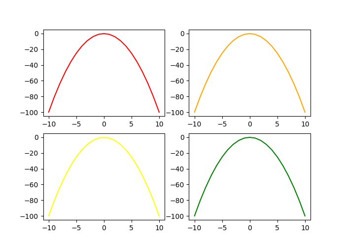
This approach has the advantage of easily specifying the sharing of axes between the different subgraphs, via the sharex and sharey arguments:
f, ax_arr = plt.subplots(2, 2, sharey=True, sharex = True)
ax_arr[0, 0].plot(x, y, color = "red")
ax_arr[0, 1].plot(x, y, color = "orange")
ax_arr[1, 0].plot(x, y, color = "yellow")
ax_arr[1, 1].plot(x, y, color = "green")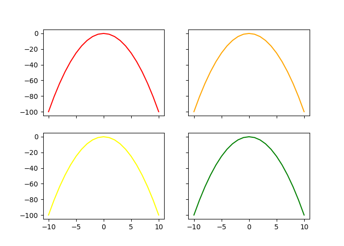
11.1.3 Graphics Elements
So far, we have looked at how to create different geometries, but we have not touched the axes, their values or labels (except in the unexplained example of side-by-side diagrams), or modified the legends or titles.
11.1.3.1 Title
To add a title to the graph, we can use the title() function:
x = np.arange(-10, 11)
y = x**2
y_2 = -y
plt.plot(x, y)
plt.plot(x, y_2)
plt.title("$y = x^2$ \nand $y = -x^2$")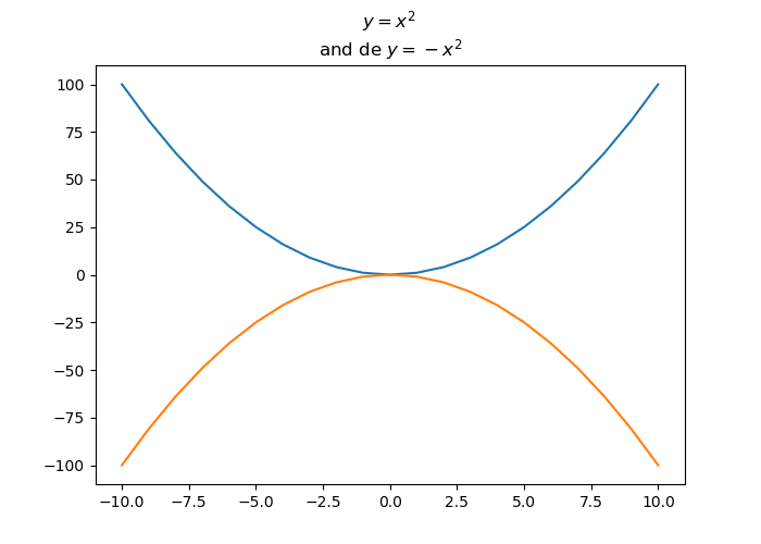
11.1.3.2 Axes
The xlabel() and ylabel() functions allow us to add labels to the axes:
x = np.arange(-10, 11)
y = x**2
plt.plot(x, y)
plt.xlabel("Values of $x$")
plt.ylabel("Values of $y$")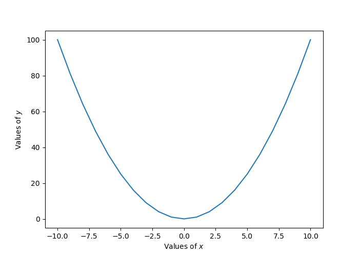
11.1.3.2.1 Limits
To control the axis limits, the axis() function is used, specifying the arguments xmin, xmax, ymax, ymin and ymax, denoting, respectively, the lower and upper bounds of the x-axis and the lower and upper bounds of the y-axis:
## (0, 5, -1, 30)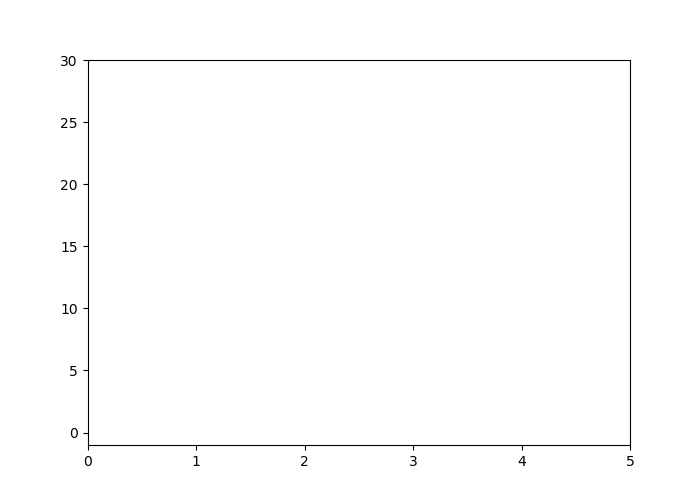
11.1.3.2.2 Marks and labels
The xticks() and yticks() functions are used to obtain or modify the marks of the x-axis and the y-axis, respectively.
## ([<matplotlib.axis.XTick object at 0x13e96c5f8>, <matplotlib.axis.XTick object at 0x13e80def0>, <matplotlib.axis.XTick object at 0x13e80dc50>, <matplotlib.axis.XTick object at 0x13e98bd68>, <matplotlib.axis.XTick object at 0x13e9902b0>, <matplotlib.axis.XTick object at 0x13e9907b8>], <a list of 6 Text xticklabel objects>)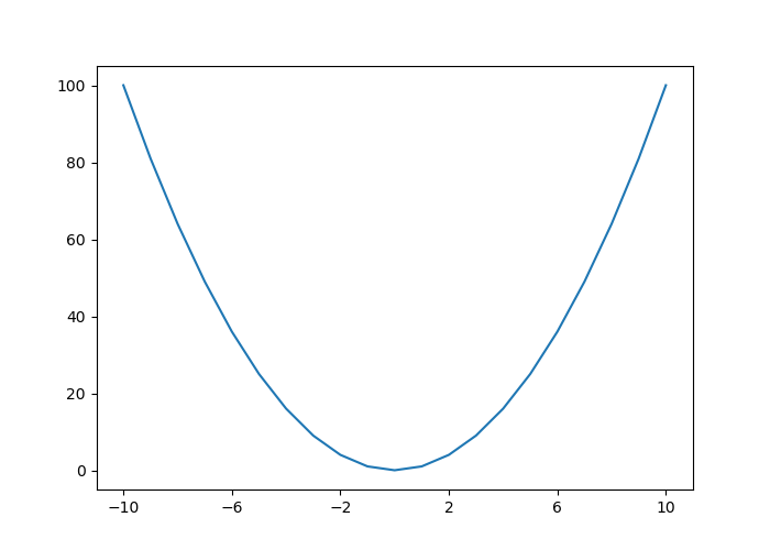
It can be convenient to retrieve the positions and labels of a graph so that we can modify them, for example to define the spacing between each mark:
plt.plot(x, y)
locs_x, labels_x = plt.xticks()
locs_y, labels_y = plt.yticks()
loc_x_new = np.arange(locs_x[0], locs_x[-1], step = 5)
loc_y_new = np.arange(locs_y[0], locs_y[-1], step = 10)

plt.xticks(loc_x_new)
plt.yticks(loc_y_new)
## ([<matplotlib.axis.XTick object at 0x13eb14a90>, <matplotlib.axis.XTick object at 0x13eb143c8>, <matplotlib.axis.XTick object at 0x13eb142b0>, <matplotlib.axis.XTick object at 0x13eb3b240>, <matplotlib.axis.XTick object at 0x13eb3b748>, <matplotlib.axis.XTick object at 0x13eb3bc50>], <a list of 6 Text xticklabel objects>)
The labels on the marks can also be modified:
plt.plot(x, y)
locs_x, labels_x = plt.xticks()
locs_y, labels_y = plt.yticks()
loc_x_new = np.arange(locs_x[0], locs_x[-1], step = 5)
loc_y_new = np.arange(locs_y[0], locs_y[-1], step = 10)

labels_x_new = []
for i in np.arange(1, len(locs_x)):
        labels_x_new.append("x : " + str(locs_x[i]))

plt.xticks(loc_x_new, labels_x_new)
plt.yticks(loc_y_new)
## ([<matplotlib.axis.XTick object at 0x13ee14f98>, <matplotlib.axis.XTick object at 0x13ee148d0>, <matplotlib.axis.XTick object at 0x13f23d3c8>, <matplotlib.axis.XTick object at 0x13f23d7b8>, <matplotlib.axis.XTick object at 0x13f23def0>], <a list of 5 Text xticklabel objects>)## ([<matplotlib.axis.YTick object at 0x13ee1add8>, <matplotlib.axis.YTick object at 0x13ee1a6a0>, <matplotlib.axis.YTick object at 0x13f24b710>, <matplotlib.axis.YTick object at 0x13f254198>, <matplotlib.axis.YTick object at 0x13f2545c0>, <matplotlib.axis.YTick object at 0x13f254ac8>, <matplotlib.axis.YTick object at 0x13f254cf8>, <matplotlib.axis.YTick object at 0x13f25d518>, <matplotlib.axis.YTick object at 0x13ee14668>, <matplotlib.axis.YTick object at 0x13e990278>, <matplotlib.axis.YTick object at 0x13f2548d0>, <matplotlib.axis.YTick object at 0x13f23d908>, <matplotlib.axis.YTick object at 0x13f24b7f0>, <matplotlib.axis.YTick object at 0x13f25dcc0>], <a list of 14 Text yticklabel objects>)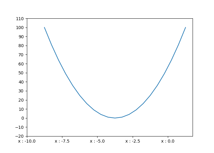
11.1.3.2.3 Grid
To add a grid, grid() function is used:
The axis argument allows to define if we want a grid for both axes (both, by default), only for the x-axis (x), or only for the y-axis (y):

It is possible to set the major or minor lines of the grid:
plt.plot(x, y)
plt.minorticks_on()
plt.grid(which = "major", axis = "y", color = "black")
plt.grid(which = "minor", axis = "y", color = "red", linestyle = "--")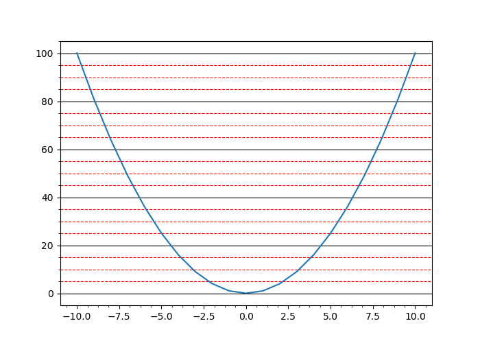
11.1.3.3 Legends
When we wish to add a legend, we specify its label to the label argument in the call of the plot function, then we use the legend() function:
x = np.arange(-10, 11)
y = x**2
y_2 = x**3
plt.plot(x, y, label = "square ($x^2$)")
plt.plot(x, y_2, label = "cube ($x^3$)")
plt.legend()
plt.legend()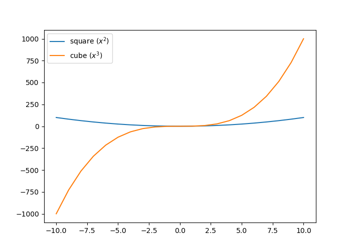
To specify the position of the legend, we can use the loc argument in the legend() function, indicating a value as reported in Table 11.4.
———–: | | ———–: | ————————————————:|
best | 0 | Let Python optimize the positroning |upper right | 1 | Upper right corner |upper left | 2 | Upper left corner |lower left | 3 | Lower left corner |lower right | 4 | Lower right corner |right | 5 | Right |center left | 6 | Centered in the middle on the left |center right | 7 | Centered in the middle on the right |lower center | 8 | Centered at the bottom |upper center | 9 | Centered at the top |center | 10 | Centered |Table: (#tab:pyplot-legendes-loc) Position of the legend
For example, to center the legend in the middle, at the bottom of the graph:
x = np.arange(-10, 11)
y = x**2
y_2 = x**3
plt.plot(x, y, label = "square ($x^2$)")
plt.plot(x, y_2, label = "cube ($x^3$)")
plt.legend(loc = "lower center")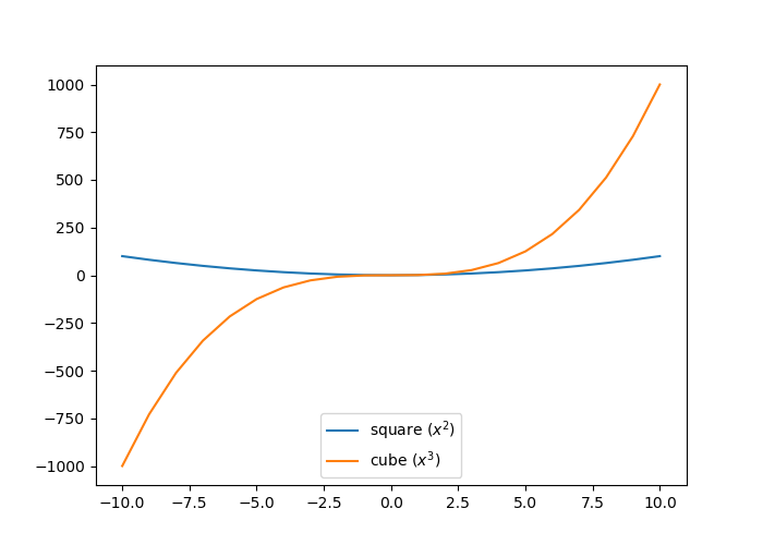
11.1.4 Dimensions
To define the dimensions of a figure, we specify the figsize argument of the figure() function. It is provided with a tuple of integers whose first element corresponds to the length and the second to the height (the values are in inches):
11.1.5 Exporting Graphs
To save a graph, the function plt.savefig() can be used. We specify the path to the file to be created, indicating the extension of the desired file (e.g., png or pdf):
x = np.arange(-10, 11)
y = x**2
y_2 = x**3
plt.figure(figsize=(10,6))
plt.plot(x, y, label = "square ($x^2$)")
plt.plot(x, y_2, label = "cube ($x^3$)")
plt.legend(loc = "lower center")
plt.savefig("test.pdf")
The specified extension (in this example, pdf) determines the output file format. The extensions indicated in the keys of the dictionary returned by the following instruction (the values giving a description of the file type) can be used:
## {'ps': 'Postscript', 'eps': 'Encapsulated Postscript', 'pdf': 'Portable Document Format', 'pgf': 'PGF code for LaTeX', 'png': 'Portable Network Graphics', 'raw': 'Raw RGBA bitmap', 'rgba': 'Raw RGBA bitmap', 'svg': 'Scalable Vector Graphics', 'svgz': 'Scalable Vector Graphics', 'jpg': 'Joint Photographic Experts Group', 'jpeg': 'Joint Photographic Experts Group', 'tif': 'Tagged Image File Format', 'tiff': 'Tagged Image File Format'}