Session 3 — Data Visualization
The slides were adapted from those of Pierre Michel and Morgan Raux, both researchers at AMSE, who kindly shared their work.
This slide deck was made with Quarto and reveal.js, it is translated by Claude Sonnet 5 from a LaTex presentation previously made with beamer.
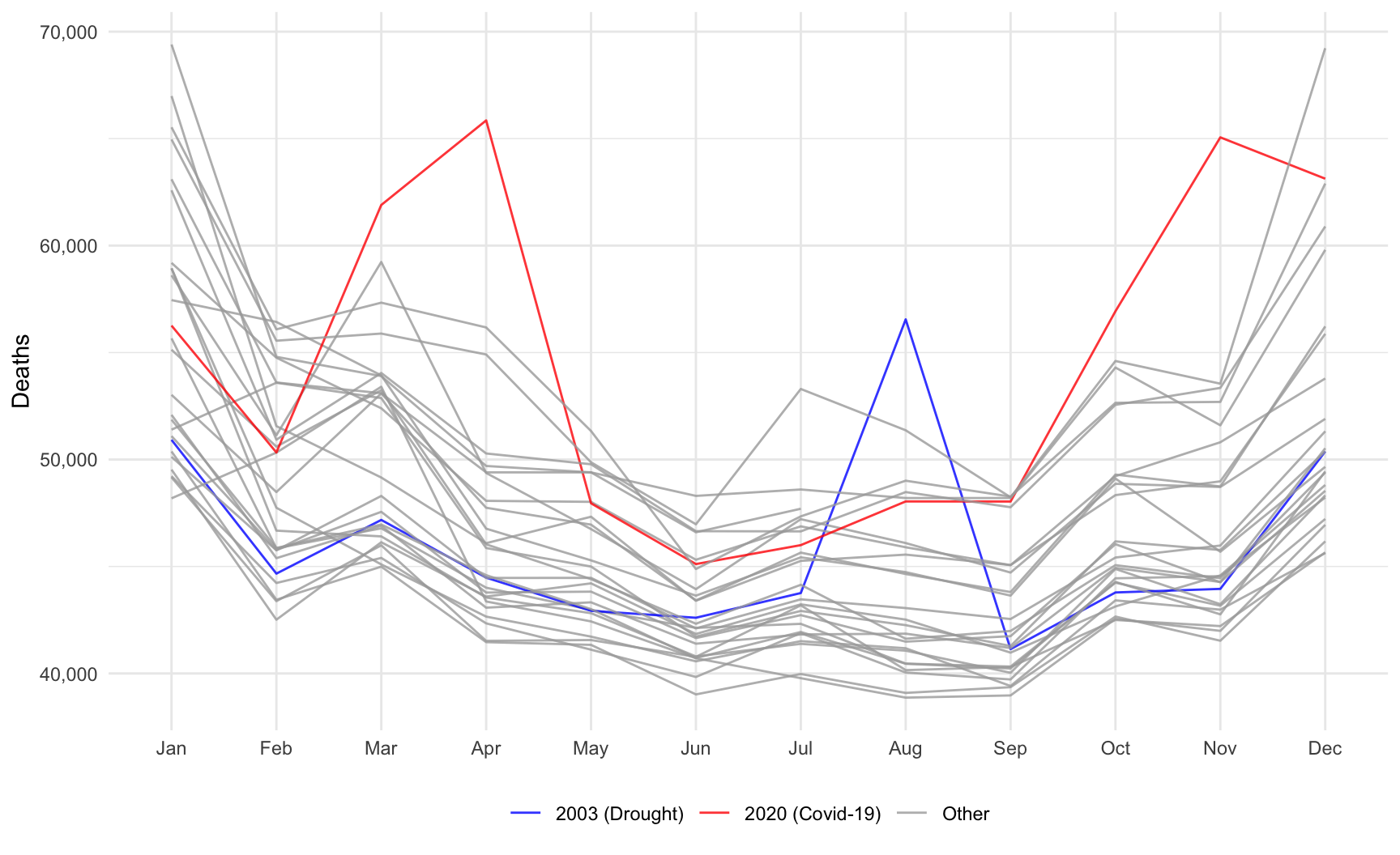
RMonthly number of deaths in France (2020–2025). Source: Insee (ref.: 000436394). (R Codes)
{ggplot2}R.
{base} and {ggplot2} packages offer plot functions I rely on the most.{ggplot2}.Disclaimer The slides are strongly inspired by the 🌐 introduction provided by de Bruin (2024).
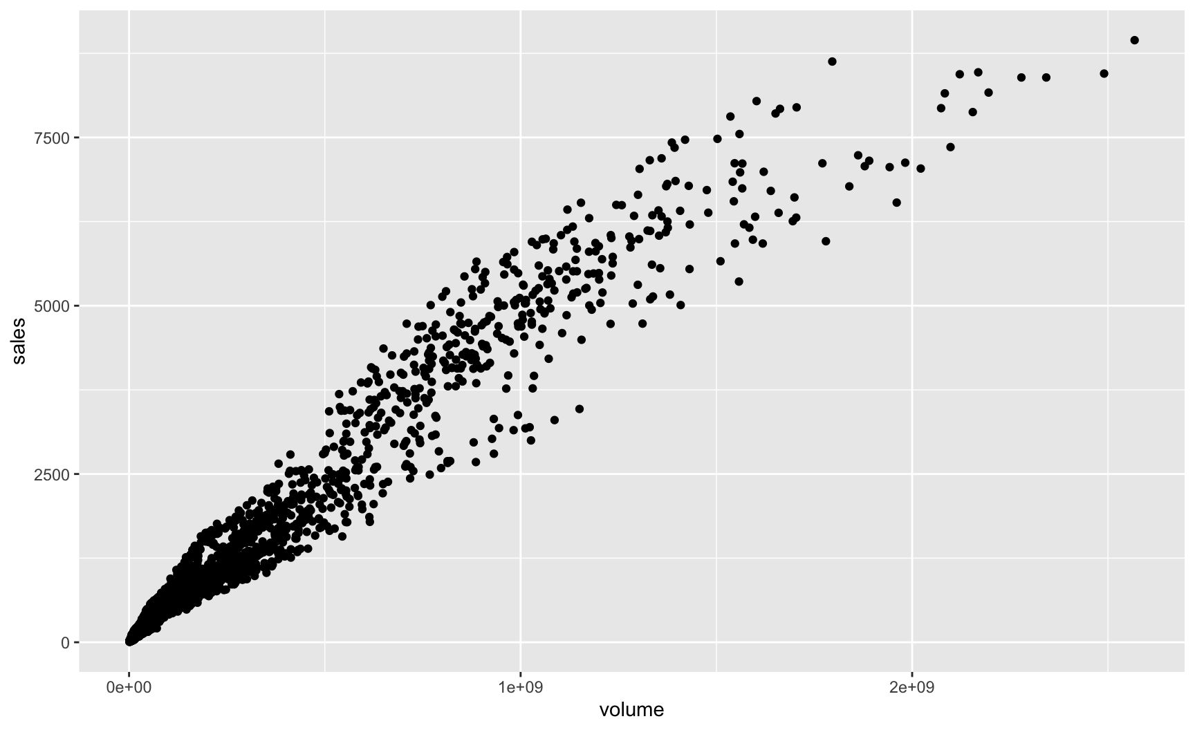
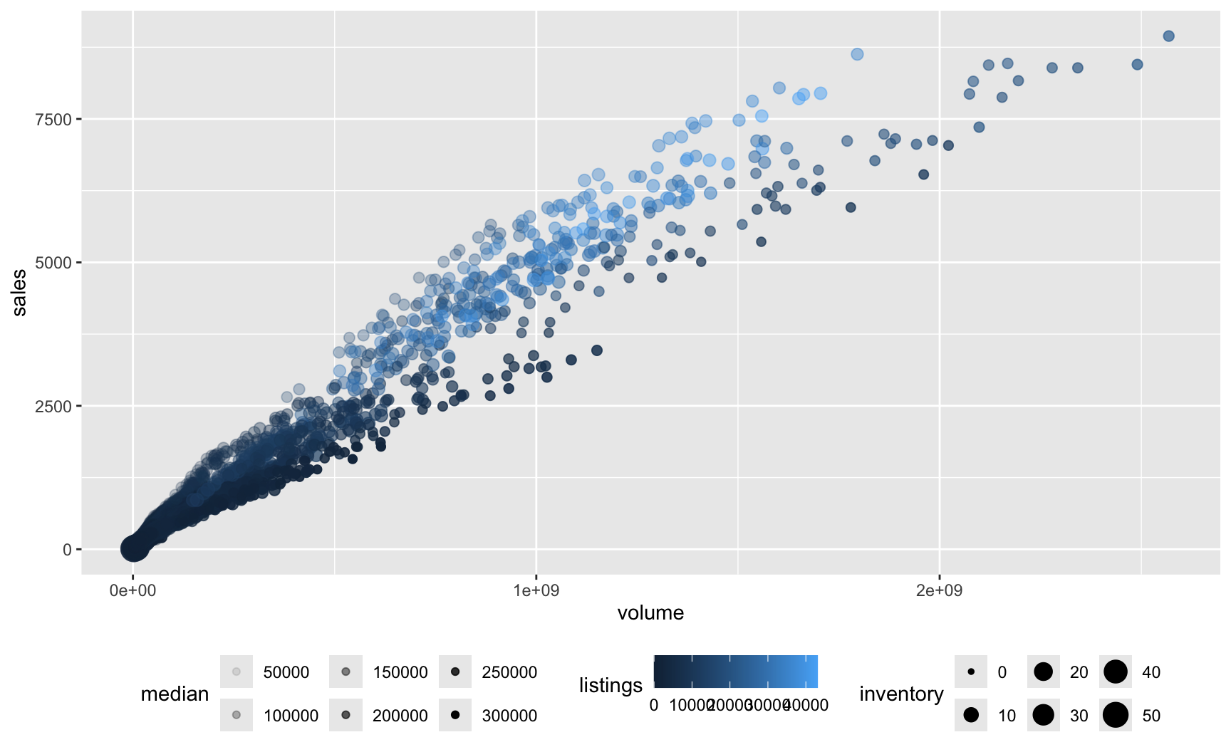
{ggplot2} is based.ggplot2 graph{ggplot2} graph is created with the ggplot() function.data: the datasetmapping: a set of aesthetic mappings between variables in the data and visual propertiesgeom function).{ggplot2}ggplot().ggplot().ggplot(
data = txhousing,
mapping = aes(x = volume, y = sales)
) +
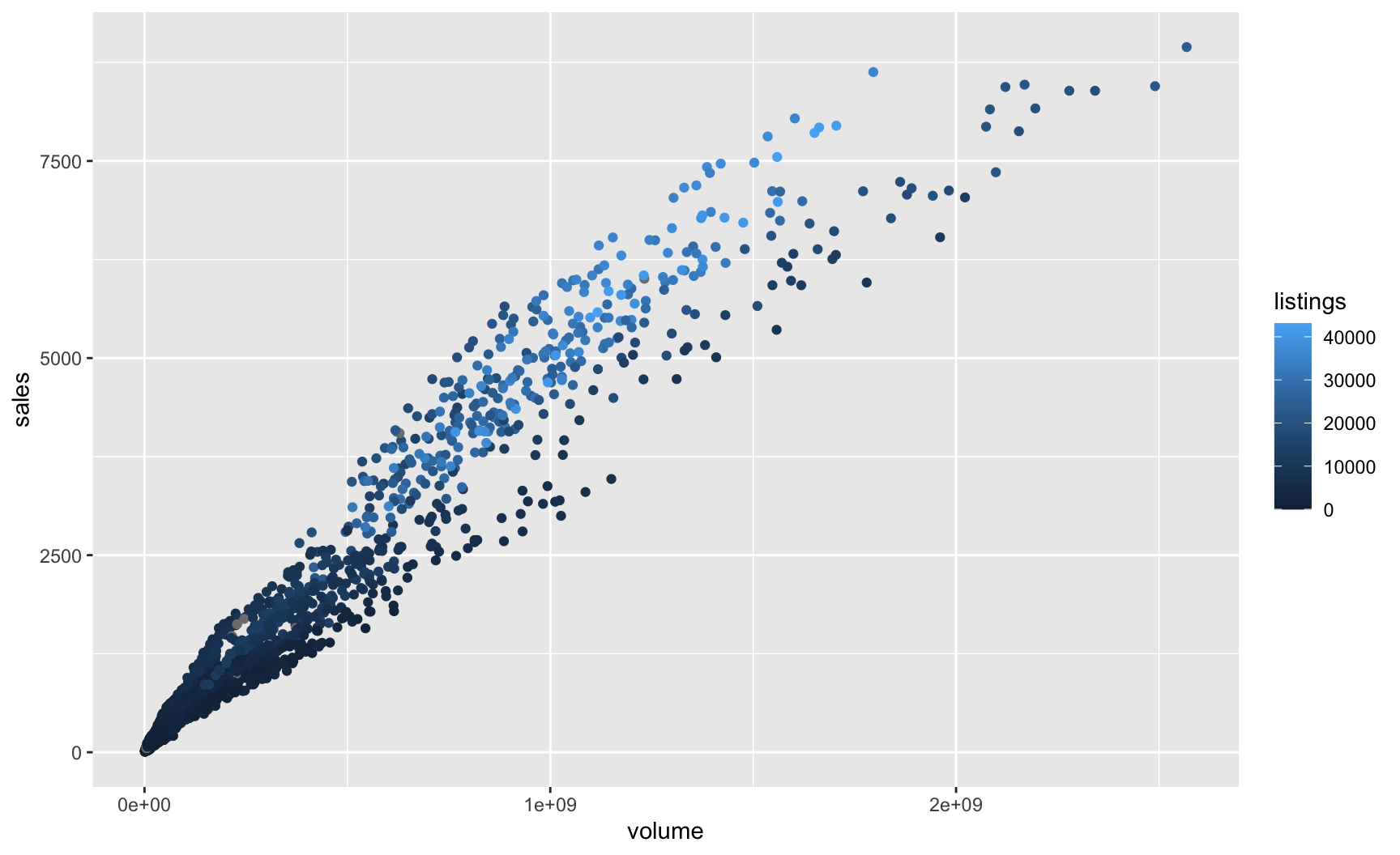
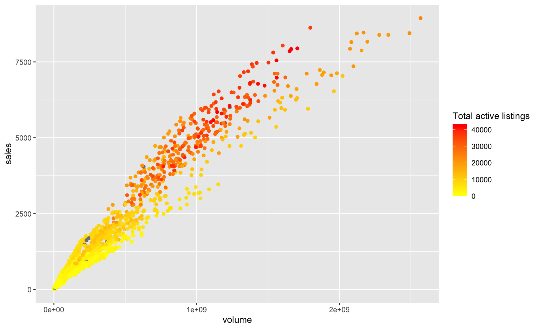
geom_point(mapping = aes(colour = listings))colour = listings causes the colour of objects to vary with values of the variable listings.x, y: positioning along x-axis and y-axis, resp.,colour: colour of objects,fill: fill colour of objects (name or hexadecimal code),linetype: how lines should be drawn (solid, dashed, dotted, …),shape: shape of markers,size: area of markers (for points), font size (for text),linesize: thickness of the lines,alpha: transparency (between 0 (transparent) and 1 (opaque)).geom_point() requires both x and y.shape aesthetic is used by geom_point(), it is not accepted by the geom_bar() function.Useful to represent covariation between a continuous variable (y-axis) and an ordered variable (x-axis).
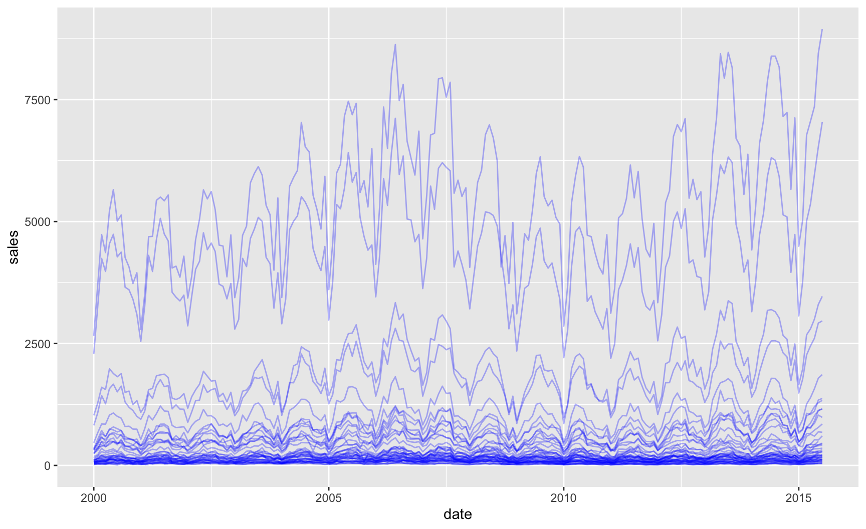
The labs() function allows to change axis, legend, and plot labels.
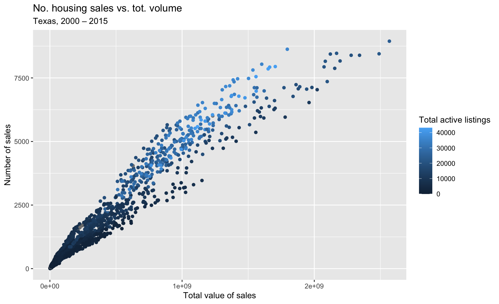
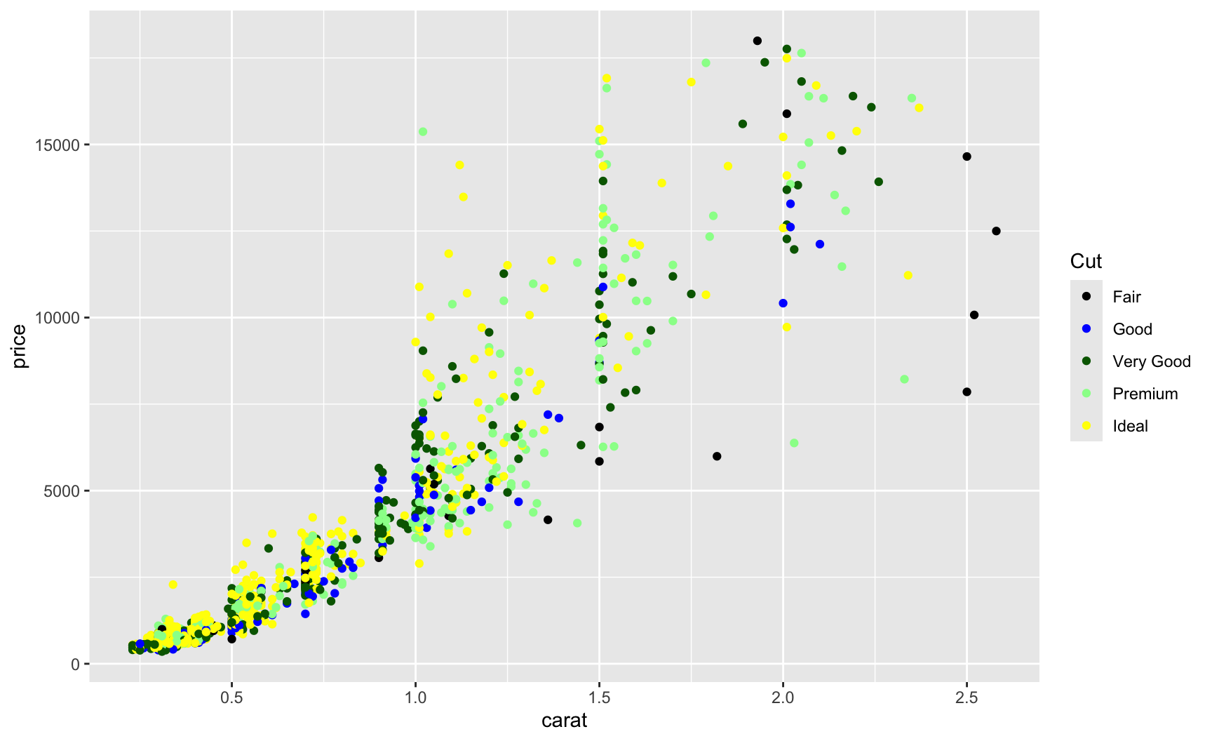
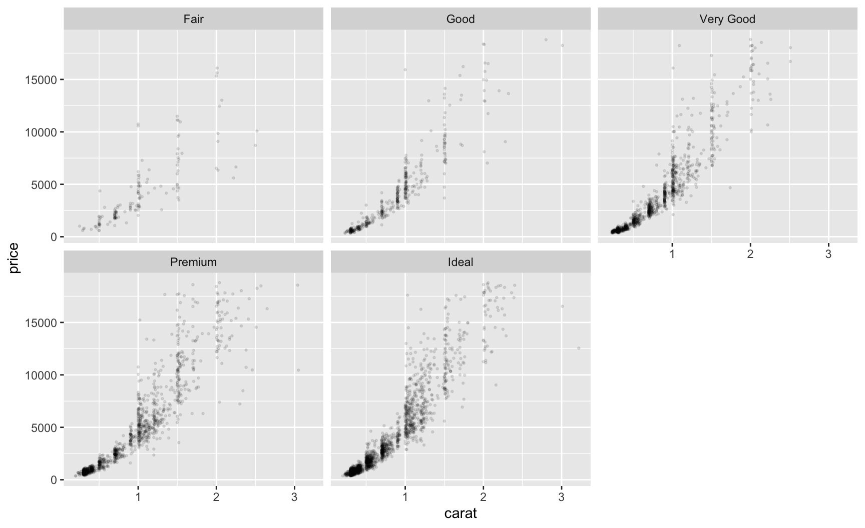
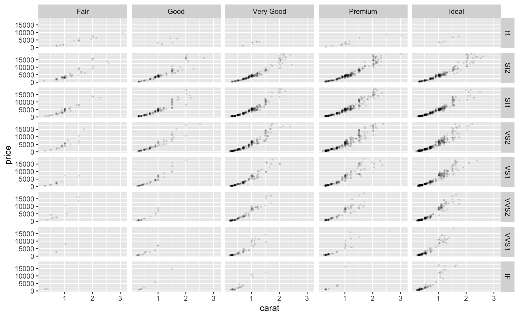
ggsave() functionggsave() function saves the last displayed plot (or a specific ggplot object if provided as argument).scale_* function.facet_wrap(): 1D wrapping of panels,facet_grid(): 2D grid of panels.facet_wrap()facet_grid()ggplot2 has to offer.Practice with the second tutorial!
p_deaths <- ggplot(
data = data_plot_deaths,
mapping = aes(x = month, y = deaths, group = year, colour = year_excess)
) +
geom_line(alpha = .8) +
scale_colour_manual(
NULL, values = c(
"2003 (Drought)" = "blue", "2020 (Covid-19)" = "red",
"Other" = "darkgray"
)) +
labs(x = NULL, y = "Deaths") +
scale_y_continuous(
labels = scales::label_number(suffix = "", scale = 1, big.mark = ",")
) + theme_minimal() + theme(legend.position = "bottom")
Introduction to programming for data analysis — Session 3